kage
kage
uselateron.com
Design analysis
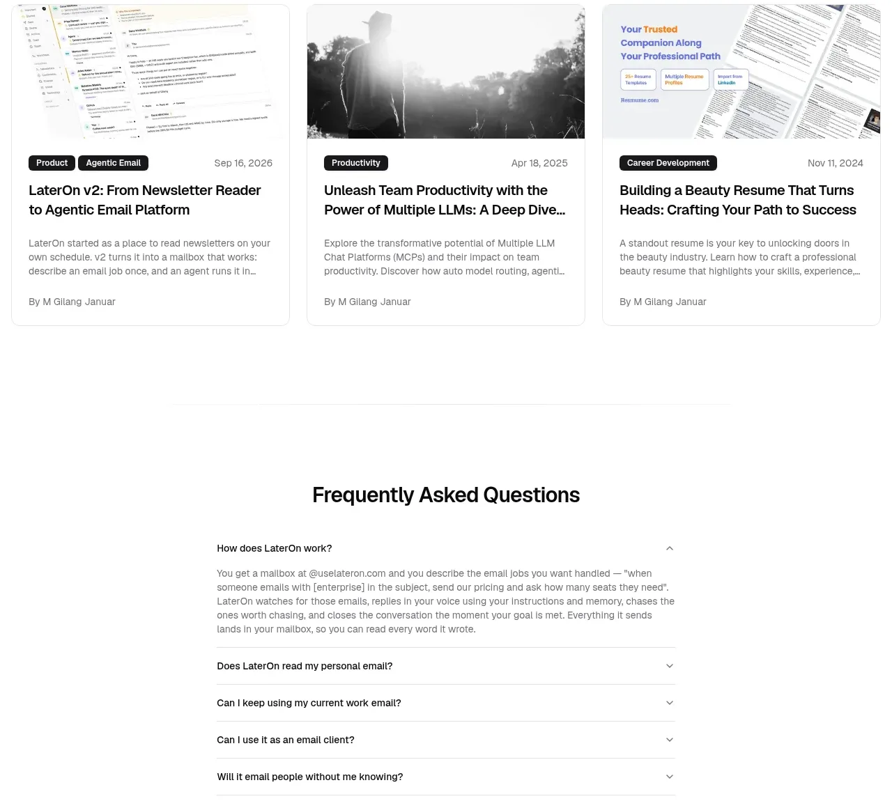
Three equal article cards create a secondary content destination with image previews, category/date metadata, titles, excerpts and author lines.
Prompt preview
## Reference images

Study these alongside the description below: hierarchy, rhythm, spacing, colour. Build for the product you are asked about, using this design language.

- Component: https://kage-design-assets.t3.tigrisfiles.io/components/lateron-v2-the-agentic-email-plaftform/0ff3184e-0d5c-46ea-8012-61473093bd6c-1790402773-7.webp
- Full page it was cut from: https://kage-design-assets.t3.tigrisfiles.io/screenshots/lateron-v2-the-agentic-email-plaftform/0ff3184e-0d5c-46ea-8012-61473093bd6c-1790402643023-full.webp
- Component on Kage: https://kage.design/component/lateron-v2-the-agentic-email-plaftform-gallery

## Before you start
Ask what topics the user's product publishes and what editorial brand it wants. Build original article content and imagery while following this structure.

Create a blog section with a simple heading aligned left and a small “read more” link aligned right. Under it, place three equal cards in a responsive row. Each card has a 16:9 image or generated abstract thumbnail, a compact metadata row with category and date, a bold two-line title, a muted two-line excerpt, and an author line. Use #fff cards with #e5e5e5 borders, 8px radius, overflow hidden, 16px internal padding, and a subtle hover lift. Keep image treatment editorial and neutral, with no copied source imagery.

Never: use logos, product names, copy, illustrations, or imagery from the reference.