kage
kage
uselateron.com

Design analysis
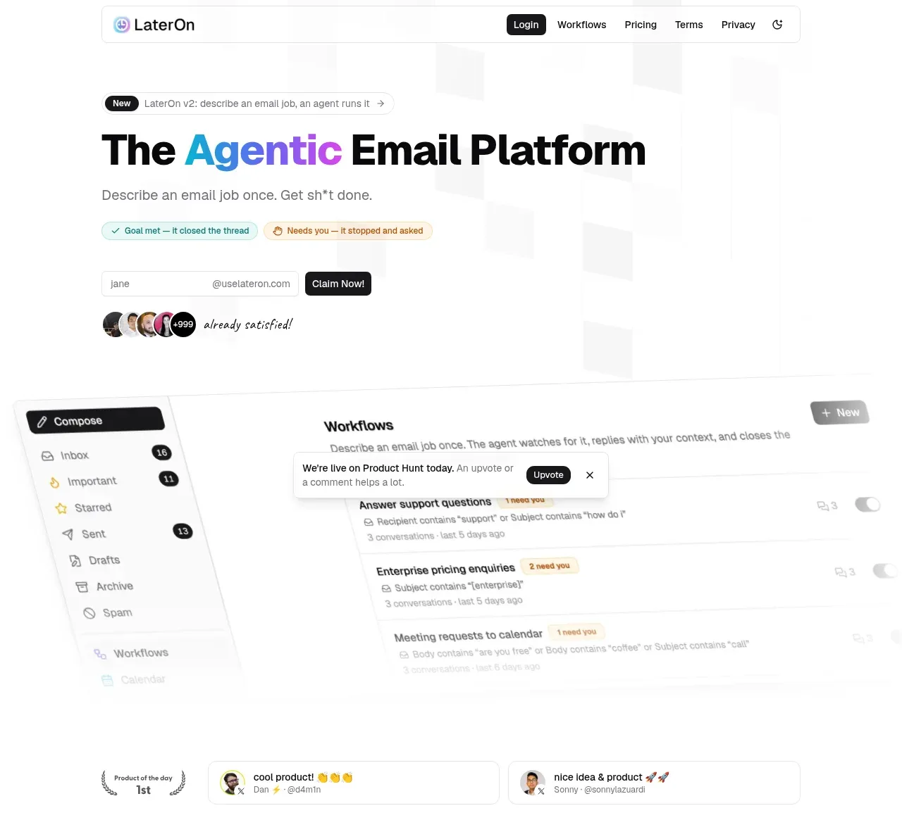
A long, highly spacious landing page uses a white canvas, near-black typography, thin gray rules, and restrained blue/teal/yellow status accents. The hero leads with a large mixed-color headline and a tilted product interface, then the page shifts into explanatory three-step content, tabbed use cases, dense feature grids, testimonials, blog cards, FAQ rows, a sparse CTA, and a multi-column footer; the rhythm alternates between oversized whitespace and compact bordered UI modules.
Prompt preview
## Reference images

Study these alongside the description below: hierarchy, rhythm, spacing, colour. Build for the product you are asked about, using this design language.

- Full page: https://kage-design-assets.t3.tigrisfiles.io/screenshots/lateron-v2-the-agentic-email-plaftform/0ff3184e-0d5c-46ea-8012-61473093bd6c-1790402643023-full.webp
- Above the fold: https://kage-design-assets.t3.tigrisfiles.io/screenshots/lateron-v2-the-agentic-email-plaftform/0ff3184e-0d5c-46ea-8012-61473093bd6c-1790402636601.webp
- Design on Kage: https://kage.design/designs/lateron-v2-the-agentic-email-plaftform-landing-page

## Before you start
Ask the user what they are building, who it is for, and what brand assets they already have (name, colours, type). Wait for their answers before continuing. Apply the reference's design language to their product, not to the reference product.

## Page structure
1. **Top navigation** — Build a slim, centered bordered header with a small product mark/name area, links, a dark filled login/action button, utility links, and a compact theme/control icon.
2. **Hero announcement and headline** — Add a small pill announcing the latest release, followed by a large left-aligned headline with one highlighted keyword in blue and a short gray supporting line.
3. **Hero interaction proof** — Place two small status pills below the copy, then a lightweight email-address capture row with a dark action button and a small cluster of avatars/social proof beneath it.
4. **Product showcase** — Show a large, softly framed and slightly angled inbox/workflow interface mockup spanning the content width. Include a left mail navigation rail, workflow list, statuses, toggles, and a floating contextual card so the product feels operational rather than decorative.
5. **Recognition and press strip** — Follow the showcase with a compact award/testimonial row, then an “as seen on” label and a horizontal set of muted publication/community marks.
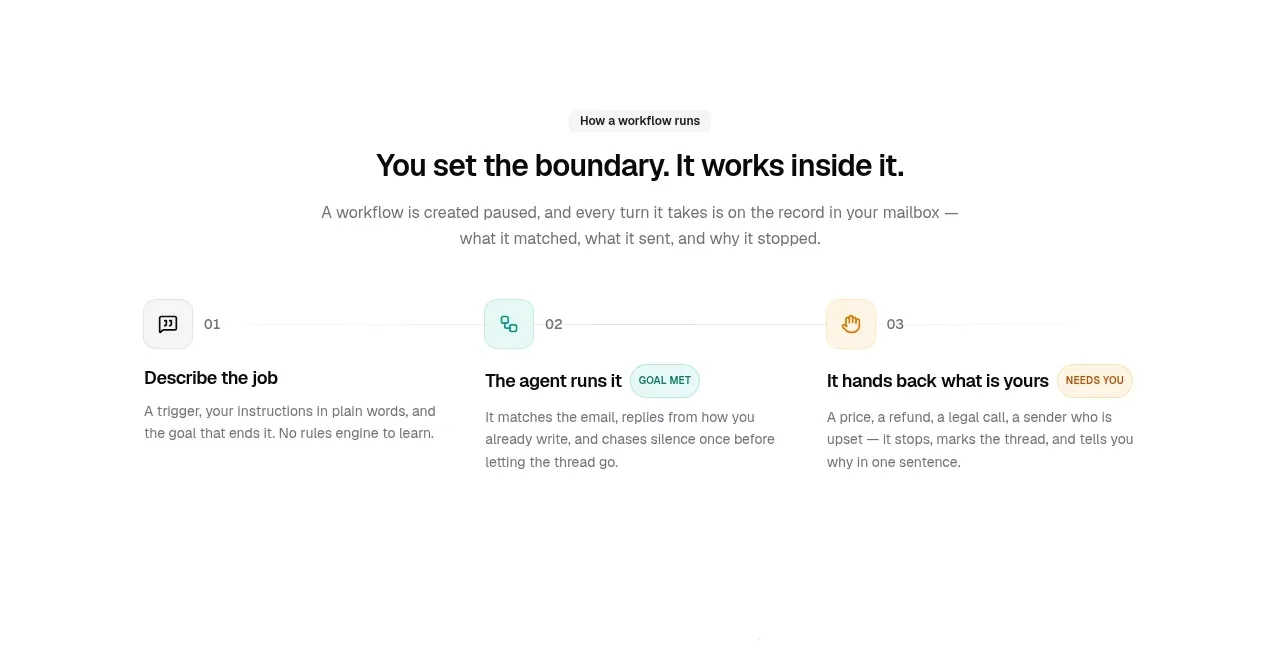
6. **Workflow explanation** — Use a centered eyebrow, headline, and short paragraph. Under it, lay out three equal columns connected by a faint horizontal rule: describe the job, let the agent run it, and hand uncertain cases back to the user, with small numbered icon blocks and colored status labels.
7. **Use-case selector** — Introduce a centered section title and explanatory paragraph, then provide rounded category tabs. Below the tabs, show a short quote-like use-case statement, success/needs-you status pills, and a large browser-style conversation/workflow screenshot with an open conversation detail panel.
8. **Key features introduction** — Add another centered eyebrow, headline, and explanatory copy to reset the rhythm before the detailed feature groups.
9. **Feature group: automation** — Use a two-column composition: a left text heading and description, and a right 2x2 bordered card grid for agentic workflows, self-stopping follow-ups, uncertainty handoffs, and guardrails.
10. **Feature group: intelligent inbox** — Repeat the same left-heading/right-grid pattern for message summaries, mailbox questions, suggested replies/AI verification, and persistent memory.
11. **Feature group: fit and integrations** — Repeat the pattern for custom addresses/domains, calendar and booking pages, MCP/API access, and installable notifications.
12. **Testimonials wall** — Present a loose three-column masonry-like grid of compact bordered testimonial cards with avatars, names, handles, and short informal quotes. Fade the lower edge slightly and add a centered “view all” button.
13. **Blog section** — Use a left-aligned “From the blog” heading and a right-aligned secondary button. Place three equal-width article cards with image thumbnails, category pills, dates, bold titles, excerpts, and author metadata.
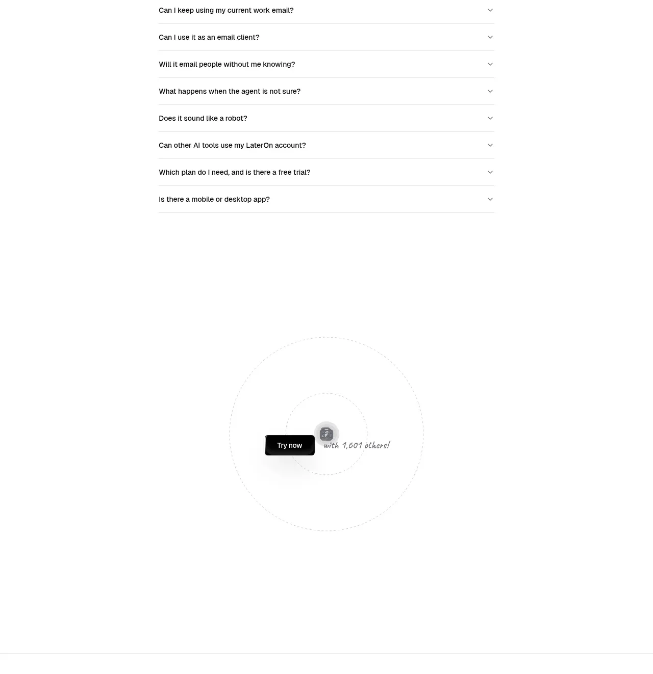
14. **FAQ section** — Center the section within a narrower column. Use a large heading and stacked accordion rows with thin separators; keep one answer expanded and the remaining questions collapsed with chevrons.
15. **Final CTA** — Leave generous whitespace around a centered dark action button, a small circular/stacked line motif, and a short social-proof phrase.
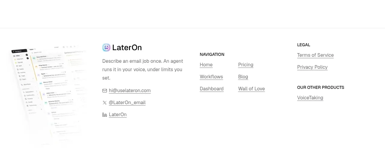
16. **Footer** — Finish with a thin top rule and a multi-column footer: faded product interface image, product description and contact/social links, navigation links, legal links, and related products. Add a centered copyright line at the bottom.

## Design language
- Use a white or very pale neutral canvas, near-black text such as `#111111`, cool gray body copy around `#737373`, and hairline borders around `#e7e7e7`.
- Build hierarchy with a heavy, modern sans-serif headline paired with a compact neutral sans for labels and body copy. Use a very large hero title, medium section headings, small uppercase/eyebrow labels, and restrained metadata.
- Keep the page airy: use large vertical gaps between major sections, especially after the press strip, use-case showcase, and feature groups. Inside cards and grids, tighten spacing and increase information density to create contrast.
- Anchor the layout to a centered wide container with generous side margins. Use asymmetric compositions where useful: left explanatory copy beside right-side feature grids, and full-width interface screenshots below centered copy.
- Treat interface mockups as proof: use thin outlines, pale panels, browser chrome, compact rows, inbox navigation, status chips, toggles, and layered detail drawers. Add only a very soft shadow and slight blur/fade at the edges; avoid dramatic 3D effects.
- Use color sparingly for meaning. Reserve a bright medium blue around `#2499d5` for one hero emphasis, teal/mint around `#dff5ef` and `#238f83` for goal-met or positive states, and pale yellow around `#fff2d5` with warm brown text for needs-attention states. Keep logos, press marks, and secondary controls gray.
- Use compact rounded pills for labels and statuses, modest corner radii around 8–12px for cards, and almost no radius on major layout containers. Borders should define structure more often than shadows.
- Make buttons high contrast and simple: near-black fill, white text, compact padding, and a small radius. Secondary actions should be outlined or text-based rather than colorful.
- Let section rhythm evolve from product proof to explanation to dense feature inventory to social proof and utility content. The page should become more modular and information-rich lower down, then become sparse again for the final CTA and footer.
- Where interaction is visible, use quiet affordances: tab selection through a mint-tinted pill, accordion chevrons, toggles, expandable conversation rows, and status chips. Motion should be subtle—fade, slide, or gentle state changes rather than bouncy animation.
- Make the responsive version stack the hero proof, three workflow steps, feature group copy/cards, testimonials, and blog cards vertically while preserving the same generous whitespace and thin-rule structure.

## Never
- Do not copy logos, wordmarks, product names, copy, illustrations, photography, publication marks, or icon sets from the reference.
- Do not reproduce the reference email UI verbatim; invent interface content, labels, data, and visual assets for the user's product.
- Never present the result as LaterOn or imply an affiliation with it.
Components from this page
All components
 Top navigation bar
LaterOn v2: The agentic email plaftform · Navigation
Top navigation bar
LaterOn v2: The agentic email plaftform · Navigation
 Agentic email platform hero
LaterOn v2: The agentic email plaftform · Hero
Agentic email platform hero
LaterOn v2: The agentic email plaftform · Hero
 Press and community recognition
LaterOn v2: The agentic email plaftform · Logo cloud
Press and community recognition
LaterOn v2: The agentic email plaftform · Logo cloud
 Three-part workflow explanation
LaterOn v2: The agentic email plaftform · Feature grid
Three-part workflow explanation
LaterOn v2: The agentic email plaftform · Feature grid
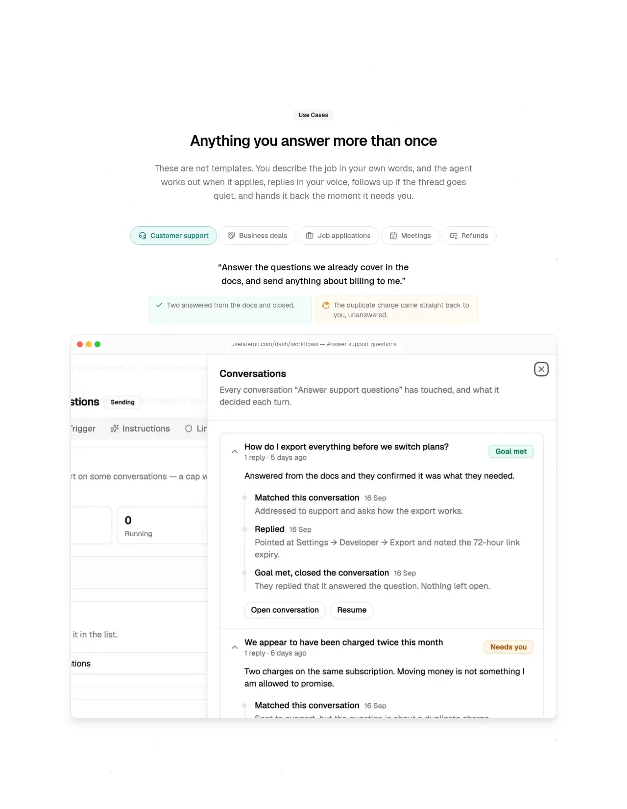 Use-case selector and product proof
LaterOn v2: The agentic email plaftform · Feature grid
Use-case selector and product proof
LaterOn v2: The agentic email plaftform · Feature grid
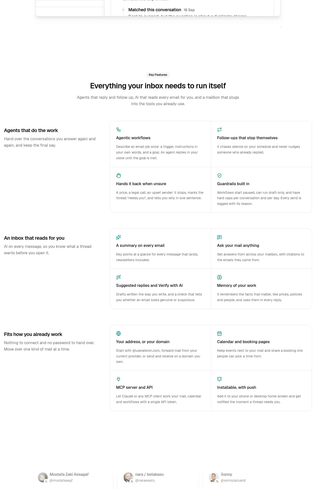 Key features grouped by job
LaterOn v2: The agentic email plaftform · Feature grid
Key features grouped by job
LaterOn v2: The agentic email plaftform · Feature grid
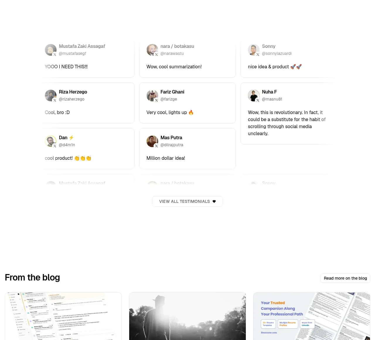 Community testimonials
LaterOn v2: The agentic email plaftform · Testimonials
Community testimonials
LaterOn v2: The agentic email plaftform · Testimonials
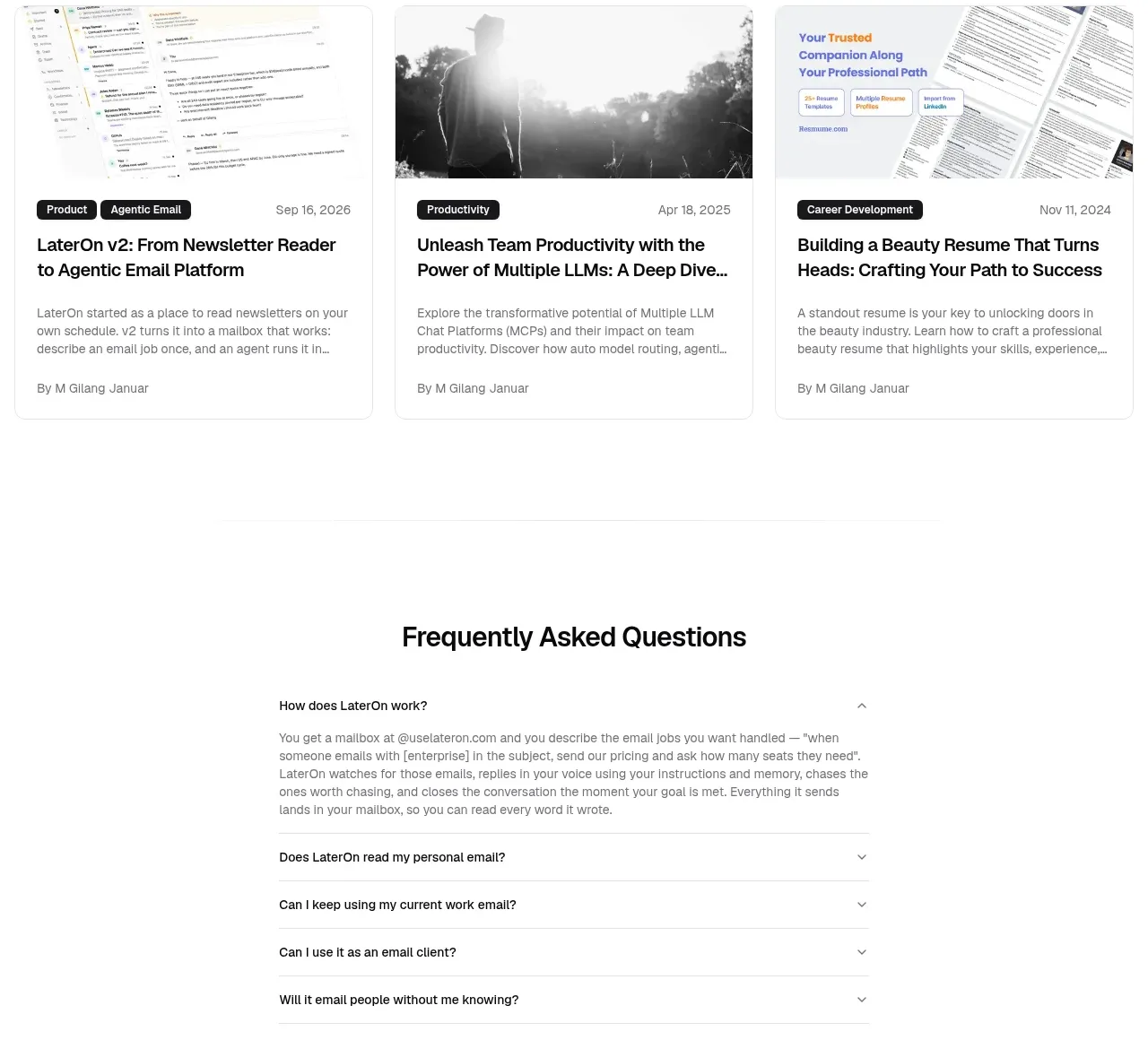 Blog article cards
LaterOn v2: The agentic email plaftform · Gallery
Blog article cards
LaterOn v2: The agentic email plaftform · Gallery
 Frequently asked questions
LaterOn v2: The agentic email plaftform · FAQ
Frequently asked questions
LaterOn v2: The agentic email plaftform · FAQ
 Final trial call to action
LaterOn v2: The agentic email plaftform · Call to action
Final trial call to action
LaterOn v2: The agentic email plaftform · Call to action
 Multi-column site footer
LaterOn v2: The agentic email plaftform · Footer
Multi-column site footer
LaterOn v2: The agentic email plaftform · Footer