 kage
kage
layernote.io
Design analysis
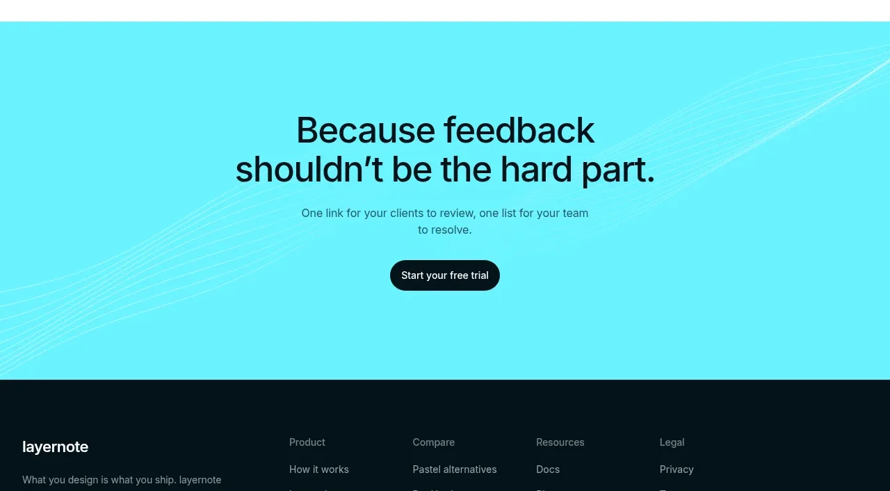
A high-contrast cyan closing band restates the product's core benefit in two lines and offers one decisive trial action. It creates a memorable final pause before the dark footer.
Prompt preview
## Reference images

Study these alongside the description below: hierarchy, rhythm, spacing, colour. Build for the product you are asked about, using this design language.

- Component: https://kage-design-assets.t3.tigrisfiles.io/components/layernote/c87f4990-99cd-473d-ba2e-c718b2a2f8cb-1790402581-11.webp
- Full page it was cut from: https://kage-design-assets.t3.tigrisfiles.io/screenshots/layernote/c87f4990-99cd-473d-ba2e-c718b2a2f8cb-1790402512875-full.webp
- Component on Kage: https://kage.design/component/layernote-cta

## Before you start
Ask what final promise should remain in the user's mind and what single action should happen next. Then write a product-specific closing CTA.

Create a full-width bright cyan #58e5ed section with subtle abstract line texture, centered dark heading, one short supporting sentence, and one dark pill button. Use 40–72px vertical padding, a max-width text column, 36–48px heading size, and enough contrast for readable text. Keep the CTA focused on one action, with no competing links inside the band. Add a gentle hover transition and a visible focus state; reduce decorative texture on small screens.

Never use the reference's logo, product name, copy, illustrations, imagery, or exact visual assets.
More components

 Split closing CTA
godaylight.com · Call to action
Split closing CTA
godaylight.com · Call to action
 Network growth CTA
godaylight.com · Call to action
Network growth CTA
godaylight.com · Call to action

 Closing conversion banner
FastRouter.ai · Call to action
Closing conversion banner
FastRouter.ai · Call to action

 Final download call to action
Blenny · Call to action
Final download call to action
Blenny · Call to action

 Visual download call to action
Art4 · Call to action
Visual download call to action
Art4 · Call to action

 Sponsor call to action
opensend.cc · Call to action
Sponsor call to action
opensend.cc · Call to action