kage
kage
layernote.io
Design analysis
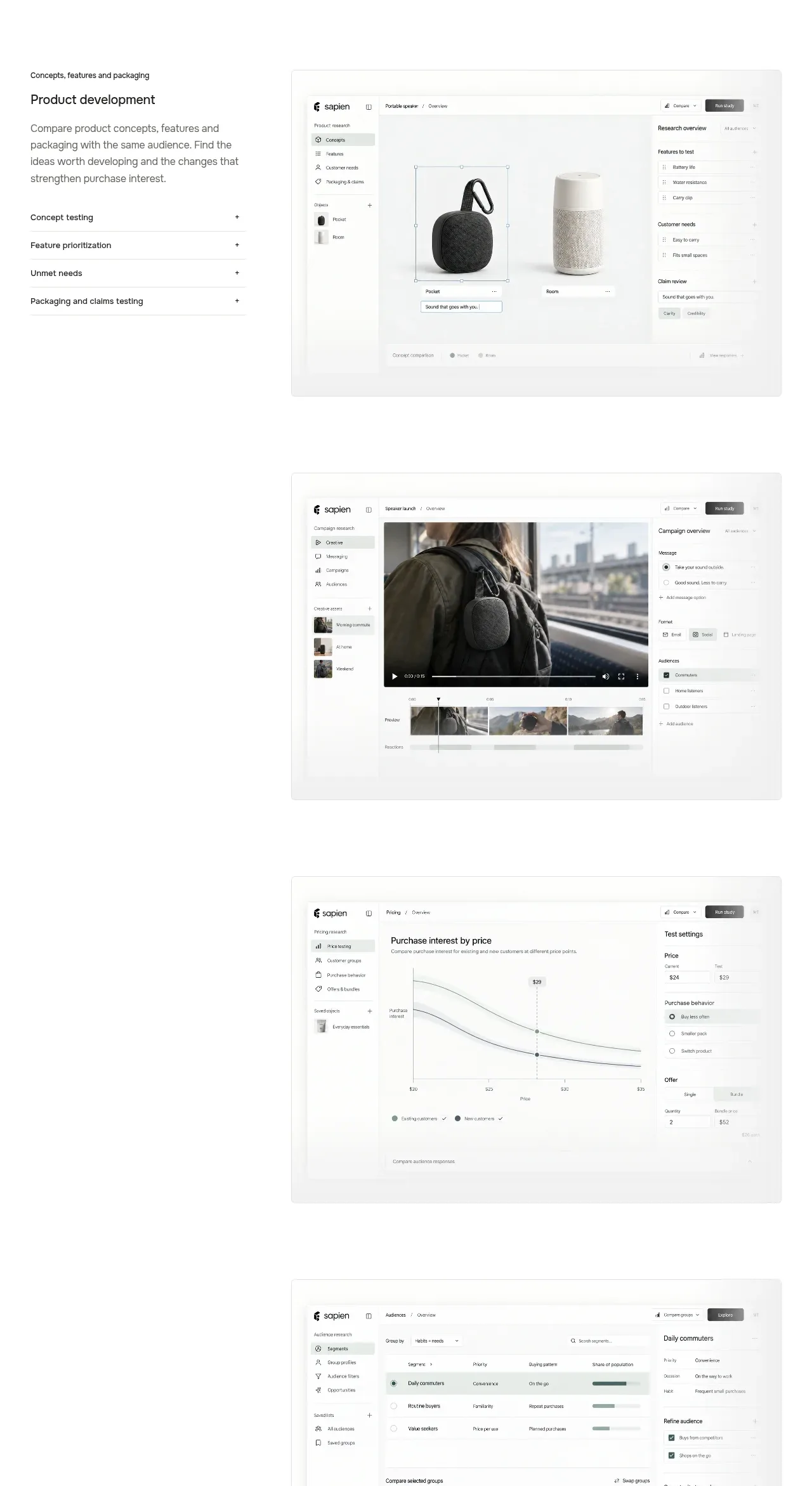
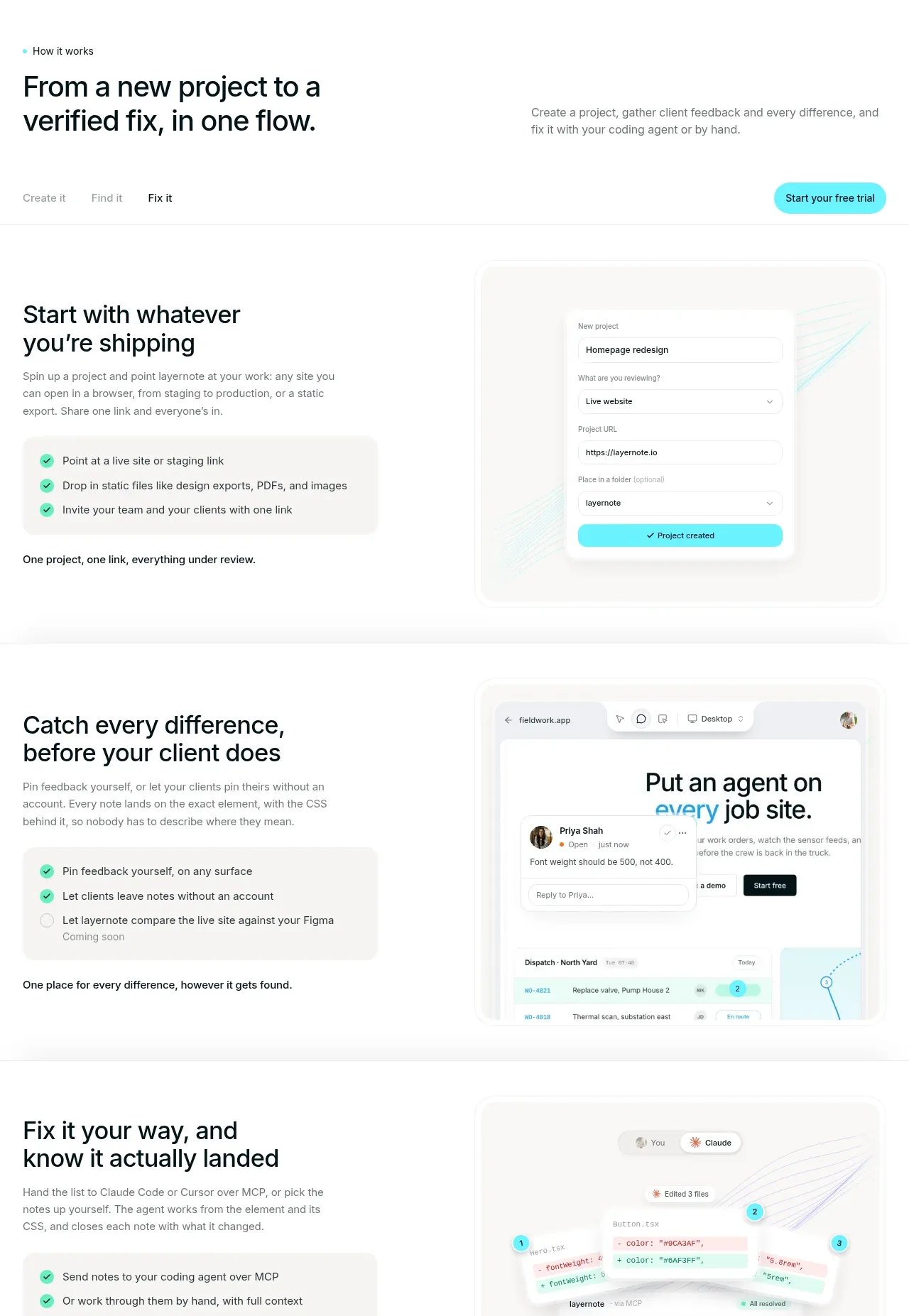
The gallery maps the product to distinct audiences through large rounded photography cards and short outcome-focused descriptions. Horizontal overflow suggests more personas without making the page feel dense.
Prompt preview
## Reference images

Study these alongside the description below: hierarchy, rhythm, spacing, colour. Build for the product you are asked about, using this design language.

- Component: https://kage-design-assets.t3.tigrisfiles.io/components/layernote/c87f4990-99cd-473d-ba2e-c718b2a2f8cb-1790402578-5.webp
- Full page it was cut from: https://kage-design-assets.t3.tigrisfiles.io/screenshots/layernote/c87f4990-99cd-473d-ba2e-c718b2a2f8cb-1790402512875-full.webp
- Component on Kage: https://kage.design/component/layernote-gallery

## Before you start
Ask which customer segments the user's product serves and what concrete outcome each segment gets. Use those segments to design an original use-case gallery.

Create a section with a small eyebrow and a left-aligned heading that states the broad audience. Add a horizontally scrollable row of three or four persona cards, each with a 3:2 image area, 12–16px rounded corners, a concise audience label, and a two-line benefit description. Use real or generated imagery appropriate to the user's audience, but keep it consistent in crop, color temperature, and aspect ratio. Add subtle previous/next controls and visible scrollbar-free overflow on mobile. Use white space, #111617 text, #737b7b secondary text, and a 1px #edf0ef border only where needed. Ensure cards remain usable with keyboard navigation and have a clear selected/hover state.

Never use the reference's logo, product name, copy, illustrations, imagery, or exact visual assets.