 kage
kage
lleverage.ai

Design analysis
A centered dark CTA closes the marketing narrative with one memorable statement and two clearly differentiated actions.
Prompt preview
## Reference images

Study these alongside the description below: hierarchy, rhythm, spacing, colour. Build for the product you are asked about, using this design language.

- Component: https://kage-design-assets.t3.tigrisfiles.io/components/lleverage/862048bd-3dd3-4c2e-9d3c-aadeb65c3eec-1792130581-9.webp
- Full page it was cut from: https://kage-design-assets.t3.tigrisfiles.io/screenshots/lleverage/862048bd-3dd3-4c2e-9d3c-aadeb65c3eec-1792130486253-full.webp
- Component on Kage: https://kage.design/component/lleverage-cta

## Before you start
Ask what the user's primary conversion goal is and what secondary action should support visitors who are not ready. Match the CTA to their brand voice.

Create a centered CTA band on deep navy #111D28 with generous top and bottom padding. Use one large serif statement in off-white, then place a filled orange button #F47A18 beside a transparent bordered secondary button. Keep the buttons compact, squared, and uppercase at 10–11px with letter spacing. Center the group, maintain a clear hierarchy, and add subtle hover darkening/brightening. Ensure the layout wraps cleanly to one column on mobile.

Never: use the reference's logos, product names, copy, illustrations, imagery, or exact CTA wording.
More components

 Final conversion banner
CrewTower Mod for Claude Code · Call to action
Final conversion banner
CrewTower Mod for Claude Code · Call to action
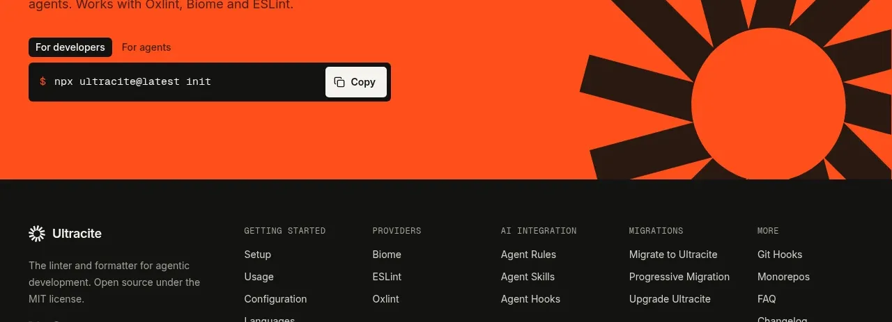
 Bright installation call to action
Ultracite v8 · Call to action
Bright installation call to action
Ultracite v8 · Call to action
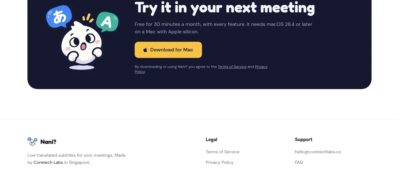
 Download call to action
NANI??? · Call to action
Download call to action
NANI??? · Call to action

 Marble-backed final CTA
Maybloc · Call to action
Marble-backed final CTA
Maybloc · Call to action
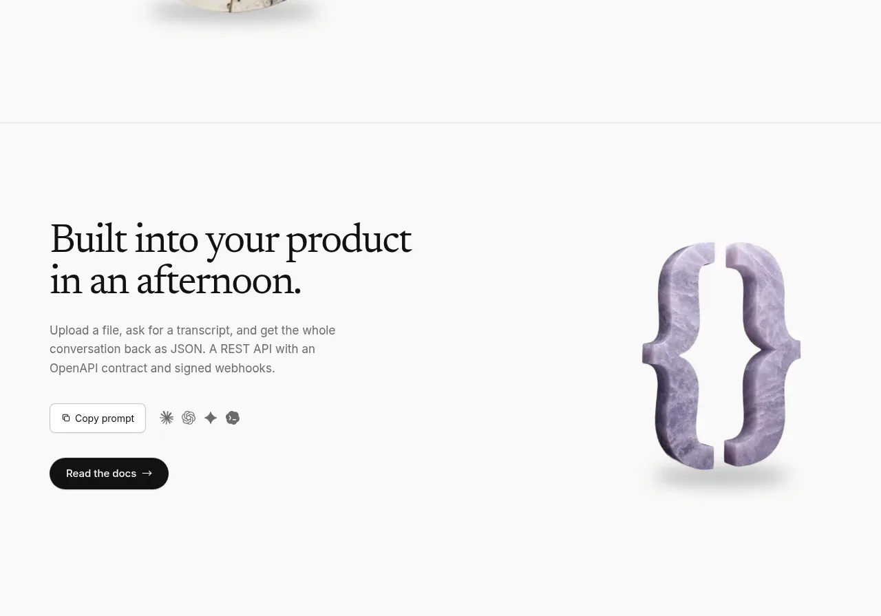 Developer integration CTA
Maybloc · Call to action
Developer integration CTA
Maybloc · Call to action
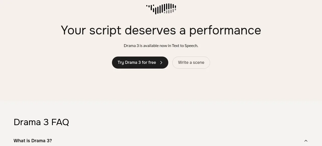
 Centered conversion call to action
Fish Audio Drama 3 · Call to action
Centered conversion call to action
Fish Audio Drama 3 · Call to action