kage
kage
lleverage.ai

Design analysis
A restrained B2B AI landing page alternates expansive white editorial sections with a deep navy product-and-security section. Large high-contrast serif headlines establish hierarchy, while compact uppercase labels, fine rules, modular grids, and small orange actions create a precise operational tone. Below the cinematic aircraft hero, the page moves from customer logos to image-led use cases, an accordion-style workflow, customer stories, integration architecture, governance cards, testimonial proof, and a centered final CTA/footer, increasing information density before returning to a spacious close.
Prompt preview
## Reference images

Study these alongside the description below: hierarchy, rhythm, spacing, colour. Build for the product you are asked about, using this design language.

- Full page: https://kage-design-assets.t3.tigrisfiles.io/screenshots/lleverage/862048bd-3dd3-4c2e-9d3c-aadeb65c3eec-1792130486253-full.webp
- Above the fold: https://kage-design-assets.t3.tigrisfiles.io/screenshots/lleverage/862048bd-3dd3-4c2e-9d3c-aadeb65c3eec-1792130483387.webp
- Design on Kage: https://kage.design/designs/lleverage-landing-page

## Before you start
Ask the user what they are building, who it is for, and which brand assets they already have (name, colours, typefaces, logos, imagery, and copy direction). Wait for their answers before designing. Apply the system below to their product, not to the reference brand or its content.

## Page structure
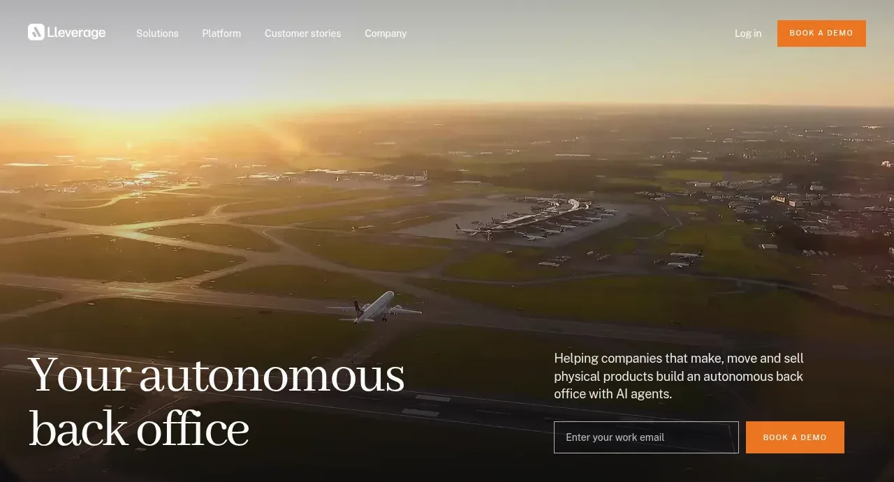
1. **Transparent hero navigation** — Place a slim navigation bar over a full-bleed cinematic image or video, with a compact brand mark at left, restrained text links in the middle, a secondary login link, and a high-contrast CTA at right.
2. **Hero message and lead capture** — Anchor a large two-line serif headline in the lower left of the image. Balance it with a concise supporting paragraph, email field, and orange CTA in the lower right; use a dark gradient overlay so the type remains legible.
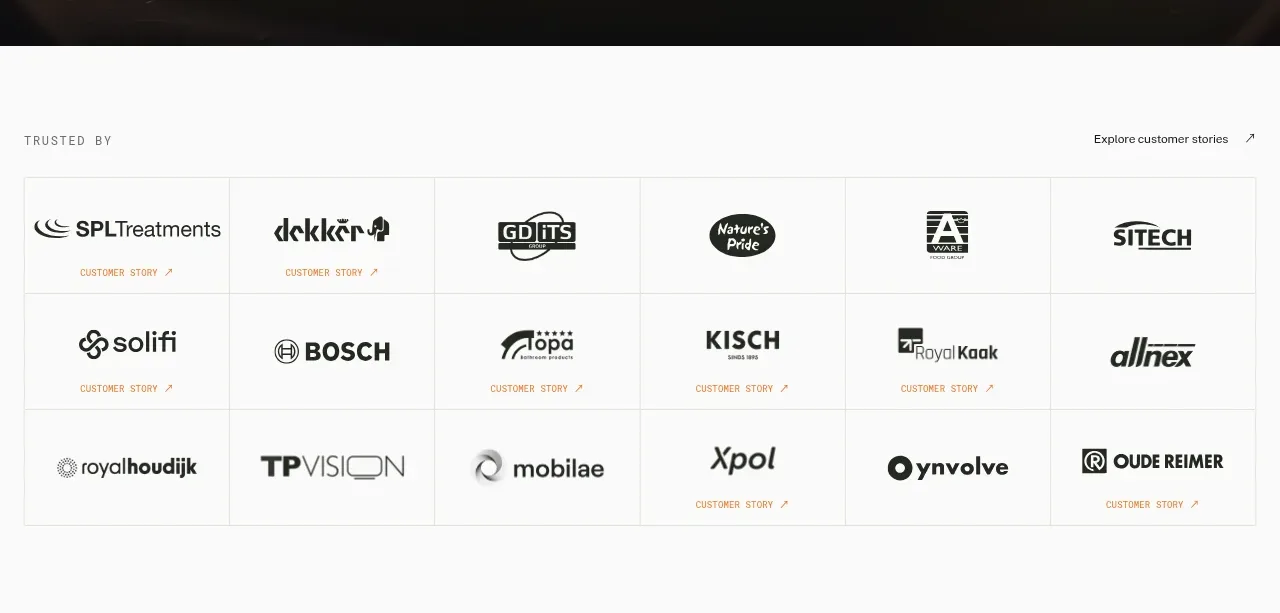
3. **Trusted-by logo grid** — Switch to a white section with a small uppercase label and an understated link above a bordered multi-column grid of customer logos. Keep each cell spacious, monochrome, and separated by hairline rules.
4. **Problem-solving/customer use-case section** — Introduce a large serif heading with compact arrow controls, then show three equal image cards. Use dark image overlays, a small customer identifier, an outcome-led serif statement, and a plain-text agent/category link beneath each card.
5. **Use-cases/workflow section** — Add generous vertical whitespace before a two-column layout: an uppercase section label and large serif/italic heading on the left, a numbered list of workflow stages below, and a product-operation screenshot or interface illustration on the right. Highlight the active stage with orange text and a short description.
6. **Customer stories video row** — Center a small uppercase label and a serif heading, then place three dark video/story cards in a row with play controls and customer marks. Follow them with a three-column proof row containing oversized percentages, short metric labels, quotes, attribution, and case-study links.
7. **Dark integration architecture section** — Change the background to deep navy. Use a left column with an uppercase eyebrow, a large two-tone serif heading, explanatory copy, and a stacked numbered navigation of platform layers. On the right, show a hub-and-spoke integration diagram connecting the product to varied business systems, with compact labels beneath.
8. **Governance and security section** — Continue the navy background and introduce a heading with a muted second phrase, supporting compliance copy, and an outlined CTA. Below, use a two-card top row and three-card bottom row of dark bordered feature panels, each with a subtle technical line illustration, title, and short explanation; finish with a small right-aligned trust-center link.
9. **Customer proof mosaic** — Return to white. Add an uppercase eyebrow and serif heading, then build a bordered three-column, two-row mosaic alternating warehouse/product photography and testimonial text panels. Anchor text cards with small customer marks and named roles.
10. **Final CTA and footer** — End on deep navy with a centered serif CTA and paired filled/outlined buttons. Below, use a multi-column footer: brand description at left, grouped links for solutions, platform, company, and resources, then a fine divider with legal links and copyright.

## Design language
- Build hierarchy through contrast between oversized editorial serif headlines and compact neutral sans-serif interface text; use uppercase, widely tracked micro-labels for section eyebrows.
- Use a wide desktop container with generous side gutters, thin horizontal rules, and carefully aligned multi-column grids. Let white sections breathe with large vertical gaps, then make the dark platform/security section denser and more technical.
- Use an off-white/white content canvas such as `#f8f8f6`, deep navy panels around `#111d28`, near-black text around `#111318`, and a vivid orange action colour around `#f47721`. Treat orange as an accent for buttons, active items, and small links rather than a background theme.
- Pair a refined high-contrast serif for display headlines with a clean modern grotesk for navigation, body copy, labels, metrics, and controls. Use very large 52–76px desktop headlines, 28–44px section heads, 11–13px uppercase labels, and quiet 13–16px body copy; tune responsively rather than preserving fixed sizes.
- Keep borders hairline-thin and low-contrast on white (`#dedfdb`) and subtly brighter on navy (`#263440`). Prefer square or minimally rounded rectangles, with no floating shadows; imagery and cards should feel architectural and flush to the grid.
- Use cinematic, real-world physical-economy imagery—facilities, warehouses, aircraft, products—under darkened overlays. Keep logos mostly monochrome and let the photographs provide warmth and texture.
- Make interactions restrained: orange hover/focus states, understated arrow links, outlined play buttons, accordion or tab activation with a clear active orange label, and subtle image/opacity transitions. Avoid decorative motion that competes with the operational message.
- Ensure the page rhythm changes intentionally: immersive image-led opening, proof-heavy logo and customer sections, a more functional workflow/integration middle, a dense dark governance block, then a calm testimonial mosaic and centered closing CTA.

## Never
- Do not use the reference company’s logos, wordmarks, product name, copy, customer names, customer logos, screenshots, illustrations, photography, integration marks, or icon set.
- Do not reproduce the reference brand identity or present the result as Lleverage. Replace all imagery, labels, content, and assets with original material for the user’s product.
- Do not turn the editorial layout into a generic SaaS template: preserve the alternating white/navy sections, fine-rule grids, serif/sans pairing, measured whitespace, and operational proof structure while adapting the actual content to the user’s product.
Components from this page
All components
 Transparent hero navigation
Lleverage · Navigation
Transparent hero navigation
Lleverage · Navigation
 Autonomous back-office hero
Lleverage · Hero
Autonomous back-office hero
Lleverage · Hero
 Trusted-by logo grid
Lleverage · Logo cloud
Trusted-by logo grid
Lleverage · Logo cloud
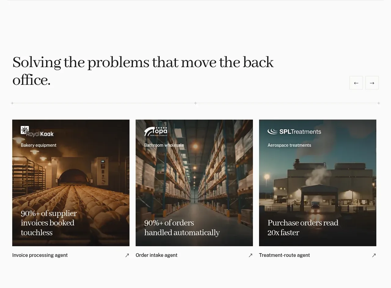 Problem-solving case-study cards
Lleverage · Feature grid
Problem-solving case-study cards
Lleverage · Feature grid
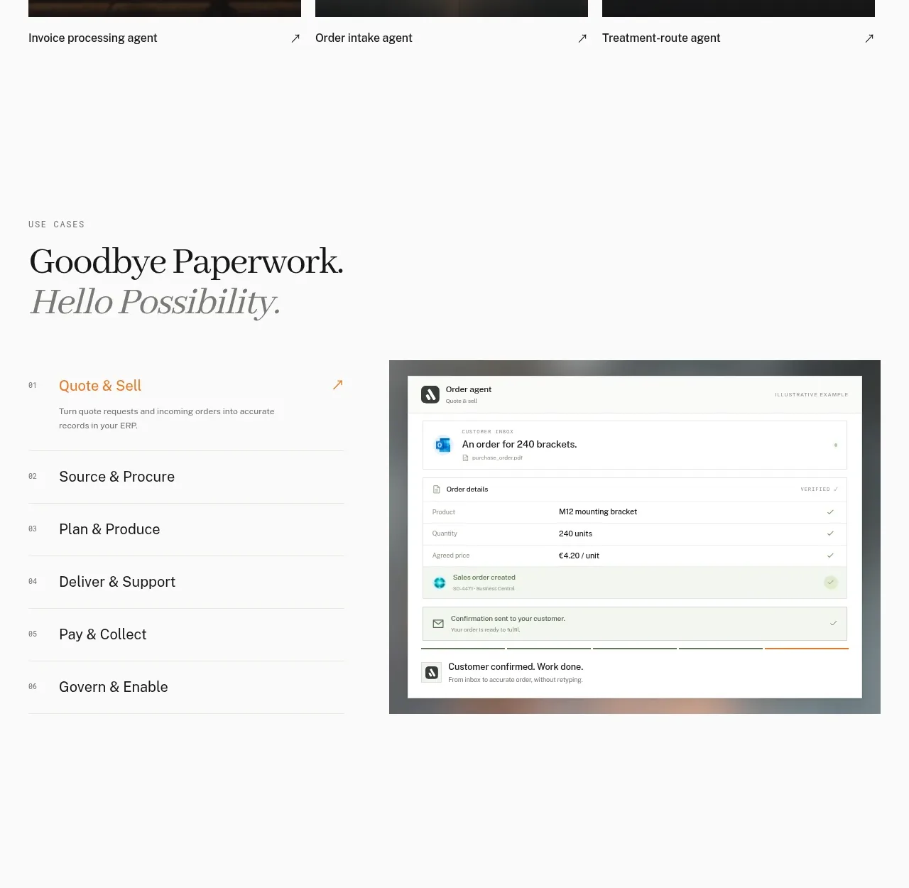 Workflow stages with product preview
Lleverage · Tabs & steps
Workflow stages with product preview
Lleverage · Tabs & steps
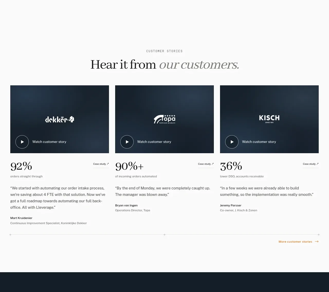 Customer story cards
Lleverage · Testimonials
Customer story cards
Lleverage · Testimonials
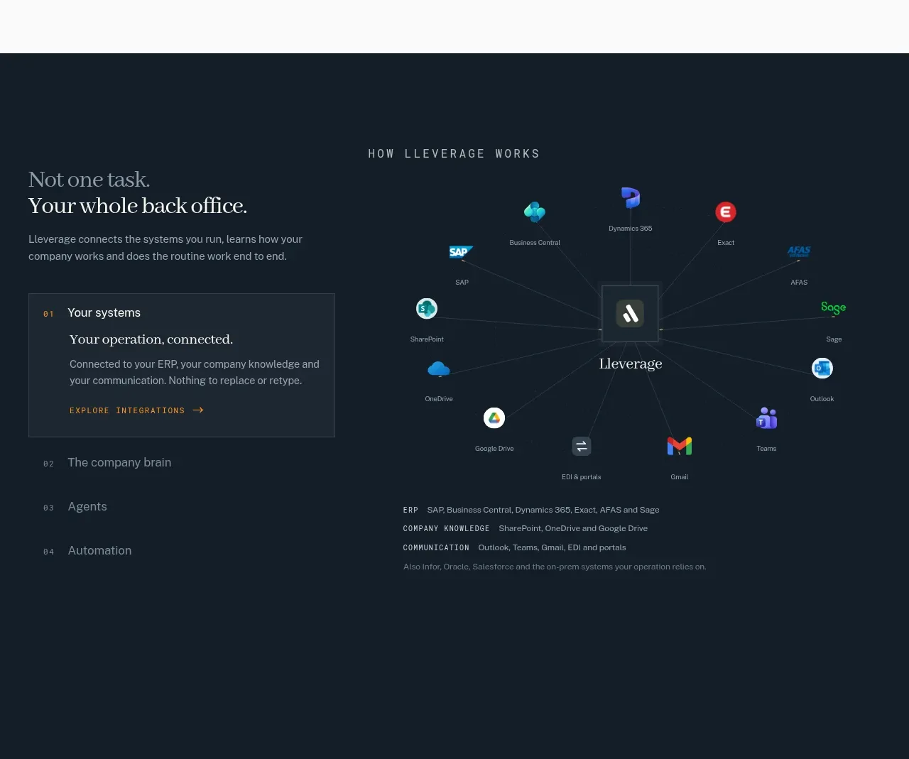 Connected systems overview
Lleverage · Feature grid
Connected systems overview
Lleverage · Feature grid
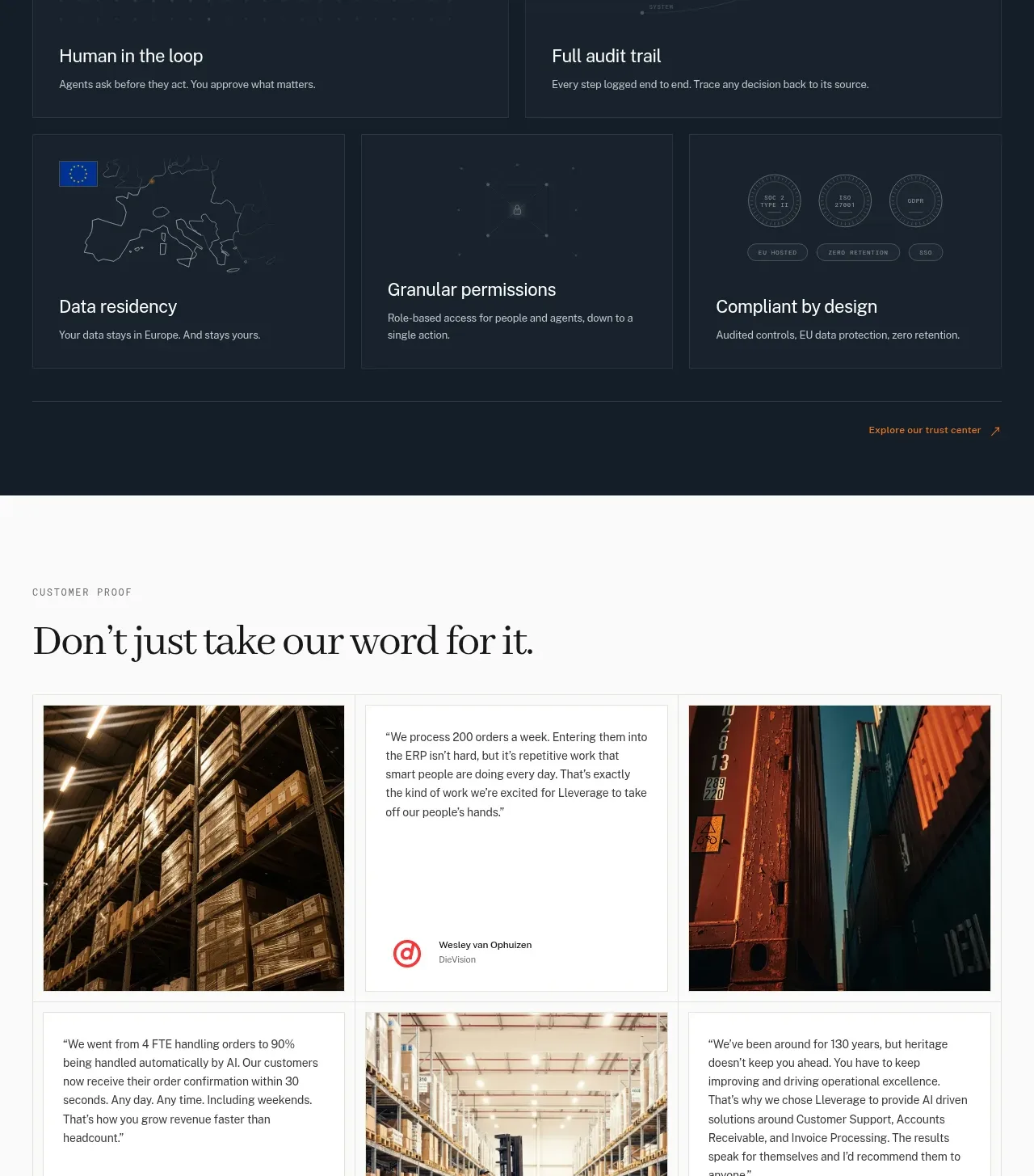 Governance and security cards
Lleverage · Feature grid
Governance and security cards
Lleverage · Feature grid
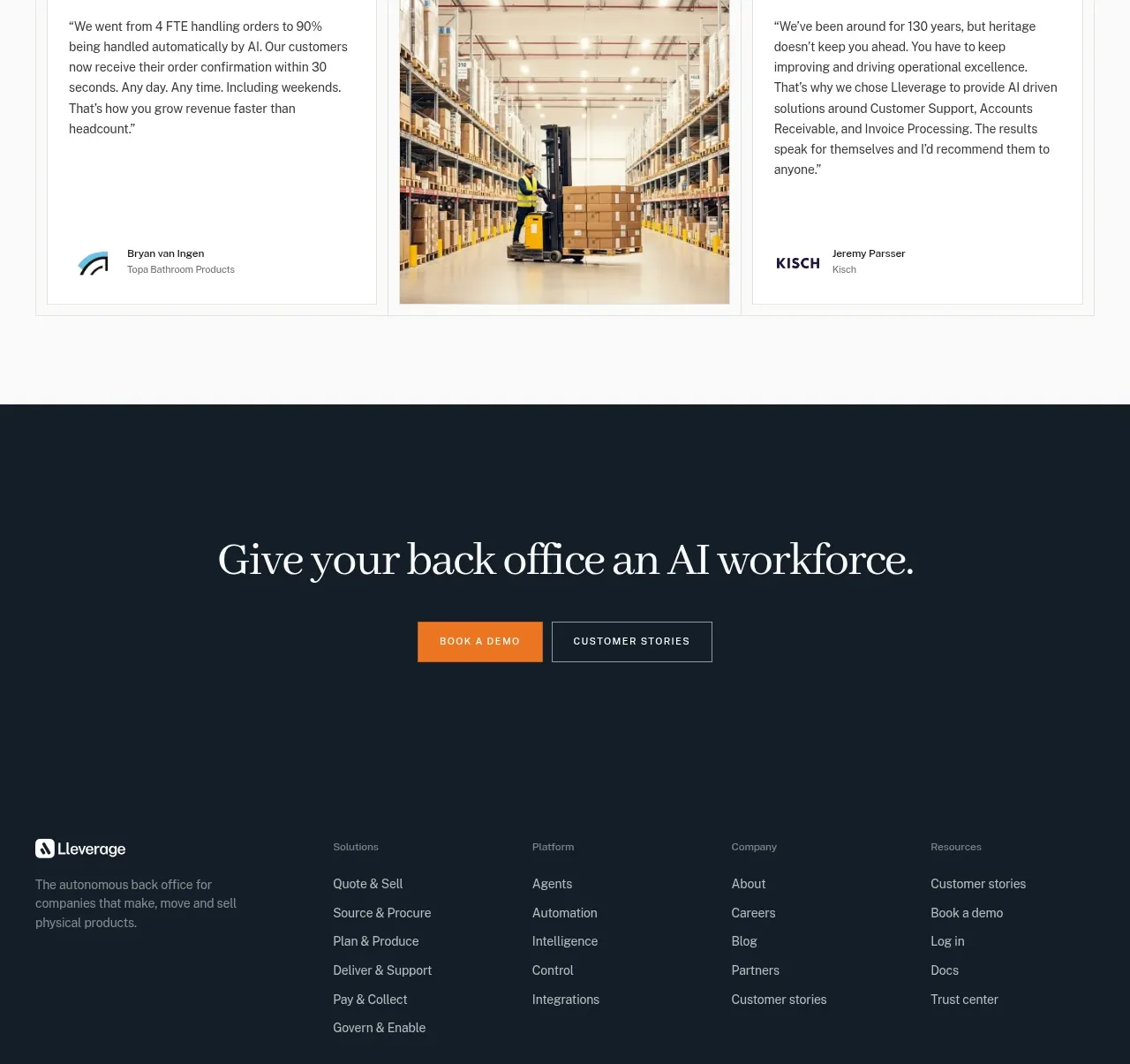 Customer proof mosaic
Lleverage · Testimonials
Customer proof mosaic
Lleverage · Testimonials
 Primary conversion call to action
Lleverage · Call to action
Primary conversion call to action
Lleverage · Call to action