 kage
kage
lovable.dev
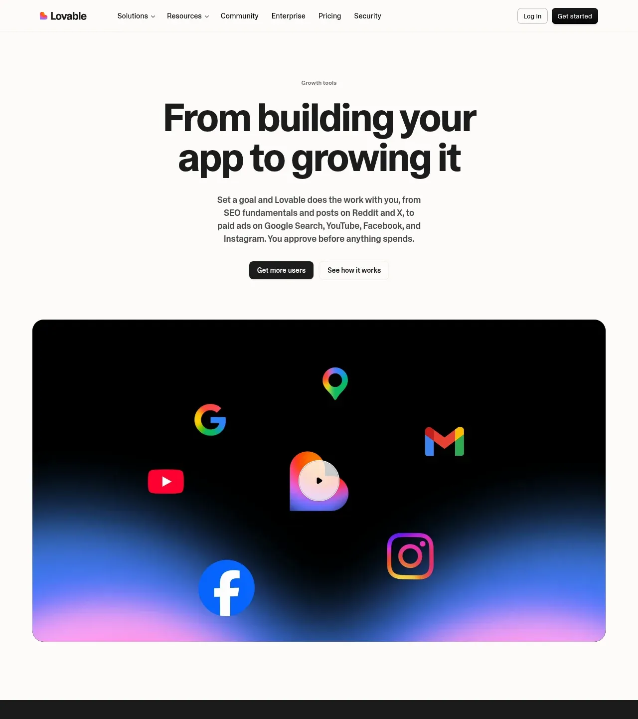
Design analysis
The centered headline promises an end-to-end outcome, followed by concise explanatory copy, two CTAs, and a large dark product-style visual. The visual uses colorful platform symbols and a soft gradient glow to make an otherwise minimal page memorable.
Prompt preview
## Reference images

Study these alongside the description below: hierarchy, rhythm, spacing, colour. Build for the product you are asked about, using this design language.

- Component: https://kage-design-assets.t3.tigrisfiles.io/components/lovable-growth-tools/9452fb95-0338-4269-a5da-8889e8804cc9-1792216982-1.webp
- Full page it was cut from: https://kage-design-assets.t3.tigrisfiles.io/screenshots/lovable-growth-tools/9452fb95-0338-4269-a5da-8889e8804cc9-1792216920277-full.webp
- Component on Kage: https://kage.design/component/lovable-growth-tools-hero

## Before you start
Ask what the user's product and brand are, then apply these principles to that product rather than reproducing the reference.

Create a centered hero directly below the navigation. Use a tiny eyebrow, an oversized two-line headline with tight line-height, a narrow supporting paragraph, and a pair of CTAs with one dark primary and one quiet secondary. Beneath the copy, place a wide rounded visual panel with a near-black background (#050505), subtle blue/pink atmospheric gradients, and abstract representations of the product's relevant channels rather than literal platform marks. Use a max-width of about 90%, 28–32px corner radius, generous vertical whitespace, and a play affordance if the visual is demonstrative. The hierarchy should be headline first, proof/visual second, with responsive stacking.

Never: use logos, product names, copy, illustrations, or imagery from the reference.
More components
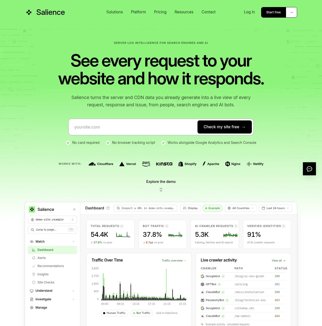
 Product promise and site checker hero
Salience · Hero
Product promise and site checker hero
Salience · Hero
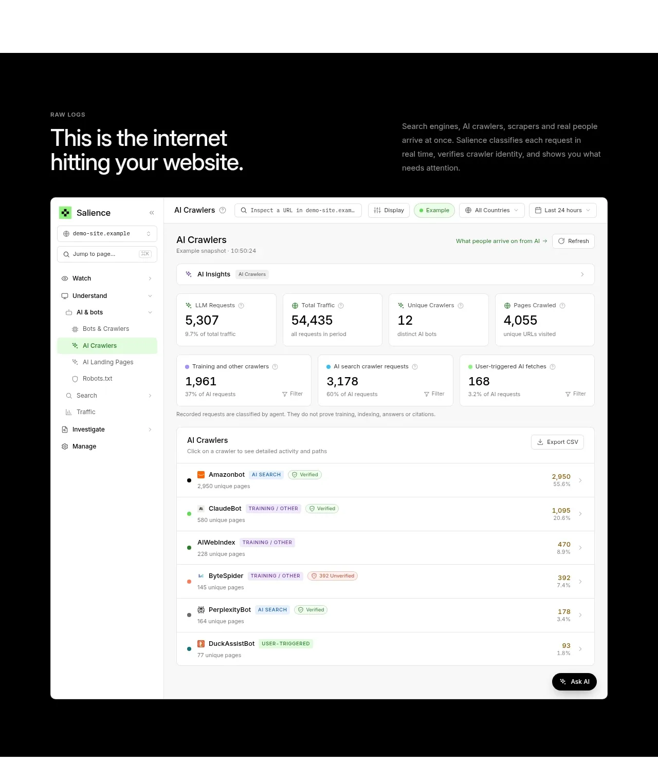 Raw activity dashboard showcase
Salience · Hero
Raw activity dashboard showcase
Salience · Hero
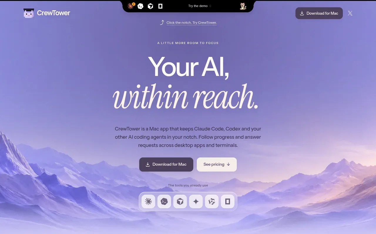
 Focus-oriented hero
CrewTower Mod for Claude Code · Hero
Focus-oriented hero
CrewTower Mod for Claude Code · Hero
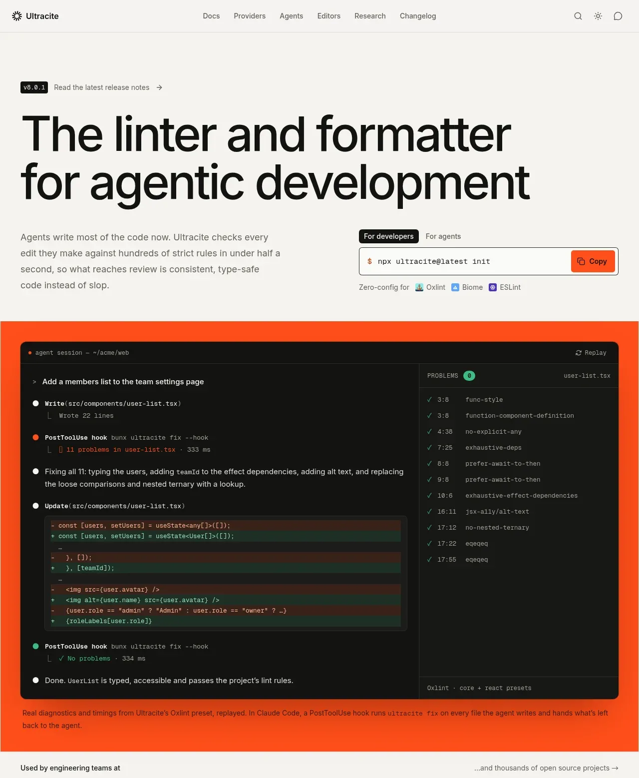
 Agentic development hero with live terminal preview
Ultracite v8 · Hero
Agentic development hero with live terminal preview
Ultracite v8 · Hero
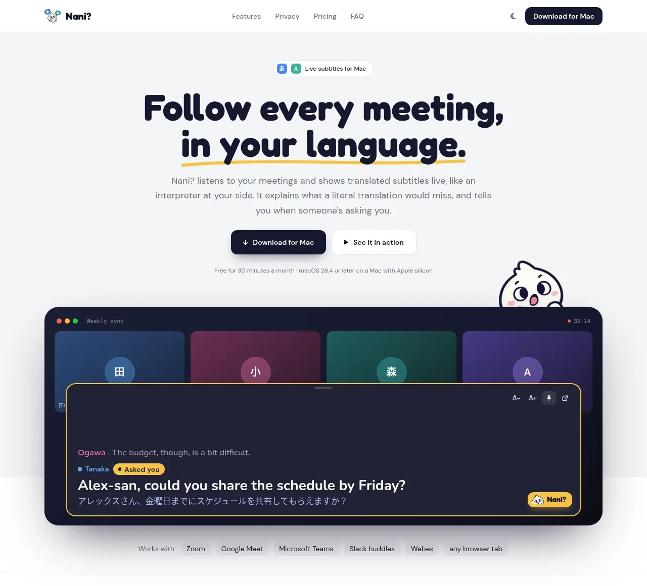
 Translation meeting hero
NANI??? · Hero
Translation meeting hero
NANI??? · Hero
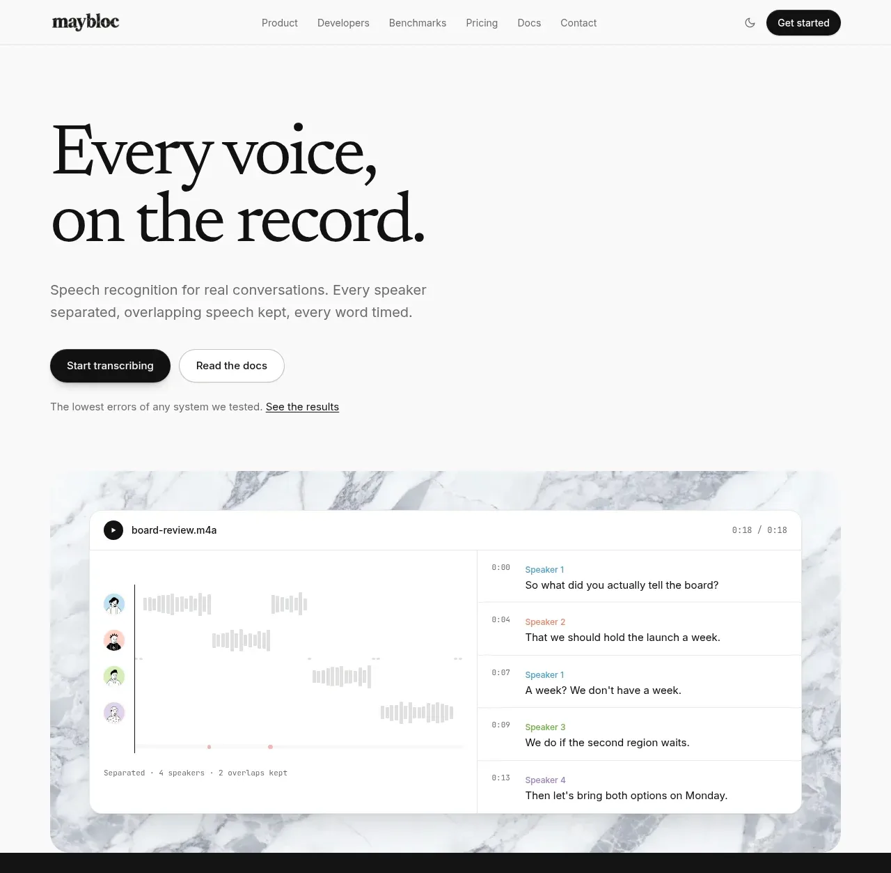
 Editorial speech transcription hero
Maybloc · Hero
Editorial speech transcription hero
Maybloc · Hero