kage
kage
lovable.dev

Design analysis
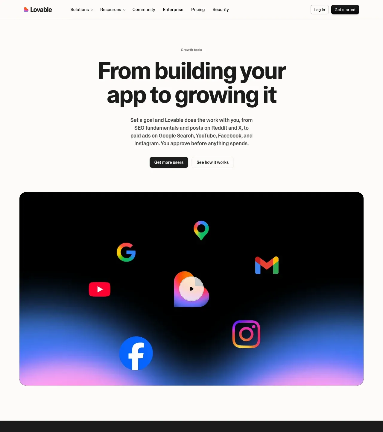
The page sells a long feature list through calm rhythm: a warm cream base interrupted by full-width black bands, each section opened by a tiny muted eyebrow and an oversized, tight-tracked headline. Layout varies section to section — accordion beside a dark chat mockup, a white SEO checklist card with red/amber/green status rows, a Google Maps business-profile mockup inside a dark band, three-card grids for ads and communities — so no two consecutive sections repeat. The hero closes on a glowing pink-blue gradient panel with floating channel icons, the page ends with a chat-input CTA, and the footer sits on a washed pink-violet-orange gradient.
Prompt preview
## Reference images

Study these alongside the description below: hierarchy, rhythm, spacing, colour. Build for the product you are asked about, using this design language.

- Full page: https://kage-design-assets.t3.tigrisfiles.io/screenshots/lovable-growth-tools/9452fb95-0338-4269-a5da-8889e8804cc9-1792216920277-full.webp
- Above the fold: https://kage-design-assets.t3.tigrisfiles.io/screenshots/lovable-growth-tools/9452fb95-0338-4269-a5da-8889e8804cc9-1792216917347.webp
- Design on Kage: https://kage.design/designs/lovable-growth-tools-landing-page

## Before you start
Ask the user what they are building, who it is for, and what brand assets they already have (product name, brand colours, typeface if any). Wait for the answers before writing any code. Everything below is a design language to apply to their product — not a clone of the reference site.

## Page structure
Build a single long marketing page in this exact order:

1. **Sticky top nav** — logo left; centre links for product areas (two with dropdown carets), community, enterprise, pricing, security; right side "Log in" text link plus a small dark pill "Get started" button. Cream background, hairline bottom border, ~64px tall.
2. **Hero** — tiny muted eyebrow label naming the feature category, then a centred two-line headline (~64–72px) and a short centred paragraph (max ~420px wide). Two CTAs: dark pill primary + quiet secondary link. Lots of whitespace above and below.
3. **Hero media band** — a full-width, large-radius (~24px) dark panel containing a glow gradient rising from its bottom edge, with floating platform/channel icons scattered around a central product mark. This is the page's one big colourful moment.
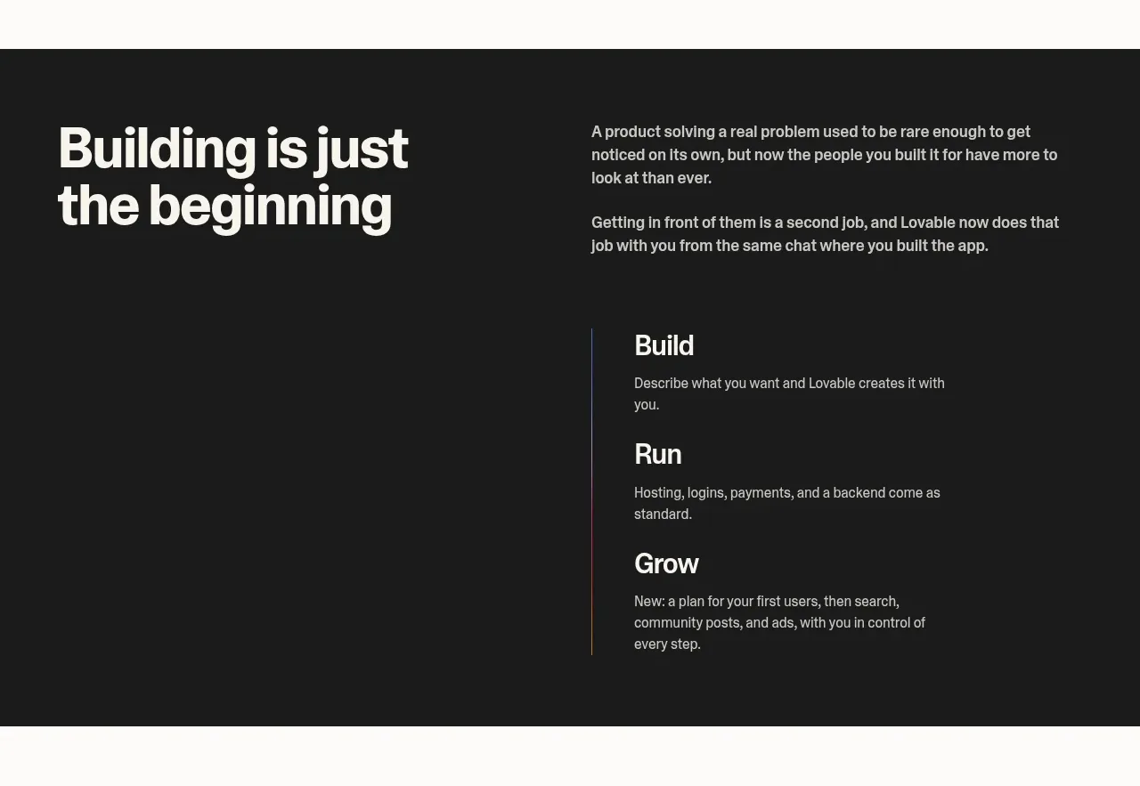
4. **Positioning band (black)** — left column: very large white headline; right column: two short paragraphs. Below the split, a vertical three-step timeline (e.g. Build / Run / Grow) with a hairline rail on the left of the list and the current/last step visually emphasized.
5. **Goal-to-outcome section (cream)** — two columns: left, a headline plus an accordion where the first item is expanded with quoted example goals; right, a dark rounded panel showing a realistic chat mockup (one user message + input row with plus and send icons).
6. **Plan feature section** — eyebrow label, then split: left headline + one paragraph; right, three small icon+title+copy feature items laid out in a loose two-column cluster.
7. **Search/SEO section** — eyebrow, split layout: left headline, paragraph, outline pill button; right, a white checklist card titled as an automated review: rows with red circle-X icons for failing items, amber warnings, green check circles for passing items, one small green "Fixed" pill, and a blue action button top-right. Directly below the split, a row of three equal white cards (icon-less, title + one short paragraph, hairline border, 12–16px radius).
8. **Communities section** — eyebrow, two-column intro (headline left, paragraph right), then a row of four equal cards, same card style as above.
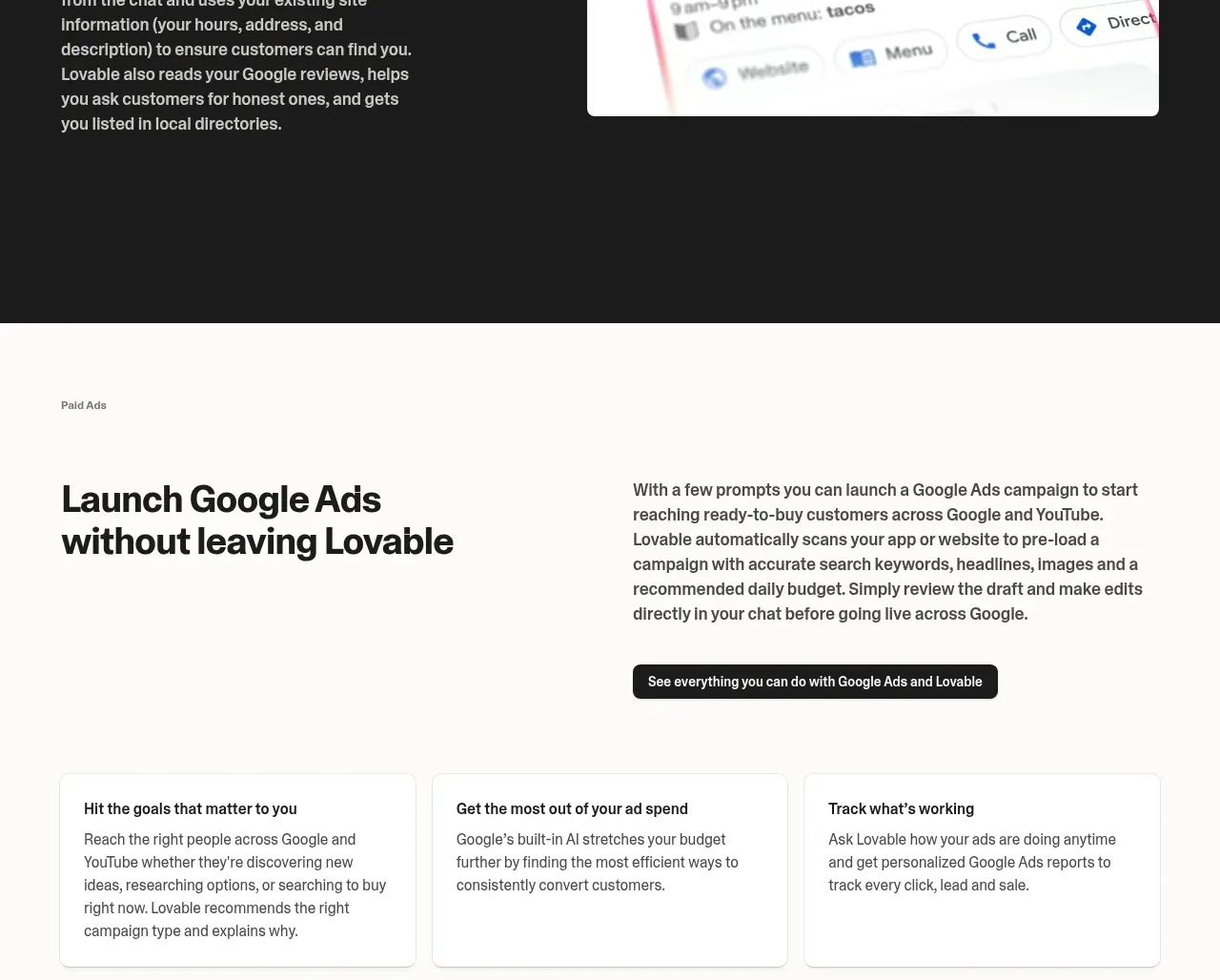
9. **Local band (black)** — eyebrow in the dark band, split layout: left headline + paragraph, right a light product mockup card (a business-profile UI with rating, photos, action buttons).
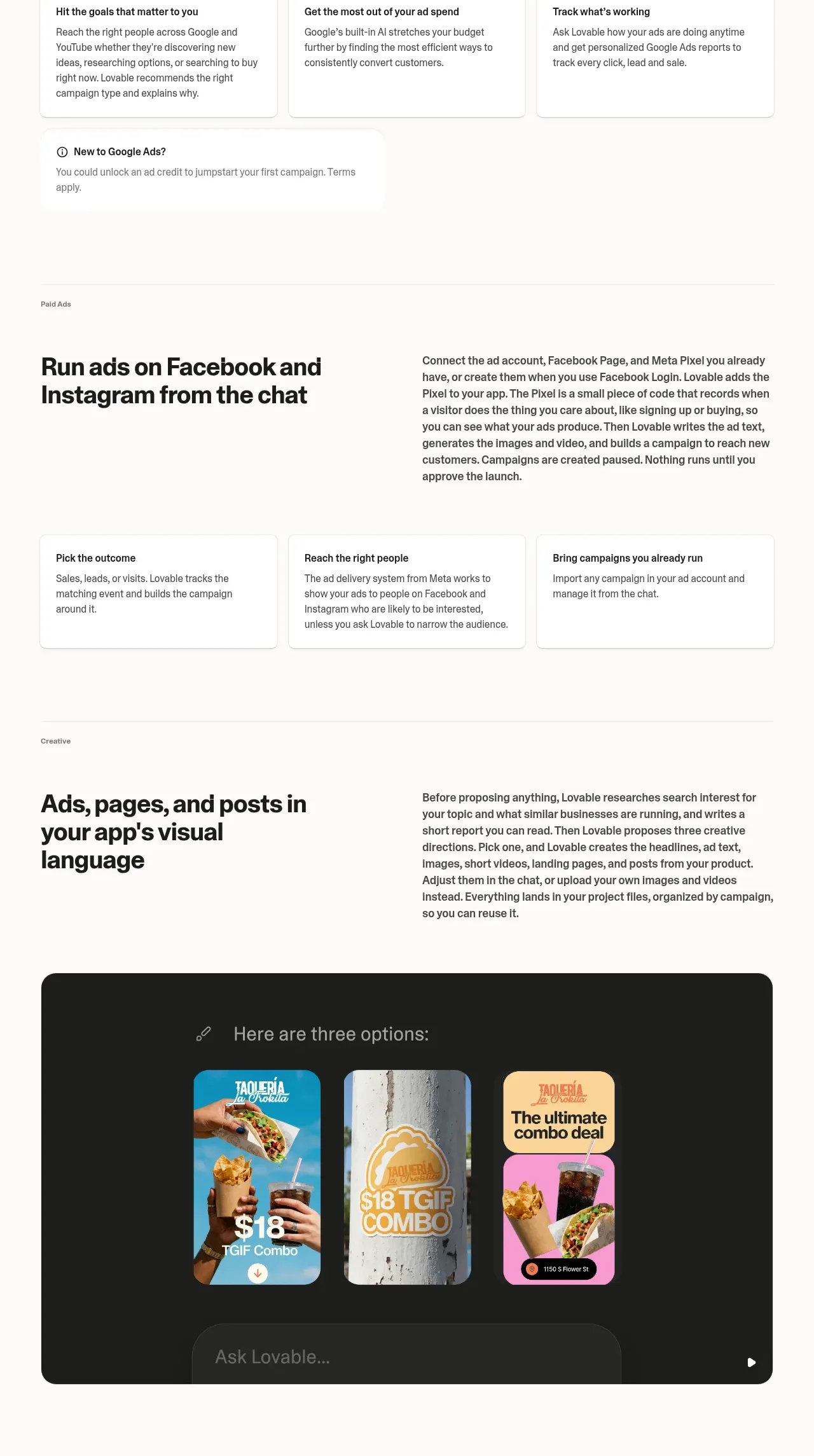
10. **Ads platform #1 section (cream)** — eyebrow, split headline/copy plus a dark pill button, then three cards, then a small tinted note card ("new here?" style with an icon) sitting under the grid.
11. **Ads platform #2 section** — same skeleton as #10 minus the note card: split intro, three cards.
12. **Creative section** — eyebrow, split intro paragraph on the right, then a full-width dark rounded panel that shows three generated creative tiles side by side with a caption above them and a chat input pill embedded at the panel's bottom edge.
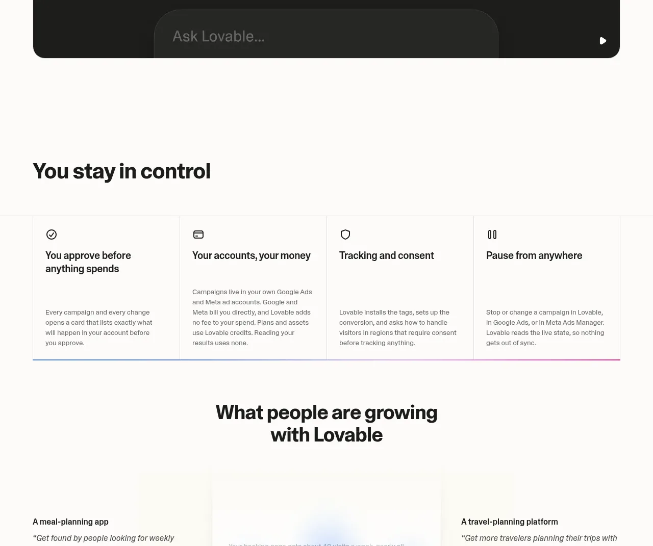
13. **Trust band (cream)** — headline "You stay in control" left-aligned, then four icon columns across the full width, each with a bold title and short paragraph.
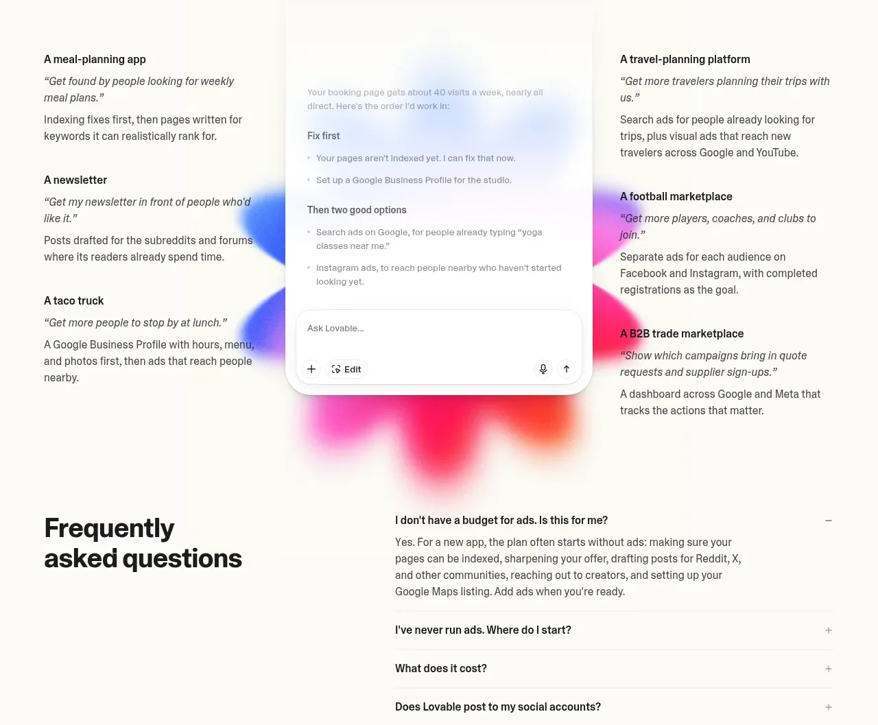
14. **Social proof** — centred two-line headline, then a three-column collage: left column of three customer examples, a phone/chat mockup in the centre, right column of three examples. Each example is a bold mini-title, an italic quoted goal, and a short paragraph. Soft blurred gradient blobs (pink/violet/orange) float behind the collage.
15. **FAQ** — left column headline; right column a long accordion (10+ questions), first item expanded, hairline dividers between rows, plus/minus toggles.
16. **Final CTA** — centred two-line headline above a large rounded chat-style input with a plus icon, a mode dropdown label, and a mic/send icon on the right.
17. **Footer** — five link columns (Company, Product, Resources, Legal, Community) with 8–12 links each, plus a small language selector bottom-left. The page's bottom edge washes into a soft pink→violet→orange gradient behind the footer.

## Design language
- **Palette**: warm off-white/cream base (#FAFAF7), ink text (#171717), pure-black bands (#0A0A0A) with white text. Signature gradient runs hot pink → violet → blue (#FF4D8D → #8B5CF6 → #3B6EF6) and is reserved for the hero glow, the footer wash, and soft background blobs — never for text or buttons. Functional colours: green #16A34A (success), red #E5484D (failure), amber #F59E0B (warning), blue #2563EB (primary action inside UI cards). Body text gray: #52525B on light, #A1A1AA on dark.
- **Type**: one grotesque sans for everything. Headlines 48–72px, medium weight (500–600), tight tracking (−0.02em to −0.04em), often broken into two lines; eyebrows 12–13px, muted gray, sentence case; body 15–16px / 1.6; card titles 15–16px semibold; buttons 13–14px medium.
- **Rhythm**: every section is a full-width band alternating cream and black; vertical padding ~110–140px per band. Each band opens with eyebrow + oversized headline, but the body layout changes every time (accordion+mockup → icon list → checklist card → card grid → dark panel → icon columns → collage → accordion). Never repeat the same layout twice in a row.
- **Splits and grids**: two-column splits place the headline left and supporting copy or UI right; card grids come in rows of 3 or 4 with equal heights, white cards, 1px hairline borders (#E5E5E0), 12–16px radius, no shadows or at most a whisper of one. Black bands use large 20–24px radius panels.
- **Product mockups as proof**: every feature claim is anchored by a dark rounded panel containing a believable UI fragment (chat thread, checklist, map card, creative tiles). Mockups are dark even on light sections — that contrast is a signature.
- **Checklist pattern**: status rows = leading status icon (red X, amber alert, green check), label, optional small green status pill; one blue pill action button in the card header.
- **Chat input as a motif**: a rounded pill input with a leading + icon and a trailing send/mic control recurs in mockups and becomes the page's final CTA — use the product's core interaction as the closing conversion device.
- **Buttons**: dark near-black pills on light sections, white or outline pills on dark; small, quiet, no gradients.
- **Motion**: minimal and functional — accordion expand/collapse, gentle hover lifts or border-darkening on cards, nothing parallax-heavy.

## Never
- Never use the Lovable name, logo, heart mark, wordmark, or any of its page copy or example content (taco truck, taqueria, meal-planning app, etc.).
- Never reproduce Google, YouTube, Gmail, Facebook, Instagram or Maps brand icons or their product UI from the reference; replace with generic or the user's own channel imagery.
- Never present the result as Lovable or imply affiliation with it.
Components from this page
All components
 Minimal global navigation
Lovable Growth Tools · Navigation
Minimal global navigation
Lovable Growth Tools · Navigation
 Growth tools hero
Lovable Growth Tools · Hero
Growth tools hero
Lovable Growth Tools · Hero
 Build, run, grow overview
Lovable Growth Tools · Feature grid
Build, run, grow overview
Lovable Growth Tools · Feature grid
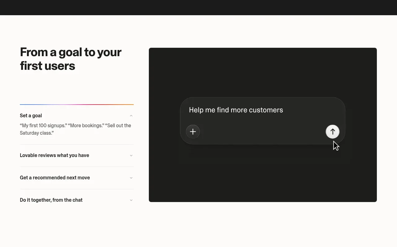 Goal-to-first-users assistant
Lovable Growth Tools · Tabs & steps
Goal-to-first-users assistant
Lovable Growth Tools · Tabs & steps
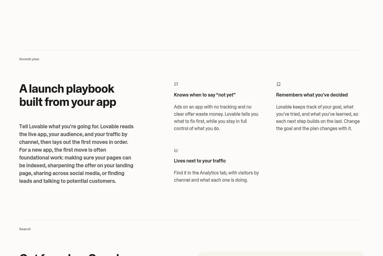 Launch playbook
Lovable Growth Tools · Feature grid
Launch playbook
Lovable Growth Tools · Feature grid
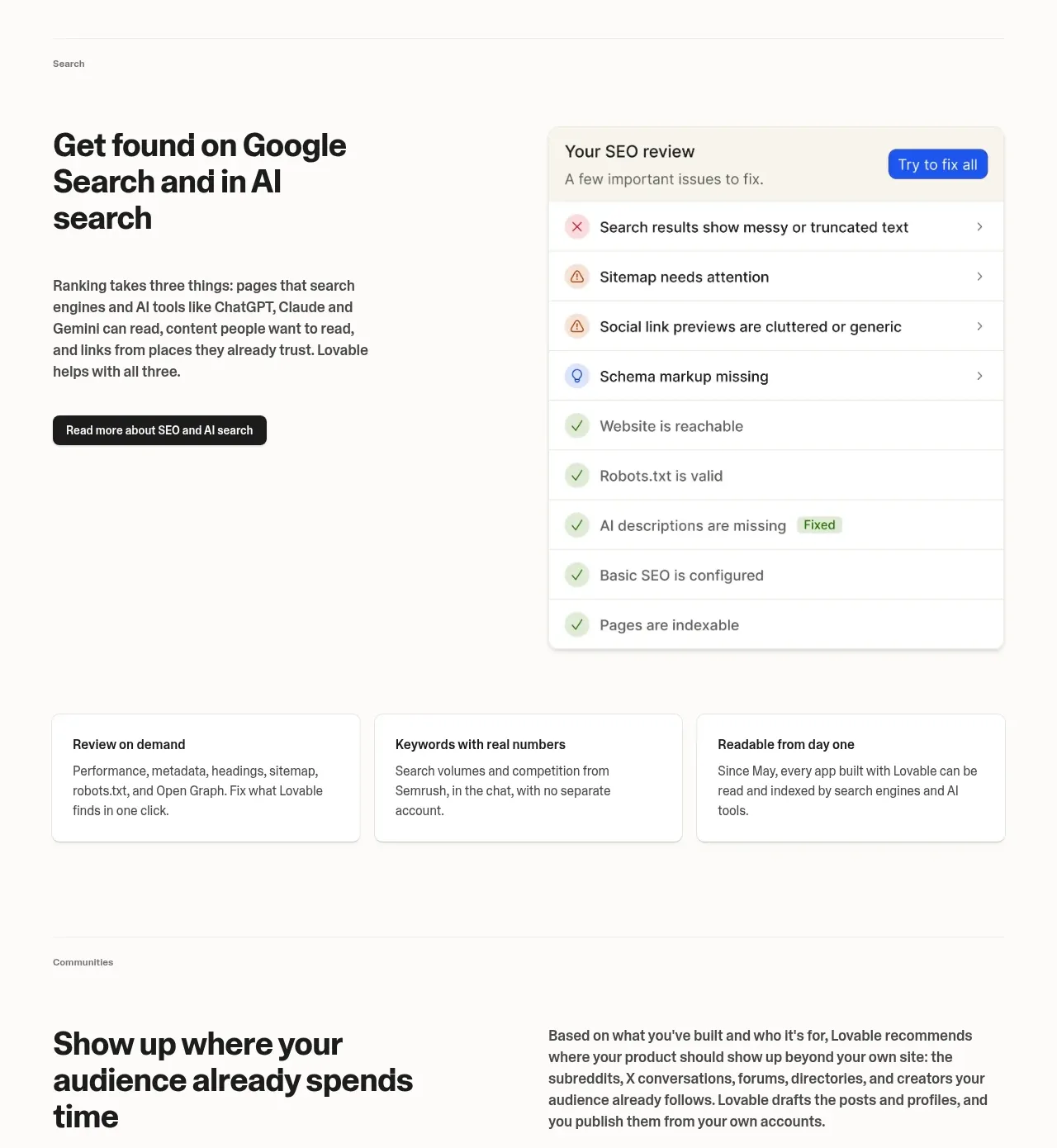 Search visibility and AI discovery
Lovable Growth Tools · Feature grid
Search visibility and AI discovery
Lovable Growth Tools · Feature grid
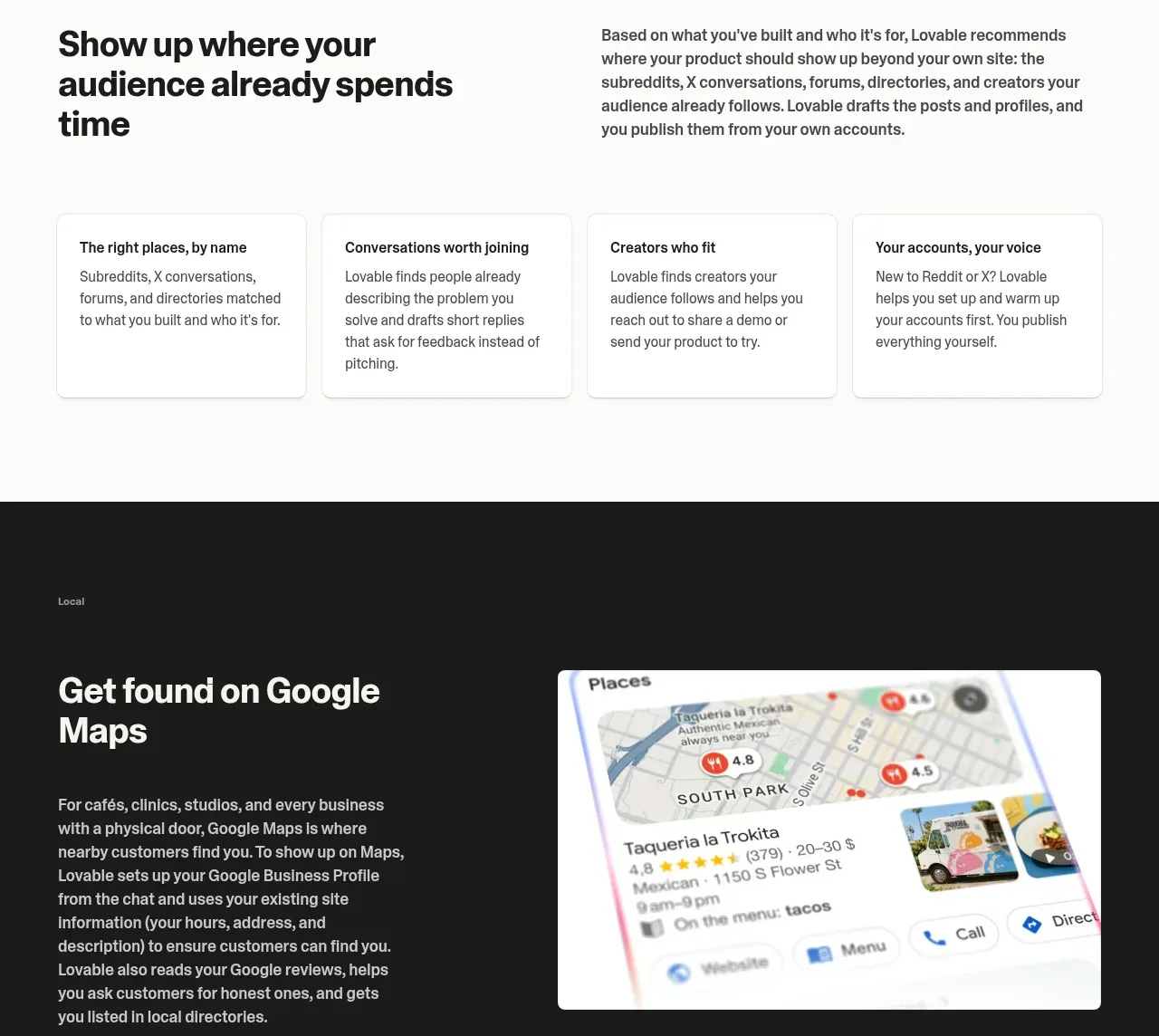 Audience and channel discovery
Lovable Growth Tools · Feature grid
Audience and channel discovery
Lovable Growth Tools · Feature grid
 Local discovery in maps
Lovable Growth Tools · Feature grid
Local discovery in maps
Lovable Growth Tools · Feature grid
 Paid acquisition workflows
Lovable Growth Tools · Feature grid
Paid acquisition workflows
Lovable Growth Tools · Feature grid
 Control and approvals
Lovable Growth Tools · Feature grid
Control and approvals
Lovable Growth Tools · Feature grid
 Customer growth examples
Lovable Growth Tools · Testimonials
Customer growth examples
Lovable Growth Tools · Testimonials
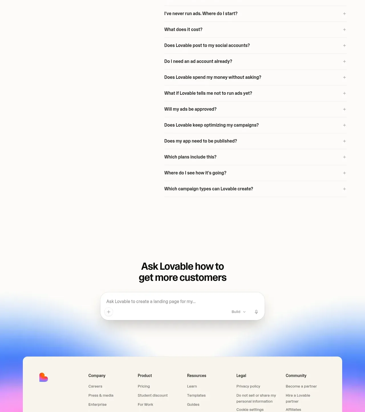 Frequently asked questions
Lovable Growth Tools · FAQ
Frequently asked questions
Lovable Growth Tools · FAQ