kage
kage
lullme.app
Design analysis
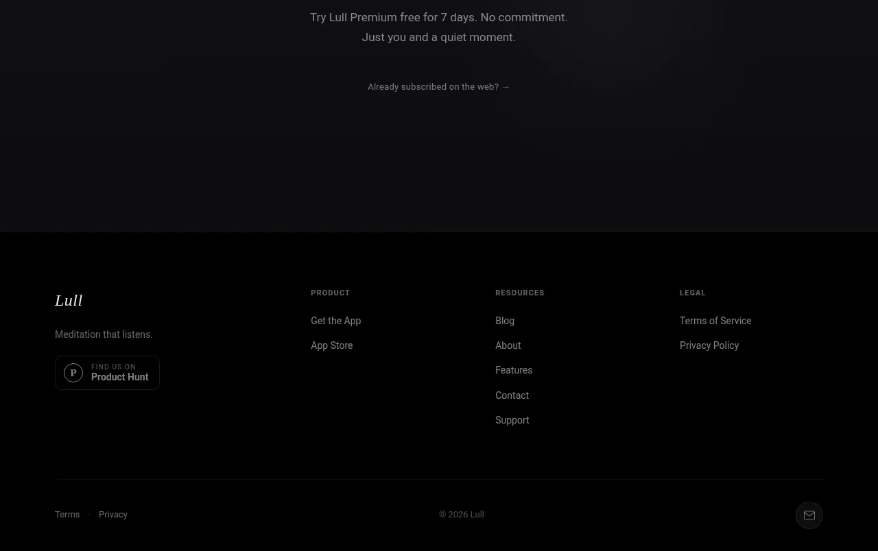
The footer closes the page with a small brand statement, grouped product/resource/legal links, a divider, and compact legal and contact utilities.
Prompt preview
## Reference images

Study these alongside the description below: hierarchy, rhythm, spacing, colour. Build for the product you are asked about, using this design language.

- Component: https://kage-design-assets.t3.tigrisfiles.io/components/lull/1eb36b3c-9a0d-499b-8ae4-8916c2d1f7b6-1789884099-9.webp
- Full page it was cut from: https://kage-design-assets.t3.tigrisfiles.io/screenshots/lull/1eb36b3c-9a0d-499b-8ae4-8916c2d1f7b6-1789884066726-full.webp
- Component on Kage: https://kage.design/component/lull-footer

## Before you start
Ask for the user's actual navigation structure, support channels, legal requirements, and social presence. Build a footer that reflects those needs while keeping the same quiet brand system.

Design a dark footer with a restrained multi-column layout. The first column contains a small brand treatment and one-line description; subsequent columns group links under short uppercase labels such as product, resources, and legal. Use generous horizontal alignment and plenty of empty space. Finish with a thin divider and a bottom utility row for terms, privacy, copyright, and one small support or contact action. On mobile, collapse columns into a readable vertical or two-column arrangement without hiding legal links.

Use #030303 or #070707 background, #e7e1d9 for primary footer text, #77736e for labels and muted copy, borders rgba(255,255,255,.08), 8–12px link spacing, and 56–80px top padding. Keep typography small but never below accessible sizes, provide visible keyboard focus states, and use subtle link-color transitions.

### Never
- Never copy the reference logo, product name, link labels, or copyright text.
- Never omit required privacy, terms, accessibility, or support links.
- Never add a newsletter form or social icons unless the user's product needs them.