kage
kage
lullme.app

Design analysis
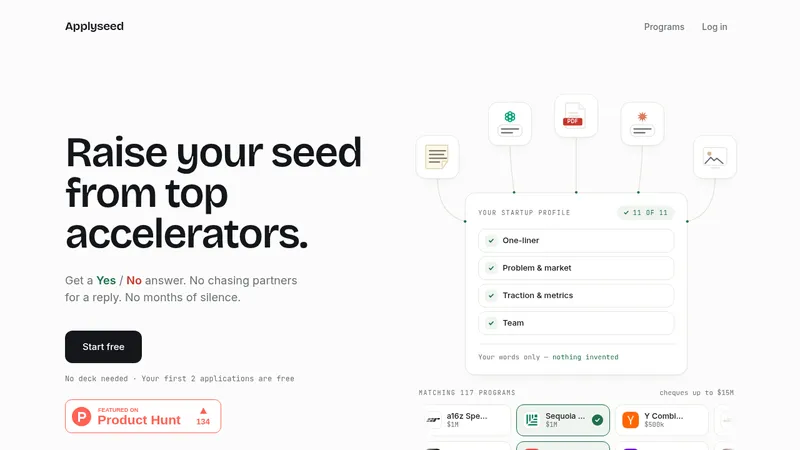
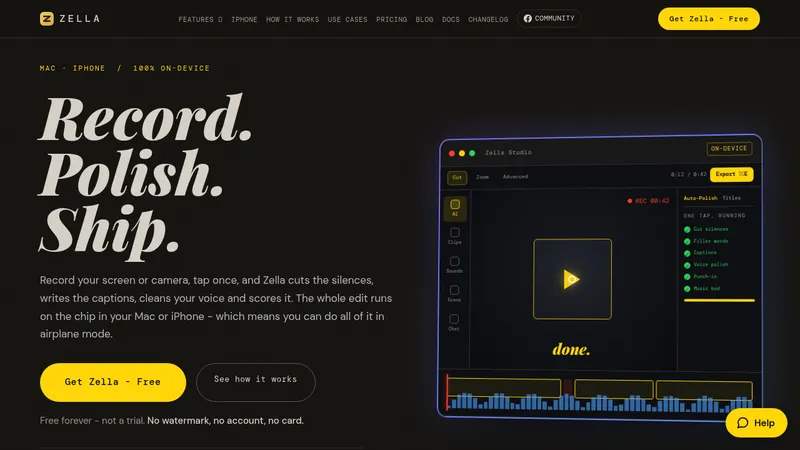
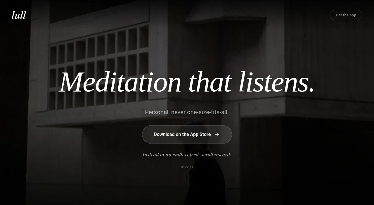
A cinematic, full-length wellness landing page uses near-black sections and muted photographic backgrounds with heavy overlays, letting large italic serif headlines carry the emotional hierarchy. The page moves from a sparse hero into increasingly information-rich feature bands: centered product explanation, metric cards, mood-tracking calendar, science and audio feature grids, then a quiet text-led reassurance section and app-download CTA. Translucent charcoal cards, fine borders, tiny uppercase labels, restrained gray body text, and generous vertical spacing keep dense product details calm rather than dashboard-like.
Prompt preview
## Reference images

Study these alongside the description below: hierarchy, rhythm, spacing, colour. Build for the product you are asked about, using this design language.

- Full page: https://kage-design-assets.t3.tigrisfiles.io/screenshots/lull/1eb36b3c-9a0d-499b-8ae4-8916c2d1f7b6-1789884066726-full.webp
- Above the fold: https://kage-design-assets.t3.tigrisfiles.io/screenshots/lull/1eb36b3c-9a0d-499b-8ae4-8916c2d1f7b6-1789884058406.webp
- Design on Kage: https://kage.design/designs/lull-landing-page

## Before you start
Ask the user what they are building, who it is for, and what brand assets they already have, including the product name, colours, type choices, imagery, and any existing logo or app-store assets. Wait for their answers before designing. Apply the system below to their product, not to the reference product, and write original copy for their audience.

## Page structure
1. **Top navigation and hero** — Use a full-viewport cinematic image or video with a deep black gradient overlay. Place a small brand mark at top left, a quiet outlined utility/download button at top right, and center a large italic serif headline, short supporting line, primary pill CTA, secondary italic invitation, and tiny scroll cue.
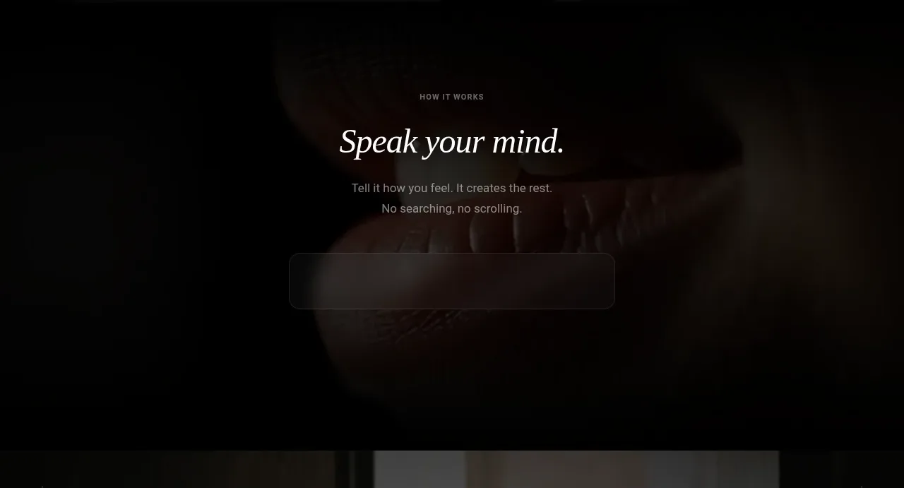
2. **How it works** — Transition into a dark, image-backed section with a centered uppercase eyebrow, concise italic serif heading, two short explanatory lines, and a wide, low-contrast translucent input/demo field beneath the copy.
3. **Personalization/value metrics** — Use a tall photographic panel with small decorative plus marks near the edges. Center the eyebrow and serif heading, then add a short paragraph and three horizontally aligned translucent statistic cards with oversized values and tiny uppercase captions.
4. **Mood or progress tracking** — Introduce a denser dark image section with a centered eyebrow and serif question headline. Show a glass calendar/tracker module in the middle, followed by three horizontally arranged benefit callouts with circular line icons, bold short titles, and muted descriptions.
5. **Science/benefits** — Use another image-backed panel with a centered eyebrow, broad serif heading, and short explanatory paragraph. Below it, place three equal glass cards in a row, numbered subtly and containing a concise benefit title plus supporting copy.
6. **Audio/product experience** — Change the visual rhythm with a warmer, abstract or fabric-like background. Center an eyebrow and serif heading, then place a wide translucent audio player with play control, timeline, duration, and volume control. Add a small centered caption below, followed by a 3-column grid of six glass feature cards arranged in two rows.
7. **Quiet reassurance and pricing philosophy** — Move to a mostly solid black section without imagery. Use a centered italic serif heading and several short, narrow paragraphs that explain the product’s low-pressure philosophy, pricing, privacy, or lack of gamification. Keep this section text-led and notably calmer than the feature grids.
8. **Final app download CTA** — Use a very dark charcoal panel with a centered serif heading, a floating smartphone/app mockup, platform download buttons, a short trial or signup message, and a small secondary link below. Give the device plenty of negative space.
9. **Footer** — End with a black footer using a multi-column layout: brand and short descriptor on the left, product/resources/legal link groups across the row, and a small badge or utility item. Add a fine horizontal divider, then a bottom line with legal links, centered copyright, and a small contact icon.

## Design language
- Build hierarchy through contrast, scale, and spacing rather than bright colour: use very large italic display serif headlines, compact sans-serif body copy, tiny uppercase tracking labels, and short paragraph widths.
- Pair an expressive editorial serif for headings with a clean neutral sans-serif for navigation, labels, controls, and body text. Use a responsive scale roughly from 11–12px utility labels, 14–16px body copy, 24–40px section headings, and 64–88px hero type, reducing aggressively on mobile.
- Keep the palette near monochrome: black and near-black backgrounds around `#050505`–`#111111`, charcoal panels around `#1a1a1a`, warm white text around `#eeeae3`, and secondary gray text around `#8b8985`. If the product has an accent, use it sparingly for tiny numbers or controls rather than large surfaces.
- Treat photography as atmosphere, not content to read: use full-bleed, quiet human or material imagery, apply black overlays and bottom gradients, and maintain readable text through contrast rather than brightening the image.
- Use translucent charcoal glass cards with subtle white borders around `rgba(255,255,255,.12)`, soft backgrounds, and little or no shadow. Prefer medium rounded corners around 12–18px for cards and controls; use pill radii only for primary buttons and compact downloads.
- Alternate spacious centered sections with denser product-proof sections. Let the hero and reassurance/CTA areas breathe, while calendars, metrics, audio controls, and feature grids provide the informational middle of the page.
- Keep controls quiet and tactile: thin outlines, restrained fills, small arrows and line icons, understated hover brightness, and no saturated gradients. Make cards and buttons gently lift or brighten on hover, and use slow crossfades or parallax only where motion supports the cinematic imagery.
- Preserve a premium, contemplative rhythm: generous vertical padding, deliberate transitions between image treatments, narrow text measures, and strong alignment across centered content and 3-column grids. Ensure the dense grids collapse cleanly to one column on small screens without losing the editorial spacing.

## Never
- Do not copy any logos, wordmarks, product names, taglines, copy, illustrations, photography, phone mockups, or icon sets from the reference.
- Do not present the result as the reference product or imply affiliation with it.
- Do not reproduce the exact text, imagery, calendar content, audio title, or branded app-store treatment; create original equivalents for the user’s product.
Components from this page
All components
 Minimal floating navigation
Lull · Navigation
Minimal floating navigation
Lull · Navigation
 Cinematic listening meditation hero
Lull · Hero
Cinematic listening meditation hero
Lull · Hero
 Simple guided interaction
Lull · Feature grid
Simple guided interaction
Lull · Feature grid
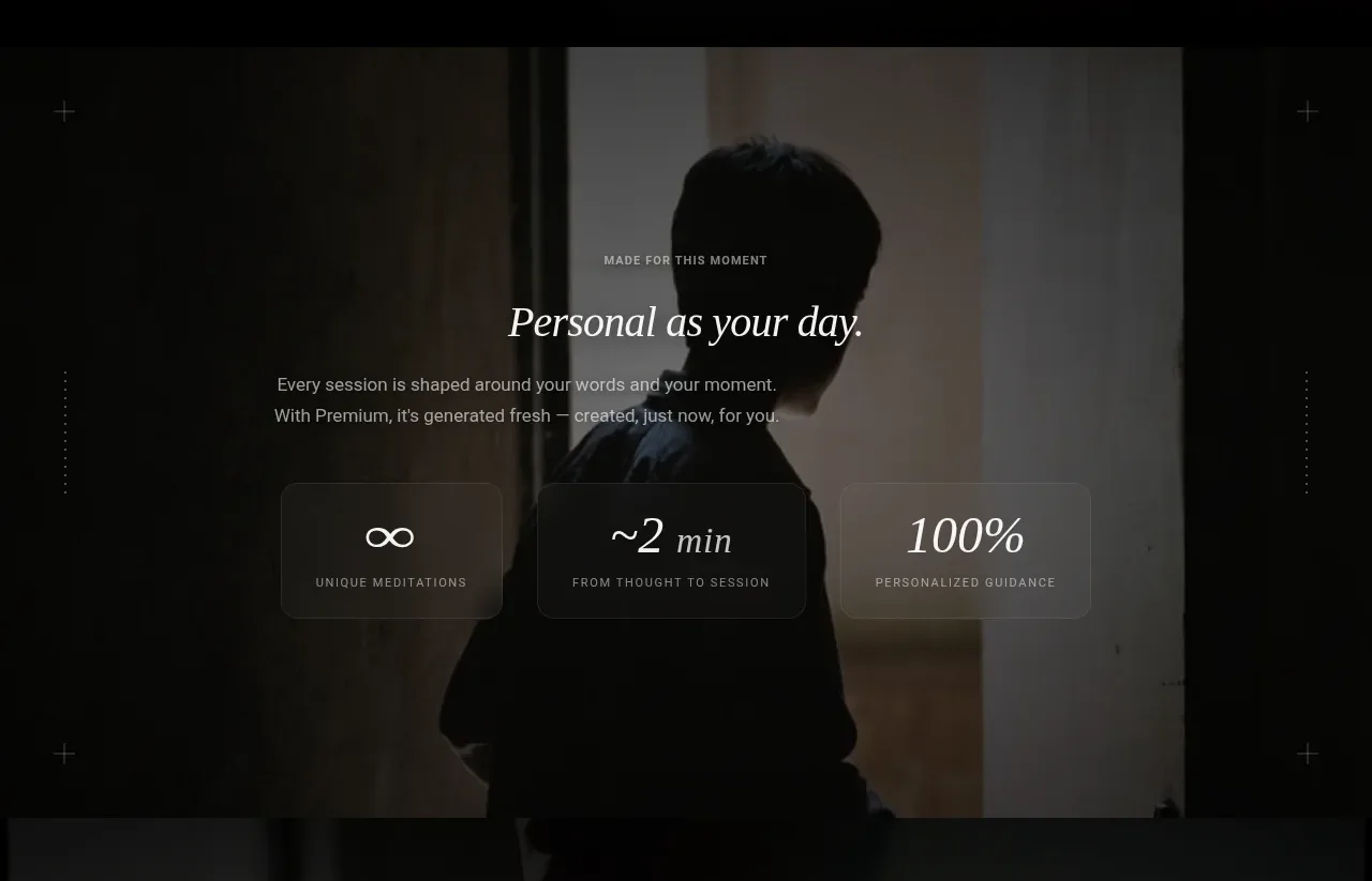 Personalized product promise
Lull · Stats
Personalized product promise
Lull · Stats
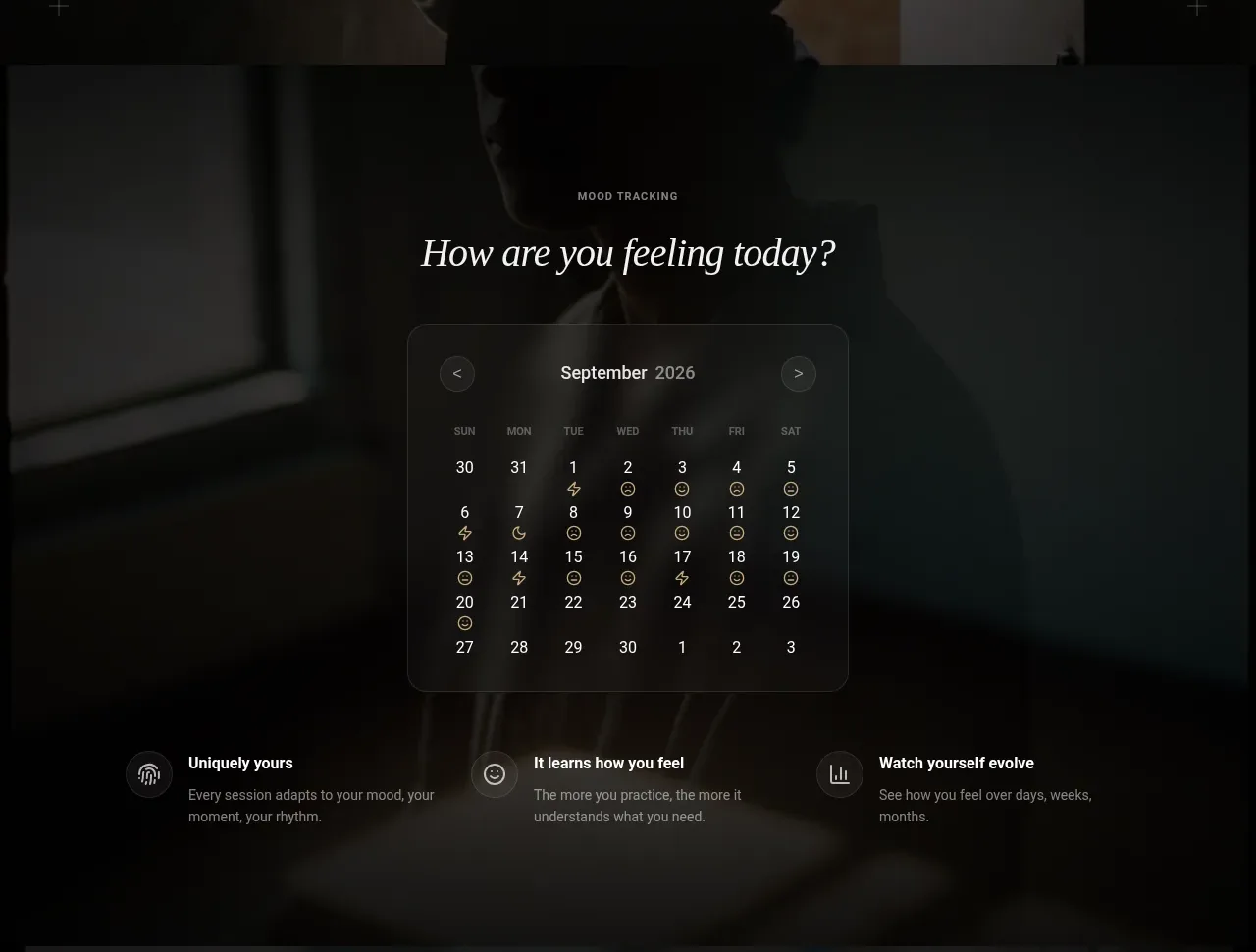 Mood tracking calendar
Lull · Tabs & steps
Mood tracking calendar
Lull · Tabs & steps
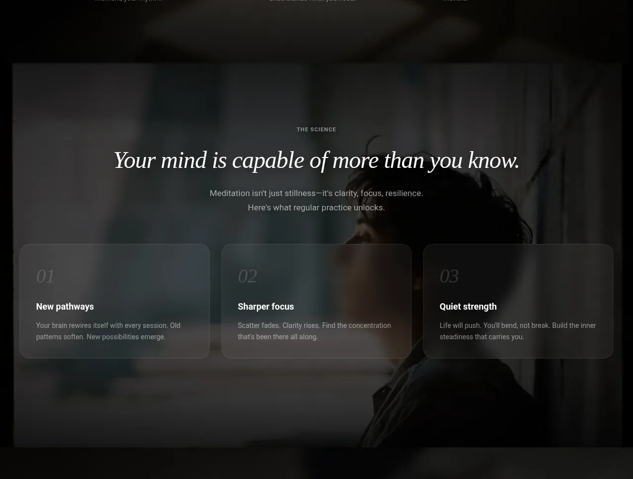 Evidence and outcomes grid
Lull · Feature grid
Evidence and outcomes grid
Lull · Feature grid
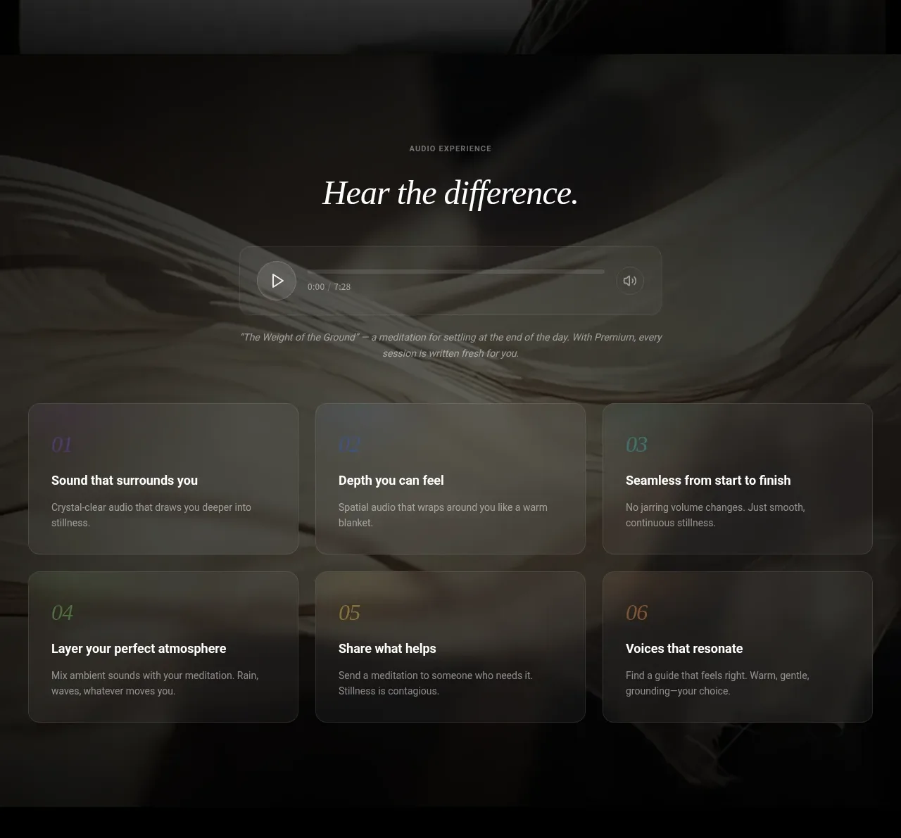 Audio experience showcase
Lull · Feature grid
Audio experience showcase
Lull · Feature grid
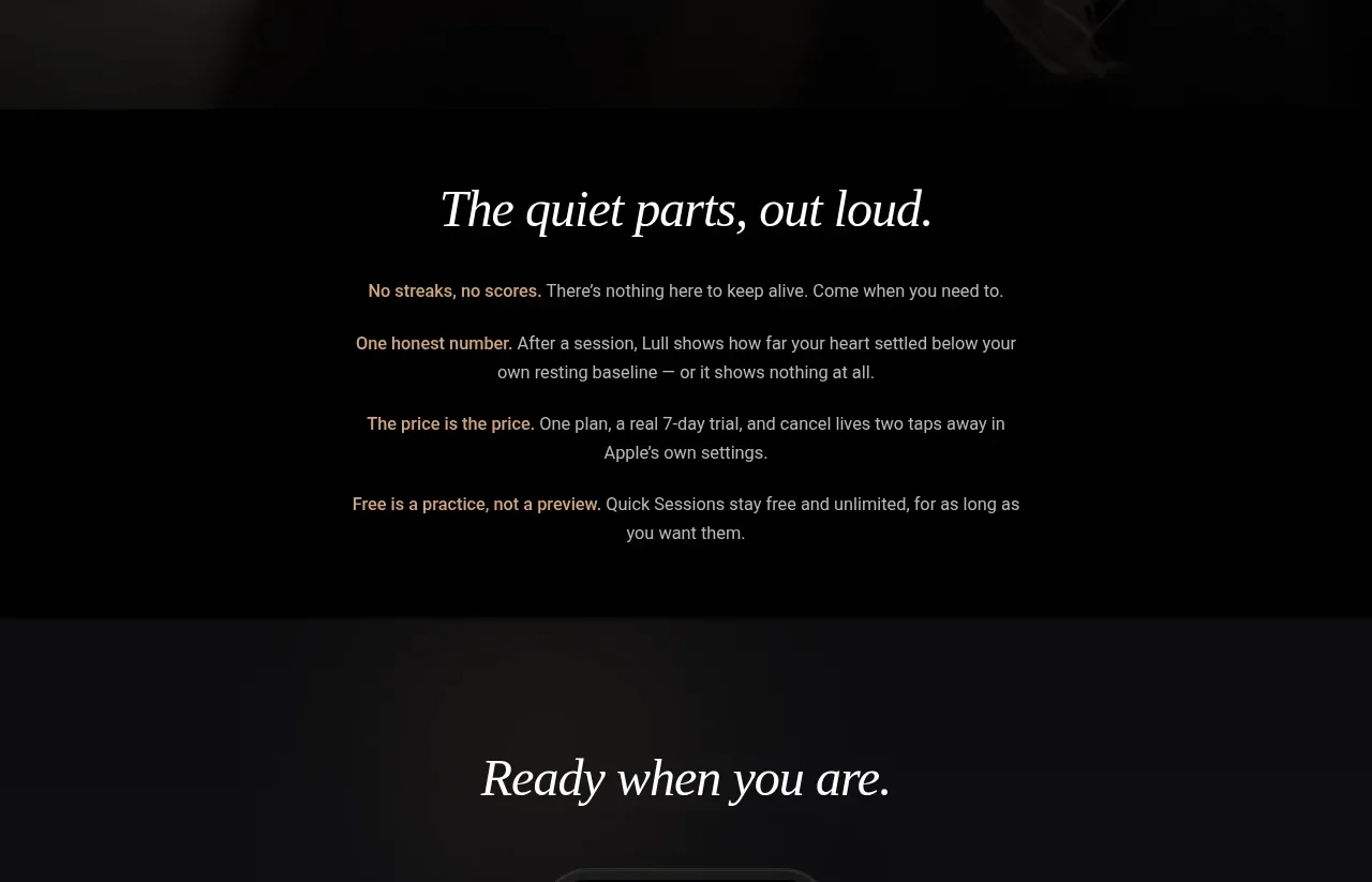 Transparent product principles
Lull · Card
Transparent product principles
Lull · Card
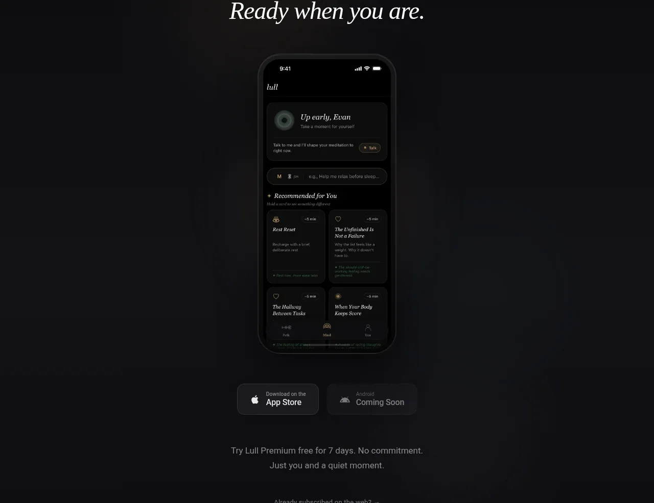 App download conversion
Lull · Call to action
App download conversion
Lull · Call to action
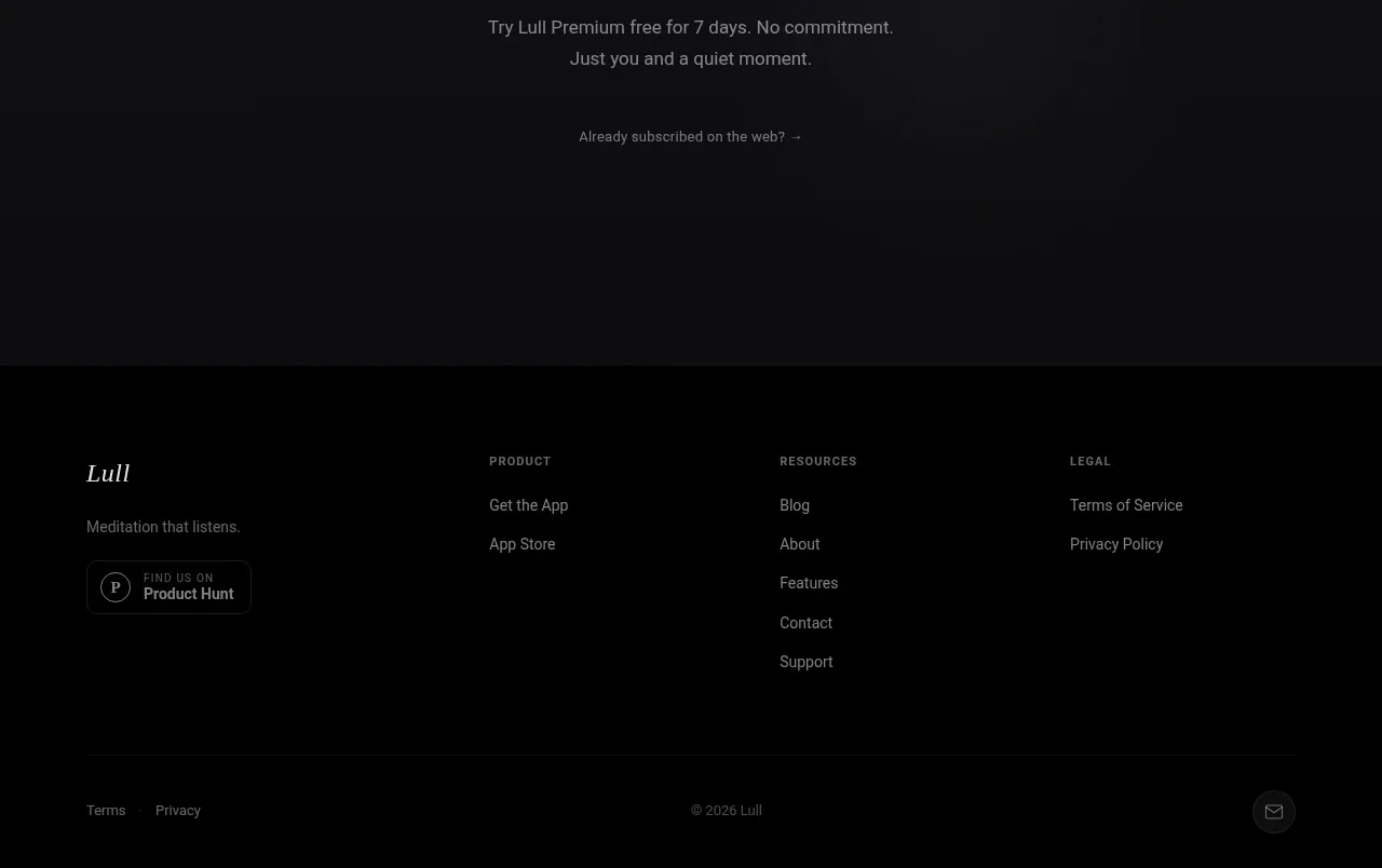 Editorial multi-column footer
Lull · Footer
Editorial multi-column footer
Lull · Footer