kage
kage
lullme.app
Design analysis
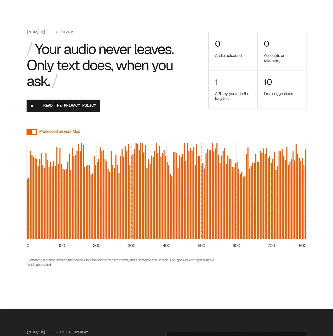
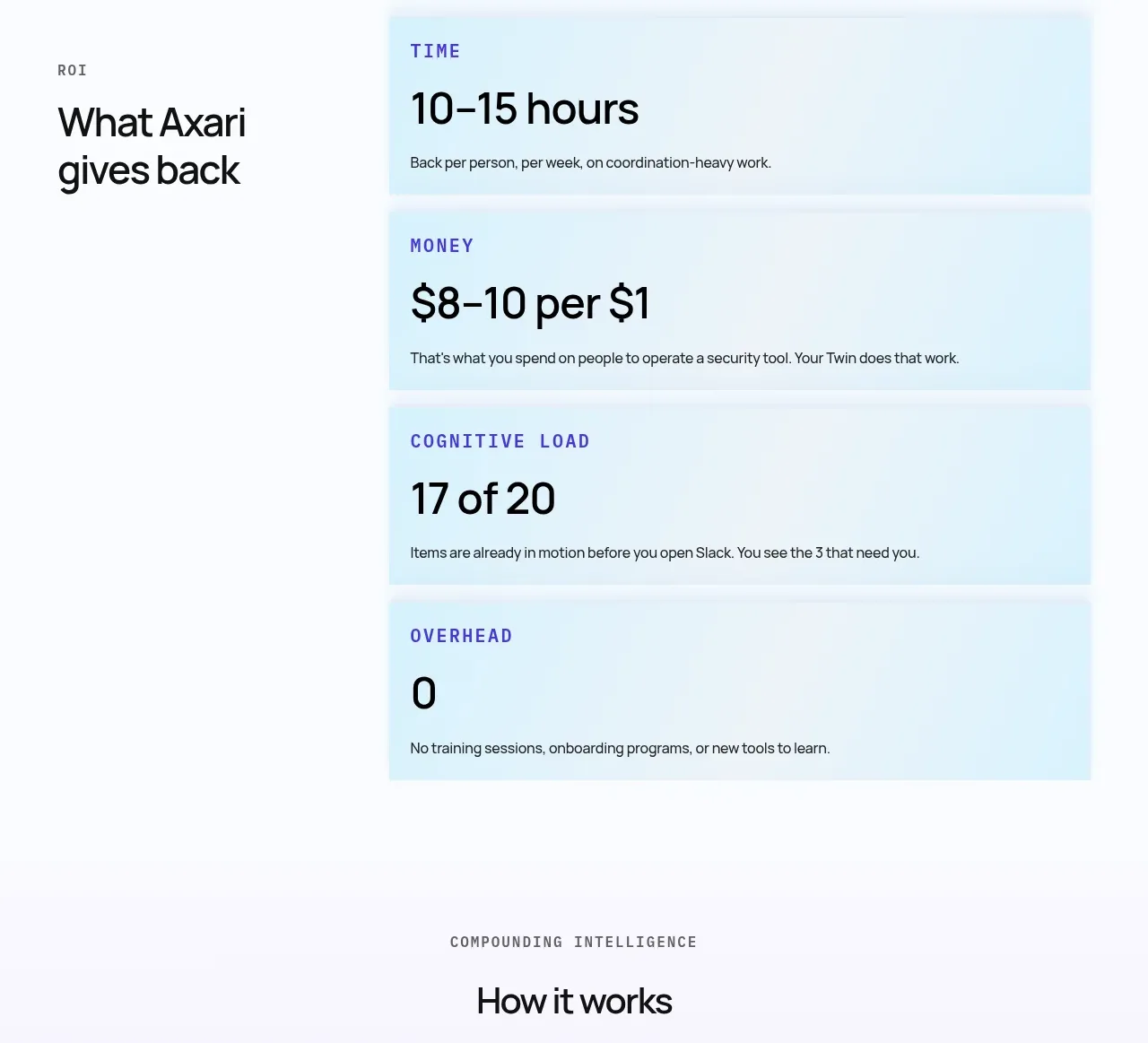
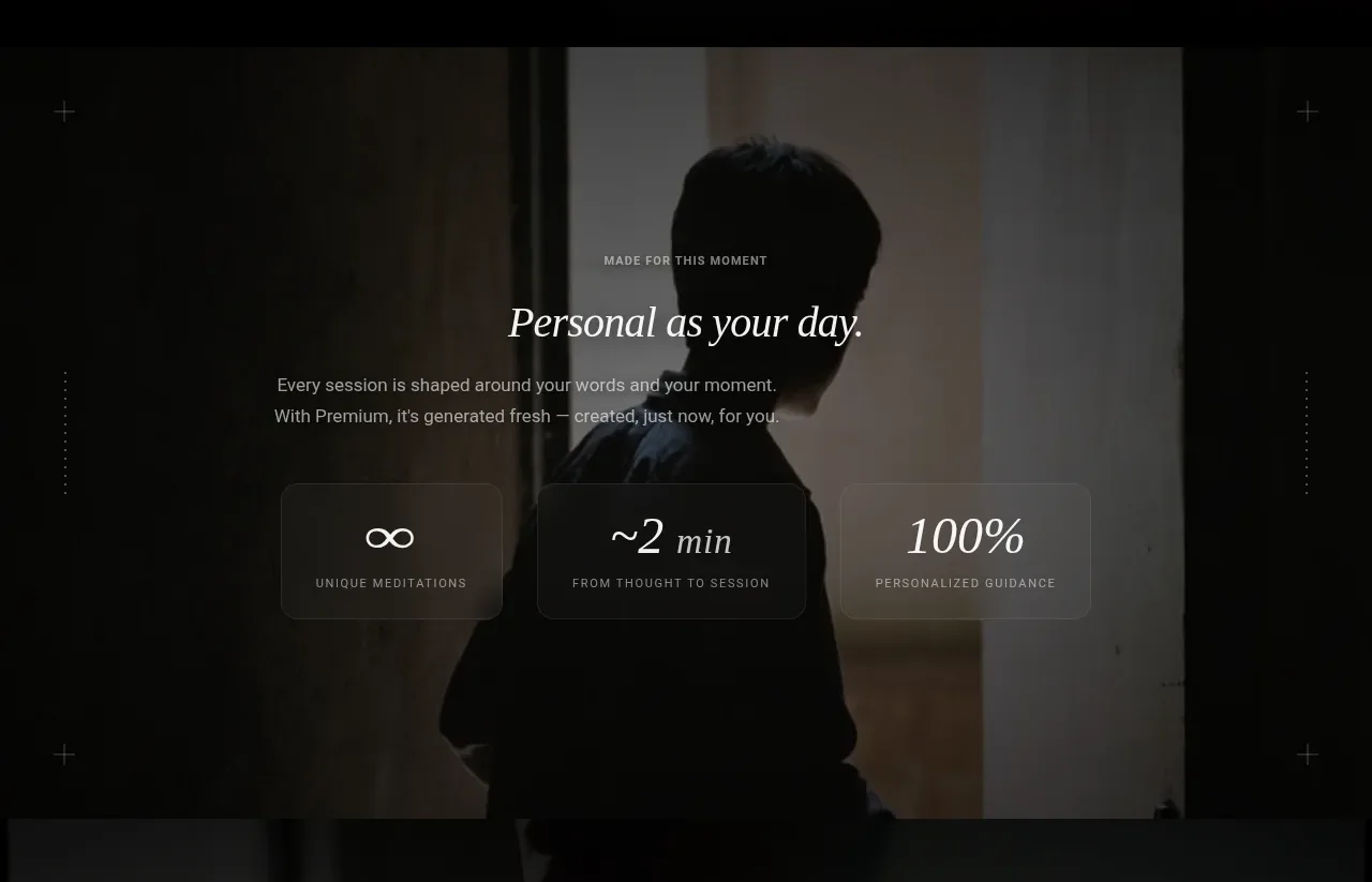
This section pairs a personalizing headline and supporting copy with three large glass statistic cards, making the product feel adaptive and specific.
Prompt preview
## Reference images

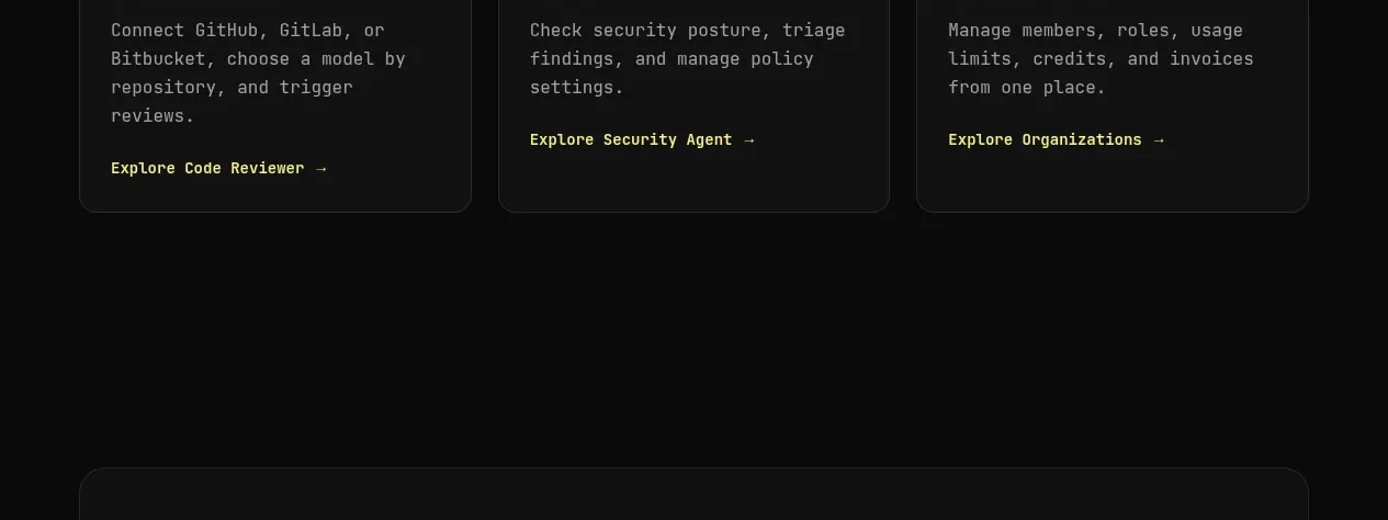
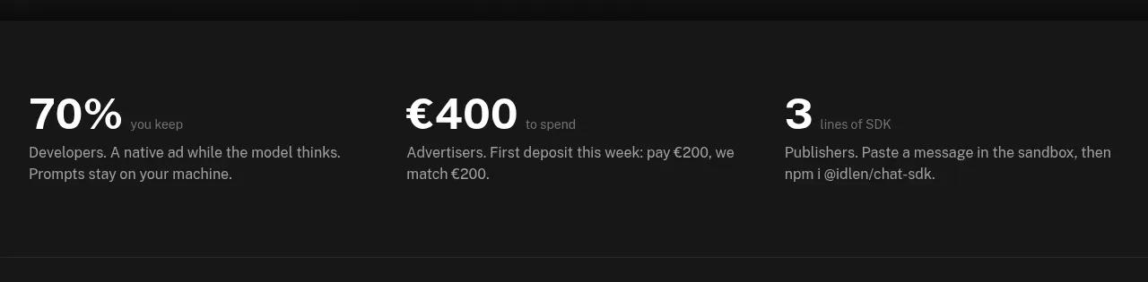
Study these alongside the description below: hierarchy, rhythm, spacing, colour. Build for the product you are asked about, using this design language.

- Component: https://kage-design-assets.t3.tigrisfiles.io/components/lull/1eb36b3c-9a0d-499b-8ae4-8916c2d1f7b6-1789884097-3.webp
- Full page it was cut from: https://kage-design-assets.t3.tigrisfiles.io/screenshots/lull/1eb36b3c-9a0d-499b-8ae4-8916c2d1f7b6-1789884066726-full.webp
- Component on Kage: https://kage.design/component/lull-stats

## Before you start
Ask what makes the user's product personal or adaptive and which three proof points are credible. Build this section around those answers.

Design a full-bleed, darkened lifestyle-image section. Center a small eyebrow, an elegant serif headline, and two concise lines of supporting copy. Beneath the copy, place three equal-width translucent cards in a horizontal row: each card has a prominent metric or symbol and a small uppercase explanation. Keep cards visually quiet so the background remains atmospheric. On smaller screens, stack the cards or use a controlled horizontal scroll. Use content-driven metrics rather than inflated claims, and add a short reveal animation only when cards enter the viewport.

Approximate language: background #0a0a09 with a warm photographic overlay, text #eeeae3, muted #a7a19a, cards rgba(255,255,255,.08), border rgba(255,255,255,.14), 14–18px radius, 28–40px card padding. Use a 40–52px serif title, 12–14px sans-serif copy, and a 28–36px metric. Align card baselines and keep equal gaps.

### Never
- Never copy the reference statistics, text, imagery, product name, or logo.
- Never invent unsupported medical or performance claims.
- Never make the cards look like a generic SaaS pricing row.