 kage
kage
mailyte.com

Design analysis
A pale illustrated-feeling backdrop contains a floating white conversion card with a direct headline, two actions, and reassurance bullets.
Prompt preview
## Reference images

Study these alongside the description below: hierarchy, rhythm, spacing, colour. Build for the product you are asked about, using this design language.

- Component: https://kage-design-assets.t3.tigrisfiles.io/components/mailyte/142780af-add7-4be9-ae30-6edb3206e4e0-1789538516-10.webp
- Full page it was cut from: https://kage-design-assets.t3.tigrisfiles.io/screenshots/mailyte/142780af-add7-4be9-ae30-6edb3206e4e0-1789538442487-full.webp
- Component on Kage: https://kage.design/component/mailyte-cta

## Before you start
Ask what the user's product, audience, and brand are, then apply the principles below to that product rather than reproducing the reference.

Create a final conversion CTA with a soft lavender background (#f2f3ff) and subtle abstract decorative shapes or neutral placeholders positioned behind the content. Center a raised white card, roughly 560–680px wide, with 32–40px radius and a soft shadow. Inside, place an optional small avatar/group cue, a 40–52px headline, concise supporting text, two buttons, and a row of three reassurance points with check icons. Use a deep indigo primary (#3930a3), neutral secondary button, #17151d heading, #77747e copy, 72–120px outer padding, and 28–40px card padding. Keep decorative elements nonessential and hide or simplify them on mobile; buttons must remain prominent and accessible.

Never: use logos, product names, copy, illustrations, or imagery from the reference.
More components

 Final conversion banner
tiun. · Call to action
Final conversion banner
tiun. · Call to action

 Mobile app conversion CTA
Payflip · Call to action
Mobile app conversion CTA
Payflip · Call to action

 Final download call to action
Grimo AI · Call to action
Final download call to action
Grimo AI · Call to action
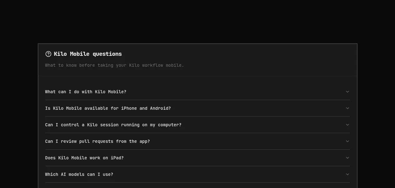
 Download conversion panel
Kilo Code for iOS and Android · Call to action
Download conversion panel
Kilo Code for iOS and Android · Call to action
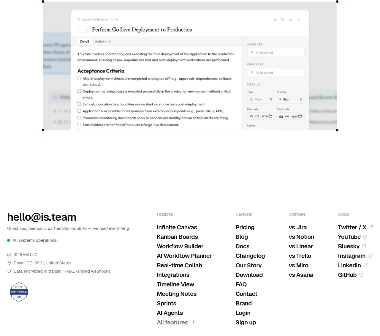
 Final conversion CTA
is.team · Call to action
Final conversion CTA
is.team · Call to action

 Studio closing call to action
FATHER · Call to action
Studio closing call to action
FATHER · Call to action