kage
kage

Design analysis
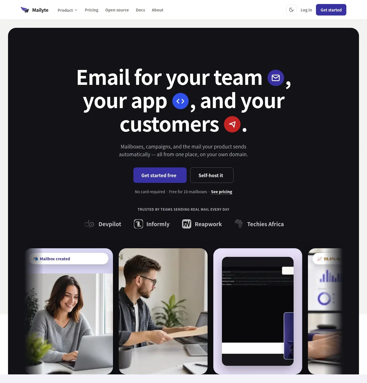
A polished email-platform landing page uses a dark, high-contrast hero with oversized centered typography, vivid purple, blue, and red accent chips, and a partially cropped collage of product and lifestyle cards to create depth. Below, the page alternates pale lavender, white, blush, and near-black bands: compact three-card summaries lead into split feature sections, then a tabbed deliverability panel, pill-shaped included-feature rows, a metrics strip, an open-source comparison, testimonials, a final illustrated CTA, and a dense multi-column footer. The consistent rounded geometry, restrained shadows, small uppercase eyebrow labels, and repeated primary/secondary button pair keep the long page cohesive while the colour changes establish section rhythm.
Prompt preview
## Reference images

Study these alongside the description below: hierarchy, rhythm, spacing, colour. Build for the product you are asked about, using this design language.

- Full page: https://kage-design-assets.t3.tigrisfiles.io/screenshots/mailyte/142780af-add7-4be9-ae30-6edb3206e4e0-1789538442487-full.webp
- Above the fold: https://kage-design-assets.t3.tigrisfiles.io/screenshots/mailyte/142780af-add7-4be9-ae30-6edb3206e4e0-1789538432217.webp
- Design on Kage: https://kage.design/designs/mailyte-landing-page

## Before you start
Ask the user what they are building, who it is for, and what brand assets they already have, including the product name, colours, typography, logo, and imagery. Wait for their answers before designing. Apply the system below to their product rather than copying the reference product.

## Page structure
1. **Global navigation:** Create a slim white header with a small brand mark and name at left, compact navigation links in the middle, and a theme control, login link, and filled primary CTA at right.
2. **Hero section:** Use a large near-black rounded panel inset from the page edges. Center a three-line oversized headline, inserting small coloured circular icon chips into the text where appropriate; add a concise supporting paragraph, paired CTAs, reassurance text, and a row of customer or partner marks.
3. **Hero visual collage:** Finish the dark hero with a wide, partially cropped row of tall rounded cards containing a mix of product UI and human imagery. Let the outer cards fade or clip at the panel edges to create a gallery-like depth effect.
4. **Three-purpose overview:** Switch to a pale lavender background. Add a centered uppercase eyebrow, headline, and subtitle, followed by three equal white cards explaining the product’s primary audiences or jobs. Give each card a black icon tile, bold title, and short muted description.
5. **Email hosting feature:** On white, use a generous two-column section with a soft lavender product screenshot panel on the left and text on the right. Include an eyebrow, heading, paragraph, three checkmarked benefits, and primary/secondary buttons.
6. **Developer feature:** Reverse or vary the visual treatment in the next pale lavender band: show a bold blue-framed visual on the left and the copy block on the right. Repeat the eyebrow, heading, description, three benefits, and paired actions while keeping the content rhythm consistent.
7. **Deliverability section:** Use a warm blush background with a centered eyebrow and heading. Below, arrange a vertical list of deliverability topics on the left with one highlighted tab, controls beneath, and a large supporting product visual plus explanatory text on the right. Make the highlighted state red-tinted and use a red CTA.
8. **Included features band:** Move to near-black. Place a left-aligned eyebrow and headline with one phrase in red, supporting copy and CTAs toward the right, then lay out six wide pill-like feature rows in a three-column grid. Each row has a circular icon, label, and trailing arrow.
9. **Metrics strip:** Add a clean white band with four evenly spaced, oversized metrics separated by subtle vertical rules. Use alternating purple, blue, and red metric colours with small explanatory labels beneath.
10. **Open-source comparison:** Return to near-black with a centered eyebrow, headline, and short paragraph. Add two large side-by-side comparison cards: a dark-purple card for self-hosting and a dark-red card for managed hosting, each with an icon, heading, bullets, and a contrasting CTA.
11. **Testimonials:** On white, center an eyebrow and heading above a large testimonial carousel. Use one dominant white quote card with a coloured top border, oversized quotation mark, bold quote, avatar and attribution, plus several narrow preview cards at the side and small carousel controls below.
12. **Final CTA banner:** Use a pale blue-lavender illustrated background with abstract envelope and brand-neutral decorative marks. Center a large translucent or white rounded card containing a small avatar cluster, bold CTA headline, supporting line, paired buttons, and three compact reassurance points.
13. **Footer:** Finish with a very dark multi-column footer. Put the brand summary and social buttons in the first column, then organize links under five or more uppercase categories. Add a thin divider and a bottom row for copyright, legal links, cookies, security, and status.

## Design language
- Build hierarchy with compact uppercase eyebrow labels, heavy near-black headings, short paragraphs, and repeated primary/secondary button pairs. Scale the hero headline dramatically, then reduce headings through the feature sections while keeping generous whitespace.
- Change rhythm by section: immersive and image-heavy at the top, compact three-card explanation next, spacious alternating split features, denser tabs and pill rows in the middle, then proof, conversion, and navigation-heavy content near the bottom.
- Use near-black surfaces around `#0d0d12`, white content areas around `#ffffff`, pale lavender around `#f2f1fb`, blush around `#fff3f3`, and pale blue-lavender around `#eef0ff`. Reserve saturated purple/indigo near `#4030a8`, electric blue near `#2855e8`, and red near `#d52b31` for CTAs, active states, chips, and emphasis.
- Pair a clean geometric sans-serif for all text with a strong, weighty display treatment for hero and section headings. Use tight heading line-height, medium-weight body copy, small uppercase labels with letter spacing, and muted gray secondary text.
- Treat cards and image panels with large rounded corners, generally 16–24px, while feature pills use fully rounded borders. Use thin low-contrast borders and soft diffuse shadows on white cards; keep dark sections flatter with subtle charcoal outlines rather than heavy shadows.
- Use restrained motion: buttons should brighten or lift slightly on hover, cards may translate a few pixels, tabs should crossfade or slide their visual and copy, and the testimonial carousel should move horizontally with clear dots or arrow controls. Avoid continuous animation that competes with the content.
- Keep imagery framed as UI mockups, portraits, or abstract branded graphics inside consistent rounded containers. Use deliberate cropping and overlap in the hero, but simpler aligned compositions in the feature sections.

## Never
- Do not use the reference brand’s logo, wordmark, product name, exact copy, illustrations, photography, screenshots, or icon set.
- Do not reproduce the reference content verbatim or present the result as Mailyte.
- Replace all brand assets and product-specific claims with assets, language, and proof appropriate to the user’s product.
Components from this page
All components
 Global navigation
Mailyte · Navigation
Global navigation
Mailyte · Navigation
 Hero with proof and product collage
Mailyte · Hero
Hero with proof and product collage
Mailyte · Hero
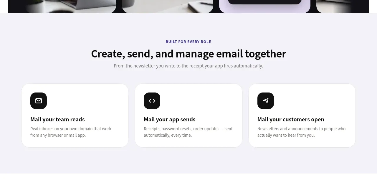 Role-based email workflow cards
Mailyte · Feature grid
Role-based email workflow cards
Mailyte · Feature grid
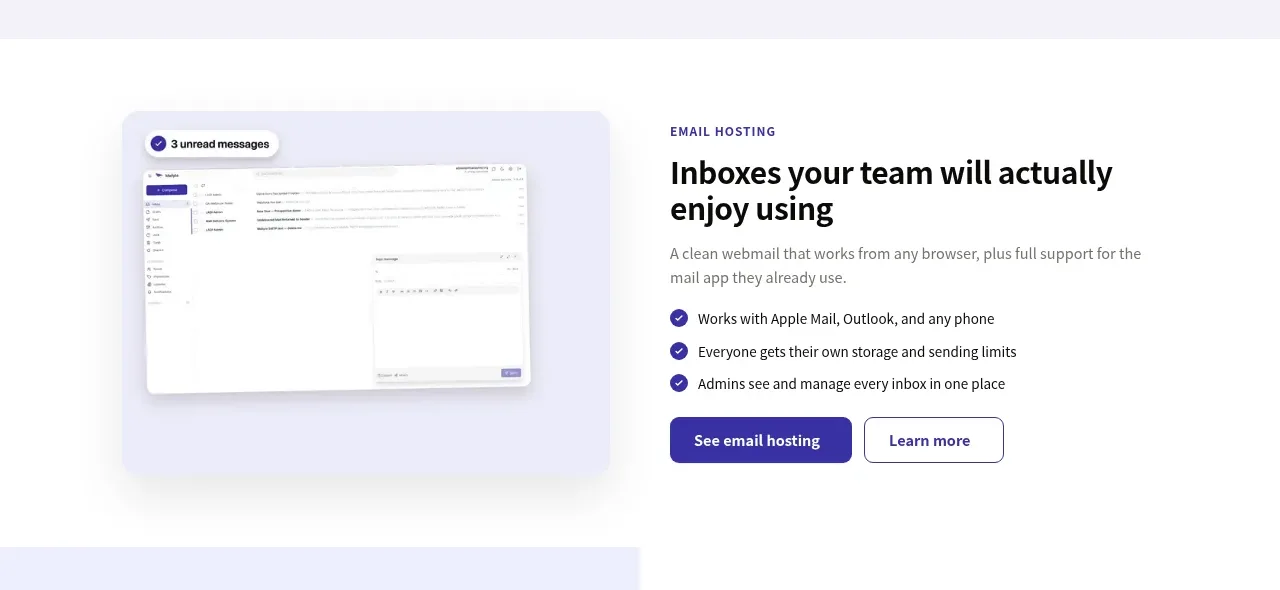 Email hosting capability split
Mailyte · Feature grid
Email hosting capability split
Mailyte · Feature grid
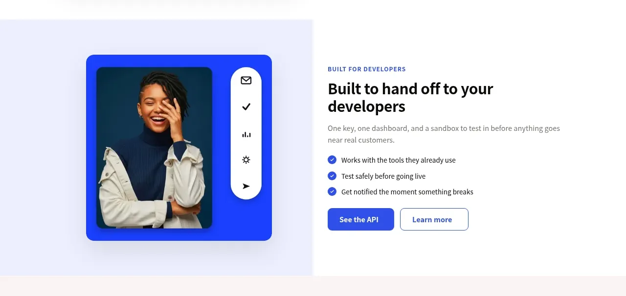 Developer feature split
Mailyte · Feature grid
Developer feature split
Mailyte · Feature grid
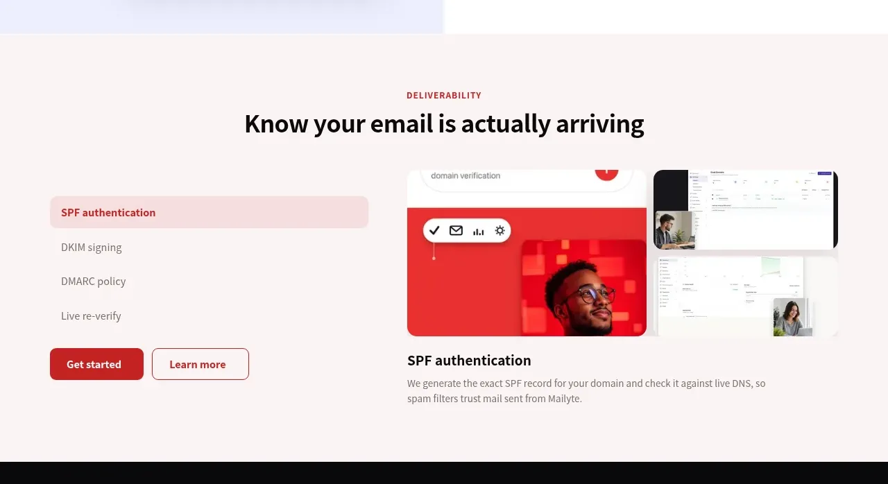 Deliverability feature tabs
Mailyte · Tabs & steps
Deliverability feature tabs
Mailyte · Tabs & steps
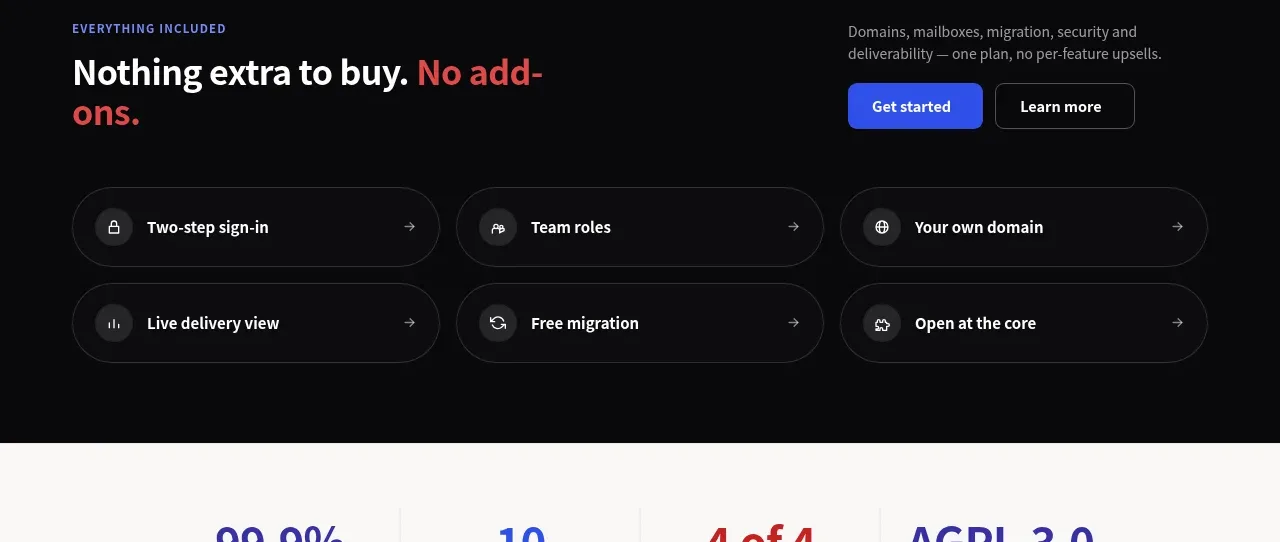 Included capabilities
Mailyte · Feature grid
Included capabilities
Mailyte · Feature grid
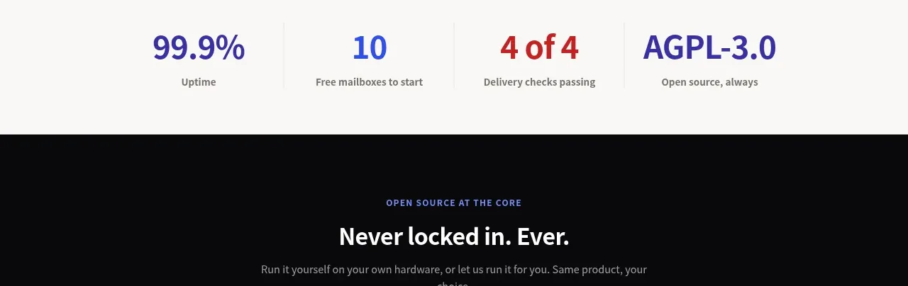 Trust and performance stats
Mailyte · Stats
Trust and performance stats
Mailyte · Stats
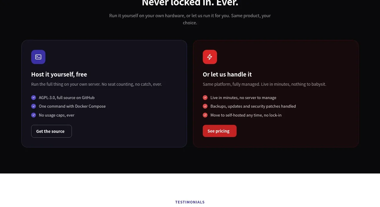 Open-source hosting choice cards
Mailyte · Card
Open-source hosting choice cards
Mailyte · Card
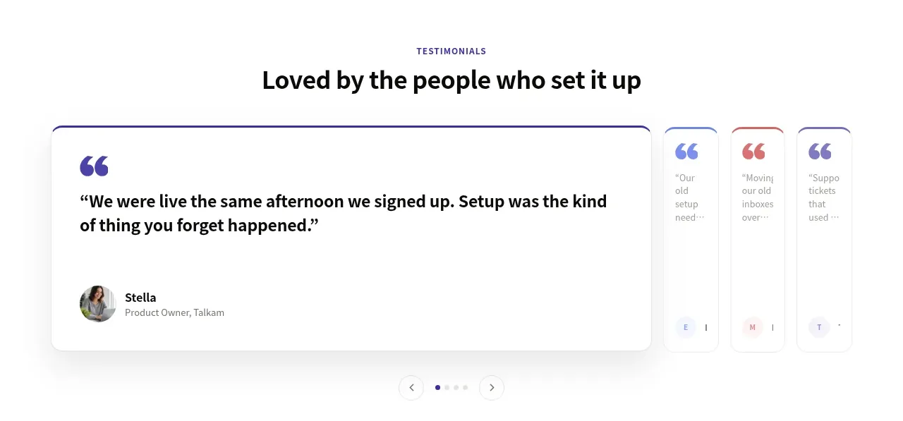 Customer testimonial carousel
Mailyte · Testimonials
Customer testimonial carousel
Mailyte · Testimonials
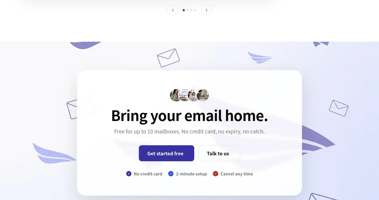 Final conversion CTA
Mailyte · Call to action
Final conversion CTA
Mailyte · Call to action
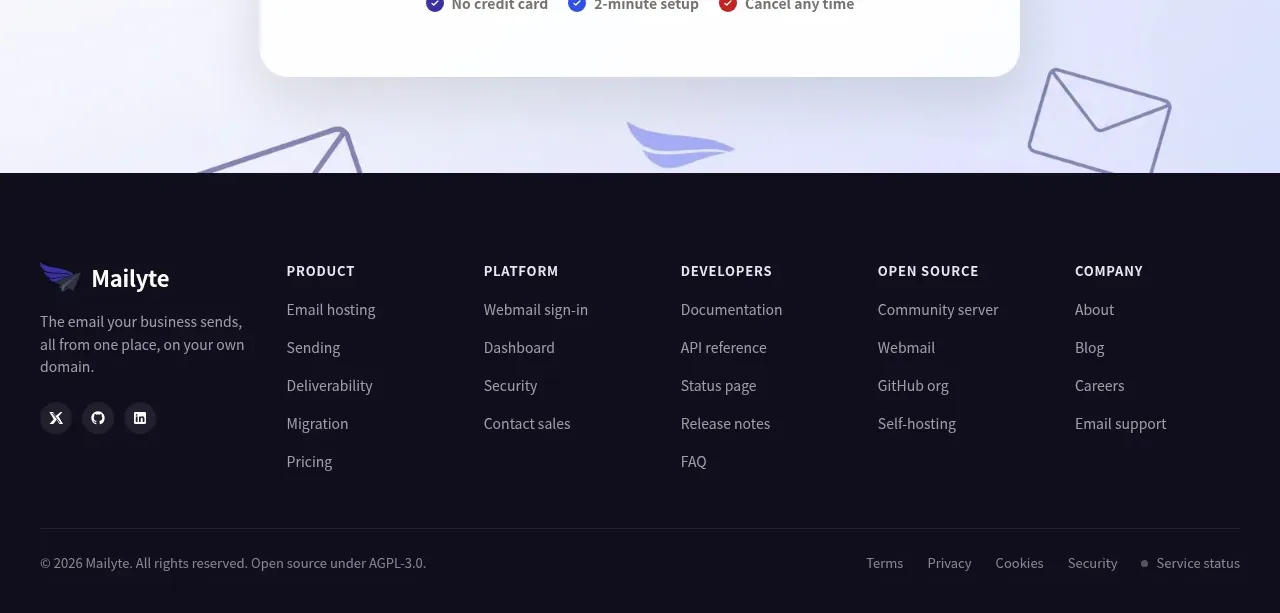 Multi-column site footer
Mailyte · Footer
Multi-column site footer
Mailyte · Footer