kage
kage
mailyte.com
Design analysis
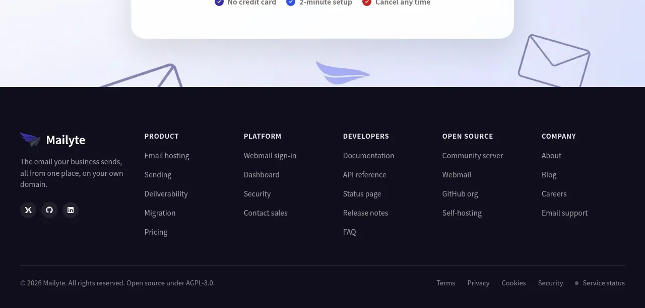
The dark footer closes the page with brand context, grouped navigation columns, social links, and a separated legal utility row.
Prompt preview
## Reference images

Study these alongside the description below: hierarchy, rhythm, spacing, colour. Build for the product you are asked about, using this design language.

- Component: https://kage-design-assets.t3.tigrisfiles.io/components/mailyte/142780af-add7-4be9-ae30-6edb3206e4e0-1789538516-11.webp
- Full page it was cut from: https://kage-design-assets.t3.tigrisfiles.io/screenshots/mailyte/142780af-add7-4be9-ae30-6edb3206e4e0-1789538442487-full.webp
- Component on Kage: https://kage.design/component/mailyte-footer

## Before you start
Ask what the user's product, audience, and brand are, then apply the principles below to that product rather than reproducing the reference.

Build a dark multi-column footer on #101019 with a centered max-width container. Use a left brand block with wordmark placeholder, a short description, and social icon buttons; to the right include 4–5 grouped navigation columns with uppercase or small semibold headings and vertically spaced links. Add a thin divider and a bottom utility row containing copyright, legal links, privacy controls, and service/status links. Use #f2f0f7 headings, #aaa7b2 body text, #282733 dividers, 13–15px link text, 8px social/button radii, and 64–80px top padding. Links need clear hover/focus states, columns should collapse into a two-column or accordion layout on mobile, and the footer should remain readable at high contrast.

Never: use logos, product names, copy, illustrations, or imagery from the reference.