kage
kage
mailyte.com

Design analysis
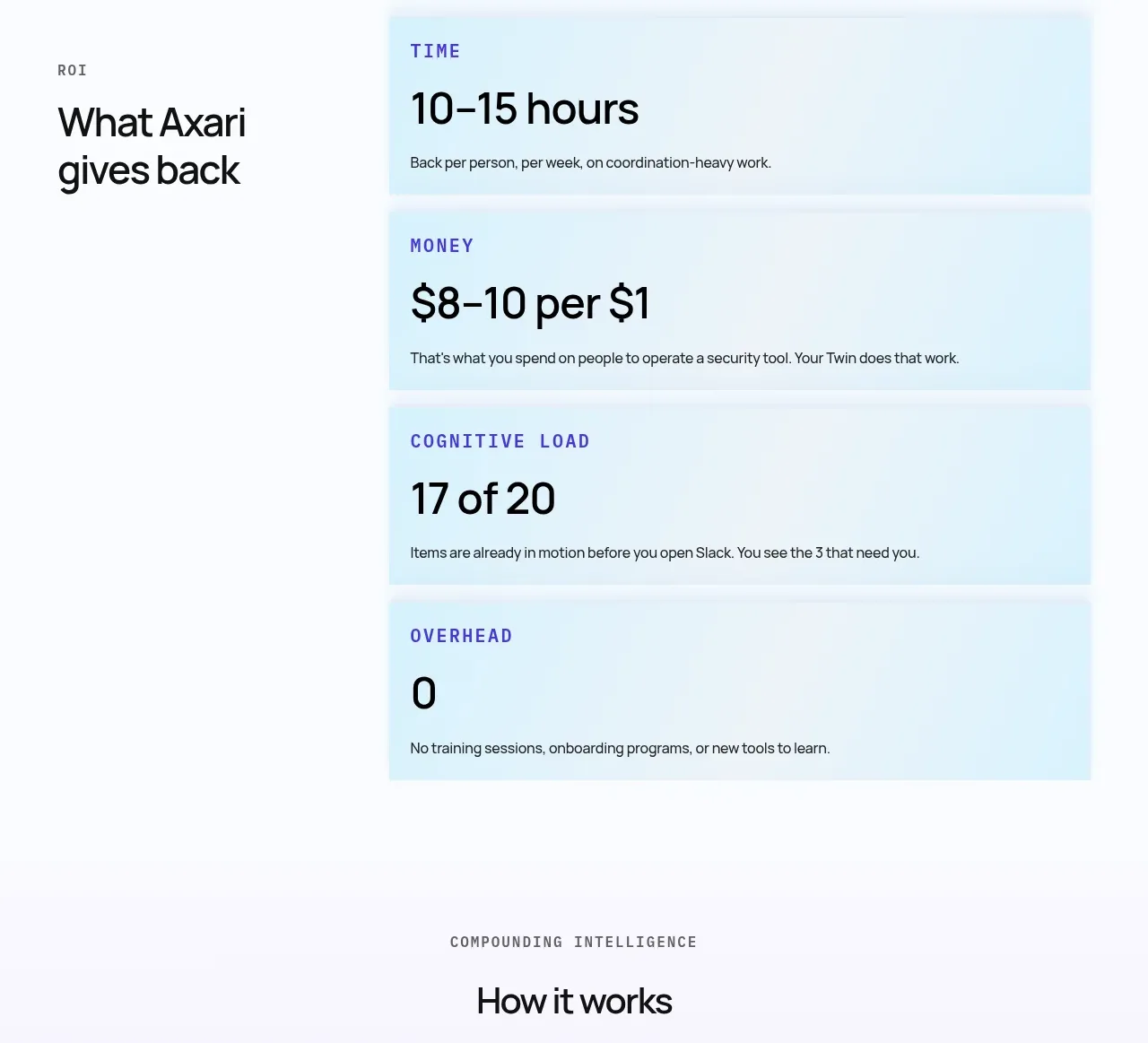
A bright, minimal stats band gives four quick proof points equal visual weight with large numbers and compact labels.
Prompt preview
## Reference images

Study these alongside the description below: hierarchy, rhythm, spacing, colour. Build for the product you are asked about, using this design language.

- Component: https://kage-design-assets.t3.tigrisfiles.io/components/mailyte/142780af-add7-4be9-ae30-6edb3206e4e0-1789538515-7.webp
- Full page it was cut from: https://kage-design-assets.t3.tigrisfiles.io/screenshots/mailyte/142780af-add7-4be9-ae30-6edb3206e4e0-1789538442487-full.webp
- Component on Kage: https://kage.design/component/mailyte-stats

## Before you start
Ask what the user's product, audience, and brand are, then apply the principles below to that product rather than reproducing the reference.

Build a horizontal stats strip on a white or warm-white background. Present four equal statistic columns separated by faint vertical rules; each has a large 30–40px number, a short label, and optional one-line qualifier. Use a restrained palette with indigo (#3f329d), blue (#3155e8), and one contrasting warm accent (#bd2e32), on #17151d and #77747c text. Keep the layout centered within a 760px–1100px max width, with 56–80px vertical padding and 20–28px column gaps. Animate values only when meaningful and respect reduced-motion preferences; on mobile use a 2x2 grid without cramped dividers.

Never: use logos, product names, copy, illustrations, or imagery from the reference.