kage
kage
make0.ai
Design analysis
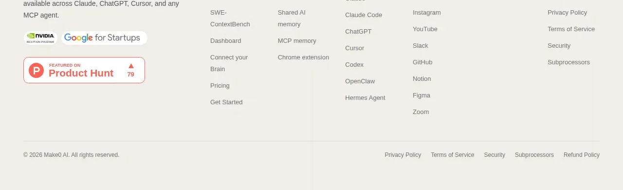
The footer closes with a brand summary, multiple categorized link columns, social/proof badges, and a slim legal bar.
Prompt preview
## Reference images

Study these alongside the description below: hierarchy, rhythm, spacing, colour. Build for the product you are asked about, using this design language.

- Component: https://kage-design-assets.t3.tigrisfiles.io/components/make0-brain/19c81372-003a-4a5c-a9ad-89626e51177c-1792044276-7.webp
- Full page it was cut from: https://kage-design-assets.t3.tigrisfiles.io/screenshots/make0-brain/19c81372-003a-4a5c-a9ad-89626e51177c-1792044170316-full.webp
- Component on Kage: https://kage.design/component/make0-brain-footer

## Before you start
Ask what the user's product and brand are, then apply these principles to that product rather than reproducing the reference.

Create a full-width footer on a slightly darker warm-gray surface around `#f5f2ed`, separated from the content by a subtle top border. Use a multi-column desktop grid: a left brand/about block with short description and optional neutral trust badges, followed by four or five link groups with small uppercase headings and vertically spaced muted links. Use 12–14px body text, 11px category labels with modest letter spacing, dark charcoal headings, and gray links. Add a lower legal strip with a thin divider, copyright on the left, and privacy/legal links on the right. Keep generous 40–56px padding and collapse to stacked groups on mobile.

Never: use logos, product names, copy, illustrations, or imagery from the reference.