kage
kage
rtrvr.ai
Design analysis
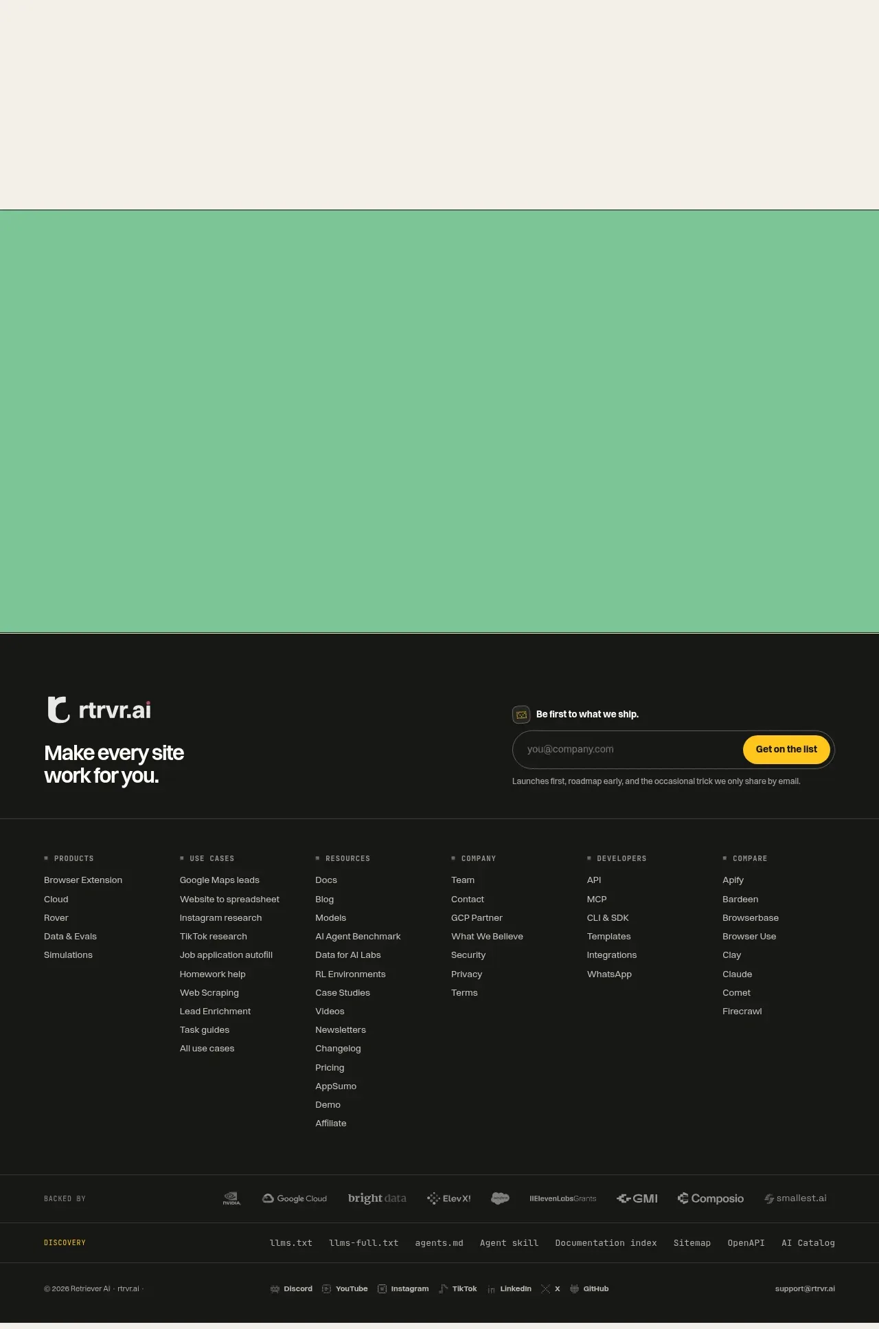
A dark footer combines a strong brand sign-off with an email signup, a broad multi-column sitemap, partner/discovery rows, and a compact legal/social utility bar.
Prompt preview
## Reference images

Study these alongside the description below: hierarchy, rhythm, spacing, colour. Build for the product you are asked about, using this design language.

- Component: https://kage-design-assets.t3.tigrisfiles.io/components/retriever-ai/4363ca9a-43f9-447c-8e7d-56b17f2dfed5-1792044246-6.webp
- Full page it was cut from: https://kage-design-assets.t3.tigrisfiles.io/screenshots/retriever-ai/4363ca9a-43f9-447c-8e7d-56b17f2dfed5-1792044106345-full.webp
- Component on Kage: https://kage.design/component/retriever-footer

## Before you start
Ask what the user's product and brand are, what newsletter promise is legitimate, and which navigation destinations must be included. Then build a footer hierarchy tailored to that product.

Create a large dark footer in four layers. First, use a two-column intro: a simple text-based brand treatment and a concise brand promise on the left, with an email signup module on the right containing a short invitation, input, and bright submit button. Add a thin divider. Second, create a six-column sitemap with small uppercase column headings and compact stacked links. Third, add a subdued partner or “backed by” row and a separate discovery/resources row. Finally, close with a thin utility bar containing copyright, social links, and a support/contact link. Keep all layers inside a max-width container and let columns collapse cleanly on mobile.

Design language: background #171817 or #151615, primary text #f5f1e8, muted text #9b9b91, borders rgba(245,241,232,.14), and accent yellow #ffd21c or coral #ff735f for the submit button. Use a 28–34px bold footer statement, 10px uppercase headings with letter spacing, 12px links, 8px input/button radius, 1px input border, and 56–72px vertical spacing between major layers. Provide visible focus states, useful validation, and a clear success message for the signup form. Keep link columns scannable rather than filling every available space.

Never: copy logos, product names, copy, illustrations, or imagery from the reference.