kage
kage
reasonmachines.com

Design analysis
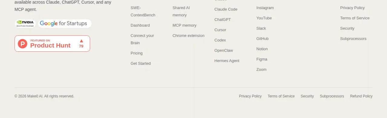
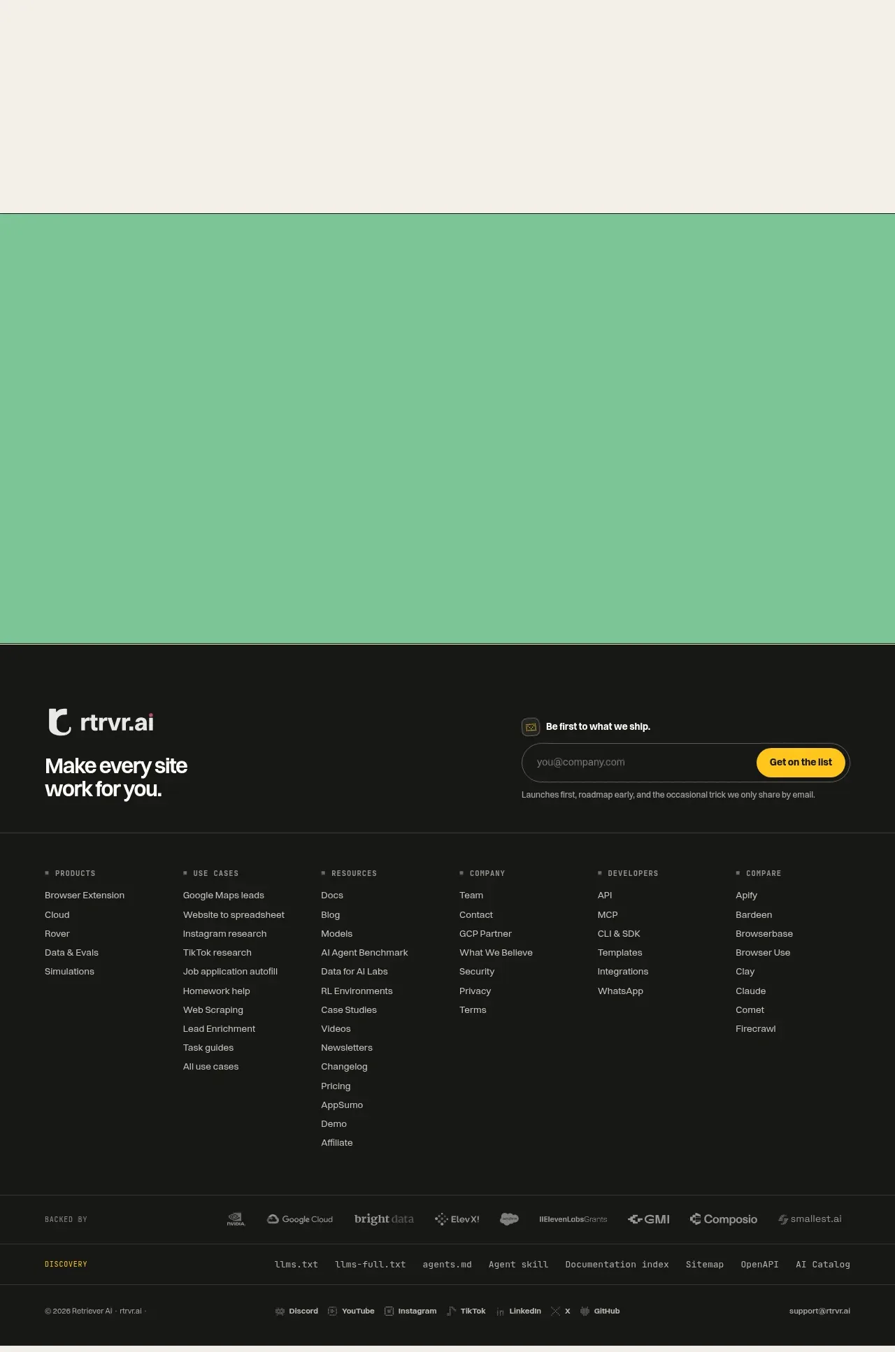
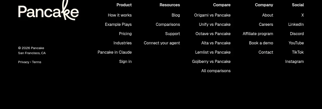
A compact footer uses a single horizontal row to combine trust signals, an independent credential, and low-emphasis utility/legal links. The generous white space keeps it visually quiet while still closing the page with credibility and essential destinations.
Prompt preview
## Reference images

Study these alongside the description below: hierarchy, rhythm, spacing, colour. Build for the product you are asked about, using this design language.

- Component: https://kage-design-assets.t3.tigrisfiles.io/components/reason/2bab5115-4041-4830-a11d-e755b25d1e85-1792044285-1.webp
- Full page it was cut from: https://kage-design-assets.t3.tigrisfiles.io/screenshots/reason/2bab5115-4041-4830-a11d-e755b25d1e85-1792044194874-full.webp
- Component on Kage: https://kage.design/component/reason-footer

## Before you start
Ask the user what their product is, which trust signals are accurate, what legal links are required, and what brand palette and typography they use. Then apply these principles to build an original footer for that product.

Create a compact, full-width footer on a clean near-white background. Use a centered max-width container and a single horizontal flex row on desktop, with trust/credential items grouped on the left and utility, social, privacy, and terms links grouped on the right. Preserve a clear visual separation from the hero using whitespace rather than a heavy divider. On mobile, stack the groups neatly and keep the legal links easy to tap.

Use near-black text around `#202020`, muted utility text around `#707070`, and subtle border or divider tones around `#e5e5e5`. Keep typography small but accessible: approximately 12–14px for metadata and links, with medium weight for the most important trust statement. Use 16–24px horizontal gaps, 24–40px vertical padding, and a max-width consistent with the rest of the page. If showing a certification, security statement, or partner mark, place it in a restrained inline badge with a thin neutral border and a small radius of 2–6px; only use assets supplied by the user.

Make links visibly interactive with a subtle underline, color shift, or opacity change on hover and a clear keyboard focus ring. Keep the footer informational rather than promotional, and use separators sparingly so it does not become visually noisy.

### Never
- Never use logos, product names, copy, illustrations, screenshots, or imagery from the reference.
- Never claim certifications, partnerships, privacy guarantees, or security standards that the user has not verified.
- Never make legal links too small to read or too close together on touch devices.
- Never reproduce the reference footer's exact ordering, labels, or visual assets.