kage
kage
pancake.ai
Design analysis
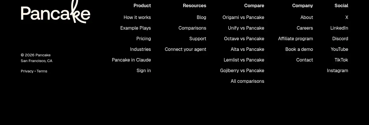
A near-black footer closes the page with a large light wordmark, grouped navigation columns, social links, and a compact legal/copyright area. Strong contrast makes the final navigation easy to scan.
Prompt preview
## Reference images

Study these alongside the description below: hierarchy, rhythm, spacing, colour. Build for the product you are asked about, using this design language.

- Component: https://kage-design-assets.t3.tigrisfiles.io/components/pancake/f2dcc4e1-7584-486e-8c34-37279d03f6e2-1792044192-6.webp
- Full page it was cut from: https://kage-design-assets.t3.tigrisfiles.io/screenshots/pancake/f2dcc4e1-7584-486e-8c34-37279d03f6e2-1792044073540-full.webp
- Component on Kage: https://kage.design/component/pancake-footer

## Before you start
Ask for the user's product name, approved navigation taxonomy, social channels, legal links, location, and preferred footer tone. Apply the information architecture to the user's brand rather than copying the reference.

Build a dark footer beginning after the pricing area. Use near-black `#050505` or `#09070a` as the background and ivory `#fbf7f1` for primary text. Place a large light brand treatment or wordmark on the left, then 4–5 evenly spaced link columns with small uppercase or medium-weight headings and 13–15px links beneath. Include product, resources, company, comparison or solutions, and social groups only when relevant. Put copyright, location, privacy, terms, and other legal details in a compact lower-left or bottom row using muted gray `#aaa3a9`. Use generous 48–72px top padding, 24–32px column gaps, and clear hover/focus underlines or color changes. On mobile, stack the columns into an accordion or two-column list while keeping legal links visible.

Never: use the reference logo, product name, exact copy, illustrations, or imagery.