kage
kage
marqly.com
Design analysis
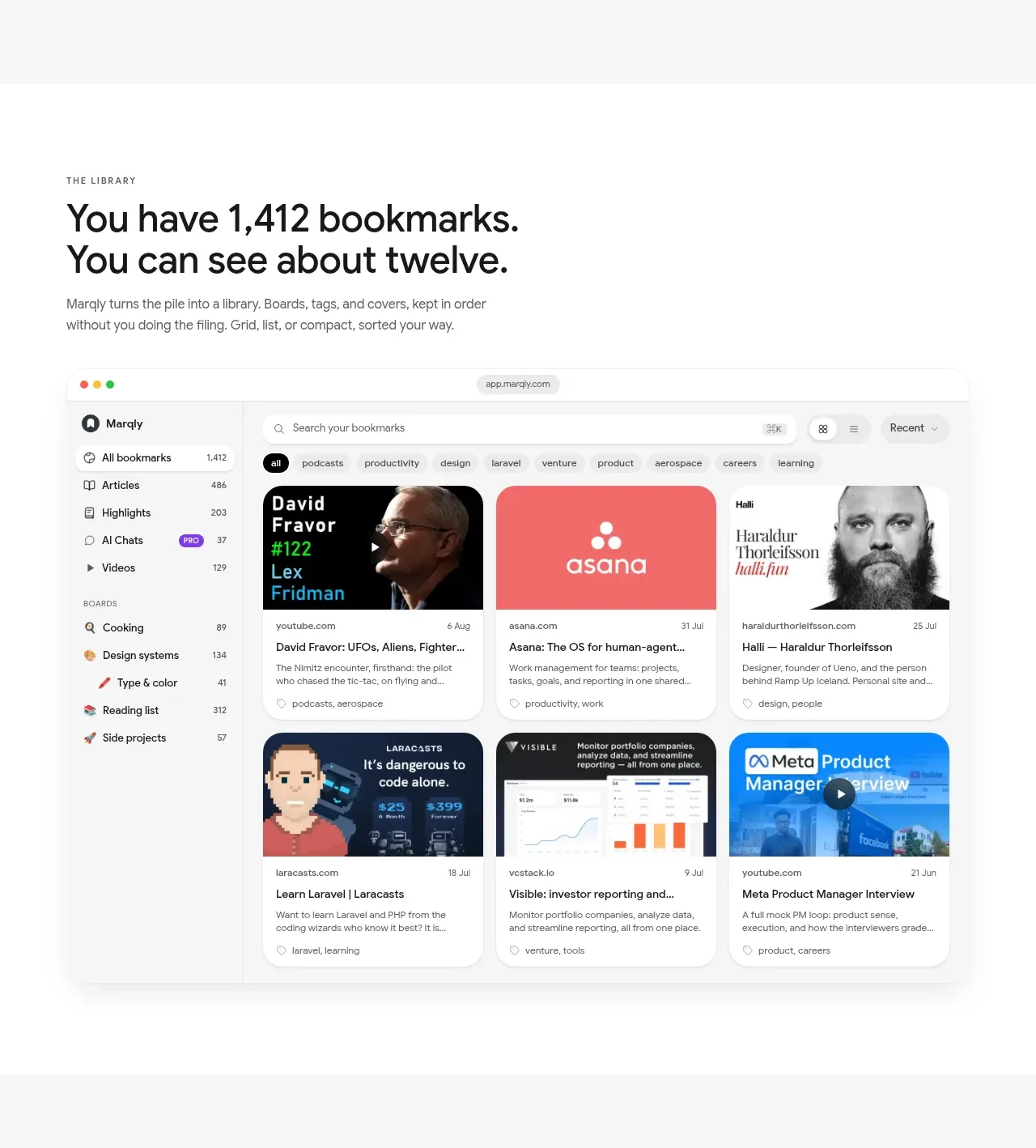
A large library showcase explains the scale of saved content and uses a detailed multi-card interface image as the central proof point.
Prompt preview
## Reference images

Study these alongside the description below: hierarchy, rhythm, spacing, colour. Build for the product you are asked about, using this design language.

- Component: https://kage-design-assets.t3.tigrisfiles.io/components/marqly-6-0/c854bda3-2558-4a76-a0fe-ed0b4296df4d-1789452131-3.webp
- Full page it was cut from: https://kage-design-assets.t3.tigrisfiles.io/screenshots/marqly-6-0/c854bda3-2558-4a76-a0fe-ed0b4296df4d-1789452075868-full.webp
- Component on Kage: https://kage.design/component/marqly-6-0-gallery

## Before you start
Ask what the user's product is, who it serves, and what its brand personality should be. Apply the principles below to that product rather than copying the reference.

Create a product showcase section for a searchable content library. Use a small uppercase eyebrow, a large left-aligned heading, and a supporting sentence above a wide desktop dashboard mockup. The dashboard should show a sidebar, search/filter controls, and a visually rich grid of content cards with varied thumbnails, labels, and dates. Use a white background #ffffff against a light gray page area #f5f5f3, black text #151515, subtle gray dividers #e4e5e4, and selective pastel thumbnail colours. Give the mockup a 16–22px radius, a very soft shadow, and enough internal whitespace that it reads as a real product rather than a flat screenshot. Use a 40–48px heading, 14px body copy, and a max content width around 1080px. On small screens, turn the sidebar into a filter button and reduce the grid to one or two columns.

Never: use the reference logo, product name, copy, illustrations, imagery, or brand assets.