kage
kage
marqly.com

Design analysis
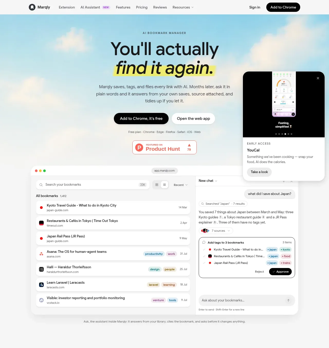
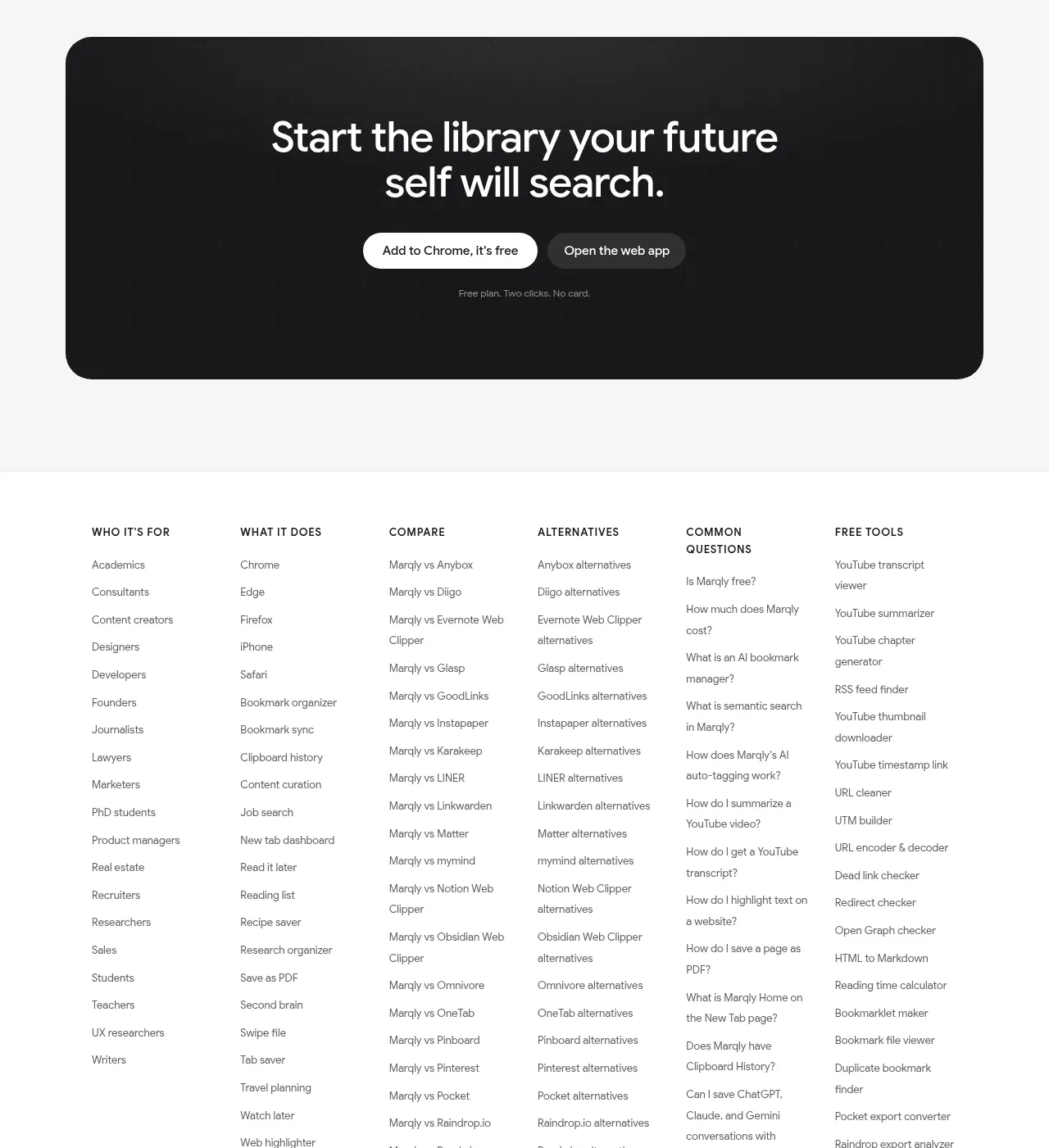
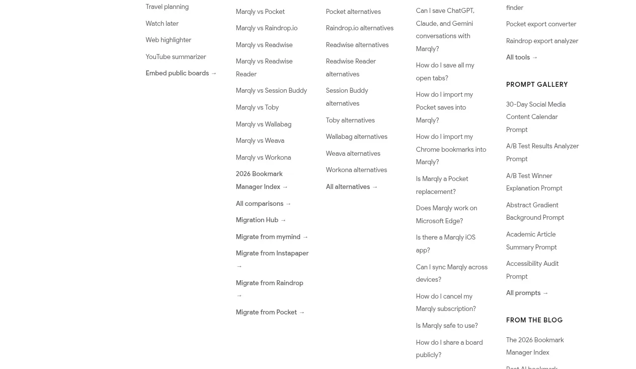
A long-form product landing page uses a restrained white and very light gray canvas, oversized black sans-serif headlines, and yellow marker-style highlights to create hierarchy without a loud brand palette. The page alternates spacious editorial feature sections with large browser and mobile UI mockups, then tightens into pricing, testimonials, FAQ, a dark conversion panel, and an unusually information-dense multi-column footer; below the hero, the rhythm shifts from feature storytelling to comparison and decision support.
Prompt preview
## Reference images

Study these alongside the description below: hierarchy, rhythm, spacing, colour. Build for the product you are asked about, using this design language.

- Full page: https://kage-design-assets.t3.tigrisfiles.io/screenshots/marqly-6-0/c854bda3-2558-4a76-a0fe-ed0b4296df4d-1789452075868-full.webp
- Above the fold: https://kage-design-assets.t3.tigrisfiles.io/screenshots/marqly-6-0/c854bda3-2558-4a76-a0fe-ed0b4296df4d-1789452071527.webp
- Design on Kage: https://kage.design/designs/marqly-6-0-landing-page

## Before you start
Ask the user what they are building, who it is for, and what brand assets they already have, including the product name, colours, typography, logo, and any existing UI or imagery. Wait for their answers before designing. Apply the reference's structural and visual principles to that product, not to the reference product.

## Page structure
1. **Slim top navigation:** Place a compact white header with a small product mark at left, a horizontal set of product and resource links, and lightweight sign-in and primary CTA actions at right.
2. **Hero:** Use a pale, airy hero with a small uppercase eyebrow, a large two-line headline, one or two words emphasized with a hand-marked highlight, concise supporting copy, paired CTAs, and small platform/trust metadata. Anchor the hero with a large browser application mockup and a floating mobile/product preview overlapping its upper-right area.
3. **AI assistant feature:** Introduce the assistant with a left-aligned eyebrow and large headline, followed by explanatory copy and a small trial note. Show a wide, muted browser mockup with an integrations/permissions modal, then add four compact supporting feature cards in a row beneath it.
4. **Library feature:** On a white section, state the scale and value of the library in a large headline and short paragraph. Show a large browser mockup of a sidebar and card-based bookmark grid, using the product interface as the main visual.
5. **Retrieval/search feature:** Use a light gray split layout: left column for eyebrow, headline with a yellow-highlighted phrase, and copy; right column for a large semantic/full-text search result mockup.
6. **Capture feature:** Present the saving workflow with a left-aligned heading and description, followed by two side-by-side pastel-backed UI panels for creating a bookmark and highlighting/recalling text. Add a wider lower row pairing a video card with an AI-generated transcript/summary panel.
7. **Backlog/import feature:** Use another pale gray split section with copy on the left and a large categorization/AI organizer mockup on the right. Explain importing an existing messy collection and approving suggested organization.
8. **AI chats feature:** On white, pair left-column copy about saved conversations with a wide chat/search interface on the right, then place three smaller pastel conversation cards beneath it for different AI providers or use cases.
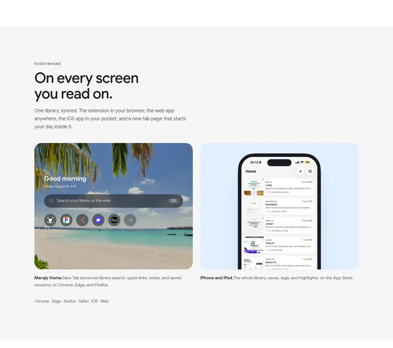
9. **Everywhere feature:** Return to a gray section with copy on the left and two large visual cards on the right/below: a browser start/search screen over a photographic background and a phone app mockup on a cool pastel background. Include a small platform compatibility line.
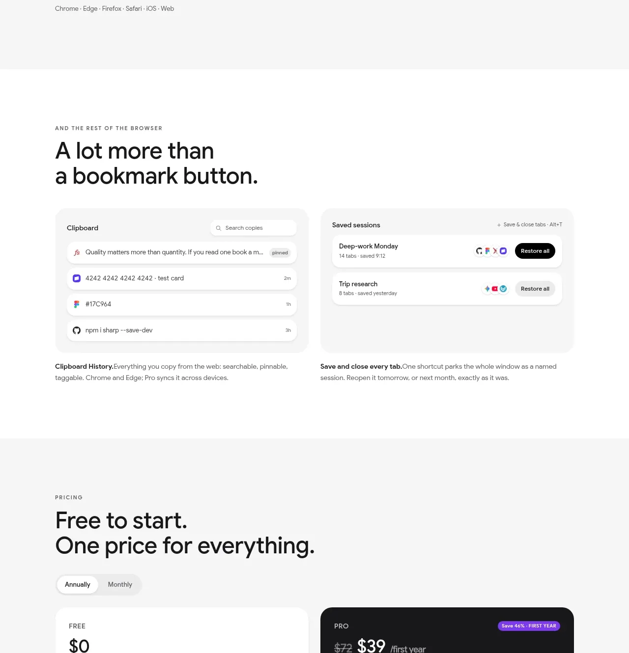
10. **Additional browser tools:** Use a white section with a large heading and two compact side-by-side utility panels, such as searchable clipboard history and restorable saved sessions, with short captions below each.
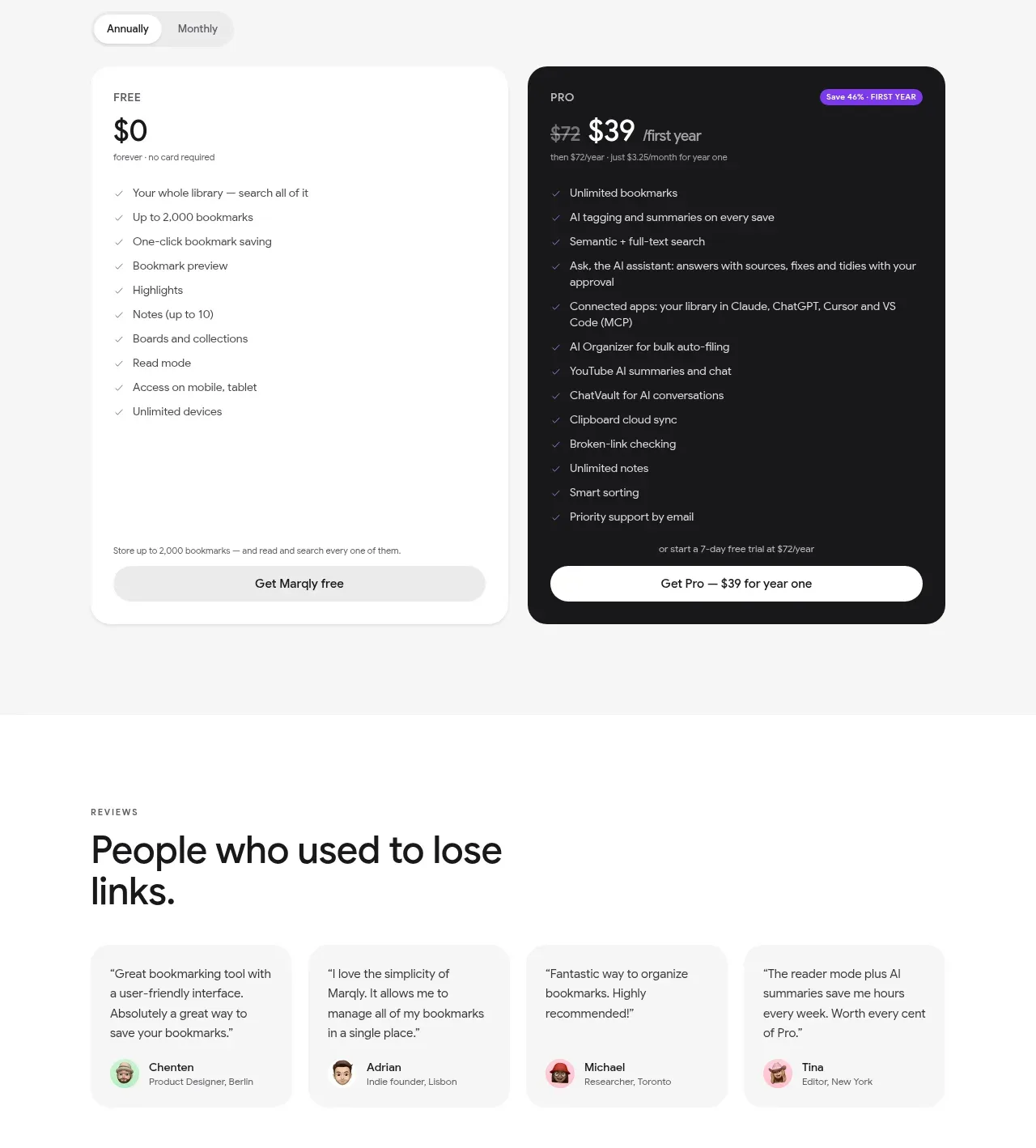
11. **Pricing:** Create a light gray pricing section with a heading, annual/monthly toggle, and two large contrasting cards: a white free plan and a near-black paid plan with a small purple savings badge. Use dense checklists and full-width pill CTAs.
12. **Reviews:** On white, show a heading followed by four small testimonial cards in a row, each with short text and a compact avatar/name attribution.
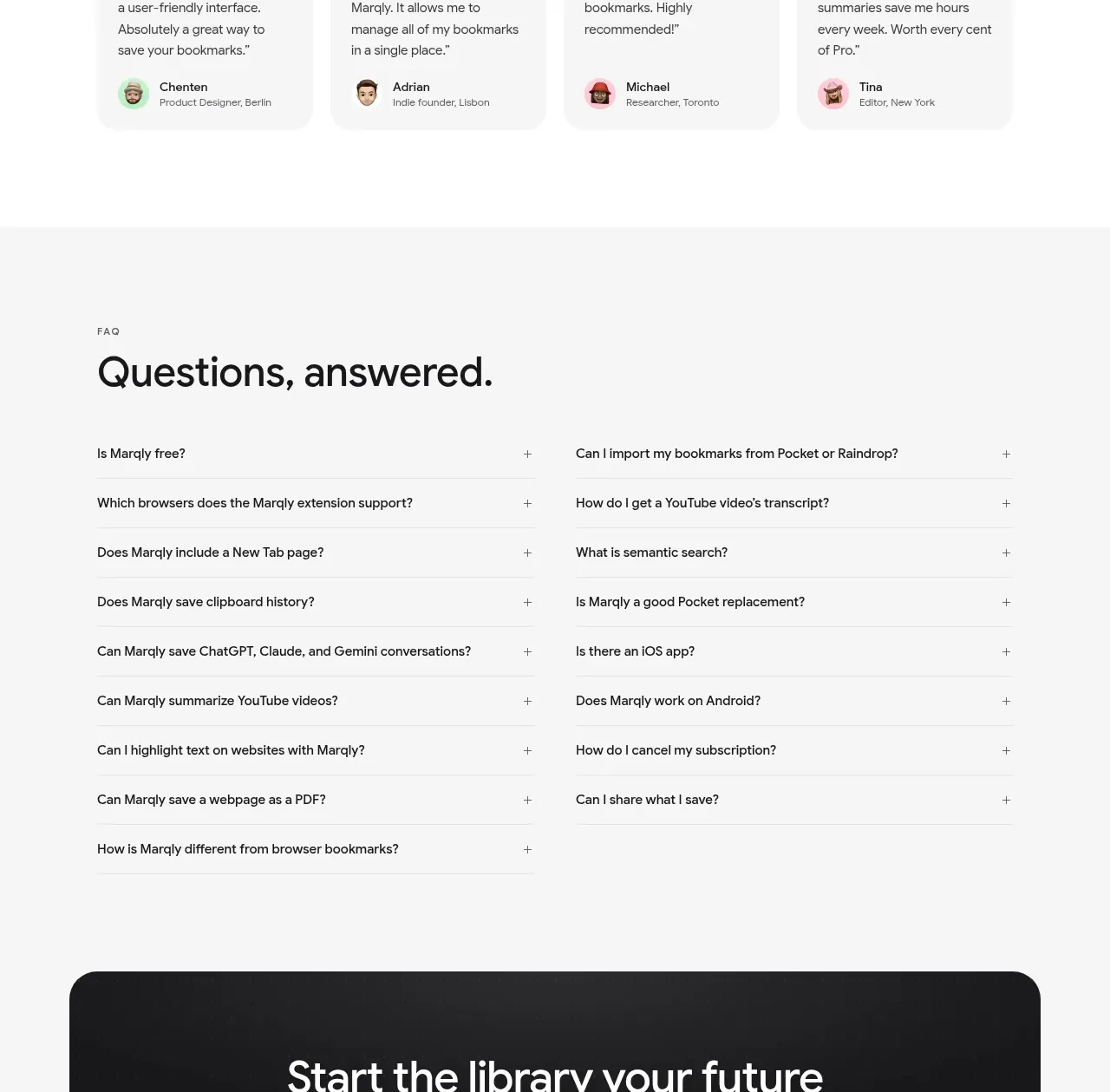
13. **FAQ:** Use a pale gray FAQ section with a large heading and a two-column list of evenly spaced question rows, each ending with a small plus affordance.
14. **Final CTA:** Place a wide, rounded near-black panel with centered heading, paired light/dark buttons, and quiet supporting metadata.
15. **Upper footer link directory:** Follow with a white, highly dense multi-column directory of audience links, feature links, comparison pages, alternatives, common questions, free tools, prompt gallery, and blog links.
16. **Lower footer:** Add a second, more compact footer navigation area with the product description, grouped product/download/compare/resources/company links, language selector row, copyright, and a small legal or attribution item.

## Design language
- Build hierarchy through scale and spacing rather than saturated colour: use near-black text around `#171717`, secondary gray around `#6f6f6f`, white `#ffffff`, and alternating section backgrounds around `#f6f6f4` or `#f2f2f0`.
- Use a modern, slightly humanist sans-serif. Make hero and section headlines large, tight, and nearly black; use small uppercase eyebrow labels with generous letter spacing; keep body copy compact and readable at roughly 14–16px.
- Use yellow as a restrained annotation device, approximately `#f4ed3d`: apply it behind select words in headlines like a marker stroke rather than as a general fill or button colour.
- Let the page alternate rhythm: spacious headline-plus-mockup sections, then denser supporting cards, then decision-oriented pricing, reviews, FAQ, and an information-heavy footer. Keep most content in a centered max-width grid with generous vertical padding.
- Treat product screenshots as the dominant imagery. Frame browser windows with subtle chrome, thin gray borders, soft ambient shadows, and restrained corner radii around 12–18px; use larger 20–28px radii for major panels and the final CTA.
- Keep buttons compact and pill-shaped, with a black primary action, white or pale secondary action, and strong text contrast. Use thin dividers and small plus signs for FAQ rows instead of heavy component chrome.
- Use pastel support surfaces sparingly behind feature imagery—soft blue, green, pink, and beige—while keeping the surrounding layout mostly monochrome. Photography, where needed for a product-specific asset, should sit inside a rounded feature card rather than dominate the page.
- Make the page feel calm and precise: avoid gradients, excessive shadows, decorative illustrations, and ornamental iconography. Use subtle hover colour or elevation changes, expand FAQ rows in place, and keep motion limited to gentle reveal and mockup hover/scroll cues.
- On responsive layouts, collapse navigation into a compact menu, stack split feature sections and pricing cards, turn card rows into horizontal scroll or one-column lists, and preserve the strong headline-to-product-preview relationship.

## Never
Do not copy the reference's logos, wordmarks, product name, exact copy, screenshots, UI data, testimonials, illustrations, photography, icons, or branded assets. Do not present the result as Marqly or imply affiliation with it. Create original content, product mockups, and visual assets for the user's product while preserving only the reusable layout and design language.
Components from this page
All components
 Primary navigation bar
Marqly 6.0 · Navigation
Primary navigation bar
Marqly 6.0 · Navigation
 AI-powered bookmark manager hero
Marqly 6.0 · Hero
AI-powered bookmark manager hero
Marqly 6.0 · Hero
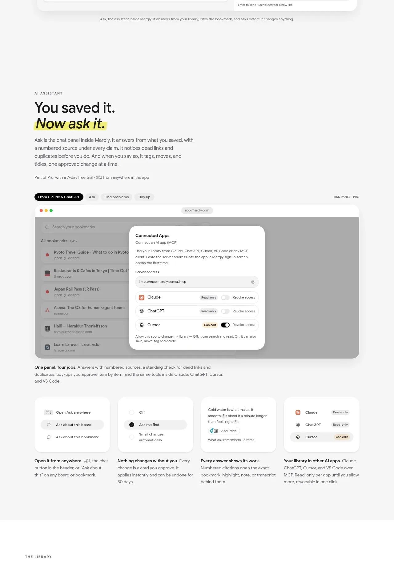 AI assistant capabilities
Marqly 6.0 · Feature grid
AI assistant capabilities
Marqly 6.0 · Feature grid
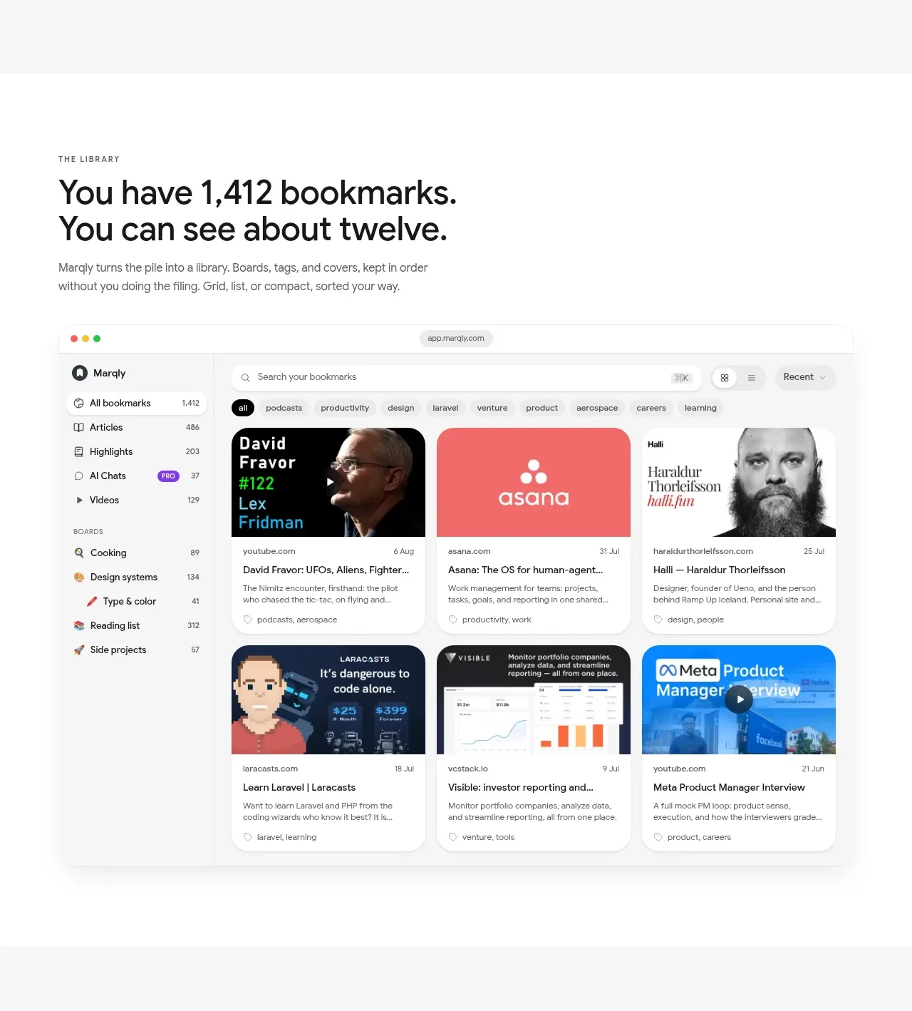 Bookmark library showcase
Marqly 6.0 · Gallery
Bookmark library showcase
Marqly 6.0 · Gallery
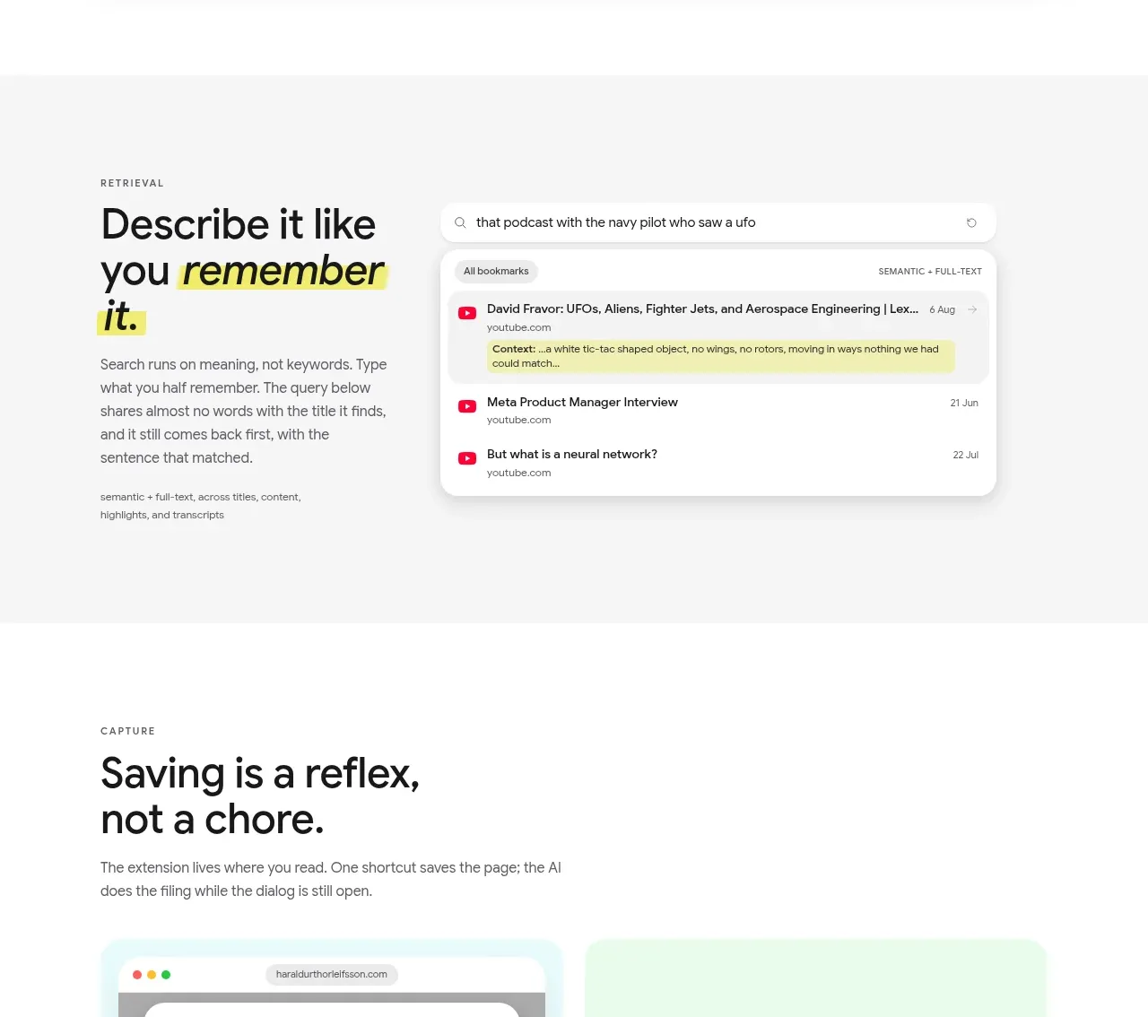 Semantic search feature
Marqly 6.0 · Feature grid
Semantic search feature
Marqly 6.0 · Feature grid
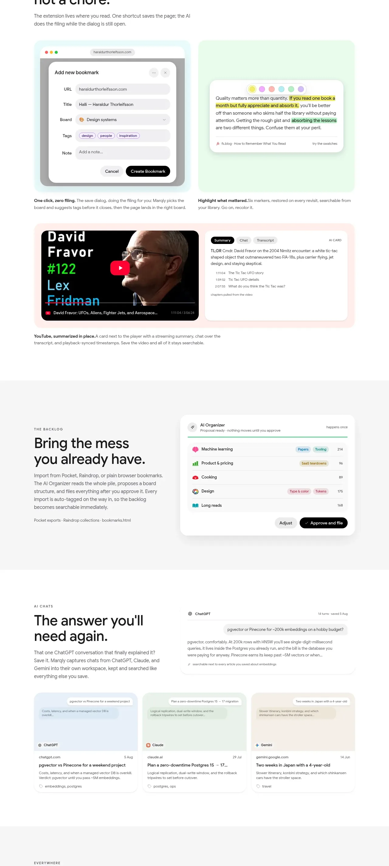 Capture, highlight, and summarize
Marqly 6.0 · Feature grid
Capture, highlight, and summarize
Marqly 6.0 · Feature grid
 Organize the existing backlog
Marqly 6.0 · Feature grid
Organize the existing backlog
Marqly 6.0 · Feature grid
 AI chat memory
Marqly 6.0 · Feature grid
AI chat memory
Marqly 6.0 · Feature grid
 Available everywhere
Marqly 6.0 · Gallery
Available everywhere
Marqly 6.0 · Gallery
 Browser productivity tools
Marqly 6.0 · Feature grid
Browser productivity tools
Marqly 6.0 · Feature grid
 Free and pro pricing
Marqly 6.0 · Pricing table
Free and pro pricing
Marqly 6.0 · Pricing table
 Customer review cards
Marqly 6.0 · Testimonials
Customer review cards
Marqly 6.0 · Testimonials