kage
kage
marqly.com
Design analysis
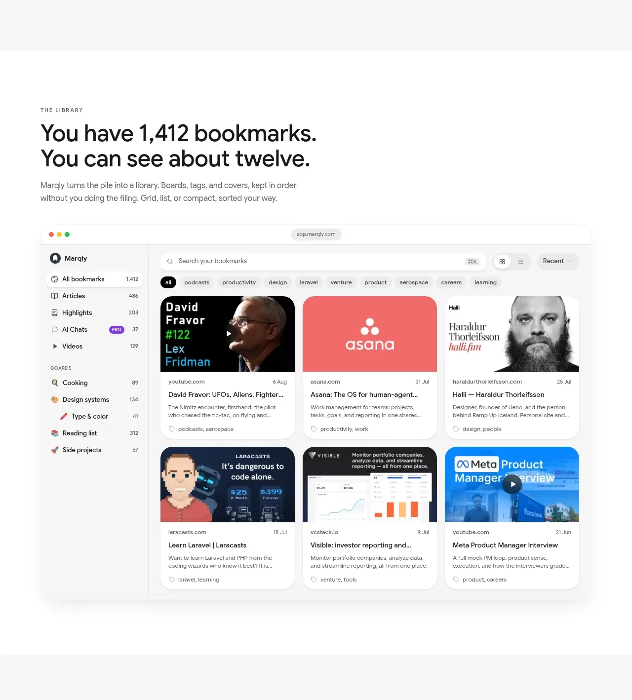
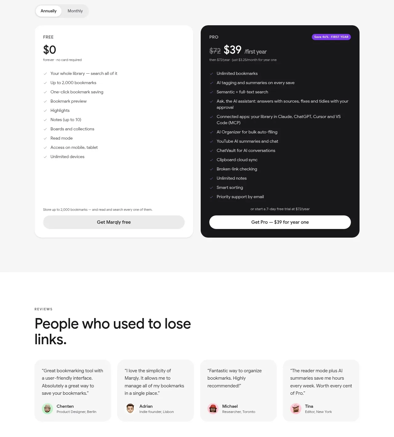
A platform-availability section uses two contrasting visual cards—web and mobile—to communicate that the library follows the user across screens.
Prompt preview
## Reference images

Study these alongside the description below: hierarchy, rhythm, spacing, colour. Build for the product you are asked about, using this design language.

- Component: https://kage-design-assets.t3.tigrisfiles.io/components/marqly-6-0/c854bda3-2558-4a76-a0fe-ed0b4296df4d-1789452134-8.webp
- Full page it was cut from: https://kage-design-assets.t3.tigrisfiles.io/screenshots/marqly-6-0/c854bda3-2558-4a76-a0fe-ed0b4296df4d-1789452075868-full.webp
- Component on Kage: https://kage.design/component/marqly-6-0-gallery-2

## Before you start
Ask what the user's product is, who it serves, and what its brand personality should be. Apply the principles below to that product rather than copying the reference.

Create an availability section with an eyebrow, large headline, short paragraph, and two equal visual cards: one for a browser/web experience and one for a phone or tablet experience. Use a light gray background #f5f6f4, near-black #171719 text, and varied but brand-neutral visual surfaces: a soft aqua/sky panel #dff5fb for mobile and a scenic or abstract teal panel #bfe8e4 for web, generated specifically for the user's product. Use 38–44px heading size, 14px body, 20px card corners, clipped media, and low-contrast shadows. Add small platform labels beneath each card and a compact compatibility line below. Keep the media aspect ratios consistent and stack cards on mobile. Provide hover/focus states that do not obscure labels.

Never: use the reference logo, product name, copy, illustrations, imagery, or brand assets.