 kage
kage
mermaidonline.live
Design analysis
A centered conversion band presents a strong invitation, one supporting sentence, and a single blue launch button. Faint concentric linework gives the otherwise white section a subtle sense of depth.
Prompt preview
## Reference images

Study these alongside the description below: hierarchy, rhythm, spacing, colour. Build for the product you are asked about, using this design language.

- Component: https://kage-design-assets.t3.tigrisfiles.io/components/mermaidonline-live/7b9ecc63-d7b9-4b92-a5d2-b69508fba7f2-1792152745-9.webp
- Full page it was cut from: https://kage-design-assets.t3.tigrisfiles.io/screenshots/mermaidonline-live/7b9ecc63-d7b9-4b92-a5d2-b69508fba7f2-1792152710959-full.webp
- Component on Kage: https://kage.design/component/mermaidonline-live-cta

## Before you start
Ask what the user's primary conversion action is and what brand mood should shape the final call to action. Apply these rules without copying the reference.

Create a centered CTA band with a bold headline, one concise supporting sentence, and one primary button. Use generous 64–88px vertical padding, a white or near-white background, and an extremely subtle decorative radial/concentric line pattern behind the content. Use charcoal #2f3135, gray #73777d, and blue #4285df for the button, with white button text, 8px radius, and a modest shadow. Keep the CTA single-purpose, with strong contrast and a visible keyboard focus state. On mobile, make the button comfortably full-width without making the section feel crowded.

Never: use logos, product names, copy, illustrations, or imagery from the reference.
More components

 Final conversion banner
CrewTower Mod for Claude Code · Call to action
Final conversion banner
CrewTower Mod for Claude Code · Call to action
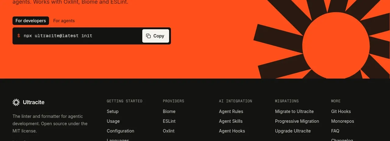
 Bright installation call to action
Ultracite v8 · Call to action
Bright installation call to action
Ultracite v8 · Call to action
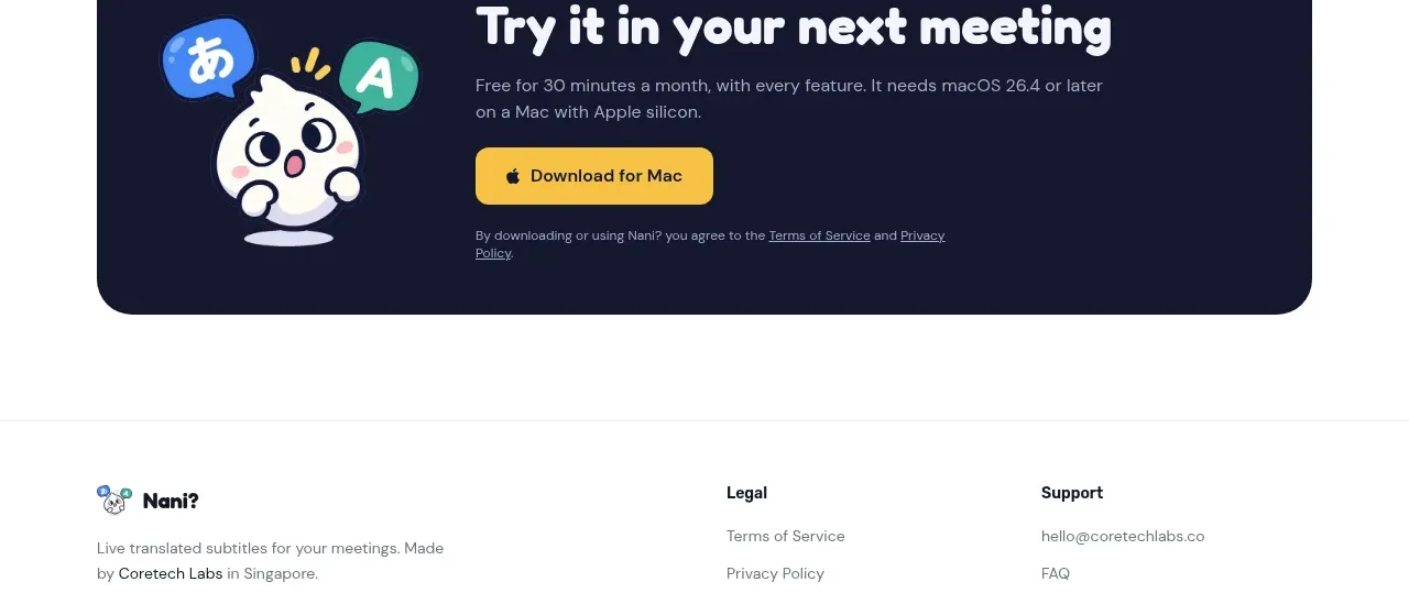
 Download call to action
NANI??? · Call to action
Download call to action
NANI??? · Call to action
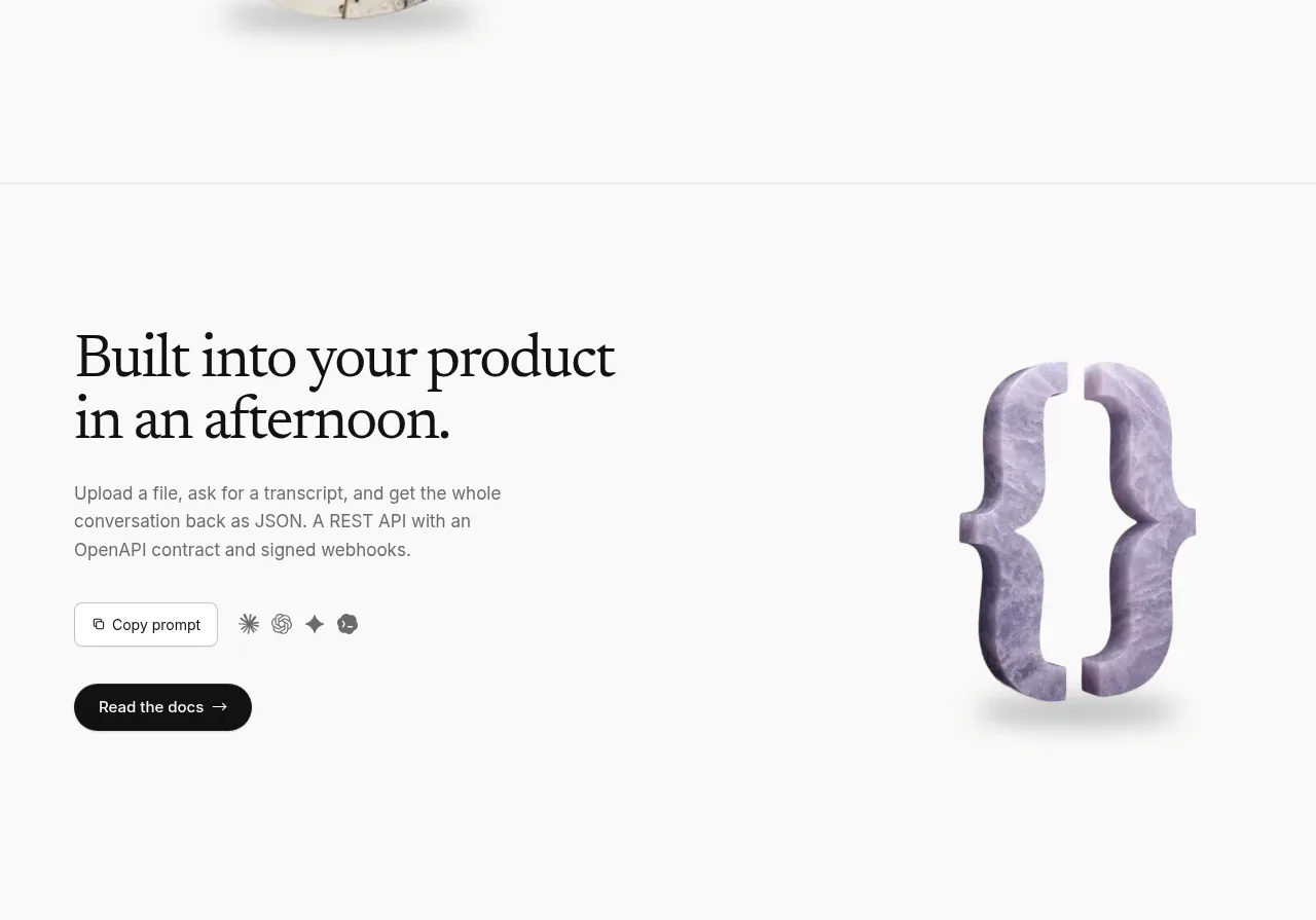
 Developer integration CTA
Maybloc · Call to action
Developer integration CTA
Maybloc · Call to action
 Marble-backed final CTA
Maybloc · Call to action
Marble-backed final CTA
Maybloc · Call to action
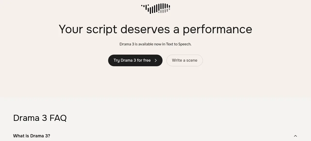
 Centered conversion call to action
Fish Audio Drama 3 · Call to action
Centered conversion call to action
Fish Audio Drama 3 · Call to action