kage
kage
mermaidonline.live

Design analysis
A long, white SaaS landing page combines a light technical grid with a centered hero and an immediately usable diagram-generation prompt box. Below the hero, the rhythm shifts from a dense editor/preview demonstration to spacious two-column explanation sections, a horizontal three-step workflow, icon-led feature blocks, FAQ columns, CTA, and a three-card pricing area. Blue is the primary action colour, while green, purple, yellow, and orange appear as restrained accents in editor controls, diagrams, and plan buttons; cards use thin gray borders, small radii, and very soft shadows.
Prompt preview
## Reference images

Study these alongside the description below: hierarchy, rhythm, spacing, colour. Build for the product you are asked about, using this design language.

- Full page: https://kage-design-assets.t3.tigrisfiles.io/screenshots/mermaidonline-live/7b9ecc63-d7b9-4b92-a5d2-b69508fba7f2-1792152710959-full.webp
- Above the fold: https://kage-design-assets.t3.tigrisfiles.io/screenshots/mermaidonline-live/7b9ecc63-d7b9-4b92-a5d2-b69508fba7f2-1792152705032.webp
- Design on Kage: https://kage.design/designs/mermaidonline-live-landing-page

## Before you start
Ask the user what they are building, who it is for, and what brand assets they already have (brand name, colours, typography, logo or other visual assets). Wait for their answers before designing. Apply everything below to their product, not to the reference product.

## Page structure
1. **Top navigation** — Create a slim white header with a compact brand mark and name on the left, a row of product and resource links in the middle, and language selection plus a blue sign-in button on the right.
2. **Hero announcement and headline** — Place a small blue “new” badge above a large, centered two-line headline. Add a short gray explanatory paragraph beneath it.
3. **Hero interactive input** — Put a wide rounded bordered prompt/editor surface below the copy, with placeholder text, a small mode selector in the lower-left, and a disabled-looking circular submit control in the lower-right. Add a tiny keyboard hint underneath. Use a faint technical grid behind the hero and allow a floating support/chat affordance at the right edge.
4. **Product introduction** — Add a centered eyebrow, repeated product-specific headline pattern adapted to the user’s product, and a short supporting paragraph. Follow it with four evenly spaced capabilities, each using a small colored line icon and a concise label.
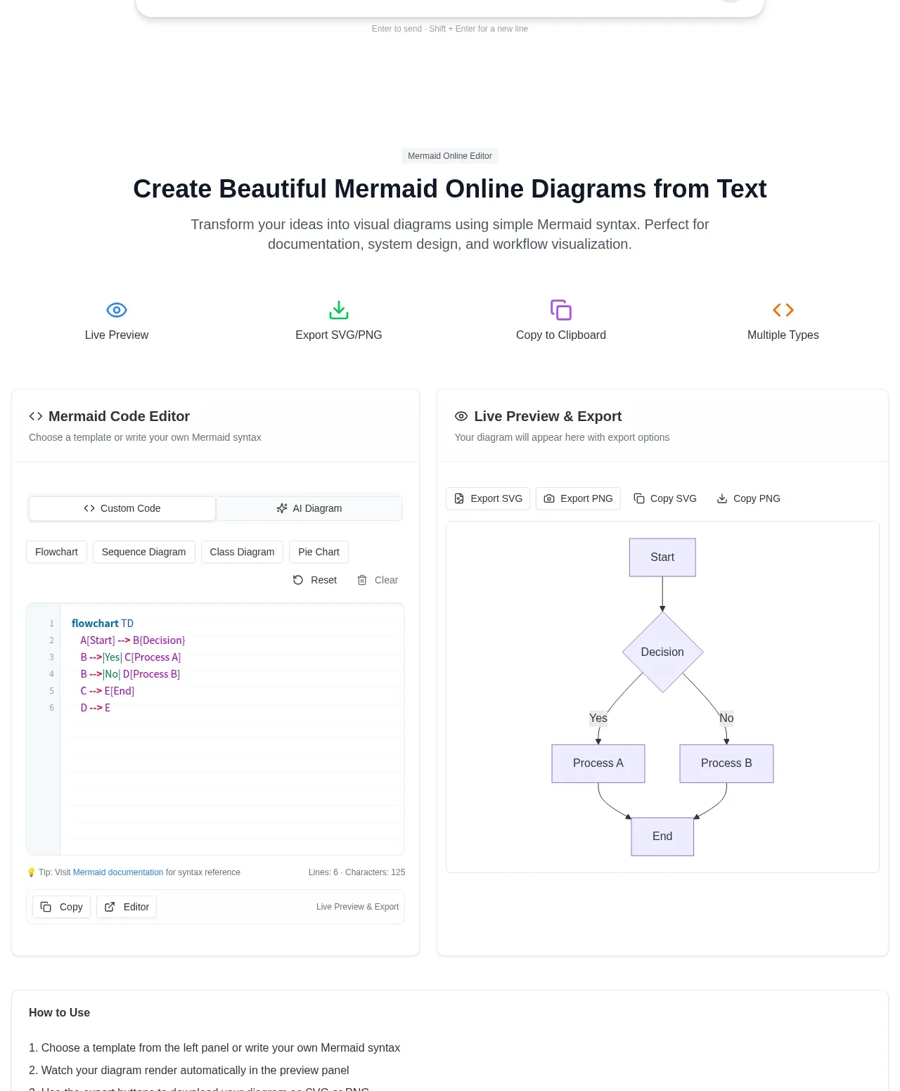
5. **Editor and preview showcase** — Use a two-column card layout: a code/editor panel on the left with tabs, template chips, syntax-colored sample text, and utility controls; a live rendered output/preview panel on the right with export and copy actions. Keep both panels equal in height with clear internal dividers.
6. **How-to-use checklist card** — Add a full-width bordered card containing a short numbered list that explains the editor workflow from choosing a template or writing code through previewing and exporting.
7. **What-is-this-product section** — Switch to a spacious two-column layout. Show a product interface or diagram image on the left and a heading, descriptive paragraph, and three vertically stacked benefits with small icons on the right.
8. **Why-choose-us section** — Reverse the visual emphasis with an accordion/list on the left and a large supporting product image on the right. Give each accordion row a thin divider, compact icon, label, and chevron; show one expanded item with supporting text.
9. **Three-step process** — Use a wide horizontal timeline with three numbered steps connected by a thin line. Each step has a title and short description, with the first step visually emphasized using a blue filled number marker.
10. **Key features** — Present four feature blocks in a two-column grid. Use circular outlined icon containers, bold titles, and quiet gray descriptions; maintain generous whitespace rather than card-heavy decoration.
11. **FAQ** — Center a small blue FAQ eyebrow, heading, and supporting line, then lay out four numbered question-and-answer blocks in two columns. Use small outlined number squares and concise gray body copy.
12. **Closing CTA** — Add a centered call to action with a large heading, short subtitle, blue button, and extremely subtle radiating curved-line decoration in the background.
13. **Pricing section** — Introduce three equal pricing cards for recurring, one-time, and lifetime access. Include plan labels, prices, primary buttons with distinct green, black, and purple treatments, and vertically stacked checkmarked feature lists; give the featured or default plan a thin yellow outline.
14. **Footer** — Finish with a multi-column footer. Put the brand summary and contact/repository links on the left, then several dense link columns for AI tools, product conversions, templates, and resources. Add a thin divider and a bottom row with copyright plus privacy and terms links.

## Design language
- Build hierarchy with a very large, heavy sans-serif headline, medium-weight section headings, and small gray utility text. Use tight headline line-height around 0.98–1.08 and comfortable body line-height around 1.45–1.6.
- Keep the page predominantly white and spacious. Start with the most interactive and visually dense editor demo, then progressively use more whitespace as the page moves through explanation, process, features, FAQ, and CTA before becoming denser again in pricing and the footer.
- Use a restrained technical palette: white and near-black text such as #242424, muted gray copy around #6f6f6f, pale borders around #e5e5e5, and primary blue around #3b82e6. Reserve green around #10a66f, purple around #6040ee, yellow around #e1b52e, and orange around #d8892f for controls, feature accents, diagrams, or plan differentiation.
- Pair a neutral modern sans-serif for all text with syntax-colored monospace text inside code surfaces. Scale the hero headline prominently, section headings to roughly 30–42px, card headings to 15–20px, and supporting text to 13–16px.
- Use thin 1px gray borders, approximately 8–14px corner radii, and very soft shadows only on interactive cards and editor surfaces. Avoid heavy elevation, glossy gradients, and dark panels.
- Use faint graph-paper grid lines behind the hero, but keep the rest of the page mostly untextured. Let diagrams, screenshots, and code samples provide the visual variety instead of decorative illustrations.
- Use simple outlined or line icons with one accent colour per feature group. Keep controls compact, rectangular, and functional, with subtle hover and focus states; primary buttons may use a small radius and a light shadow.
- Make the editor demo feel interactive: tabs, template chips, copy/export actions, textarea focus, preview updates, and a disabled-to-active submit state should be visually clear. Accordions should expand one item at a time, FAQ questions should be keyboard accessible, and pricing buttons should have clear hover feedback.
- Keep the layout centered in a wide max-width container, use two-column sections at desktop widths, and collapse editor, explanatory, feature, FAQ, pricing, and footer columns into a readable single-column flow on small screens.

## Never
- Do not copy the reference product’s logo, wordmark, product name, exact copy, diagrams, screenshots, illustrations, or icon set.
- Do not present the result as Mermaid Online or imply affiliation with it.
- Do not reuse the reference pricing values, plan names, AI/product link taxonomy, or branded visual assets; generate content and assets appropriate to the user’s product.
- Do not make the page a generic dark SaaS template, an overly decorative illustration page, or a wall of identical cards.
Components from this page
All components
 Top navigation
mermaidonline.live · Navigation
Top navigation
mermaidonline.live · Navigation
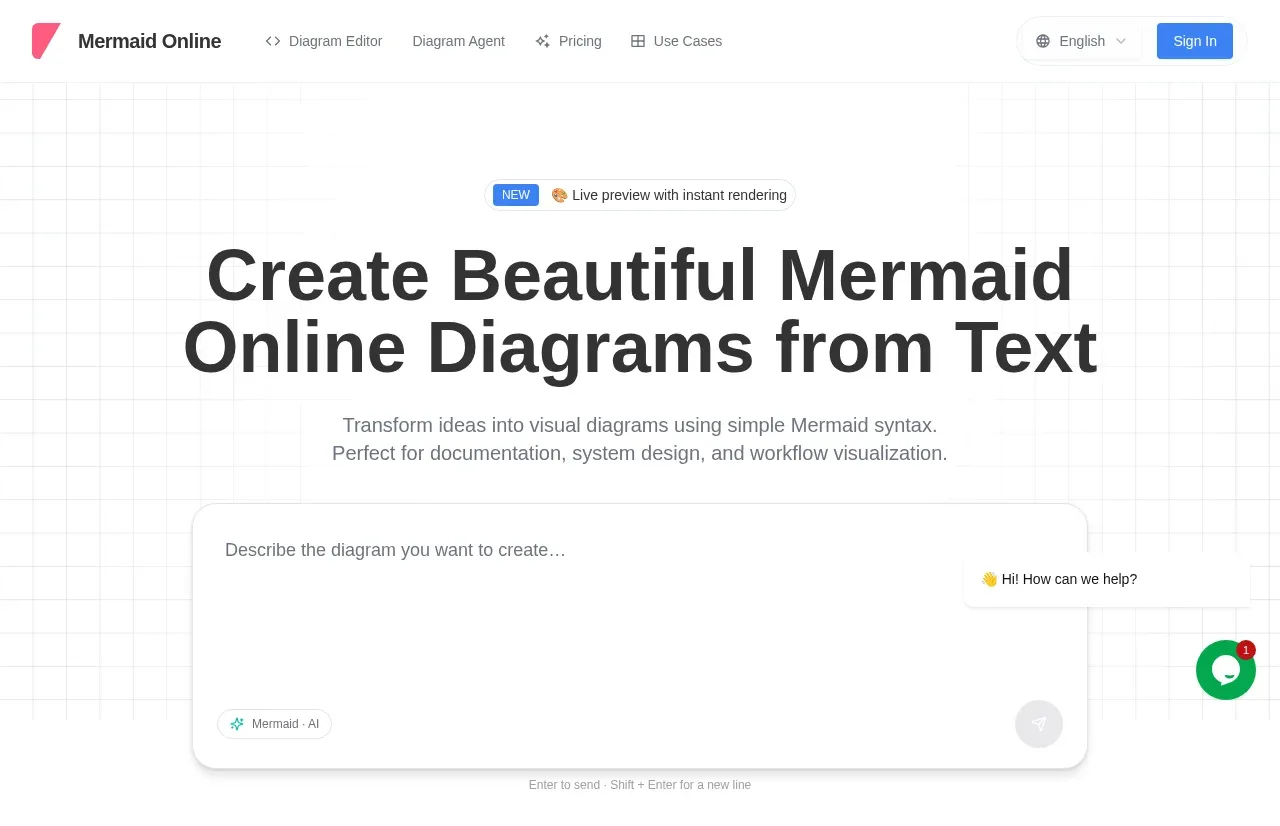 Diagram creation hero
mermaidonline.live · Hero
Diagram creation hero
mermaidonline.live · Hero
 Online editor workspace
mermaidonline.live · Feature grid
Online editor workspace
mermaidonline.live · Feature grid
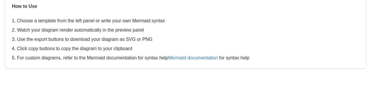 How-to-use instruction card
mermaidonline.live · Card
How-to-use instruction card
mermaidonline.live · Card
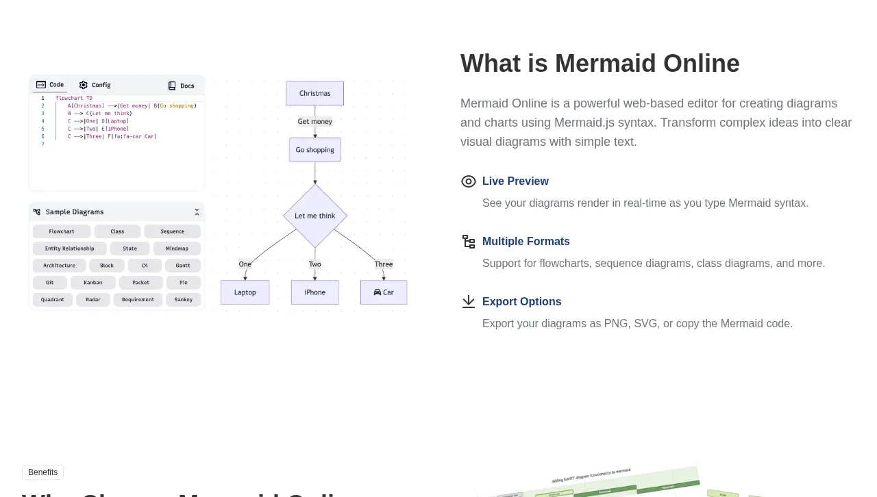 What the product is
mermaidonline.live · Feature grid
What the product is
mermaidonline.live · Feature grid
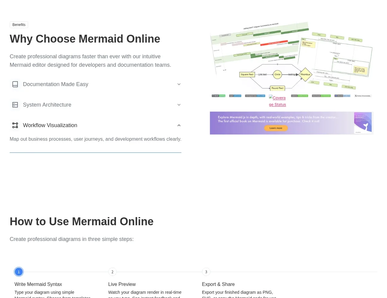 Why choose the product
mermaidonline.live · Feature grid
Why choose the product
mermaidonline.live · Feature grid
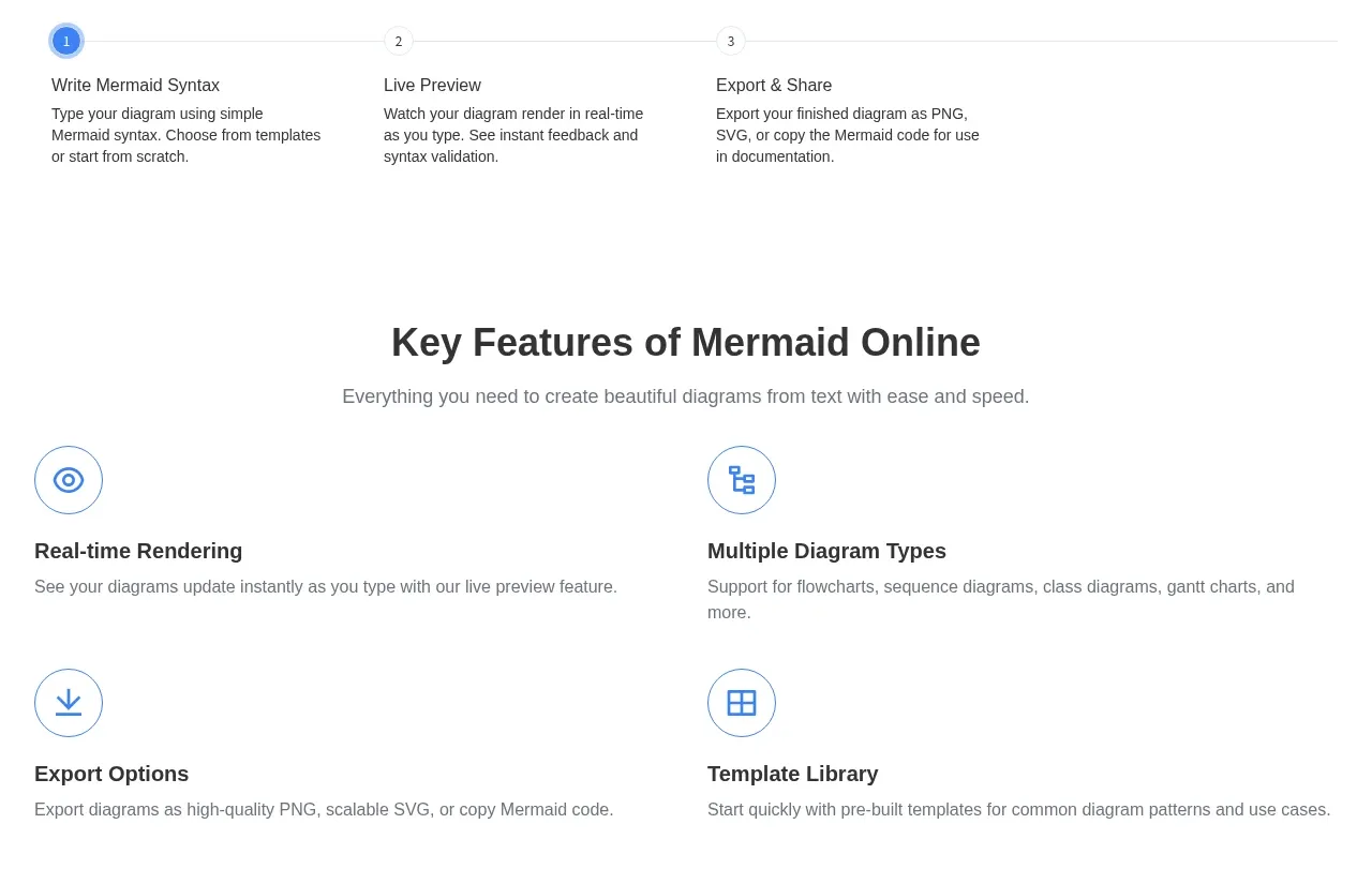 Three-step workflow
mermaidonline.live · Feature grid
Three-step workflow
mermaidonline.live · Feature grid
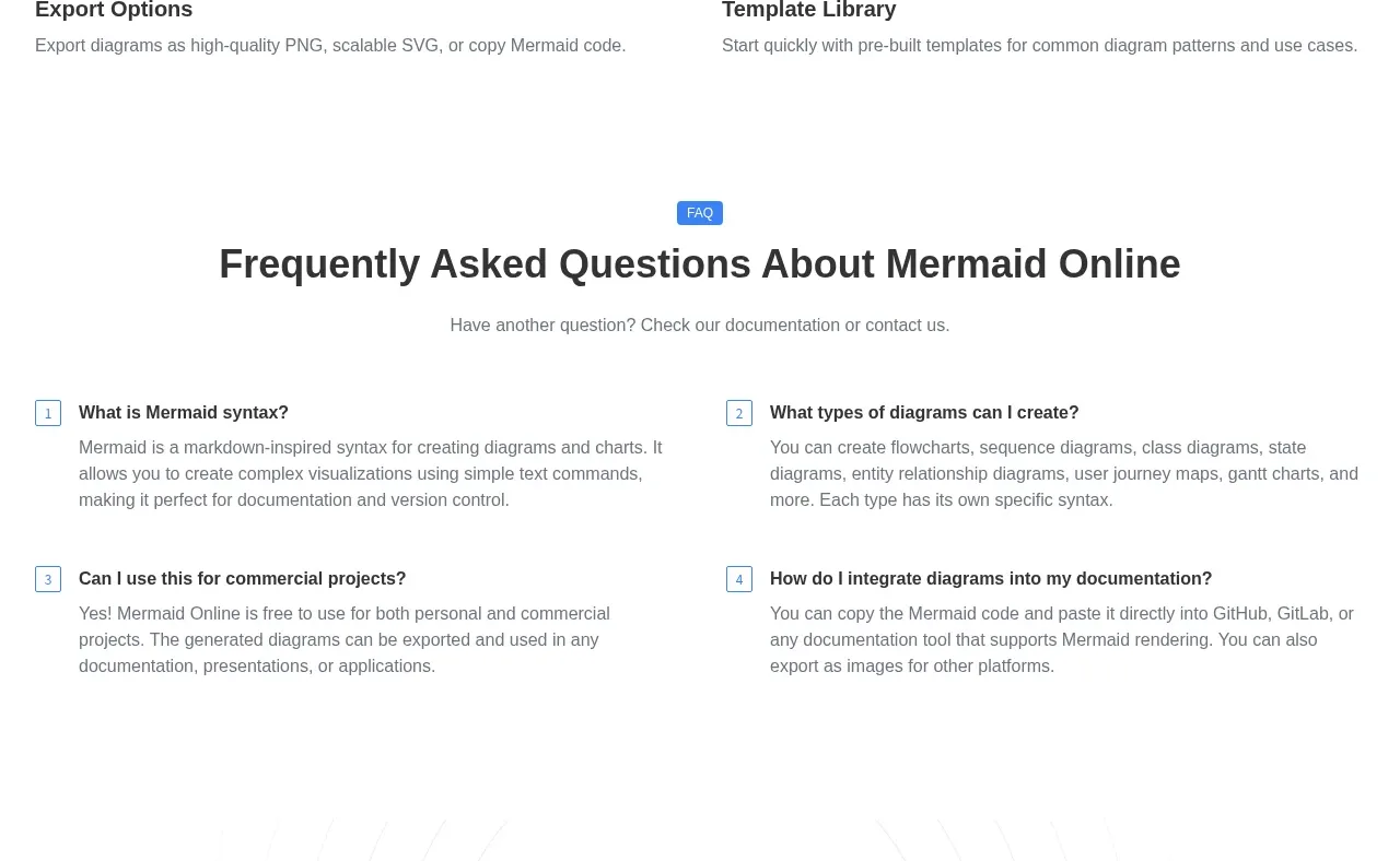 Key features grid
mermaidonline.live · Feature grid
Key features grid
mermaidonline.live · Feature grid
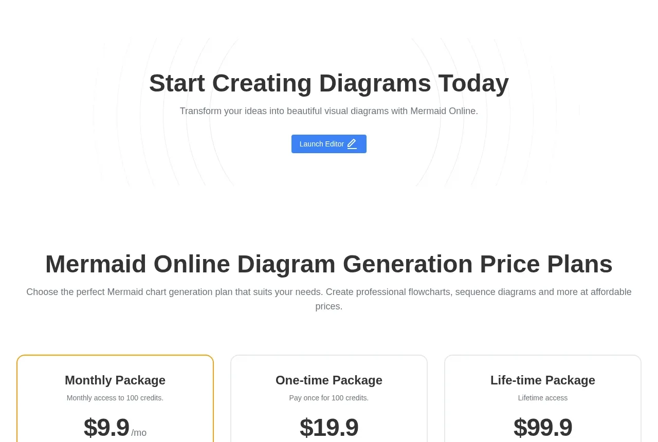 Frequently asked questions
mermaidonline.live · FAQ
Frequently asked questions
mermaidonline.live · FAQ
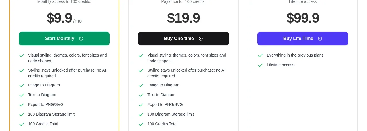 Start creating call to action
mermaidonline.live · Call to action
Start creating call to action
mermaidonline.live · Call to action
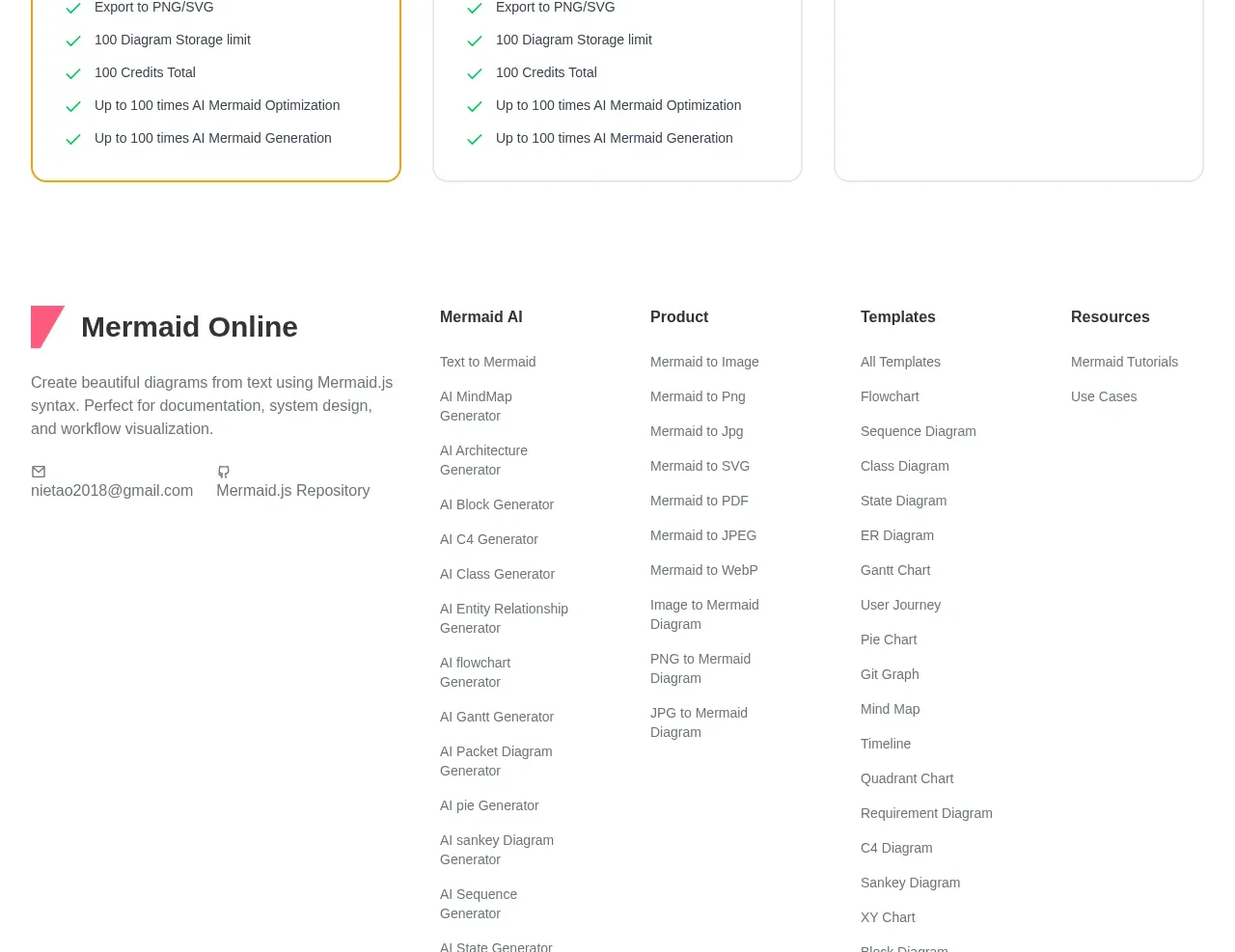 Three-tier pricing plans
mermaidonline.live · Pricing table
Three-tier pricing plans
mermaidonline.live · Pricing table
 Multi-column site footer
mermaidonline.live · Footer
Multi-column site footer
mermaidonline.live · Footer