kage
kage
mermaidonline.live
Design analysis
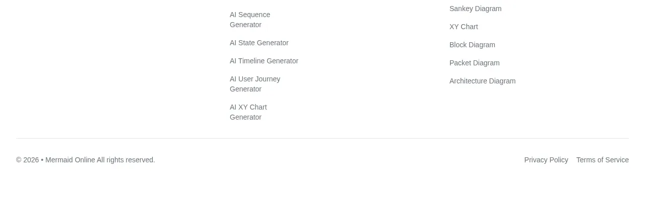
The footer closes with a brand summary and contact/repository links on the left, several categorized link columns, and a thin legal row at the bottom. Its low-contrast typography keeps attention on the page while preserving discoverability.
Prompt preview
## Reference images

Study these alongside the description below: hierarchy, rhythm, spacing, colour. Build for the product you are asked about, using this design language.

- Component: https://kage-design-assets.t3.tigrisfiles.io/components/mermaidonline-live/7b9ecc63-d7b9-4b92-a5d2-b69508fba7f2-1792152746-11.webp
- Full page it was cut from: https://kage-design-assets.t3.tigrisfiles.io/screenshots/mermaidonline-live/7b9ecc63-d7b9-4b92-a5d2-b69508fba7f2-1792152710959-full.webp
- Component on Kage: https://kage.design/component/mermaidonline-live-footer

## Before you start
Ask what the user's brand name, support channels, product categories, resources, and legal links are. Populate an original footer for that product.

Build a responsive multi-column footer. Put the brand mark/name, short description, and contact/social links in the first column; follow with three or four categorized navigation columns. Finish with a thin divider and a bottom row containing copyright, privacy, and terms links. Use white or #fafafa background, charcoal #303238 for headings, muted gray #747980 for links, #e5e5e5 dividers, 12–14px text, and 32–48px spacing. Keep link hit areas generous, add hover/focus color changes, and collapse columns into stacked groups on mobile. Avoid visual clutter despite a substantial link inventory.

Never: use logos, product names, copy, illustrations, or imagery from the reference.