 kage
kage
milepost.club
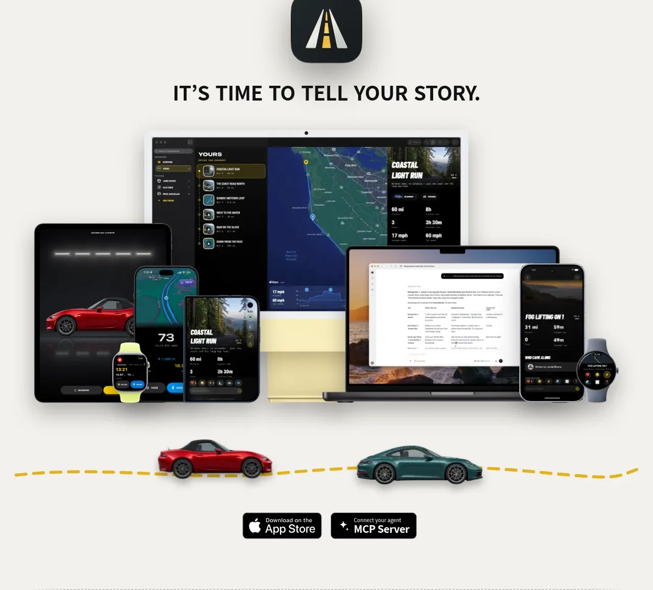
Design analysis
The closing conversion section combines a compact brand reminder, a broad multi-device product image, and two platform actions before the restrained footer.
Prompt preview
## Reference images

Study these alongside the description below: hierarchy, rhythm, spacing, colour. Build for the product you are asked about, using this design language.

- Component: https://kage-design-assets.t3.tigrisfiles.io/components/milepost/daa1b44b-e646-4a0f-860e-b6d9c76440c8-1791871477-7.webp
- Full page it was cut from: https://kage-design-assets.t3.tigrisfiles.io/screenshots/milepost/daa1b44b-e646-4a0f-860e-b6d9c76440c8-1791871382204-full.webp
- Component on Kage: https://kage.design/component/milepost-cta

## Before you start
Ask what final action the user's product needs, which platforms it supports, and what closing proof or ecosystem visual will build confidence. Create an original closing CTA for that product.

Build a centered closing CTA on a warm off-white background #f4f3ef. Start with a small rounded brand mark, followed by a strong uppercase statement and a wide multi-device or ecosystem visual beneath it. Keep the visual as the hero of the lower half: show responsive screens across desktop, tablet, phone, wearable, or other relevant surfaces, with realistic but original UI. Add a subtle brand-accent route/line or grounding element only if it supports the product story. Finish with two compact dark platform/action buttons, one primary and one secondary, using white text, 8–12px radii, and clear icon-text alignment. Maintain generous spacing and make the CTA buttons easy to tap.

Never: use logos, product names, copy, illustrations or imagery from the reference.
More components
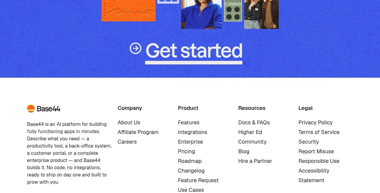
 Bright closing call to action
Base Code · Call to action
Bright closing call to action
Base Code · Call to action
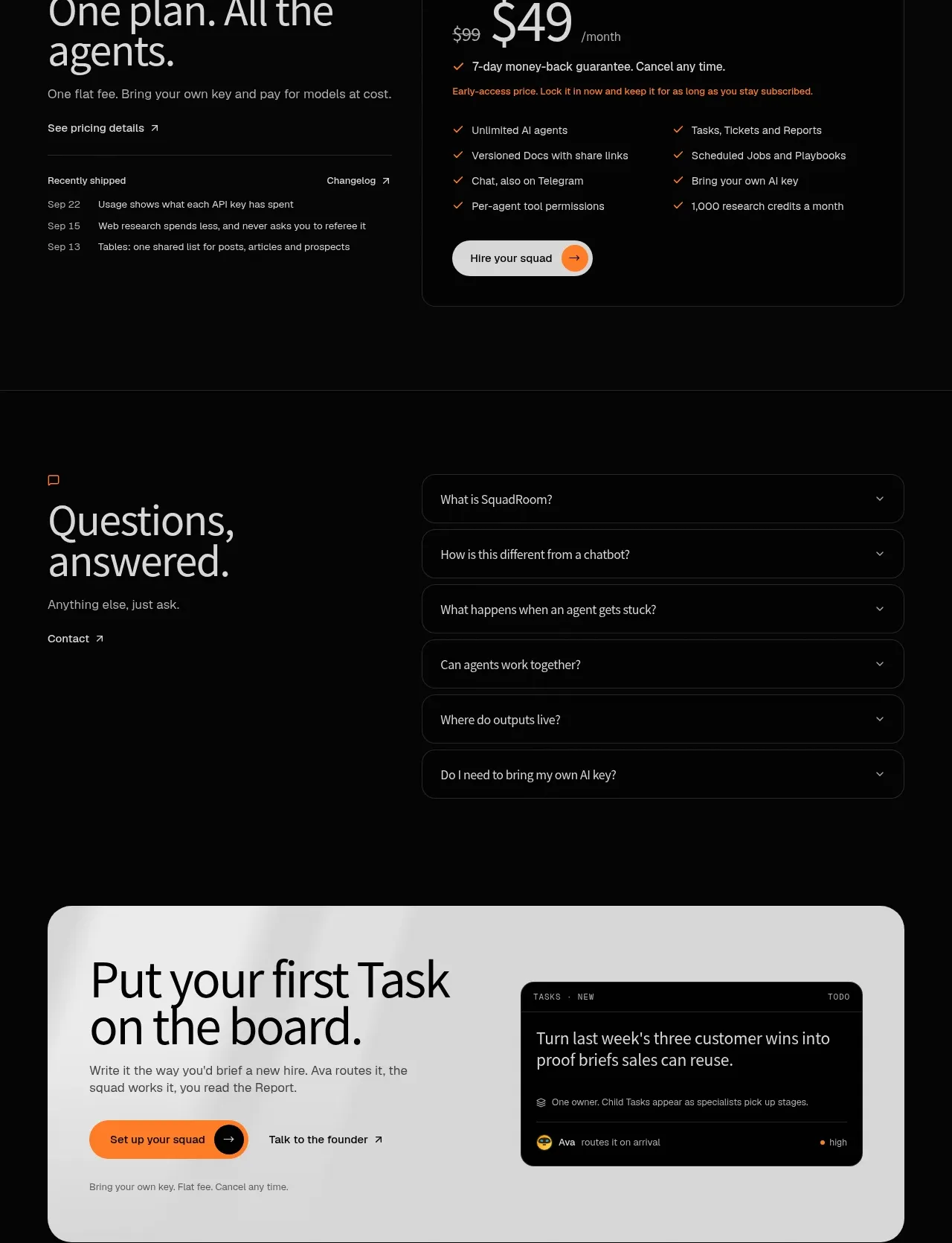
 First-action conversion banner
SquadRoom · Call to action
First-action conversion banner
SquadRoom · Call to action
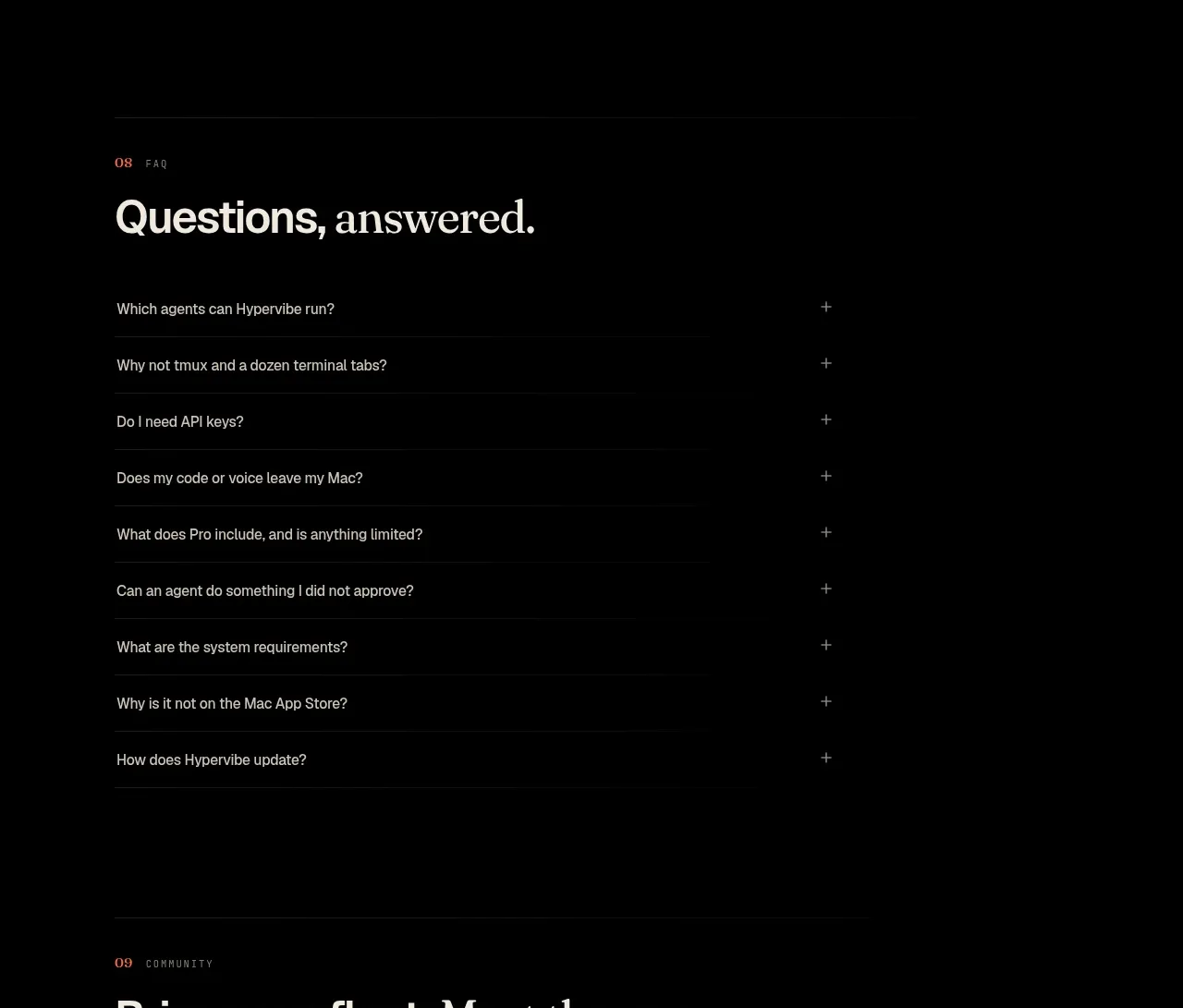
 Community invitation
Hypervibe · Call to action
Community invitation
Hypervibe · Call to action
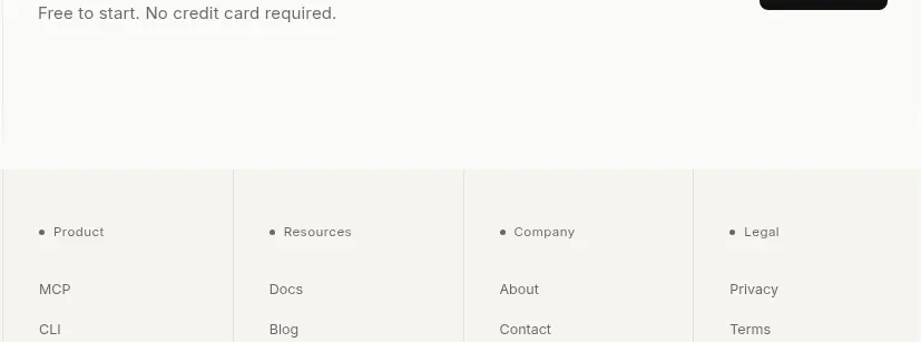
 Trust and final conversion
Lune · Call to action
Trust and final conversion
Lune · Call to action
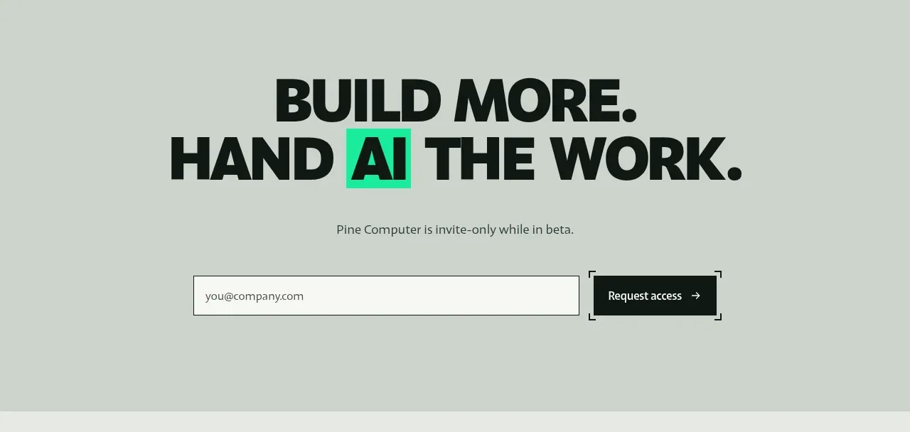
 Request-access conversion block
Pine Computer · Call to action
Request-access conversion block
Pine Computer · Call to action
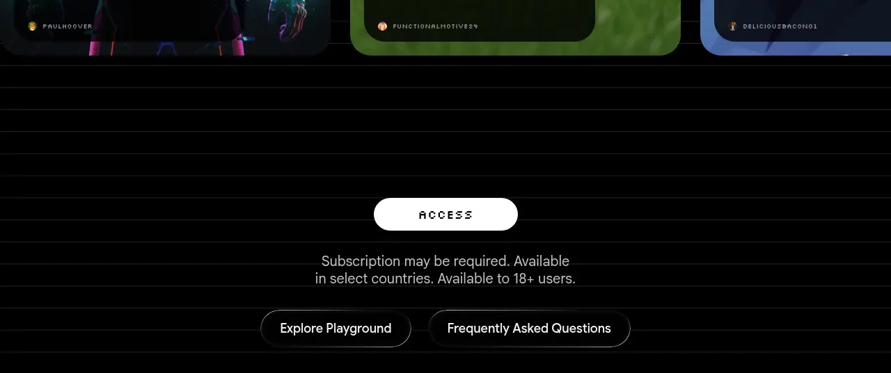
 Access conversion block
Playground by Google Labs · Call to action
Access conversion block
Playground by Google Labs · Call to action