 kage
kage
squadroom.app
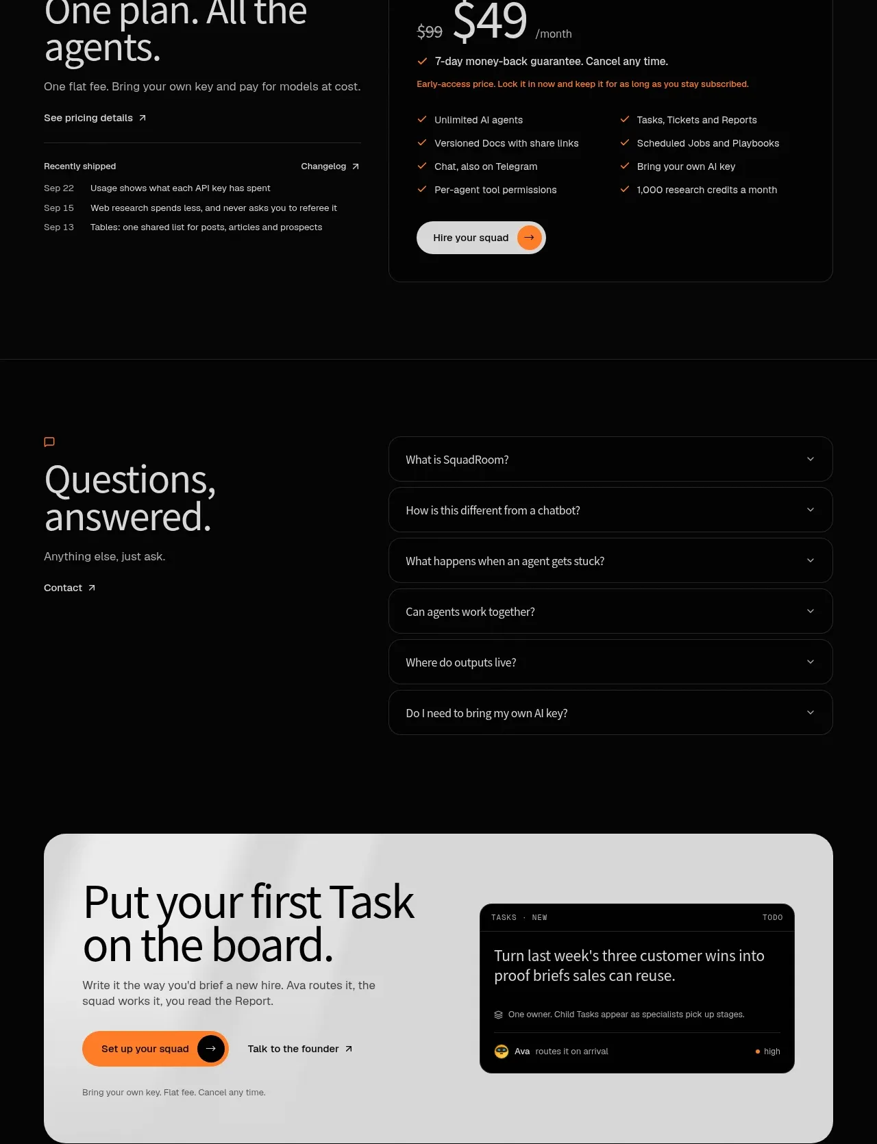
Design analysis
The closing CTA switches to a large light rounded panel, pairing a decisive headline and action with a small dark product card for a memorable final conversion moment.
Prompt preview
## Reference images

Study these alongside the description below: hierarchy, rhythm, spacing, colour. Build for the product you are asked about, using this design language.

- Component: https://kage-design-assets.t3.tigrisfiles.io/components/squadroom/d449f1a3-a1d7-46c0-a9d5-0020447fa3ed-1791871294-10.webp
- Full page it was cut from: https://kage-design-assets.t3.tigrisfiles.io/screenshots/squadroom/d449f1a3-a1d7-46c0-a9d5-0020447fa3ed-1791871247696-full.webp
- Component on Kage: https://kage.design/component/squadroom-cta

## Before you start
Ask what the user's highest-value first action is and what reassurance belongs beside it. Apply this visual pattern to that product and brand.

Build a large closing CTA inside a light gray rounded rectangle (#dededc) on the dark page. Use generous 36–40px corner radii, 36–48px internal padding, and a two-column composition: a dark headline and supporting copy on the left with a primary orange button and secondary text link, and a compact dark product/task card on the right. The light panel should feel like a deliberate visual reset after the dark page.

Use near-black #090909 for headline text, muted #555550 for body copy, vivid orange #ff7624 for the main button, and a black #090909 preview card with subtle #303030 borders and 12px radius. Make the CTA headline around 42–56px with tight line-height, and include a small reassurance line below the buttons. Ensure the card is decorative but semantically useful, and stack the columns on mobile while preserving the rounded container and whitespace.

Never: use logos, product names, copy, illustrations, or imagery from the reference.
More components
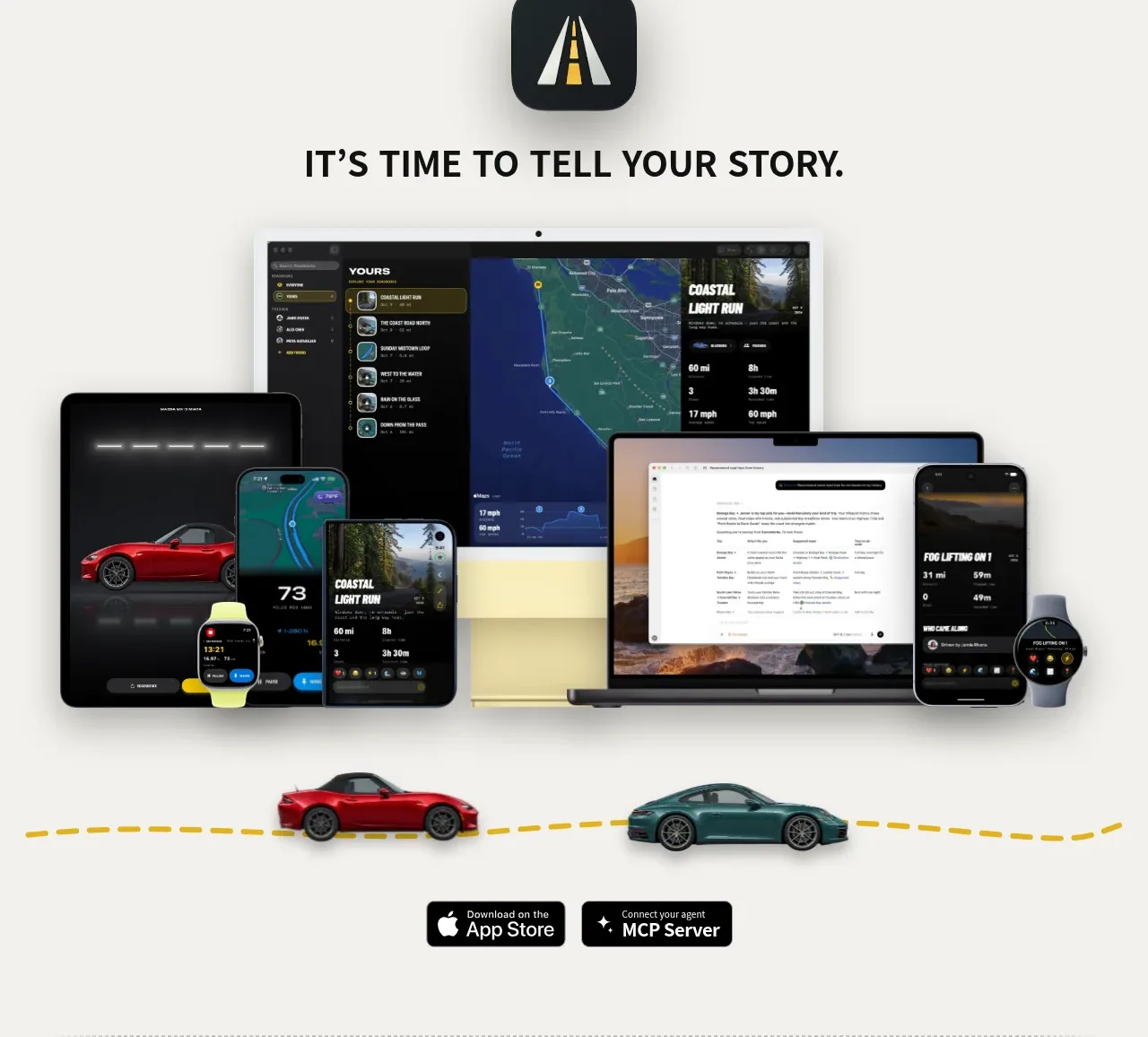
 Cross-device story CTA
Milepost · Call to action
Cross-device story CTA
Milepost · Call to action
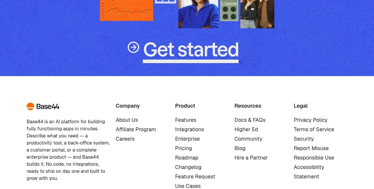
 Bright closing call to action
Base Code · Call to action
Bright closing call to action
Base Code · Call to action
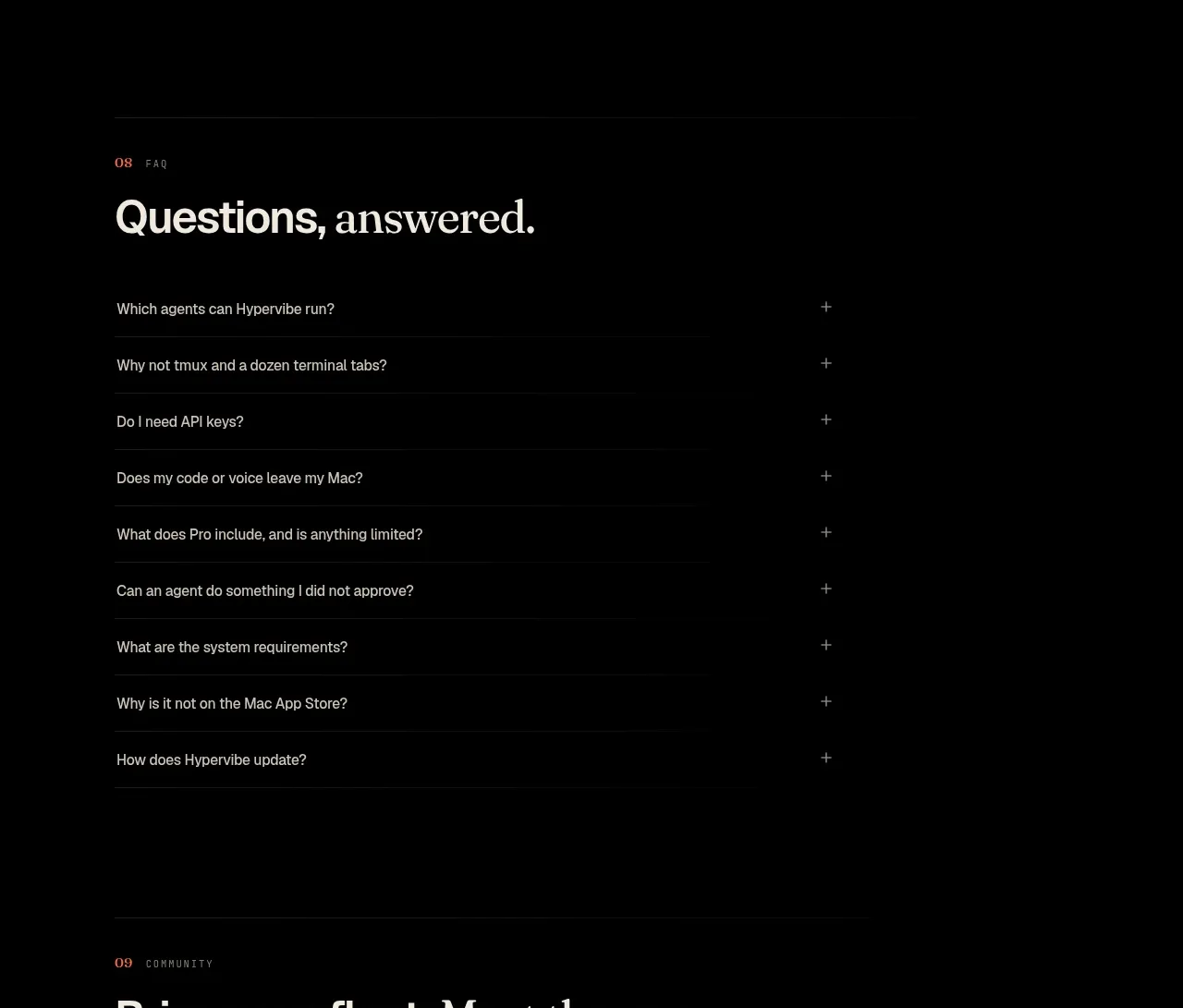
 Community invitation
Hypervibe · Call to action
Community invitation
Hypervibe · Call to action
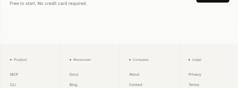
 Trust and final conversion
Lune · Call to action
Trust and final conversion
Lune · Call to action
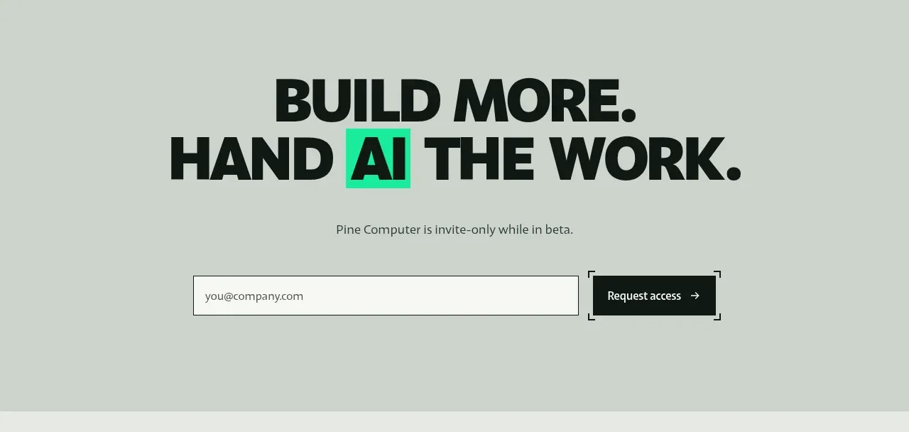
 Request-access conversion block
Pine Computer · Call to action
Request-access conversion block
Pine Computer · Call to action
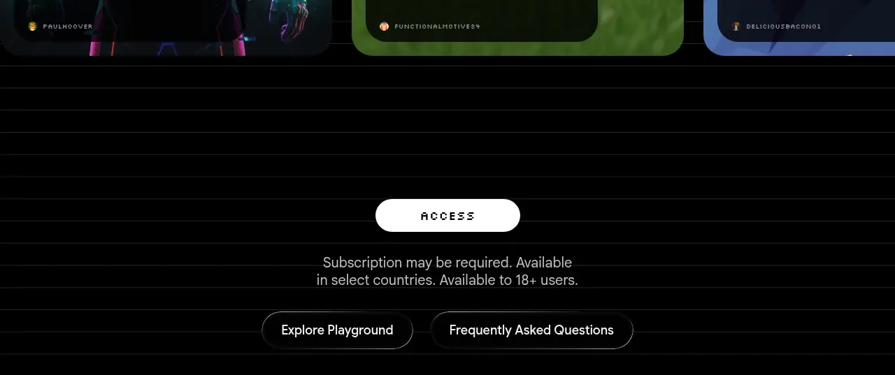
 Access conversion block
Playground by Google Labs · Call to action
Access conversion block
Playground by Google Labs · Call to action