 kage
kage
labs.google

Design analysis
A sparse dark conversion area uses a single high-contrast action, eligibility note, and two secondary rounded links.
Prompt preview
## Reference images

Study these alongside the description below: hierarchy, rhythm, spacing, colour. Build for the product you are asked about, using this design language.

- Component: https://kage-design-assets.t3.tigrisfiles.io/components/playground-by-google-labs/93d2afab-1def-4986-9178-dd9a071e412b-1791612311-6.webp
- Full page it was cut from: https://kage-design-assets.t3.tigrisfiles.io/screenshots/playground-by-google-labs/93d2afab-1def-4986-9178-dd9a071e412b-1791612198337-full.webp
- Component on Kage: https://kage.design/component/playground-by-google-labs-cta

## Before you start
Ask what the user's primary conversion is, who is eligible, and which secondary destinations need to be offered. Apply the principles below to that product rather than copying the reference.

Design a sparse, centered access CTA on a black background. Start with a compact high-contrast pill button, then add a short eligibility or availability note, followed by two outlined secondary links. Use a vertical rhythm of roughly 24–32px between elements and large surrounding whitespace. Primary buttons can be white with black text; secondary controls can use transparent fill, #303030 borders, white text, and 999px radius. Keep the note muted at #A0A0A0 and constrain it to 360–500px. Make all actions keyboard accessible and ensure the mobile layout stacks cleanly.

Never: use logos, product names, copy, illustrations, or imagery from the reference.
More components
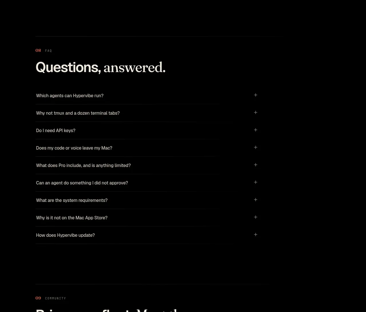
 Community invitation
Hypervibe · Call to action
Community invitation
Hypervibe · Call to action
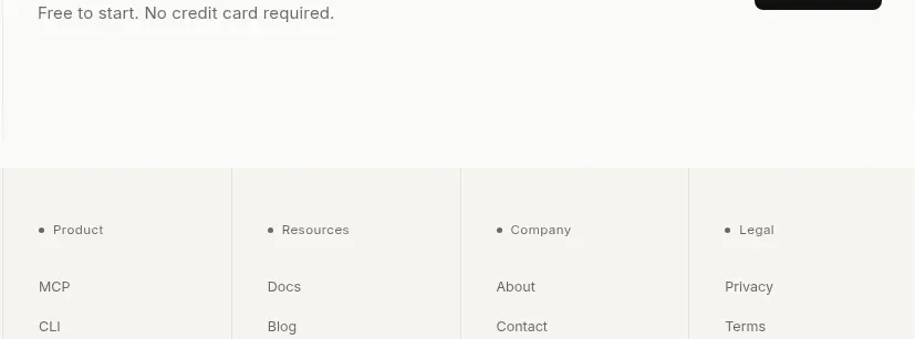
 Trust and final conversion
Lune · Call to action
Trust and final conversion
Lune · Call to action

 Request-access conversion block
Pine Computer · Call to action
Request-access conversion block
Pine Computer · Call to action

 Closing product call to action
HeyPi · Call to action
Closing product call to action
HeyPi · Call to action
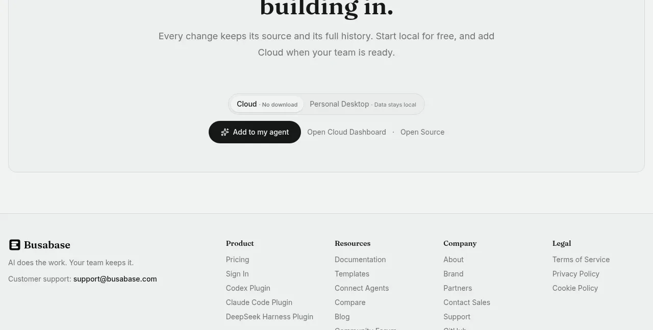
 Final conversion call to action
Busabase · Call to action
Final conversion call to action
Busabase · Call to action
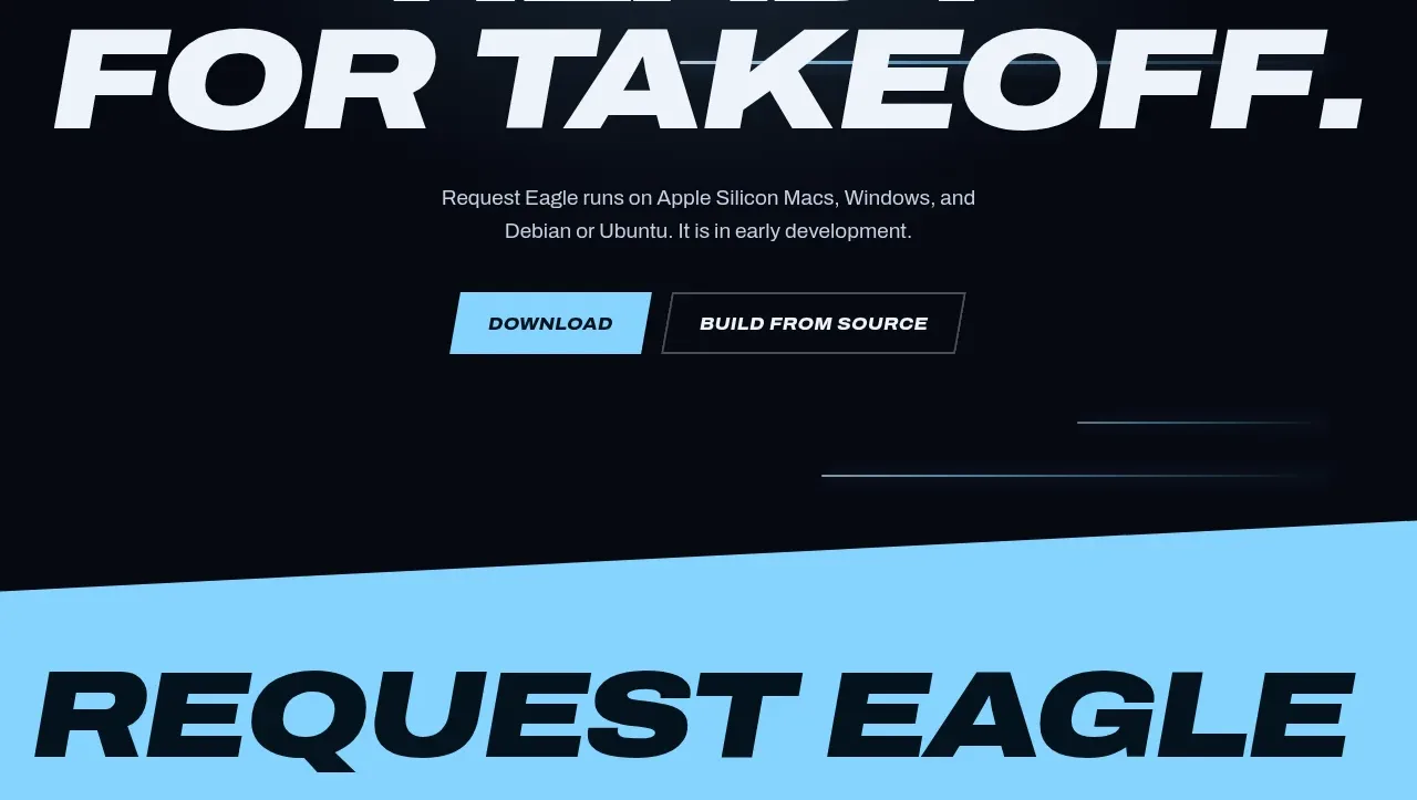
 Final download call to action
Request Eagle · Call to action
Final download call to action
Request Eagle · Call to action