 kage
kage
hypervibe.so
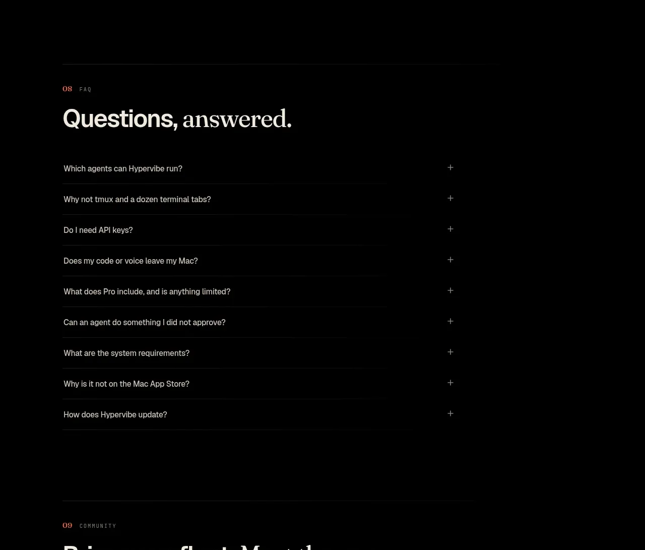
Design analysis
A community section combines a short invitation with a wide framed visual and a clear route to join the user community.
Prompt preview
## Reference images

Study these alongside the description below: hierarchy, rhythm, spacing, colour. Build for the product you are asked about, using this design language.

- Component: https://kage-design-assets.t3.tigrisfiles.io/components/hypervibe/0f025394-2dff-4c9b-be5f-8e394ec4a30f-1791699118-11.webp
- Full page it was cut from: https://kage-design-assets.t3.tigrisfiles.io/screenshots/hypervibe/0f025394-2dff-4c9b-be5f-8e394ec4a30f-1791699070438-full.webp
- Component on Kage: https://kage.design/component/hypervibe-cta

## Before you start
Ask whether the user's product has a community, what members gain from joining, and which destination should receive the CTA. Then design the invitation around that value.

Build a community section with a small numbered eyebrow, an inviting heading, and a short paragraph explaining the community benefit. Add a wide rounded panel below: use a custom abstract or product-related visual on one side and a concise invitation, three short numbered benefits, and a light CTA button on the other. Use a deep charcoal panel (#151412), subtle border, 16px radius, low-saturation decorative accents, and clear text hierarchy. Keep the CTA action-specific, provide an external-link indication where needed, and stack the panel cleanly on mobile.

### Never
- Never use logos, product names, copy, illustrations, or imagery from the reference.
- Never copy the reference community artwork, invite text, or destination.
- Never imply community benefits that do not exist.
More components
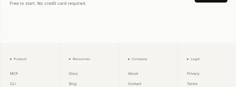
 Trust and final conversion
Lune · Call to action
Trust and final conversion
Lune · Call to action
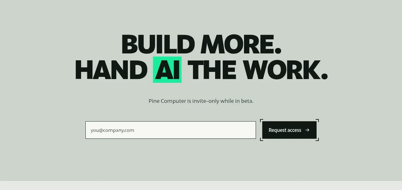
 Request-access conversion block
Pine Computer · Call to action
Request-access conversion block
Pine Computer · Call to action
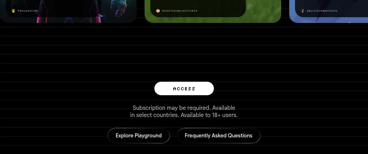
 Access conversion block
Playground by Google Labs · Call to action
Access conversion block
Playground by Google Labs · Call to action
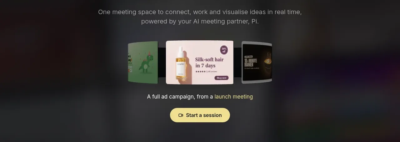
 Closing product call to action
HeyPi · Call to action
Closing product call to action
HeyPi · Call to action
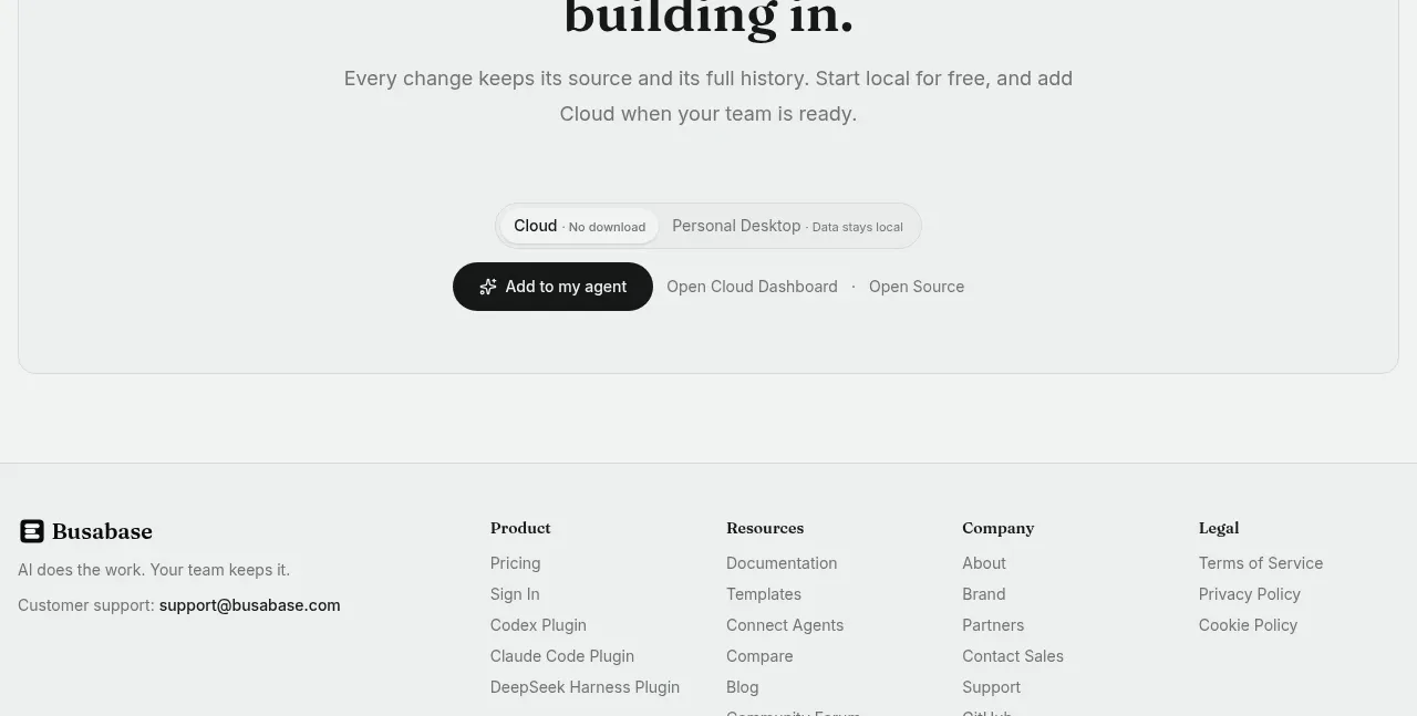
 Final conversion call to action
Busabase · Call to action
Final conversion call to action
Busabase · Call to action
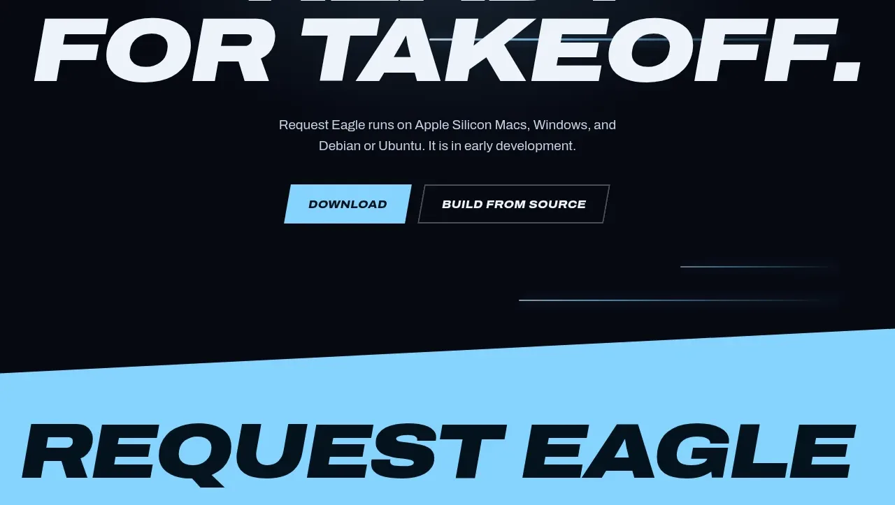
 Final download call to action
Request Eagle · Call to action
Final download call to action
Request Eagle · Call to action