 kage
kage
luneresearch.com
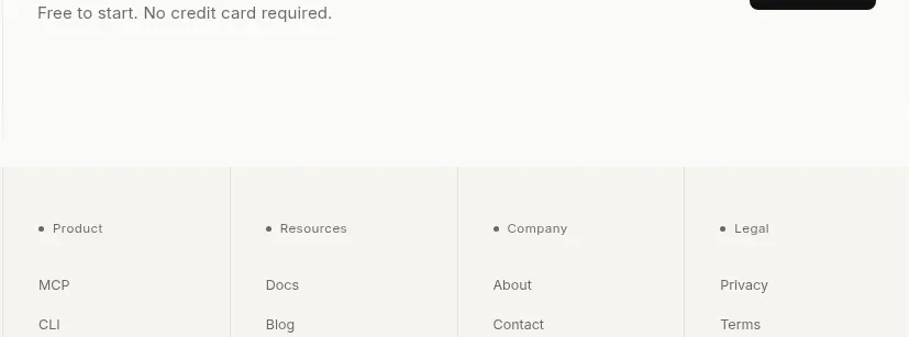
Design analysis
A restrained final CTA closes the content with a trust-oriented headline, no-credit-card reassurance, and a single dark action button aligned to the right.
Prompt preview
## Reference images

Study these alongside the description below: hierarchy, rhythm, spacing, colour. Build for the product you are asked about, using this design language.

- Component: https://kage-design-assets.t3.tigrisfiles.io/components/lune/4bf7ff48-f6a1-4cc9-aba1-cb69c6f24fa8-1791698510-6.webp
- Full page it was cut from: https://kage-design-assets.t3.tigrisfiles.io/screenshots/lune/4bf7ff48-f6a1-4cc9-aba1-cb69c6f24fa8-1791698434673-full.webp
- Component on Kage: https://kage.design/component/lune-cta

## Before you start
Ask what final action the user should take and what reassurance removes the biggest barrier. Build a short closing CTA for that product.

Create a horizontal closing CTA with an editorial serif title, one muted reassurance line, and a dark rounded button aligned on the right. Keep the composition sparse and confident, separated from pricing by a generous top margin and a thin divider. Use #f8f8f5, #171716, #777772, and a black button #171716 with white text. Use 8px radius, 14px button text, 18–24px heading text, and enough whitespace for the section to feel like a conclusion rather than another feature block. Stack the button beneath the copy on mobile, retain visible focus states, and include a subtle arrow only if it helps communicate progression.

Never: use the reference's logos, product names, copy, illustrations, imagery, or exact CTA wording.
More components
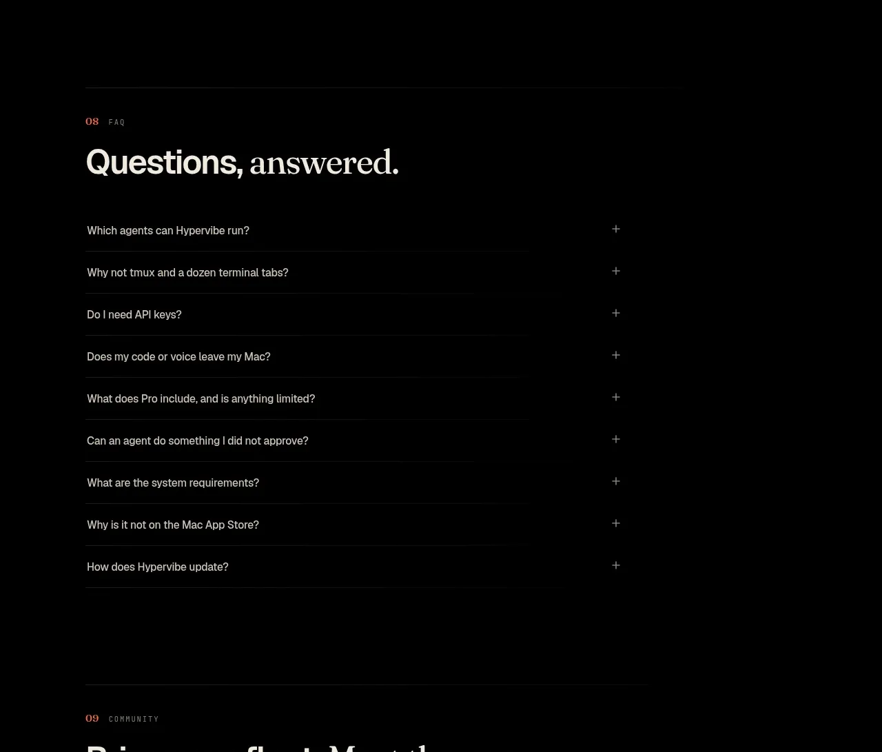
 Community invitation
Hypervibe · Call to action
Community invitation
Hypervibe · Call to action

 Request-access conversion block
Pine Computer · Call to action
Request-access conversion block
Pine Computer · Call to action

 Access conversion block
Playground by Google Labs · Call to action
Access conversion block
Playground by Google Labs · Call to action

 Closing product call to action
HeyPi · Call to action
Closing product call to action
HeyPi · Call to action
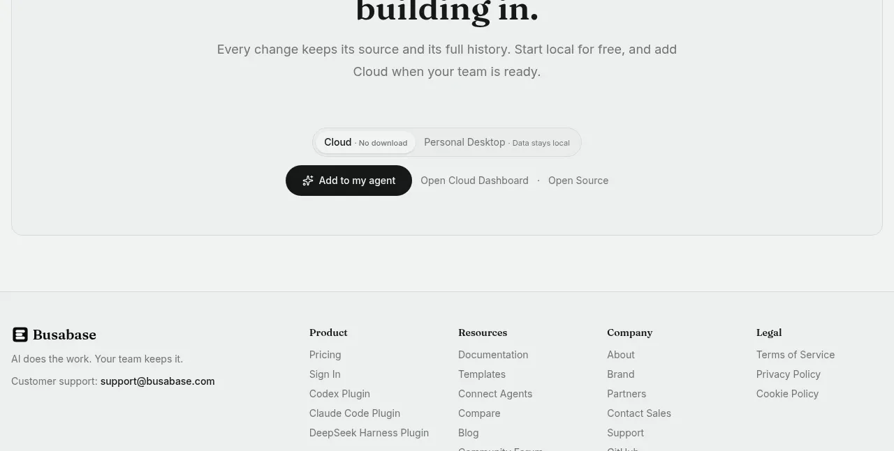
 Final conversion call to action
Busabase · Call to action
Final conversion call to action
Busabase · Call to action
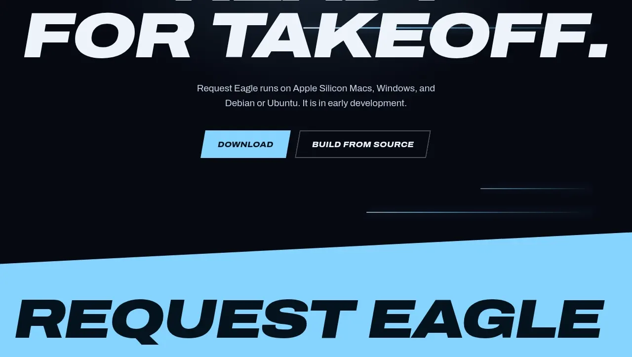
 Final download call to action
Request Eagle · Call to action
Final download call to action
Request Eagle · Call to action