kage
kage
milepost.club
Design analysis
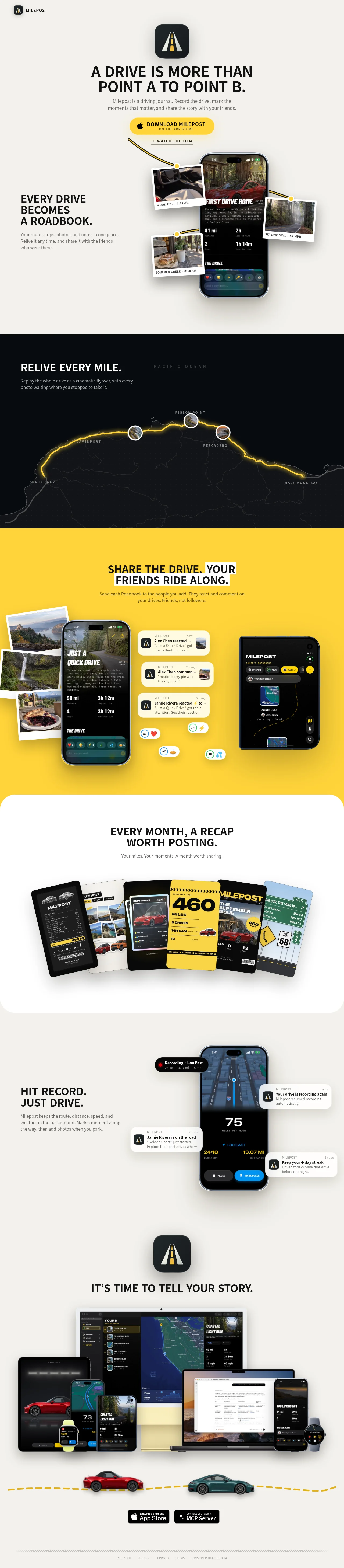
A consumer app-store-style landing page set on a warm cream canvas, segmented by full-bleed colour bands — cream, black, yellow, white — so each feature gets its own climate. Headlines are condensed uppercase grotesques written as complete sentences ending in a period, with small gray sentence-case body copy beneath. The signature move is a scrapbook collage language: rotated polaroid-framed photos pinned around phone mockups with dashed yellow connector lines, notification cards with avatar chips on the yellow band, and a fanned deck of six differently-styled monthly recap cards. The page closes with a device-family collage, a playful strip of toy cars on a dashed road, and two black pill CTAs.
Prompt preview
## Reference images

Study these alongside the description below: hierarchy, rhythm, spacing, colour. Build for the product you are asked about, using this design language.

- Full page: https://kage-design-assets.t3.tigrisfiles.io/screenshots/milepost/daa1b44b-e646-4a0f-860e-b6d9c76440c8-1791871382204-full.webp
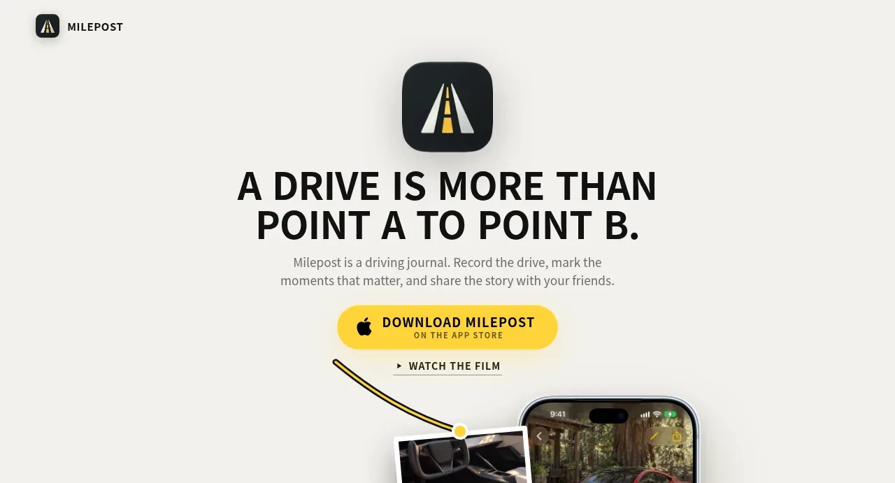
- Above the fold: https://kage-design-assets.t3.tigrisfiles.io/screenshots/milepost/daa1b44b-e646-4a0f-860e-b6d9c76440c8-1791871377726.webp
- Design on Kage: https://kage.design/designs/milepost-landing-page

# Design language: scrapbook collage product page with full-bleed colour bands

## Before you start
Ask the user what they are building, who it is for, and what brand assets they already have — name, colours, type, logo, app icon, and any product screenshots or real photography to feature. Wait for the answers before writing any code. Everything below is applied to their product; the reference page is only a pattern source.

## Page structure
1. **Top bar** — a small logo tile (rounded square) plus wordmark, top-left, with no nav links. The page reads as a poster, not a SaaS site.
2. **Hero (centred, poster style)** — stacked composition on the base background: app icon squircle, two-line condensed uppercase headline written as a full sentence with a period, one short gray subcopy line, a pill primary CTA with a tiny platform caption inside it, and a secondary text link with a small play glyph ("watch the film" pattern) beneath.
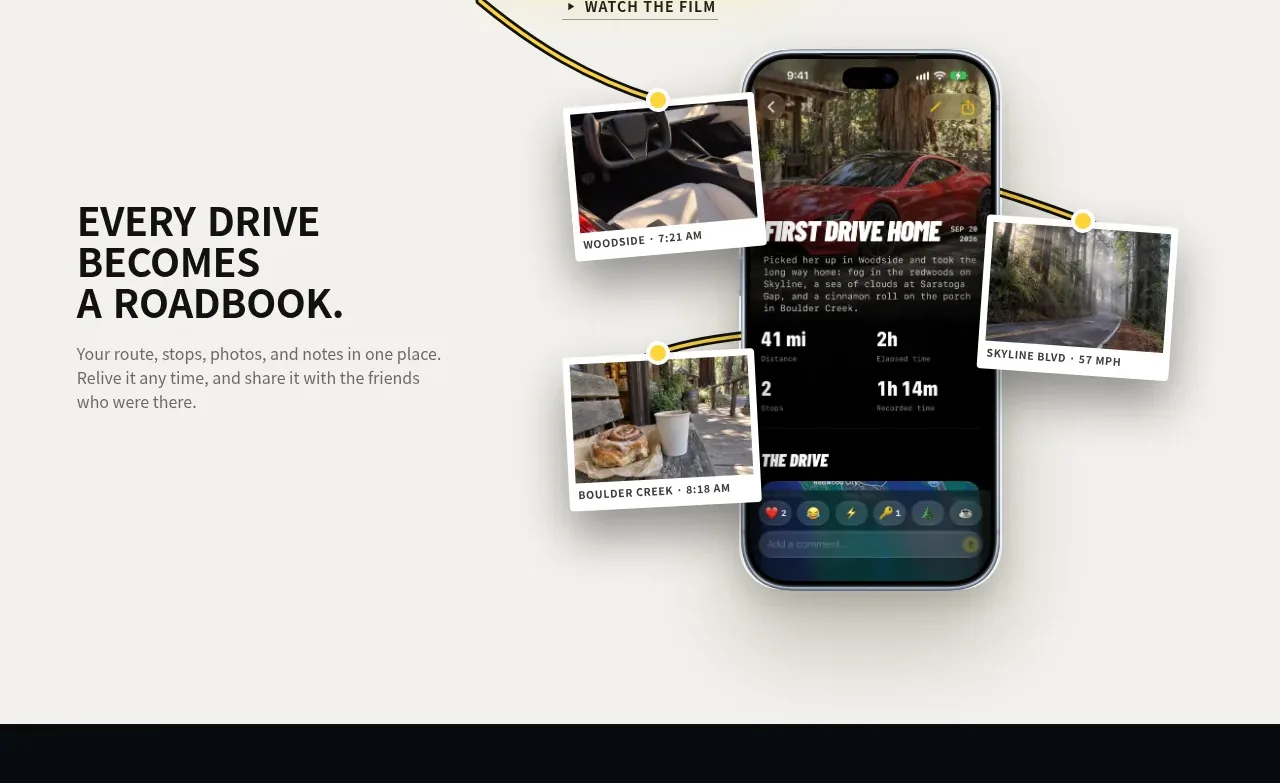
3. **Feature 1 — the journal (text-left / collage-right)** — a narrow left column with a heading and short paragraph; on the right, a phone-frame app screenshot with 3–4 rotated polaroid-framed photos scattered around it, each with a caption chip, attached via tiny round pins and dashed accent-coloured connector lines.
4. **Feature 2 — the replay (full-bleed black band)** — heading and subcopy at top-left; below, a full-width dark map with one bright route polyline, letter-spaced all-caps place names, and small circular photo thumbnails pinned at waypoints along the route.
5. **Feature 3 — sharing (full-bleed yellow band, centred)** — headline with white highlight boxes behind the key words, centred subcopy, then a three-part collage: a phone with polaroids trailing behind it, a stack of notification-style reaction cards with avatar chips and emoji reactions, and a second phone showing a friends/map screen.
6. **Feature 4 — generated artefacts (white band, centred)** — centred heading + subcopy, then a fanned arc of 5–6 overlapping "output" cards, each in a different style (receipt-like stat card, photo grid, big-number card, magazine cover, signage collage) with heavy soft shadows.
7. **Feature 5 — the live/ambient mode (light band, text-left / device-right)** — left text block; right a phone mockup of the live UI (a big readout number, two action buttons), surrounded by floating notification pills and cards arranged like real push notifications.
8. **Final CTA (centred, base background)** — app icon again, one-line condensed headline, then a large device-family collage (desktop, laptop, phone, watch) showing the whole ecosystem.
9. **Playful footer strip** — a full-width dashed road-style line with two small toy-like illustrations driving along it.
10. **Footer** — two black pill buttons side by side (primary download + secondary integration CTA), a dashed hairline rule, and a row of tiny letter-spaced caps utility links.

## Design language
- **Palette:** warm cream canvas (#F2EFE8), near-black ink (#141414), one saturated yellow accent (#F4C624), white for polaroid frames and highlight chips, mid-gray (#6B6B66) for body copy. Segment the page with full-bleed colour bands — light, black, yellow, white, light — so each feature has its own climate.
- **Headlines:** condensed uppercase grotesque, tight leading, phrased as complete short sentences that end with a period; hero ~64–80px, section heads ~40–48px. On coloured bands, box key words in white highlight chips.
- **Body and labels:** 14–16px sentence-case sans in gray, ~34ch measure; captions, place names and metadata in 10–11px all-caps with wide letter-spacing.
- **Collage motif:** every photo near a device mockup sits in a white polaroid frame rotated −8° to +8° with a caption chip; connect artefacts to the device with dashed accent-coloured lines and small round pins so collages feel hand-arranged, not dropped in.
- **Cards as decks:** present feature outputs as overlapping, fanned sets with varied internal styles and strong soft shadows — the collection, not any single card, is the message.
- **Shape and shadow:** squircle icon radii, pill buttons, 16–24px card radii; large soft low-opacity shadows under devices, tighter harder shadows under sticker-like cards.
- **Thematic decoration:** reuse dashed lines, signage-style caps, and road-sign shapes as connectors and rules wherever the product has a journey/route metaphor.
- **Rhythm:** alternate centred poster sections on light bands with left-aligned text inside dark bands; keep density low — one idea plus one collage per band.
- **Motion:** subtle only — slight rotations and gentle hover lifts on polaroids and cards; no parallax overload.

## Never
- Do not reuse the reference product's name, wordmark, road app icon, headlines, captions, or any of its photography.
- Do not reproduce its car imagery, toy-car illustrations, or recap-card artwork.
- Do not present the result as that product or imply affiliation.
Components from this page
All components
 Minimal brand navigation
Milepost · Navigation
Minimal brand navigation
Milepost · Navigation
 Driving-story hero
Milepost · Hero
Driving-story hero
Milepost · Hero
 Roadbook feature story
Milepost · Feature grid
Roadbook feature story
Milepost · Feature grid
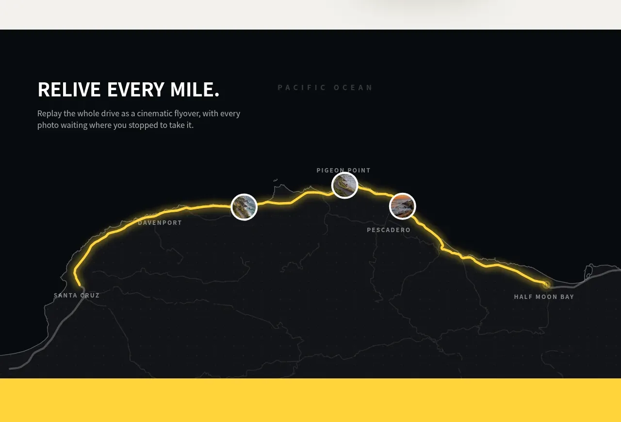 Route replay map feature
Milepost · Feature grid
Route replay map feature
Milepost · Feature grid
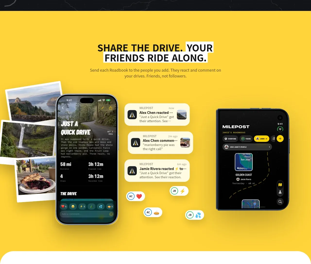 Shared drive feature
Milepost · Feature grid
Shared drive feature
Milepost · Feature grid
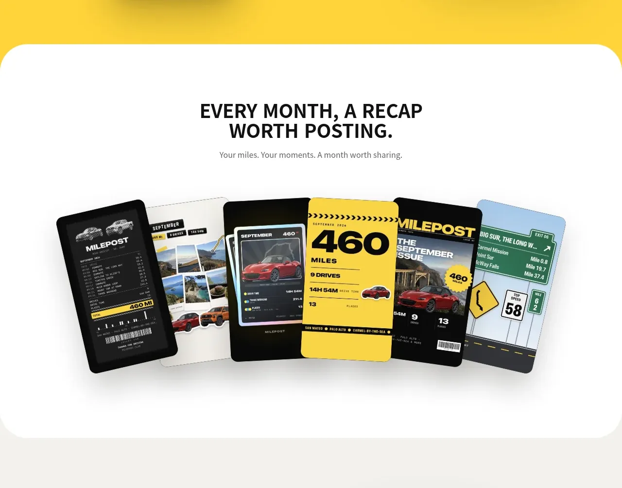 Monthly recap gallery
Milepost · Gallery
Monthly recap gallery
Milepost · Gallery
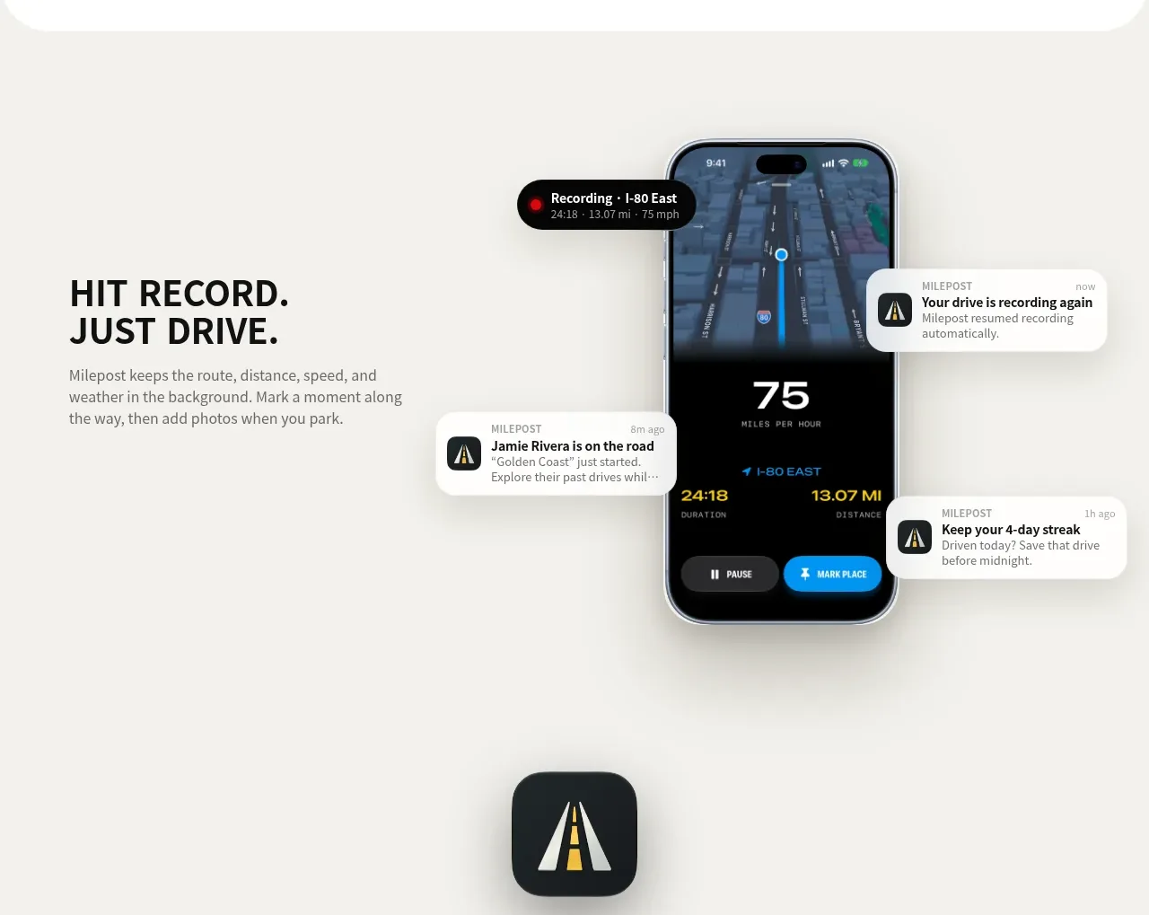 Automatic recording feature
Milepost · Feature grid
Automatic recording feature
Milepost · Feature grid
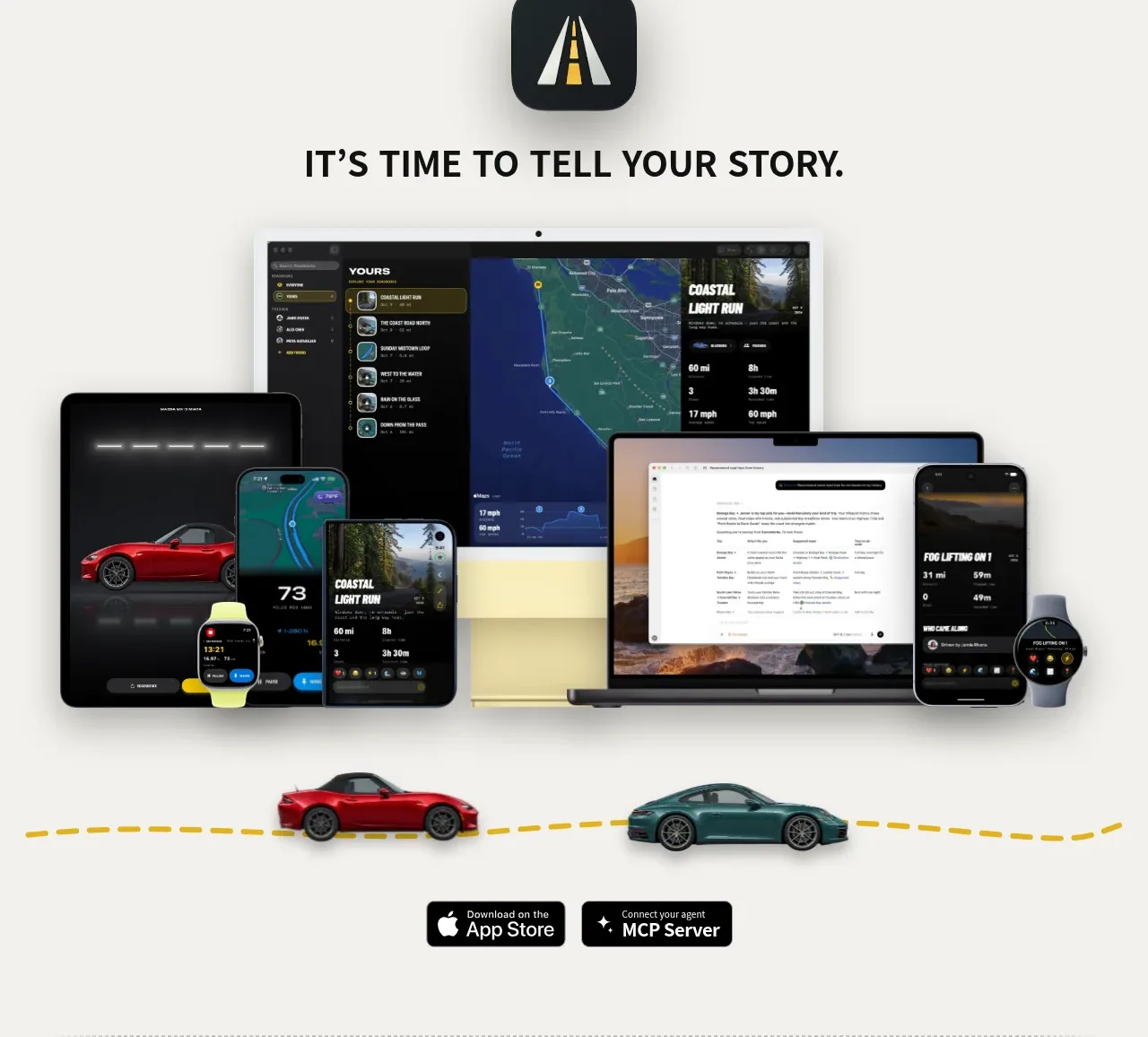 Cross-device story CTA
Milepost · Call to action
Cross-device story CTA
Milepost · Call to action
 Utility footer
Milepost · Footer
Utility footer
Milepost · Footer