 kage
kage
milliseconds.ai
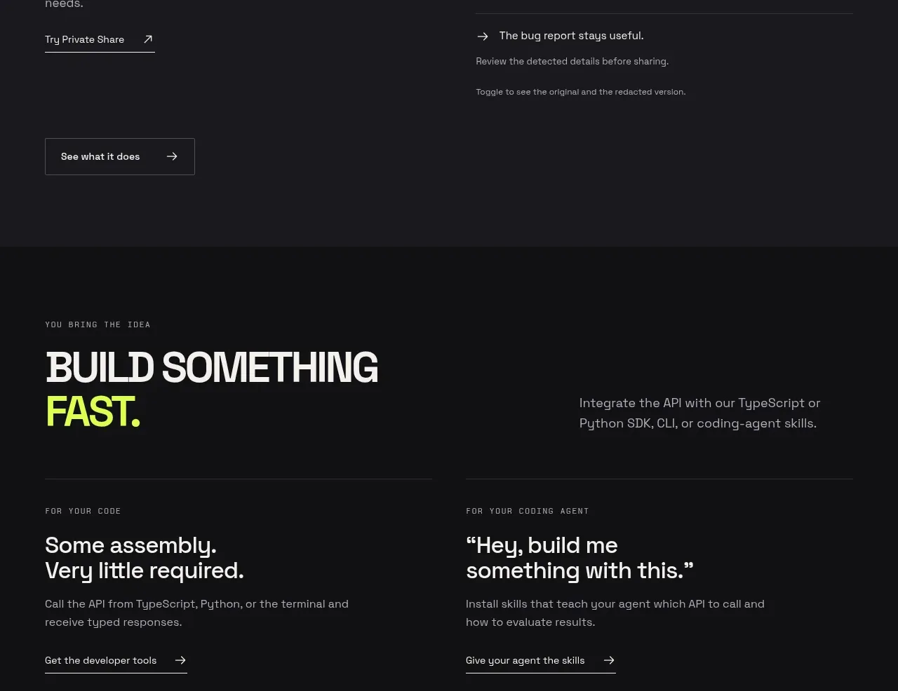
Design analysis
This section shifts from proof to adoption, offering two clear paths: conventional developer integration and coding-agent enablement. The paired columns are concise and action-led, avoiding the pressure of a single generic CTA.
Prompt preview
## Reference images

Study these alongside the description below: hierarchy, rhythm, spacing, colour. Build for the product you are asked about, using this design language.

- Component: https://kage-design-assets.t3.tigrisfiles.io/components/milliseconds-ai/6fac96f3-e489-4913-80bc-8c862b5f9e82-1790056993-5.webp
- Full page it was cut from: https://kage-design-assets.t3.tigrisfiles.io/screenshots/milliseconds-ai/6fac96f3-e489-4913-80bc-8c862b5f9e82-1790056904819-full.webp
- Component on Kage: https://kage.design/component/milliseconds-cta

## Before you start
Ask whether the user's audience needs an SDK, CLI, integration guide, agent skill, or another implementation path. Use that answer to create two complementary actions.

Create a dark developer CTA section with `#101012` background, 44px side padding, and a top intro band containing a small uppercase eyebrow, an oversized 44–52px headline with one accent-colored word, and a muted right-aligned explanation. Below, place two equal columns separated by a thin vertical divider on desktop and a horizontal divider on mobile. Each column needs a small category label, a 24–28px two-line heading, 15px supporting copy, and an understated arrow link. Use warm white `#f3f1ed`, muted gray `#96939a`, violet `#6845ff`, 1px borders, and nearly square corners. Keep the hierarchy spacious and editorial rather than card-heavy.

Make the two links independently keyboard accessible and give them a subtle arrow translation on hover. On mobile, stack the paths with at least 32px between them.

Never: copy the reference headings, product name, logo, exact developer terminology, illustrations, imagery, or copy.
More components
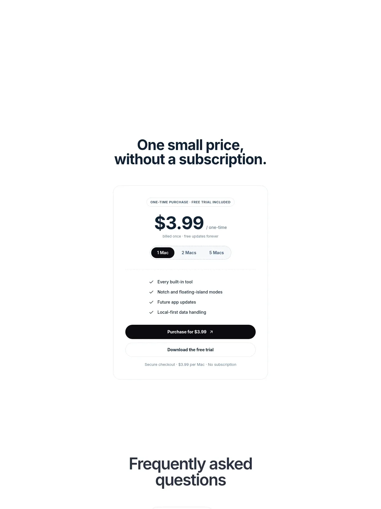
 Visual closing product statement
NotchPop · Call to action
Visual closing product statement
NotchPop · Call to action

 System positioning statement
IntellAgents.io · Call to action
System positioning statement
IntellAgents.io · Call to action
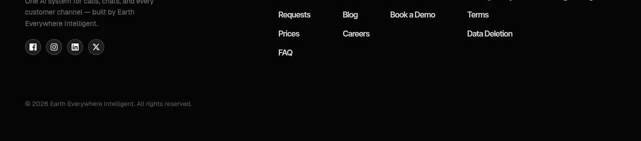 Final conversion banner
IntellAgents.io · Call to action
Final conversion banner
IntellAgents.io · Call to action
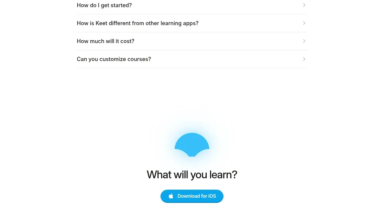
 Final app-download call to action
Keet · Call to action
Final app-download call to action
Keet · Call to action
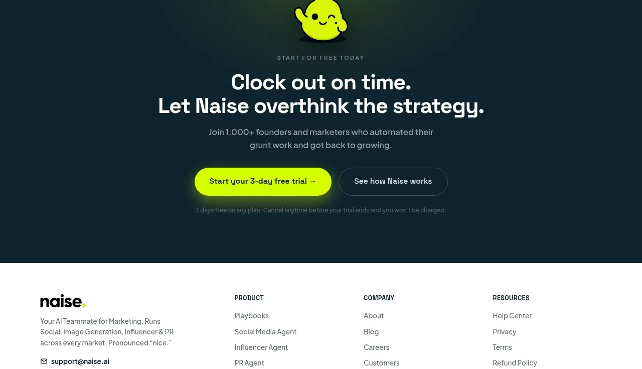
 Dark conversion call to action
Naise AI · Call to action
Dark conversion call to action
Naise AI · Call to action
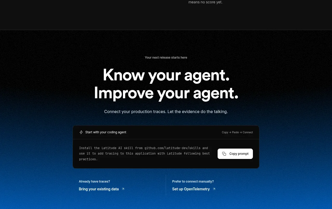
 Connect data and start improving
AgentScore · Call to action
Connect data and start improving
AgentScore · Call to action