kage
kage
milliseconds.ai

Design analysis
A long-form AI API landing page built on a near-black canvas, oversized condensed display type, and sharp accent colours: electric purple for product emphasis and fluorescent lime for calls to action and highlighted data. The page alternates dark product sections with a peach explainer band, moving from a compact hero into an interactive API demo, practical workflow examples, developer paths, a high-impact pricing banner, and a sparse footer; thin rules, small monospace labels, offset paper-like cards, and restrained borders keep the dense content legible.
Prompt preview
## Reference images

Study these alongside the description below: hierarchy, rhythm, spacing, colour. Build for the product you are asked about, using this design language.

- Full page: https://kage-design-assets.t3.tigrisfiles.io/screenshots/milliseconds-ai/6fac96f3-e489-4913-80bc-8c862b5f9e82-1790056904819-full.webp
- Above the fold: https://kage-design-assets.t3.tigrisfiles.io/screenshots/milliseconds-ai/6fac96f3-e489-4913-80bc-8c862b5f9e82-1790056902118.webp
- Design on Kage: https://kage.design/designs/milliseconds-landing-page

## Before you start
Ask the user what they are building, who it is for, and what brand assets they already have, including the product name, colours, typefaces, logo, and any existing visual constraints. Wait for their answers before designing. Apply everything below to their product, not to the reference product.

## Page structure
1. **Global navigation:** Use a slim, dark header with a small brand mark on the left, compact text links across the centre/right, and a bordered primary action at the far right.
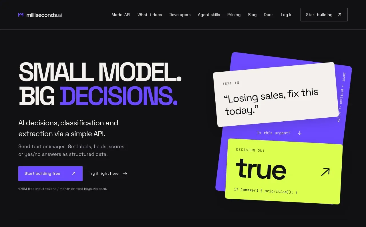
2. **Hero:** Build a two-column hero on a near-black background. Place a very large stacked headline on the left with one phrase or word in the product accent colour, followed by a concise description, primary filled CTA, secondary text link, and a small proof note; place an angled, layered decision/result card composition on the right.
3. **Hero utility rail:** End the hero with a thin horizontal rule and small utility links, including an implementation/access note on the left and a product-exploration link on the right.
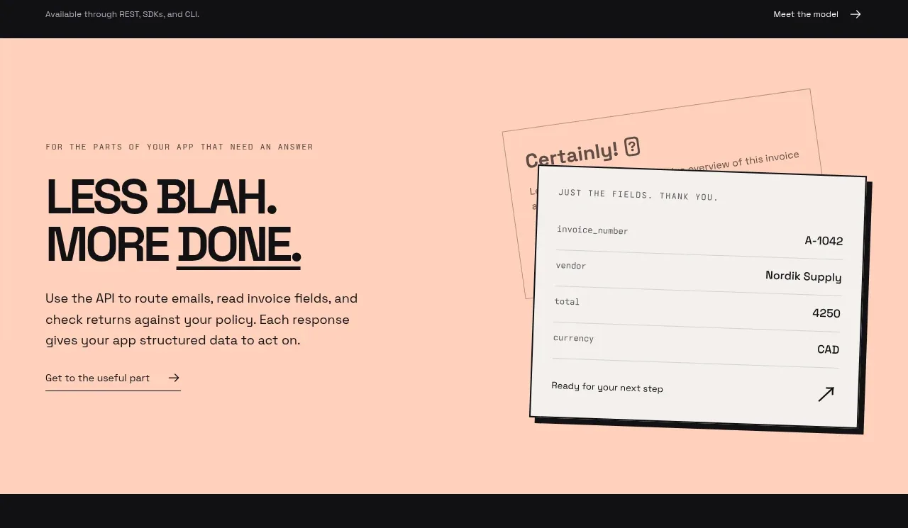
4. **Problem-to-output explainer:** Switch to a full-width warm peach section. Pair a left-aligned eyebrow, oversized two-line statement, body copy, and underlined link with an offset document/result card illustration on the right; use layered paper panels and a heavy dark outline rather than a conventional image.
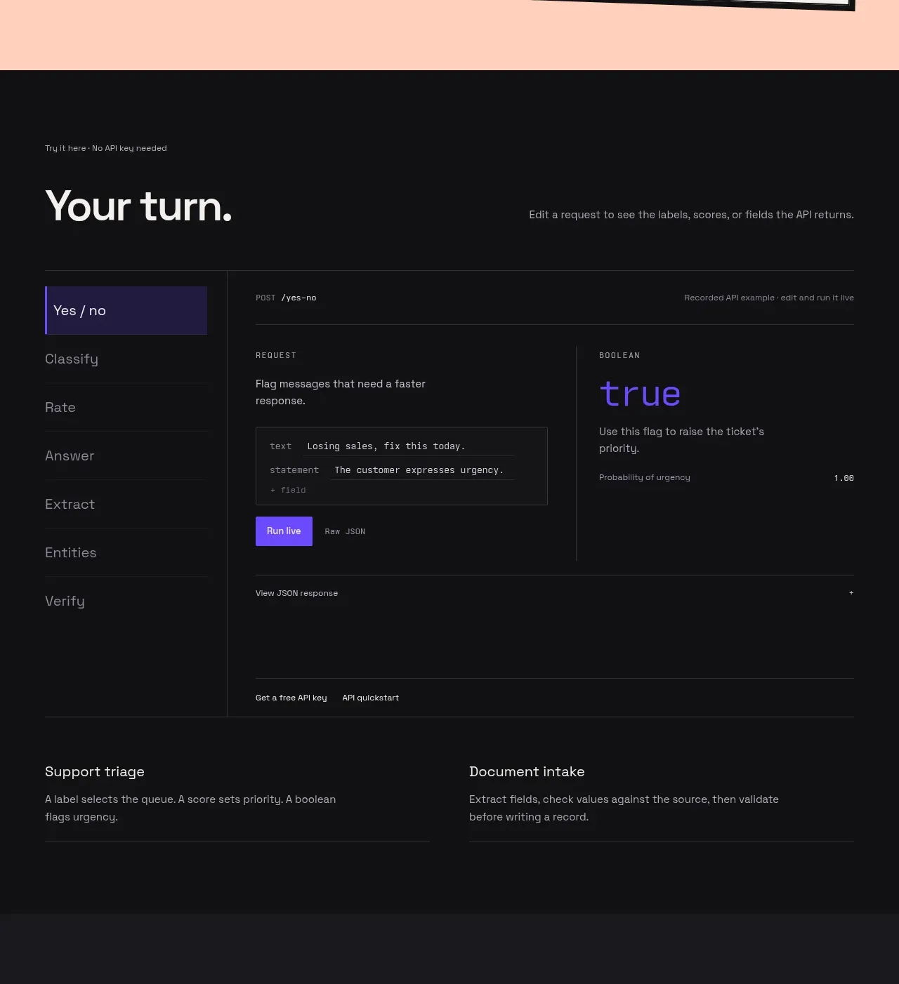
5. **Interactive API demo:** Return to the dark background with a small eyebrow, large “your turn”-style heading, and short explanatory copy. Below, create a bordered application frame with a vertical list of example operations on the left and a request/response workspace on the right, including endpoint metadata, editable-looking request fields, a vivid run button, output value, probability/detail row, and a collapsed JSON response row.
6. **Demo support links:** Beneath the main demo, add two compact side-by-side use-case summaries separated by spacing and horizontal rules, each with a title and short explanation.
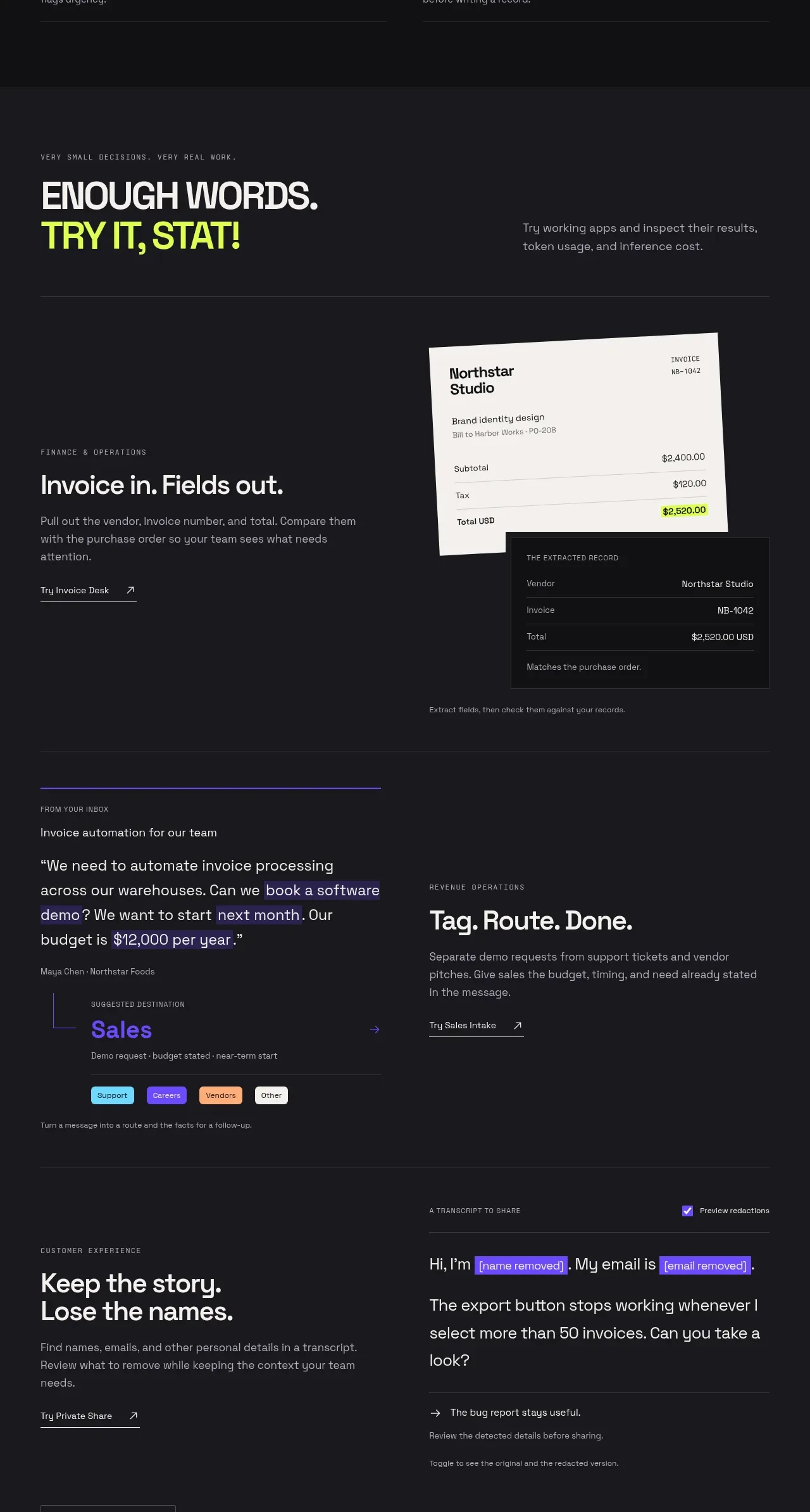
7. **Use-case showcase intro:** In a slightly lighter charcoal section, introduce practical examples with a small uppercase eyebrow, oversized headline with a lime-highlighted line, and a supporting paragraph aligned to the right.
8. **Invoice extraction example:** Use a two-column case-study row. Put the workflow title, description, and underlined CTA on the left; on the right, show an angled invoice sheet overlapped by a dark extracted-record panel with highlighted total data.
9. **Inbox routing example:** Add another two-column example separated by a rule. Show a quote-like message parser on the left with selected phrases highlighted in purple and a suggested destination/result; place the routing title, explanation, and CTA on the right.
10. **Privacy/redaction example:** Add a final two-column row. Put the use-case title, description, and CTA on the left; on the right, show a transcript interface with a redaction toggle and bright purple highlighted names, emails, or other sensitive spans.
11. **Showcase continuation CTA:** Finish the examples section with a bordered button that invites the visitor to explore the capabilities further.
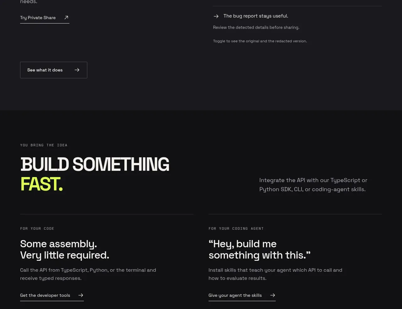
12. **Developer paths section:** Return to a near-black band with a small eyebrow, oversized headline where the final word is lime, and a right-aligned integration statement. Below, use two equal columns divided by a rule: one for direct code/SDK usage and one for coding-agent skills, each with a short explanation and underlined CTA.
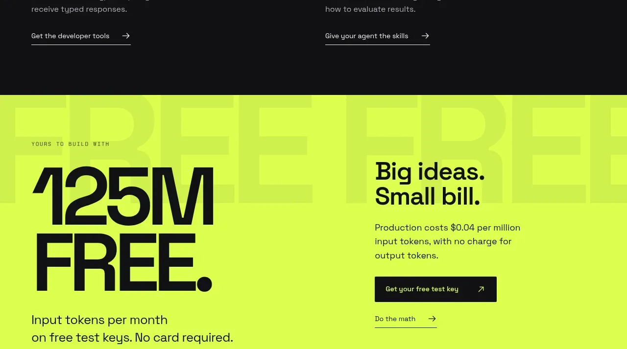
13. **Pricing/free allowance banner:** Switch to a fluorescent lime full-width section. Add oversized dark numeric typography for the free monthly allowance on the left, supporting copy beneath it, and a right-side pricing explanation with a dark filled CTA and a secondary underlined link. Add very large low-contrast background lettering for texture.
14. **Footer:** End on a dark footer with a short company/product description, a large serif or display-style wordmark treatment, three simple navigation columns, and a bottom legal row containing location/copyright details, trust/security badge treatment, company links, support, terms, and a back-to-top link.

## Design language
- Build hierarchy with a very large condensed or tightly tracked display face for headlines, medium sans-serif body copy, and tiny uppercase/monospace eyebrow labels with generous letter spacing.
- Keep the main canvas near black, approximately `#101011` to `#151519`, with off-white text around `#F2F0ED`; use thin low-contrast rules around `#2A2A2D` to structure the long page without boxing every element.
- Reserve electric purple, approximately `#6D42FF` or `#7047FF`, for emphasized headline words, active demo states, output values, links, and selected text. Use fluorescent lime around `#C9FF28` to `#D5FF32` for key CTAs, highlighted data, and the pricing band. Use a warm peach around `#FFCDBB` as the main rhythm break between dark sections.
- Let rhythm change deliberately down the page: start with a spacious, high-impact hero; move into a more functional, denser interactive demo; open up into roomy case-study rows; then simplify into developer choices, a very bold pricing block, and a quiet footer.
- Use asymmetric two-column layouts, large empty margins, and strong left alignment. Keep explanatory copy narrow, generally around 35–50 characters per line, while allowing display headlines to span several lines.
- Treat cards as physical, editorial objects: use square or very small radii, hard dark outlines, subtle offset shadows, slight rotations, and layered paper surfaces. Avoid soft SaaS card treatments, large rounded corners, and diffuse shadows.
- Use buttons as compact rectangular controls with sharp corners, strong fills, and arrow affordances. Text links should often be underlined with a short rule or paired with a simple arrow.
- Make the demo feel usable rather than decorative: show active tabs, a selected operation, endpoint/request metadata, editable fields, a run action, and a clear response state. Keep controls dark and restrained, with purple reserved for the active or result state.
- Where motion is added, favour subtle card drift, section reveal, and hover translation of arrows or underlines; do not introduce noisy animation that competes with the oversized type and high-contrast colour blocks.
- Use the lime section as a decisive visual crescendo, then return to the dark footer so the page closes with restraint. Preserve generous vertical spacing and thin separators even when the content becomes dense.

## Never
- Do not copy the reference product’s logos, wordmarks, product name, tagline, copy, illustrations, photography, exact examples, or icon set.
- Do not present the result as Milliseconds.ai or as a clone of the reference page.
- Create original content, brand assets, use cases, data, and visual compositions for the user’s product while reusing only the general layout logic and design principles above.
Components from this page
All components
 Minimal dark navigation bar
Milliseconds.ai · Navigation
Minimal dark navigation bar
Milliseconds.ai · Navigation
 Bold API value proposition hero
Milliseconds.ai · Hero
Bold API value proposition hero
Milliseconds.ai · Hero
 Plain-language product explanation
Milliseconds.ai · Feature grid
Plain-language product explanation
Milliseconds.ai · Feature grid
 Interactive API playground
Milliseconds.ai · Tabs & steps
Interactive API playground
Milliseconds.ai · Tabs & steps
 Workflow examples showcase
Milliseconds.ai · Feature grid
Workflow examples showcase
Milliseconds.ai · Feature grid
 Developer build pathways
Milliseconds.ai · Call to action
Developer build pathways
Milliseconds.ai · Call to action
 High-contrast free usage offer
Milliseconds.ai · Call to action
High-contrast free usage offer
Milliseconds.ai · Call to action
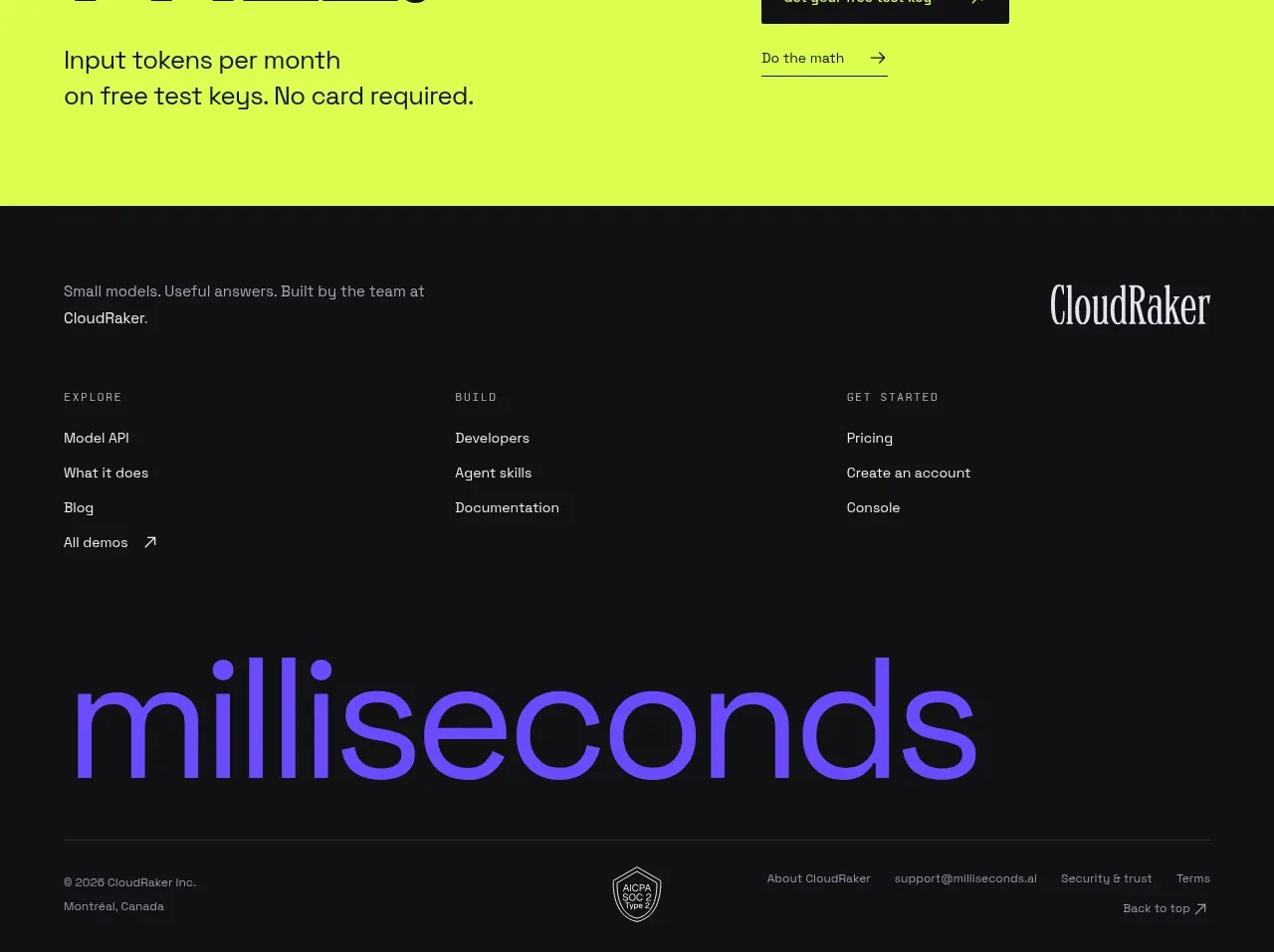 Multi-column site footer
Milliseconds.ai · Footer
Multi-column site footer
Milliseconds.ai · Footer