 kage
kage
milliseconds.ai
Design analysis
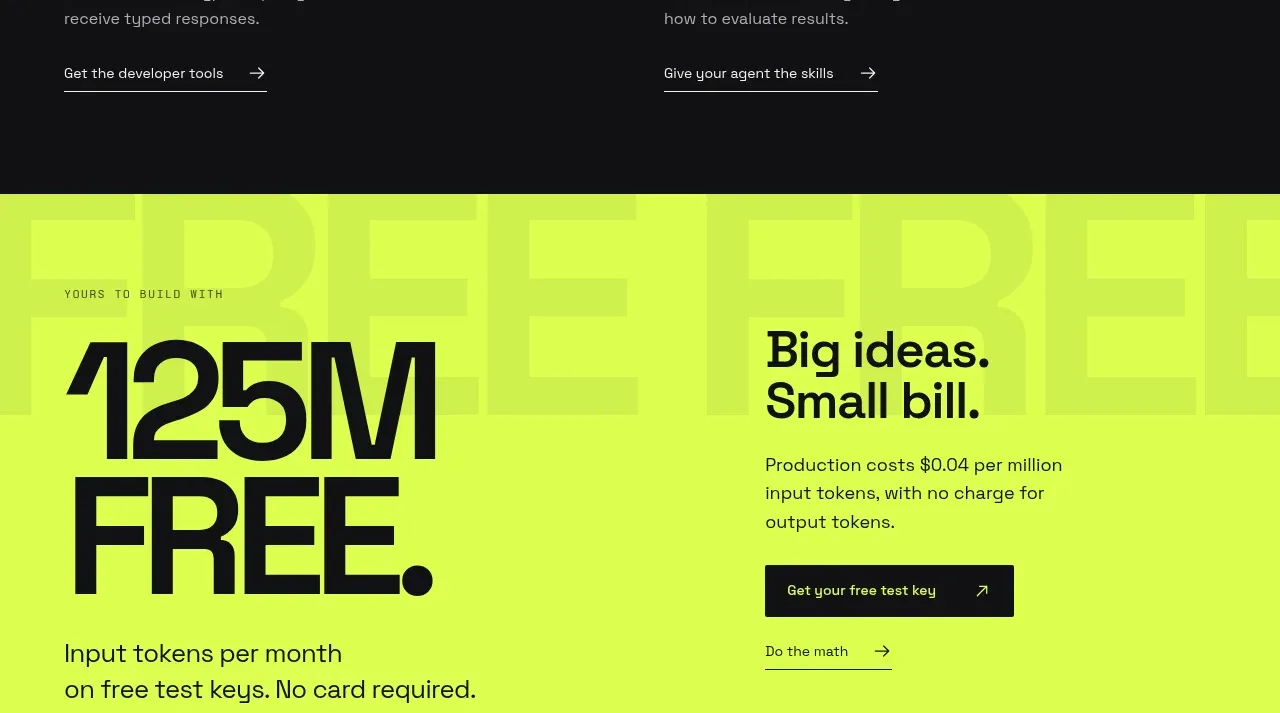
A neon-lime conversion band makes the free allowance impossible to miss. Huge typography on the left communicates scale while a compact explanatory block and dark button on the right gives the offer a clear next step.
Prompt preview
## Reference images

Study these alongside the description below: hierarchy, rhythm, spacing, colour. Build for the product you are asked about, using this design language.

- Component: https://kage-design-assets.t3.tigrisfiles.io/components/milliseconds-ai/6fac96f3-e489-4913-80bc-8c862b5f9e82-1790056994-6.webp
- Full page it was cut from: https://kage-design-assets.t3.tigrisfiles.io/screenshots/milliseconds-ai/6fac96f3-e489-4913-80bc-8c862b5f9e82-1790056904819-full.webp
- Component on Kage: https://kage.design/component/milliseconds-cta-2

## Before you start
Ask what free allowance, trial, or low-friction offer the user's product can honestly make. Apply the hierarchy to that offer and the user's brand.

Build a high-contrast CTA band with a vivid lime background around `#d7ff36` and dark charcoal text (`#101012`). Use a two-column layout with 52% for a giant offer statement and 48% for the explanation. Add a tiny uppercase eyebrow above the headline, then use 76–100px heavy typography with very tight line-height for the quantity or benefit. Put a short 18px supporting line beneath it. On the right, use a 30–36px heading, a concise 15–16px paragraph, a solid near-black button with light text, and a secondary underlined link. Keep page gutters at 44px and vertical padding around 72–96px.

Ensure the color contrast passes accessibility checks, make the entire action area responsive, and use a small hover lift or brightness change for the button. Treat the offer as a strong endpoint before the footer.

Never: copy the reference offer amount, product name, logo, pricing copy, illustrations, imagery, or exact layout text.
More components
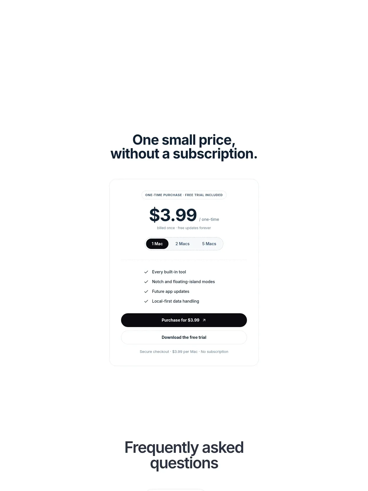
 Visual closing product statement
NotchPop · Call to action
Visual closing product statement
NotchPop · Call to action
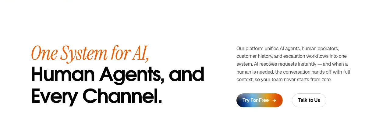
 System positioning statement
IntellAgents.io · Call to action
System positioning statement
IntellAgents.io · Call to action
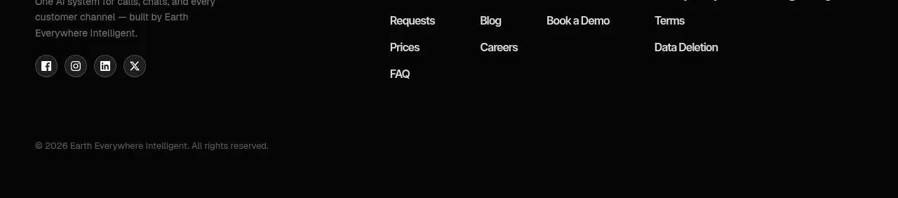 Final conversion banner
IntellAgents.io · Call to action
Final conversion banner
IntellAgents.io · Call to action
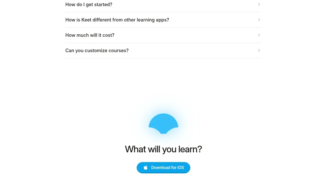
 Final app-download call to action
Keet · Call to action
Final app-download call to action
Keet · Call to action
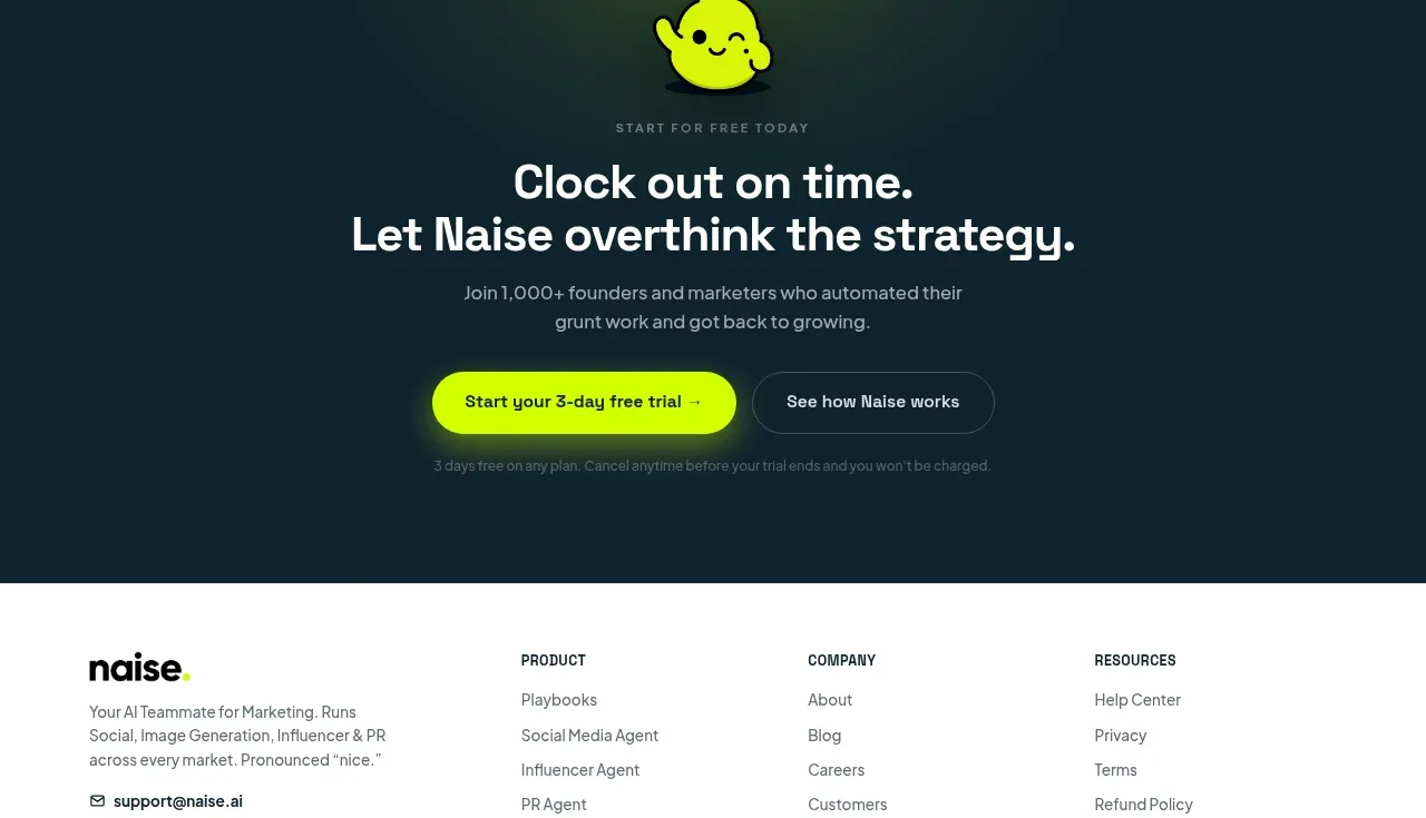
 Dark conversion call to action
Naise AI · Call to action
Dark conversion call to action
Naise AI · Call to action
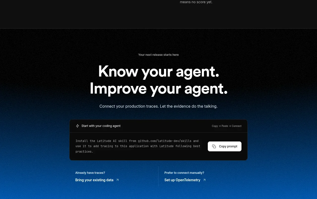
 Connect data and start improving
AgentScore · Call to action
Connect data and start improving
AgentScore · Call to action