kage
kage
mintlify.com

Design analysis
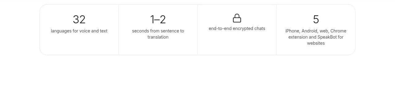
A restrained enterprise metrics section pairs a confident two-line value proposition with a minimal action and a quiet, flowing data visual. The lower stat band uses oversized figures, sparse iconography, and generous whitespace to make scale and reliability feel credible without becoming dashboard-like.
Prompt preview
## Reference images

Study these alongside the description below: hierarchy, rhythm, spacing, colour. Build for the product you are asked about, using this design language.

- Component: https://kage-design-assets.t3.tigrisfiles.io/components/mintlify-com/71224961-d985-451b-9e35-e02eddcee178-1789060645-6.webp
- Full page it was cut from: https://kage-design-assets.t3.tigrisfiles.io/screenshots/mintlify-com/71224961-d985-451b-9e35-e02eddcee178-1789060616-full.webp
- Component on Kage: https://kage.design/component/mintlify-stats

## Before you start
Ask the user what their product is, who it serves, and what its brand language, colours, and typography are. Then apply the principles below to create an original stats section for that product rather than reproducing the reference literally.

## Build an enterprise metrics section
Create a wide, editorial-style section that communicates scale, reliability, and momentum through a short statement, one supporting action, an abstract data-flow visual, and a compact row of key metrics.

### Layout and alignment
- Place the component inside a centered, high-width content frame with a very light vertical rule or boundary at each side.
- Use a generous upper panel. Align the main content to the same left inset as the metrics below.
- Arrange the upper copy and CTA in a horizontal row on large screens: copy on the left, action on the right. Let the copy occupy roughly 55–65% of the row so the statement remains dominant.
- Use a small vertical accent rule immediately before the heading to establish a visual anchor.
- Position an abstract, low-contrast flowing-line visual beneath the copy and above the metrics. It should span most of the available width and fade gently into the background rather than behave like a chart with axes.
- Separate the stats row with a subtle horizontal border. Use three or four equal columns with generous horizontal padding and faint vertical dividers only if needed.
- On smaller screens, stack the CTA under the copy, keep the visual short, and turn the stats into a two-column or vertically stacked layout while preserving the shared left alignment.

### Typography hierarchy
- Use a modern sans-serif with a clean, slightly compact appearance.
- Set the main statement in a large responsive display size, approximately 36–42px on desktop and 28–34px on mobile, with tight line-height around 0.98–1.08 and mildly tight letter spacing.
- Give the first line strong near-black emphasis and the second line a softer gray so the message has a deliberate contrast hierarchy. Adapt this treatment to the product’s brand rather than forcing black and gray.
- Make metric values oversized but lighter than the headline, approximately 34–42px desktop, with compact line-height.
- Keep metric labels small and quiet, around 12–14px, with enough contrast to remain readable.

### Spacing and proportions
- Give the upper panel substantial vertical breathing room: approximately 150–210px top padding and 55–85px bottom padding on desktop, adjusted to the surrounding page.
- Keep 28–48px between the heading and the data visual, and 55–80px between the visual and the stats boundary.
- Use consistent 32–48px gutters between metric columns.
- Avoid filling every area; the whitespace is part of the premium enterprise tone.

### Colour and visual treatment
- Start from a warm or cool near-white background such as `#fcfcfb` or `#ffffff`.
- Use near-black text such as `#111111` for the primary line and a neutral gray such as `#737777` for the secondary line.
- Use a restrained brand accent for the small vertical rule, approximately a muted green or teal such as `#1f9d78`.
- Render the flowing visual as many thin, translucent curves using a restrained range of mint, teal, pale lime, and very light gray-green tones, for example `#b9f28f`, `#78dfb4`, `#8ed9d2`, and `#dcefe6`. Keep opacity low and avoid saturated neon colour.
- Use borders around `#e9ecea`, ideally 1px, so the structure is perceptible but not boxed in.
- The CTA may use a near-black fill such as `#101010`, white text, a compact arrow or chevron, and a modest radius around 4–6px. Add a subtle hover lift or colour shift, but do not overanimate the section.

### Abstract data visual
- Build the visual with SVG, canvas, CSS paths, or another lightweight method that works in the product’s stack.
- Use smooth, long Bézier or spline curves that gently oscillate, overlap, and converge toward one side. Vary opacity, colour, and amplitude so the result feels like coordinated system activity rather than a literal graph.
- Keep the visual decorative and non-interactive unless the product has a meaningful reason to expose data details. It must remain behind the content hierarchy and never reduce text legibility.
- Respect reduced-motion preferences; if animated, use very slow, subtle movement and avoid distracting loops.

### Metrics and interaction
- Choose three or four meaningful proof points relevant to the product, such as volume handled, teams served, uptime, or performance improvement.
- Make each metric immediately scannable and ensure the value and label have a clear relationship.
- Use buttons and links with visible focus states, keyboard accessibility, and a hover state that confirms interactivity without changing the composition.
- Ensure the section works at narrow widths, with no clipped lines, overflowing curves, or unreadable figures.

## Never
- Never copy logos, product names, wording, numerical claims, or brand identifiers from the reference.
- Never reuse the reference’s exact headline, CTA label, stat values, or icon designs.
- Never include the reference’s illustration, line artwork, screenshots, or imagery; create a new abstract visual treatment suited to the user’s product.
- Never turn the section into a dense analytics dashboard with axes, legends, cards, or excessive decoration.
- Never sacrifice contrast, accessibility, responsive behaviour, or reduced-motion support for visual similarity.