kage
kage
mockmagic.com

Design analysis
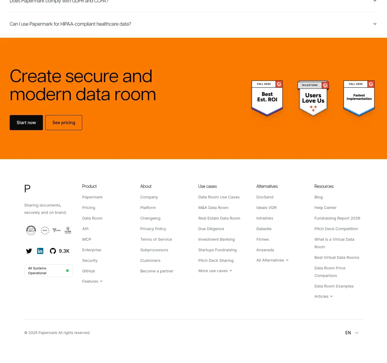
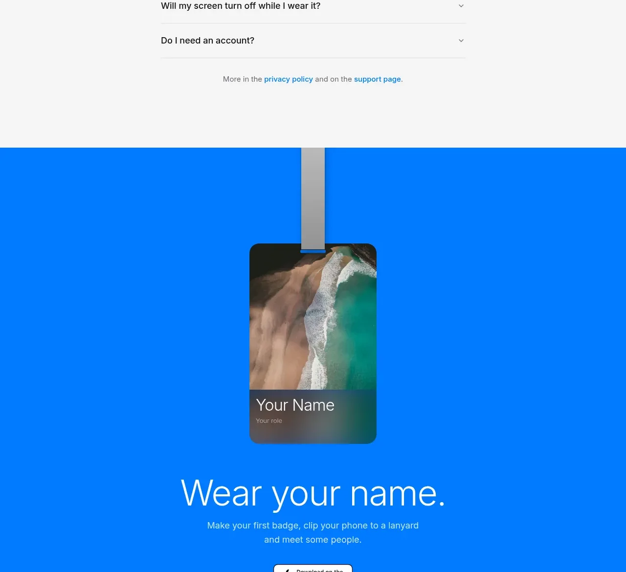
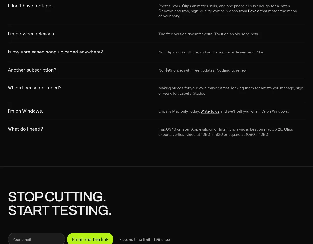
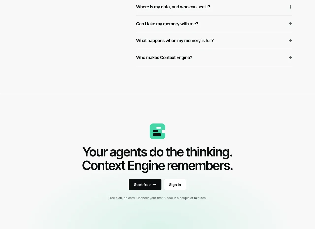
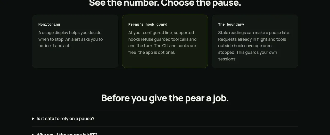
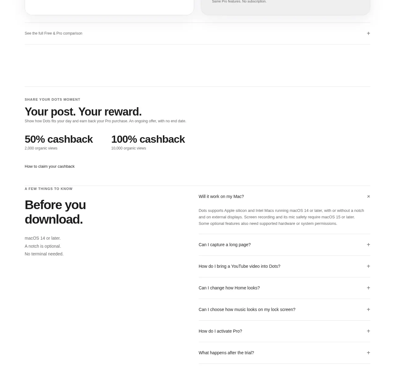
A restrained FAQ section that uses a narrow reading column, generous vertical rhythm, hairline dividers, and a single open answer to make a long list feel calm and easy to scan. High-contrast typography and understated chevrons provide clear interaction without adding visual noise.
Prompt preview
## Reference images

Study these alongside the description below: hierarchy, rhythm, spacing, colour. Build for the product you are asked about, using this design language.

- Component: https://kage-design-assets.t3.tigrisfiles.io/components/mock-magic-video-presets/201a35ef-5103-4614-9439-92b73face5de-1789106561-4.webp
- Full page it was cut from: https://kage-design-assets.t3.tigrisfiles.io/screenshots/mock-magic-video-presets/201a35ef-5103-4614-9439-92b73face5de-1789106517952-full.webp
- Component on Kage: https://kage.design/component/mock-magic-video-presets-faq

## Before you start
Ask the user what their product does, who it is for, and what visual brand they want to use. Then apply the principles below to create an FAQ section for their product—not a copy of the reference.

## Build this component
Create a focused FAQ section for a modern software product. Use a full-width section with a very dark near-black background and a thin horizontal rule near the top and bottom. Center a relatively narrow content column inside the section, with the heading centered above a vertically stacked accordion list.

### Layout and alignment
- Use a content column around 560–640px wide on desktop, centered horizontally.
- Keep the section visually airy: generous top and bottom padding, approximately 72–112px depending on the surrounding page.
- Place the heading above the accordion with roughly 56–68px of separation.
- Make every FAQ row span the full content column.
- Align question text to the left and the chevron control to the far right on the same horizontal axis.
- Use a consistent row height of about 60–64px for closed items.
- The first item may be open by default to demonstrate the component state; keep the remaining items closed.
- On small screens, reduce the column width to the viewport minus 32–40px and allow long questions to wrap without colliding with the icon.

### Typography
- Use a clean modern sans-serif with a neutral, professional feel.
- Set the section heading at approximately 36–40px with a regular or medium weight and tight-to-normal line height.
- Set questions around 18px, with a regular or medium weight and approximately 1.4 line height.
- Set answers around 16px with a relaxed 1.45–1.6 line height for comfortable reading.
- Keep the heading bright and the answer text visibly softer than the questions.

### Colour and surfaces
- Page/section background: near black, approximately `#000000` or `#050505`.
- Primary heading and question text: soft white, approximately `#F2F2F2`.
- Answer text: muted gray, approximately `#9A9A9A` to `#A6A6A6`.
- Divider rules: subtle charcoal gray, approximately `#262626` to `#303030`.
- Avoid bright accent colours unless they belong to the user’s brand; this component should remain quiet and content-led.

### Borders, icons, and spacing
- Use 1px horizontal dividers between rows and a subtle 1px rule at the section boundaries.
- Do not put each FAQ in a card or add visible boxes, shadows, or gradients.
- Use a small, thin chevron or plus/minus icon at the right edge, approximately 16–18px.
- Closed items should show a downward chevron; the open item should show an upward chevron or equivalent expanded state.
- Keep approximately 20–24px of horizontal space between the question and the icon.
- Give the expanded answer about 16–22px of top spacing and 28–36px of bottom spacing before the next divider.

### Interaction and accessibility
- Make the entire question row a button or clickable trigger, not only the icon.
- Animate expansion and collapse gently over roughly 180–240ms using height/opacity or a suitable accessible accordion pattern.
- Include visible hover and keyboard-focus states while preserving the restrained visual language; a subtle text-brightening or low-contrast outline is sufficient.
- Use semantic buttons, `aria-expanded`, and a relationship between each trigger and its answer panel.
- Ensure the accordion works with keyboard navigation and respects `prefers-reduced-motion`.
- Decide whether multiple answers can be open based on the product’s content needs, but keep the default state visually simple.

## Never
- Never use logos, product names, or branded copy from the reference.
- Never reuse the reference questions, answers, wording, or exact content structure.
- Never copy illustrations, imagery, icons, or decorative artwork from the reference.
- Never reproduce the reference pixel-for-pixel; adapt the layout, tone, and interaction principles to the user’s product and brand.
- Never sacrifice readable contrast, responsive behavior, or keyboard accessibility for visual similarity.