kage
mylens.ai
Design analysis
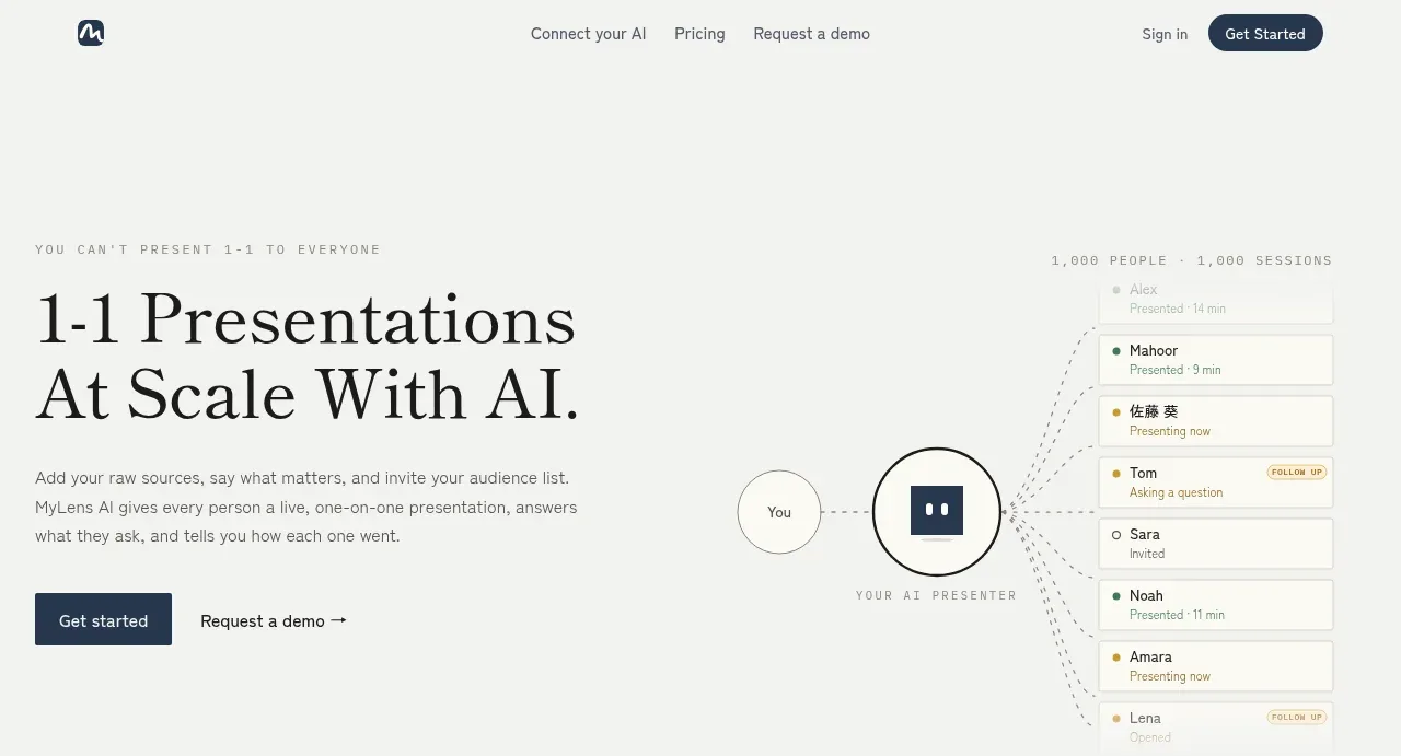
The hero pairs an oversized editorial serif headline and concise supporting copy with a simple one-to-many presentation diagram. Two clear actions sit below the copy, while the diagram explains the product idea without requiring a screenshot.
Prompt preview
## Reference images

Study these alongside the description below: hierarchy, rhythm, spacing, colour. Build for the product you are asked about, using this design language.

- Component: https://kage-design-assets.t3.tigrisfiles.io/components/mylens/1ccd9fd0-0589-4047-afdb-6c3bf2f362f8-1792389751-1.webp
- Full page it was cut from: https://kage-design-assets.t3.tigrisfiles.io/screenshots/mylens/1ccd9fd0-0589-4047-afdb-6c3bf2f362f8-1792389647544-full.webp
- Component on Kage: https://kage.design/component/mylens-hero

## Before you start
Ask what the user's product does, what outcome it promises, and what brand personality it should express. Use those answers to create an original hero following these principles.

Create a two-column hero directly below the navigation. On the left, place a tiny uppercase eyebrow, a large high-contrast editorial serif headline broken over two lines, one short explanatory paragraph, and a primary plus text-based secondary CTA. On the right, create a lightweight product concept diagram: one source/person node connected by fine dotted lines to a vertical stack of audience/session cards. Keep the diagram abstract and product-relevant rather than using a literal screenshot.

Design rules:
- Use an off-white canvas near `#f5f5f2`; headline near-black `#171817`; supporting copy muted gray `#737570`.
- Use a display serif around 52–64px with tight line-height, paired with a neutral sans-serif around 13–15px.
- Align the text to a wide left column and let the visual occupy the right half; retain substantial whitespace around both.
- Use a dark blue primary button around `#20364d`, white text, 6px radius, and a quiet arrow/link secondary action.
- Draw nodes as pale circular or rounded shapes with 1px gray borders; use very thin dotted connectors and restrained status dots.
- Keep interaction subtle: buttons gain a slight colour shift, cards may lift by 1–2px on hover.

Never:
- Never use logos, product names, copy, illustrations, or imagery from the reference.
- Never copy the exact headline, audience list, node icon, or diagram geometry.
- Never turn the hero into a dense dashboard screenshot.