kage
kage
naise.ai

Design analysis
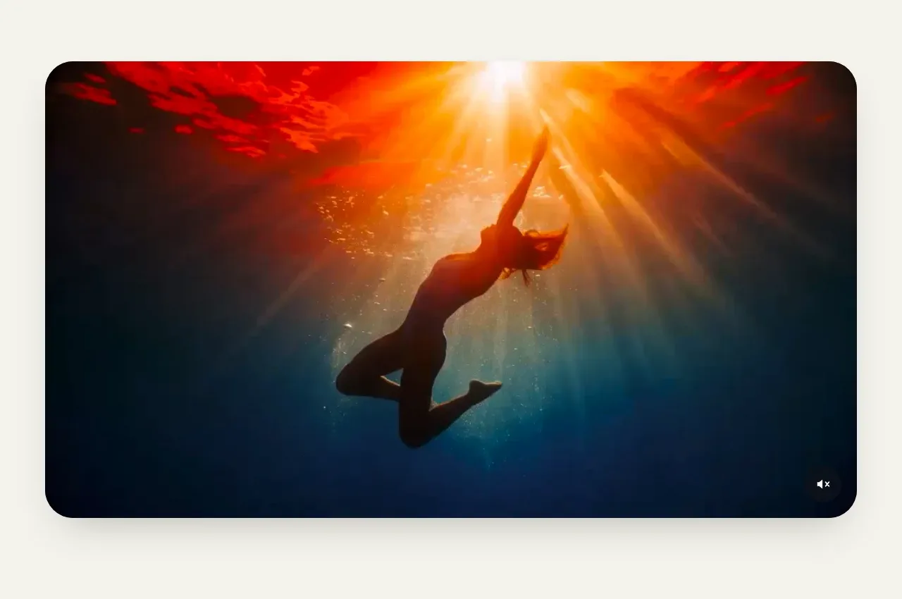
A centered section introduces the product in action and uses one large rounded interface preview with an obvious play affordance as the visual anchor.
Prompt preview
## Reference images

Study these alongside the description below: hierarchy, rhythm, spacing, colour. Build for the product you are asked about, using this design language.

- Component: https://kage-design-assets.t3.tigrisfiles.io/components/naise-ai/7a5a1374-ad41-4c97-8974-81f691da0cb9-1790229777-3.webp
- Full page it was cut from: https://kage-design-assets.t3.tigrisfiles.io/screenshots/naise-ai/7a5a1374-ad41-4c97-8974-81f691da0cb9-1790229706709-full.webp
- Component on Kage: https://kage.design/component/naise-gallery

## Before you start
Ask what the user's product and brand are, then apply these principles to that product rather than reproducing this reference.

Create a centered product-demo section on a very light gray background #f5f7f7. Add a small uppercase eyebrow, a confident two-line heading, and a short explanatory subtitle above a large desktop product screenshot or composed UI preview. Constrain the preview to roughly 75–85% of the content width, use a 16–22px radius, a subtle border and soft shadow, and place a large circular lime play button at its center with a short overlay label. Preserve ample vertical whitespace and keep the media aspect ratio stable. On mobile, use a full-width cropped preview and keep the play control accessible.

Never: use logos, product names, copy, illustrations, or imagery from the reference.