kage
kage
naise.ai
Design analysis
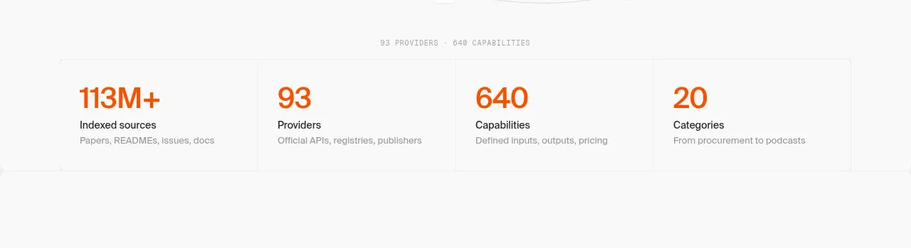
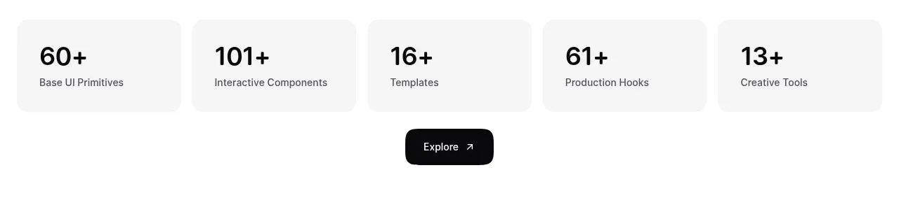
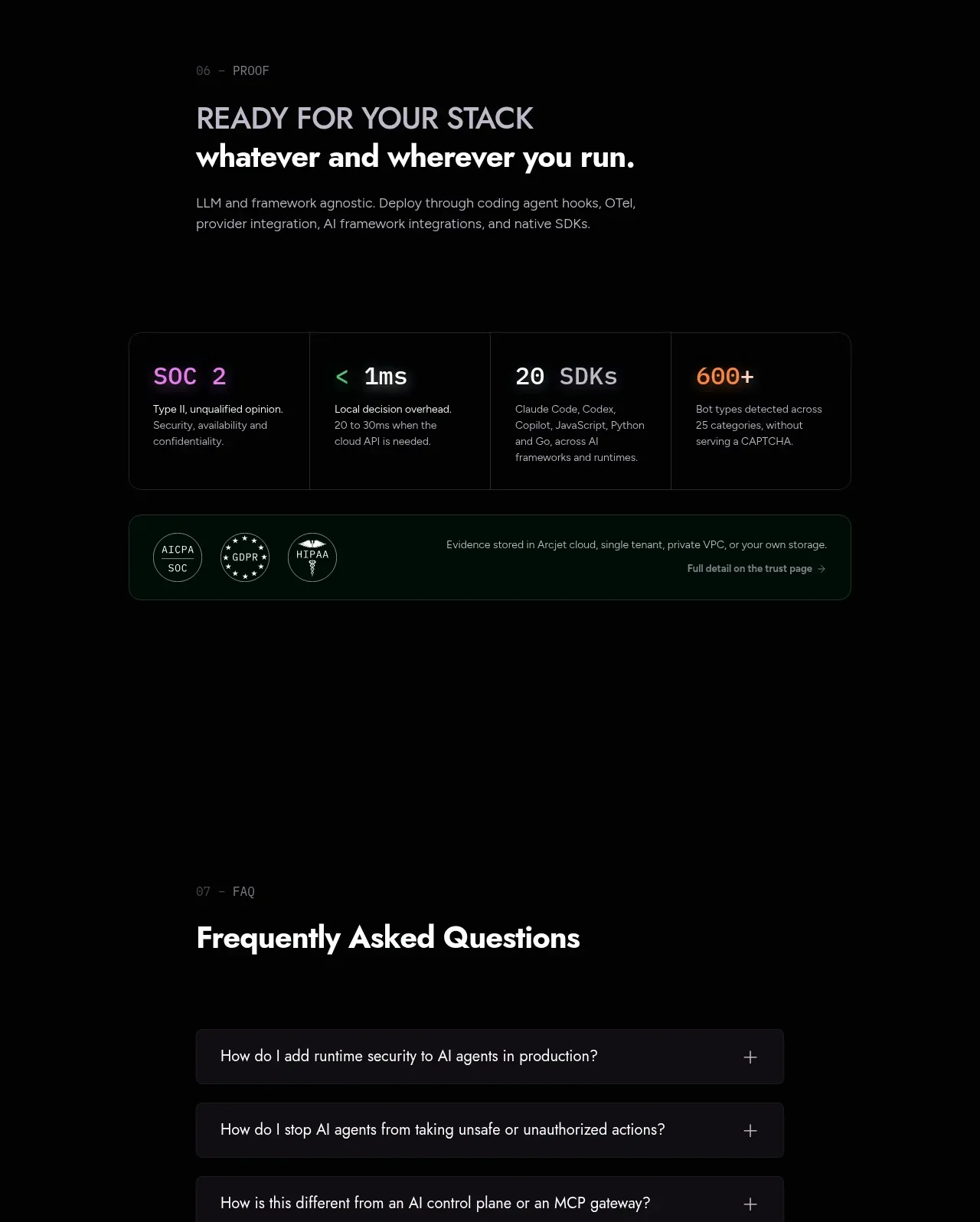
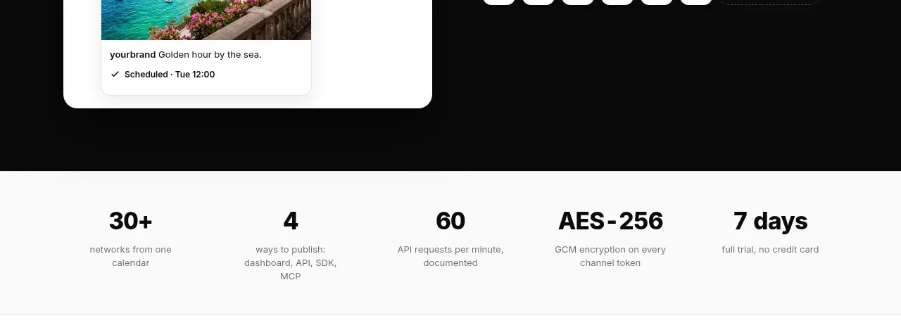
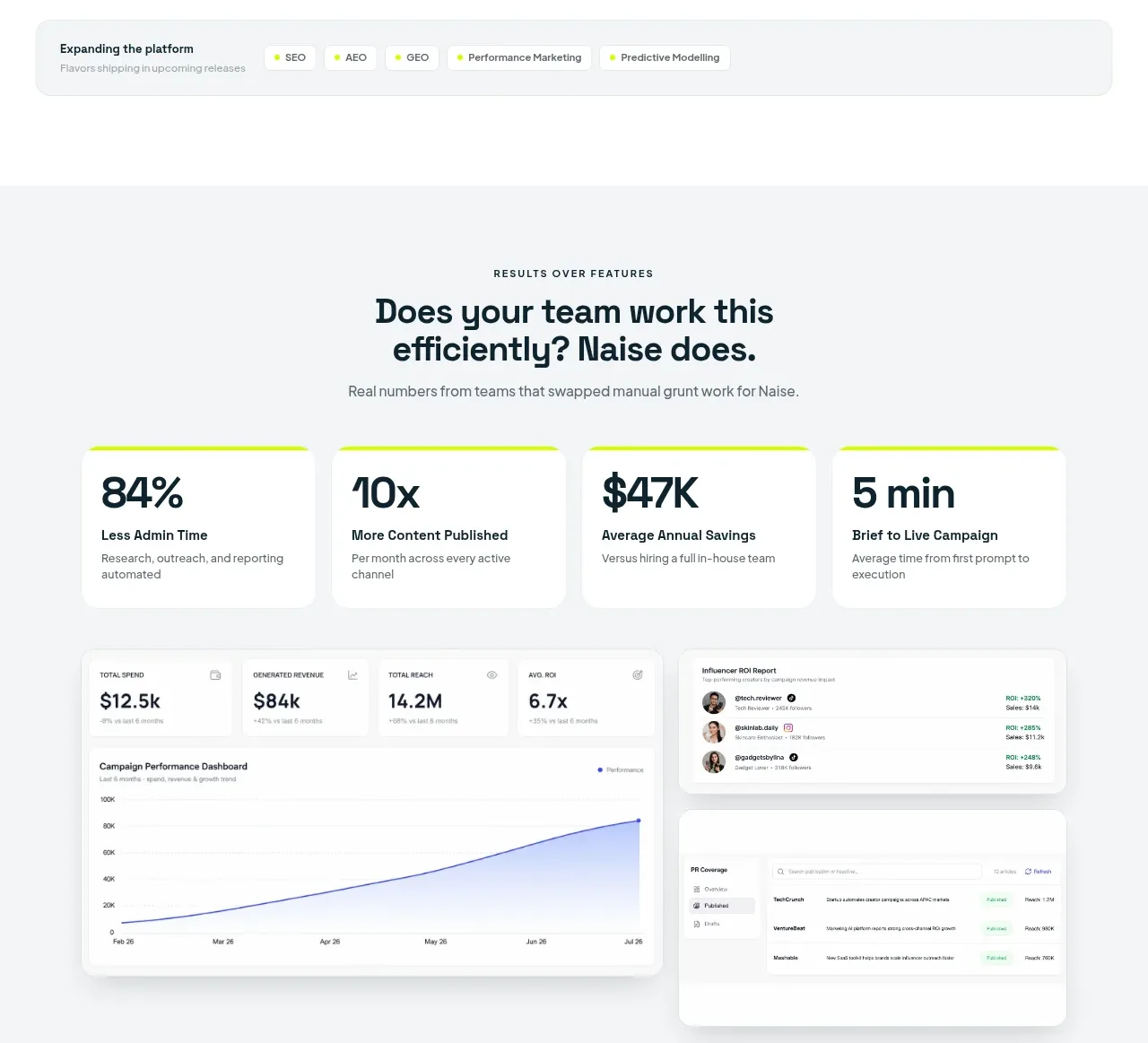
This proof section turns product value into four immediately scannable metric cards, then reinforces the numbers with a composed reporting dashboard.
Prompt preview
## Reference images

Study these alongside the description below: hierarchy, rhythm, spacing, colour. Build for the product you are asked about, using this design language.

- Component: https://kage-design-assets.t3.tigrisfiles.io/components/naise-ai/7a5a1374-ad41-4c97-8974-81f691da0cb9-1790229778-6.webp
- Full page it was cut from: https://kage-design-assets.t3.tigrisfiles.io/screenshots/naise-ai/7a5a1374-ad41-4c97-8974-81f691da0cb9-1790229706709-full.webp
- Component on Kage: https://kage.design/component/naise-stats

## Before you start
Ask what the user's product and brand are, then apply these principles to that product rather than reproducing this reference.

Build a results section with a small uppercase eyebrow, a centered headline, and one explanatory sentence. Follow with four equal statistic cards in a responsive grid. Each card should have a thin lime top rule, a very large metric, a bold label, and a brief description. Below, add a wide dashboard composition with a large line chart panel and two smaller reporting panels. Use a pale gray background #f5f7f7, white cards, dark navy text #10242d, lime #c9ff00, muted gray #6c777b, 18px radii, and soft shadows. Make numbers visually dominant and charts minimal, with no unnecessary axes or decoration. Cards should become two columns then one column on small screens.

Never: use logos, product names, copy, illustrations, or imagery from the reference.