kage
kage
usenarrative.ai

Design analysis
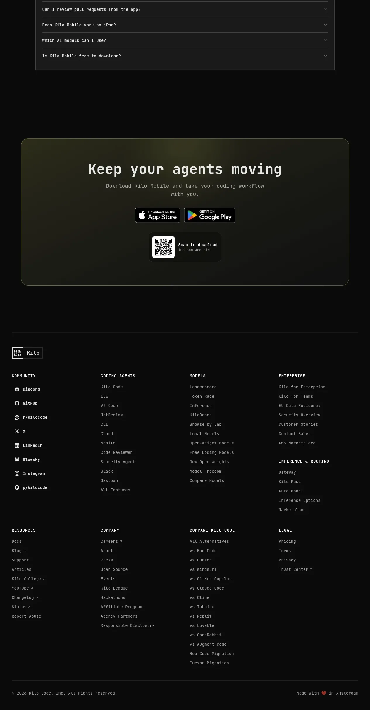
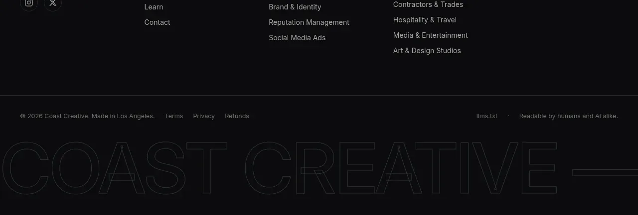
The footer is intentionally sparse: two link columns and a social cluster sit above a thin divider with copyright and locale information.
Prompt preview
## Reference images

Study these alongside the description below: hierarchy, rhythm, spacing, colour. Build for the product you are asked about, using this design language.

- Component: https://kage-design-assets.t3.tigrisfiles.io/components/narrative/6cc395b9-2f9b-4168-8f15-3f16c6d79112-1789538585-6.webp
- Full page it was cut from: https://kage-design-assets.t3.tigrisfiles.io/screenshots/narrative/6cc395b9-2f9b-4168-8f15-3f16c6d79112-1789538531078-full.webp
- Component on Kage: https://kage.design/component/narrative-footer

## Before you start
Ask what the user's product/company is called, which destinations users need, and which legal or locale links are required. Apply these rules with original labels and structure.

Create a quiet full-width footer on an off-white background. Use a constrained inner container with two or three link columns, a small brand label, and a right-side social icon cluster on wide screens. Separate the lower legal row with a thin divider and place copyright, language, privacy, and terms links there. Use 14px section labels, 13px muted links, 32–48px column spacing, 24–32px vertical padding, monochrome icons, and generous whitespace. Make links keyboard-visible and collapse columns into accordions or stacked groups on mobile.

Never: use the reference's logo, product name, copy, illustrations, imagery, or distinctive branded assets.