kage
kage
usenarrative.ai
Design analysis
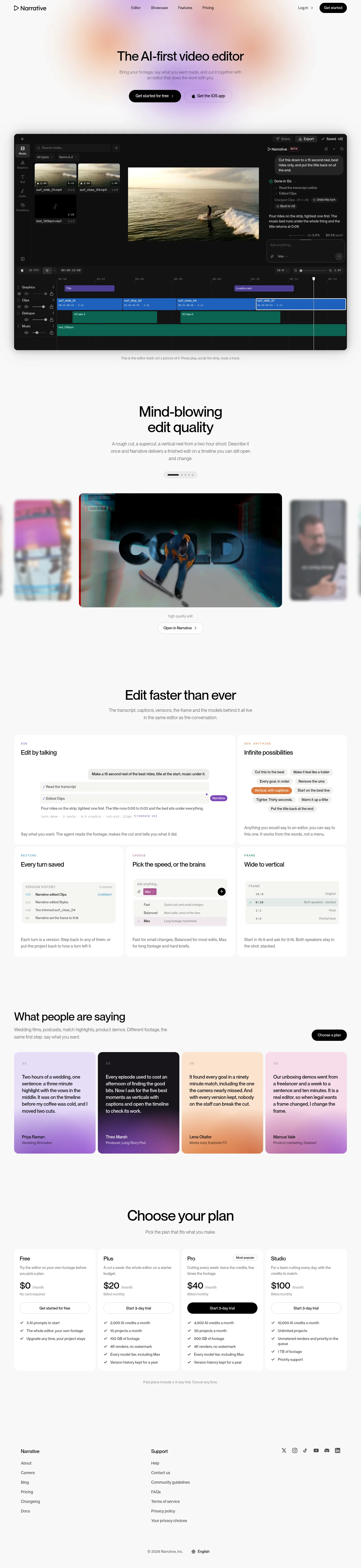
A spacious, white landing page pairs a restrained black typographic system with soft blurred pastel gradients concentrated around the hero and testimonial cards. The page moves from a large centered hero and dark editor preview into a carousel-like showcase, then a dense grid of pale feature cards, before shifting to testimonials, pricing, and a quiet multi-column footer; generous vertical spacing keeps the long page calm while card density increases in the middle and lower sections.
Prompt preview
## Reference images

Study these alongside the description below: hierarchy, rhythm, spacing, colour. Build for the product you are asked about, using this design language.

- Full page: https://kage-design-assets.t3.tigrisfiles.io/screenshots/narrative/6cc395b9-2f9b-4168-8f15-3f16c6d79112-1789538531078-full.webp
- Above the fold: https://kage-design-assets.t3.tigrisfiles.io/screenshots/narrative/6cc395b9-2f9b-4168-8f15-3f16c6d79112-1789538528121.webp
- Design on Kage: https://kage.design/designs/narrative-landing-page

## Before you start
Ask the user what they are building, who it is for, and what brand assets they already have (name, colours, type). Wait for their answers before designing. Apply the reference's design language to their product, not to the reference product.

## Page structure
1. **Top navigation:** Place a compact brand mark area on the left, centered navigation links, and authentication plus a dark pill CTA on the right; keep the header airy and nearly borderless.
2. **Hero:** Use a very large centered headline, a short muted supporting paragraph, and two adjacent CTAs. Add a soft, out-of-focus wash of peach, lavender, and pink behind the upper center without making the background visibly busy.
3. **Product editor preview:** Show a large dark media-editor interface inside a wide rounded rectangle, with media bins, a central preview, a conversational assistant panel, and a multitrack timeline. Add a small explanatory caption beneath it.
4. **Edit-quality showcase intro:** Create a centered section with a two-line headline, restrained body copy, and a small pagination indicator to suggest browsable examples.
5. **Showcase carousel:** Put one large featured video card in the center, with partially visible and heavily blurred neighboring cards at both sides. Add a small label and an outlined action below the featured media.
6. **Speed/features intro:** Introduce the next section with a centered headline and muted explanatory text about the workflow being unified.
7. **Primary feature card:** Use a wide pale card titled around conversational editing, containing a chat/request sample and supporting copy; make it span roughly two columns.
8. **Secondary feature card:** Place a narrower pale card beside it showing compact prompt chips or alternate edit instructions, with a short explanatory paragraph.
9. **Lower feature row:** Continue with three equal cards covering saved versions/history, choosing editing speed or model behaviour, and changing aspect ratio. Each card should combine a small uppercase eyebrow, a concise title, a miniature UI illustration, and bottom-aligned explanatory text.
10. **Testimonials intro:** Switch to a left-aligned heading and paragraph, with a dark pill CTA aligned to the right on the same row.
11. **Testimonials grid:** Present four equal-height quote cards in a row, each with a distinct pale gradient tint, quotation styling, large readable testimonial text, and a small author line anchored near the bottom.
12. **Pricing intro:** Center a large heading and short subtitle with ample whitespace above the pricing cards.
13. **Pricing cards:** Show four adjacent plans in clean white cards: free, entry paid, highlighted popular/pro, and premium/studio. Include plan description, large price, billing note, full-width button, and stacked checkmarked feature list; use a solid black button only for the emphasized plan.
14. **Pricing note:** Add a small centered muted note beneath the cards about trial and cancellation terms.
15. **Footer:** Finish with a sparse multi-column footer: product links on the left, support links in a second column, social icons on the right, and a bottom legal/language row with copyright and locale.

## Design language
- Build hierarchy through scale and whitespace rather than heavy decoration: use oversized, tightly set black headlines, short muted paragraphs, and compact labels.
- Keep the page predominantly white or near-white, approximately `#fafafa` to `#ffffff`, with black text around `#090909` and secondary copy around `#777777`.
- Use soft atmospheric gradients sparingly: blurred peach `#f6c6a7`, lavender `#d7c5f4`, pink `#efc8dc`, and pale yellow `#f3dfb8`; gradients should feel diffused rather than sharply graphic.
- Pair a modern grotesk/sans-serif family throughout. Use a large hero scale around 56–72px desktop, section headings around 40–52px, card headings around 18–22px, and body copy around 13–16px with generous line height.
- Establish a calm rhythm: broad whitespace around hero and section introductions, then tighter spacing and higher information density inside feature, testimonial, and pricing card grids.
- Use cards as the main structural device. Keep corners moderately rounded, around 12–18px, with very faint gray borders or soft shadows; avoid strong outlines and glossy effects.
- Treat the dark editor preview as the main contrast anchor: use near-black `#111111`, subtle gray panels, and saturated timeline tracks in blue, teal, and purple. Keep UI labels small and utilitarian.
- Make feature and pricing cards feel almost paper-like against the page: white or `#fdfdfd` surfaces, minimal elevation, crisp alignment, and consistent internal padding.
- Use gradient testimonial backgrounds as distinct but quiet colour fields, including lavender, charcoal-purple, peach, and pink/lilac. Preserve readable dark or white text according to contrast.
- Use pill-shaped CTAs sparingly. Primary actions are black with white text; secondary actions are white with a thin light-gray border. Buttons should have compact labels and subtle arrow or platform affordances.
- Where media is shown, let it carry visual weight: use large rounded frames, a centered focal item, and blurred peripheral items to imply a carousel without adding a heavy control system.
- Keep interaction feedback understated: gentle hover elevation or colour change on cards and buttons, smooth carousel transitions, and no dramatic parallax or persistent motion.

## Never
- Do not use the reference product's logos, wordmarks, product names, copy, illustrations, photography, screenshots, or icon sets.
- Do not reproduce the reference editor UI or its exact testimonial, pricing, or navigation content.
- Never present the result as Narrative or imply affiliation with it; create original content and assets for the user's product.
Components from this page
All components
 Minimal product navigation
Narrative · Navigation
Minimal product navigation
Narrative · Navigation
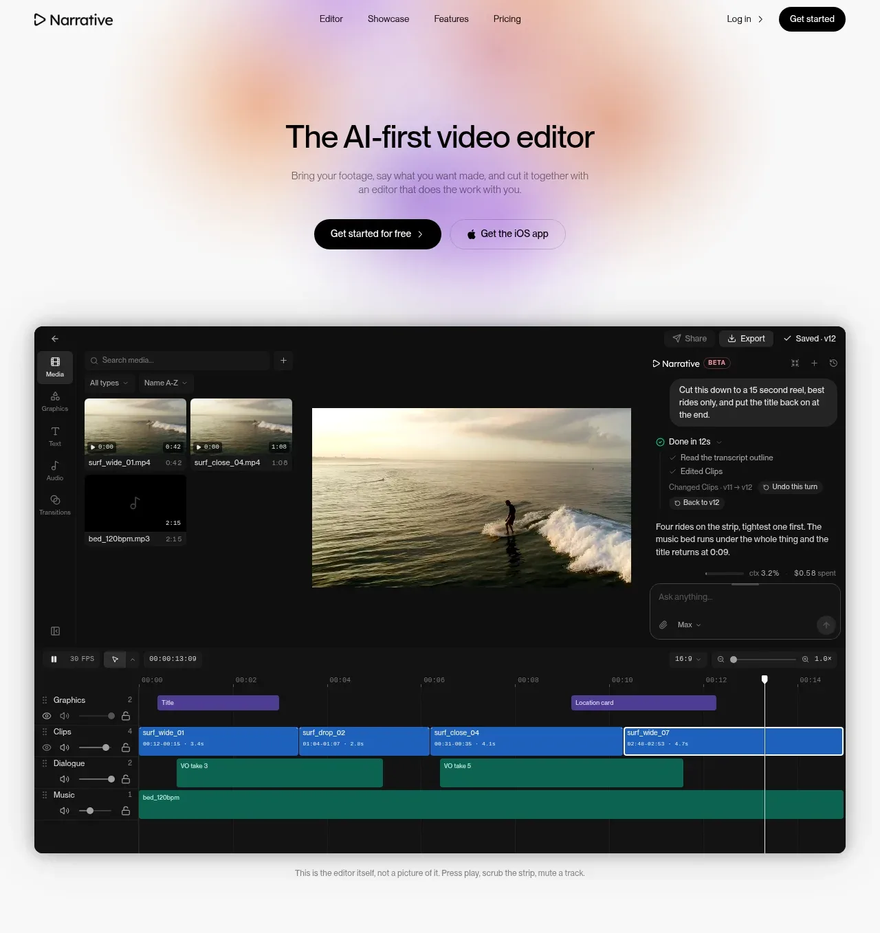 AI editor hero with product preview
Narrative · Hero
AI editor hero with product preview
Narrative · Hero
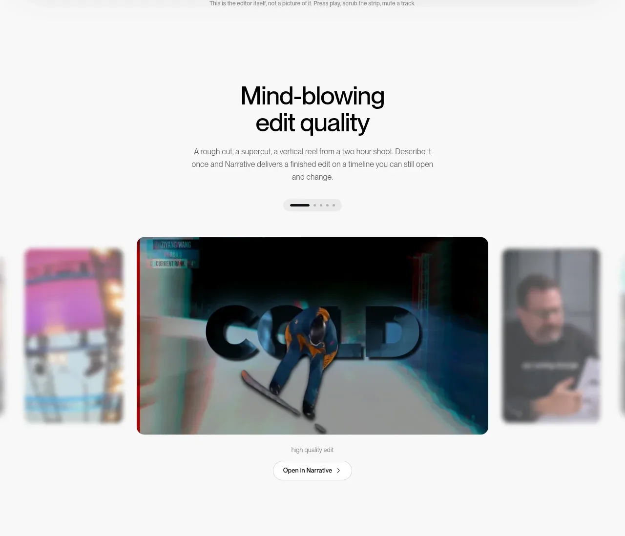 Featured output carousel
Narrative · Gallery
Featured output carousel
Narrative · Gallery
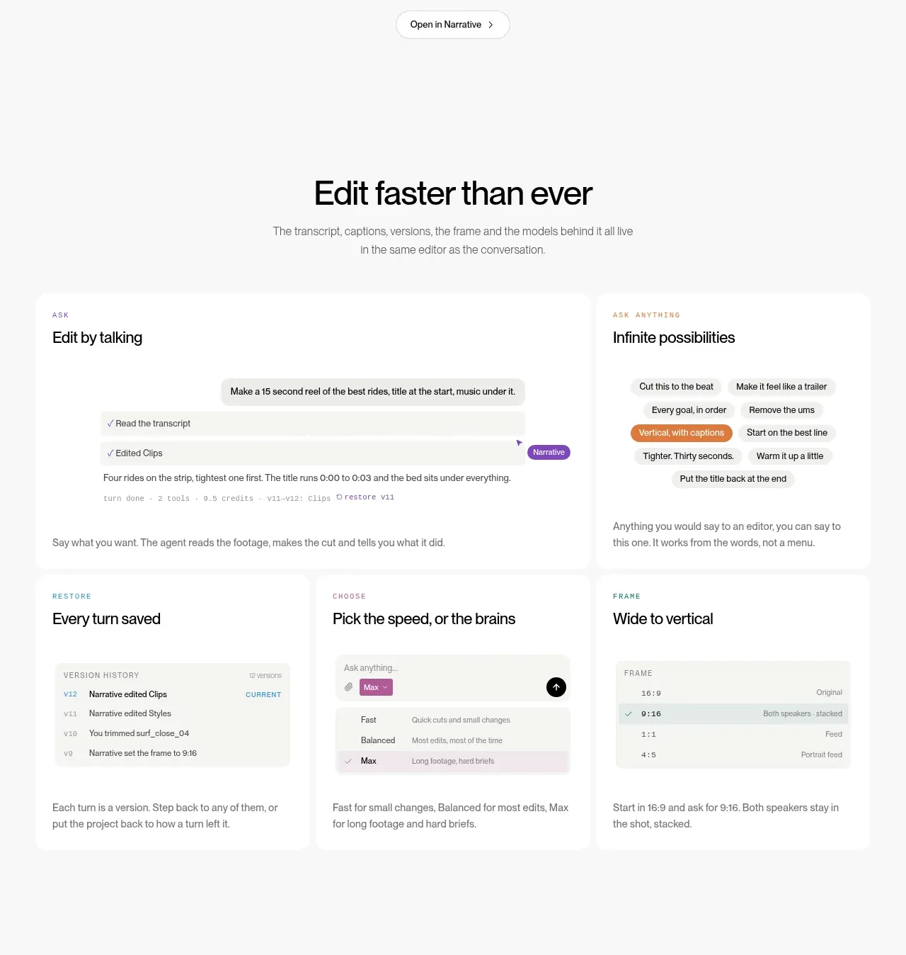 Conversational editing capabilities
Narrative · Feature grid
Conversational editing capabilities
Narrative · Feature grid
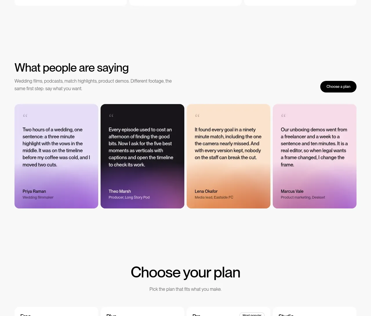 Customer testimonial cards
Narrative · Testimonials
Customer testimonial cards
Narrative · Testimonials
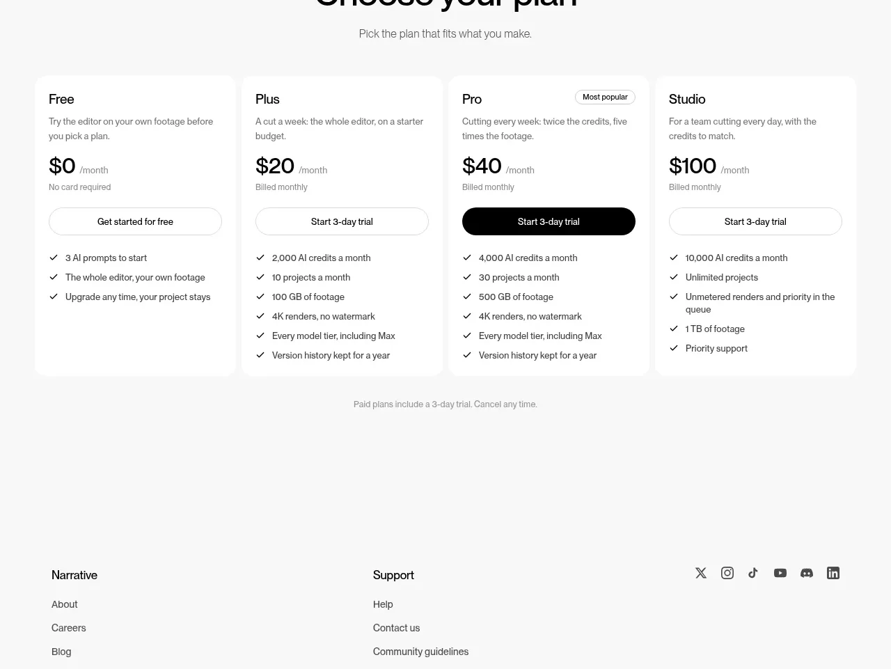 Four-tier pricing table
Narrative · Pricing table
Four-tier pricing table
Narrative · Pricing table
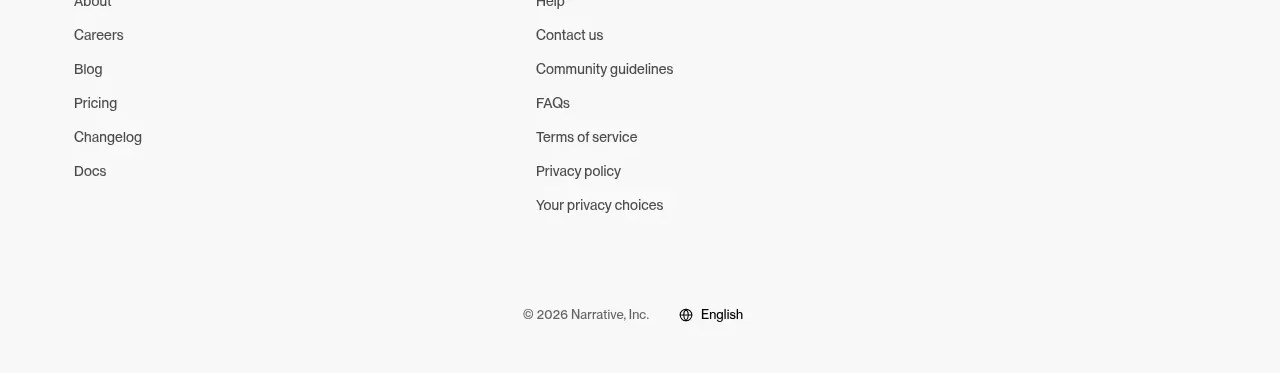 Multi-column company footer
Narrative · Footer
Multi-column company footer
Narrative · Footer