kage
kage
usenarrative.ai
Design analysis
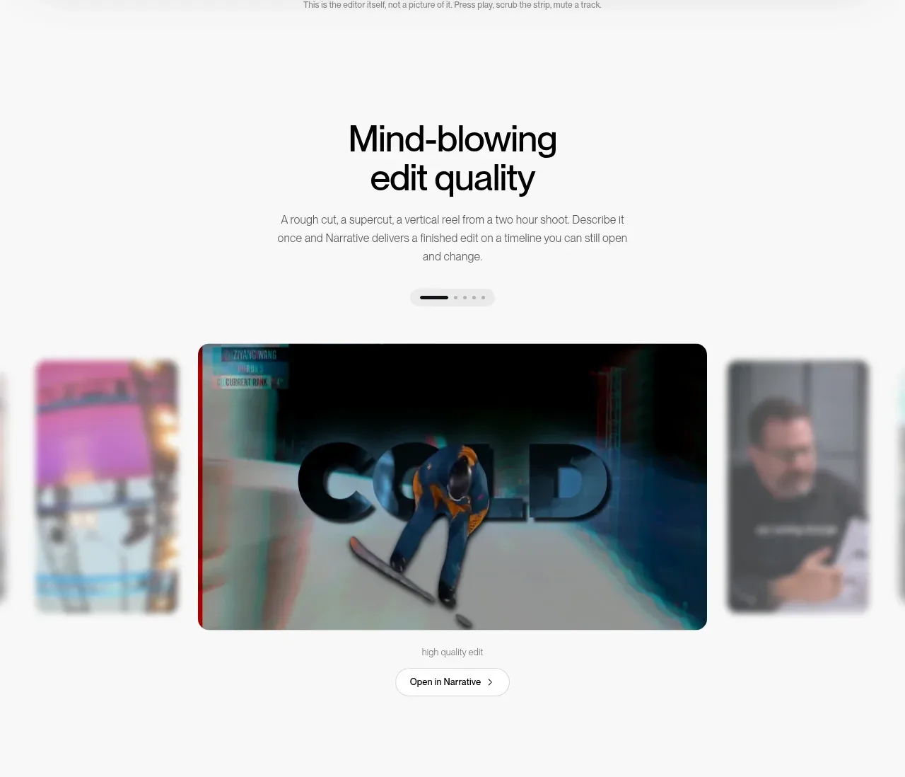
A short editorial heading introduces a large central media card, with blurred neighboring cards signaling more content and a small carousel control making the showcase interactive.
Prompt preview
## Reference images

Study these alongside the description below: hierarchy, rhythm, spacing, colour. Build for the product you are asked about, using this design language.

- Component: https://kage-design-assets.t3.tigrisfiles.io/components/narrative/6cc395b9-2f9b-4168-8f15-3f16c6d79112-1789538584-2.webp
- Full page it was cut from: https://kage-design-assets.t3.tigrisfiles.io/screenshots/narrative/6cc395b9-2f9b-4168-8f15-3f16c6d79112-1789538531078-full.webp
- Component on Kage: https://kage.design/component/narrative-gallery

## Before you start
Ask what the user's product showcases, what kind of media it produces, and which brand colors should frame it. Then build an original showcase using these rules.

Create a spacious showcase section with a centered two-line heading and restrained explanatory paragraph. Place a horizontal carousel beneath it: one large centered rounded media card is the focal item, with partially visible, softly blurred neighboring cards at both edges to communicate browsing. Include a compact pagination indicator and a small outlined action below the media. Keep the page background near white, use a 34–42px heading, 14px gray body text, 24–32px section gaps, 14–18px media radius, and a very subtle shadow. The active card should be crisp while inactive cards are lower opacity/blur; add keyboard, swipe, and arrow-button support and a reduced-motion fallback.

Never: use the reference's logo, product name, copy, illustrations, imagery, or distinctive branded assets.