 kage
kage
navige.ai
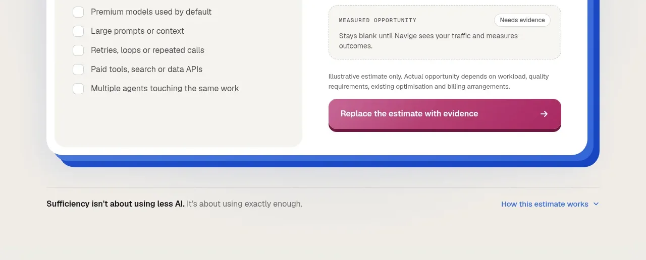
Design analysis
A wide rounded blue banner closes the marketing argument with a concise promise, supporting line, and low-friction action.
Prompt preview
## Reference images

Study these alongside the description below: hierarchy, rhythm, spacing, colour. Build for the product you are asked about, using this design language.

- Component: https://kage-design-assets.t3.tigrisfiles.io/components/navige/e3ee1ee4-7855-4062-a956-cf327122240e-1792130702-9.webp
- Full page it was cut from: https://kage-design-assets.t3.tigrisfiles.io/screenshots/navige/e3ee1ee4-7855-4062-a956-cf327122240e-1792130598253-full.webp
- Component on Kage: https://kage.design/component/navige-cta

## Before you start
Ask what final action the user's product wants visitors to take and what promise is both compelling and defensible. Apply the principles below to that product rather than reproducing this reference.

Create a wide rounded CTA banner inside a warm neutral page. Use a cobalt-to-indigo textured gradient #2457d6 to #4b63c8 with subtle pale line arcs or abstract geometry at low opacity. Align a short white headline and supporting line to the left, with one outlined or softly filled pill CTA beneath or beside it. Keep the banner around 260–300px tall, 22–28px radius, and padded 48–56px. Use a 38–48px bold headline and 14–16px supporting copy.

Give the CTA a clear hover/focus state and make the abstract background decorative only. Ensure text remains readable over the gradient.

Never: use logos, product names, copy, illustrations, or imagery from the reference.
More components

 Final conversion banner
CrewTower Mod for Claude Code · Call to action
Final conversion banner
CrewTower Mod for Claude Code · Call to action
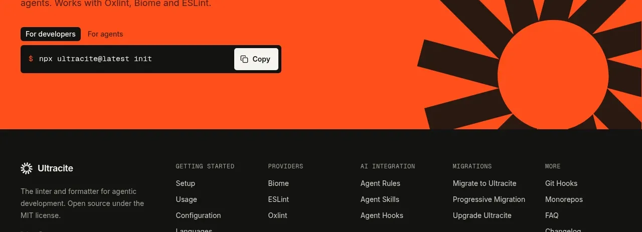
 Bright installation call to action
Ultracite v8 · Call to action
Bright installation call to action
Ultracite v8 · Call to action
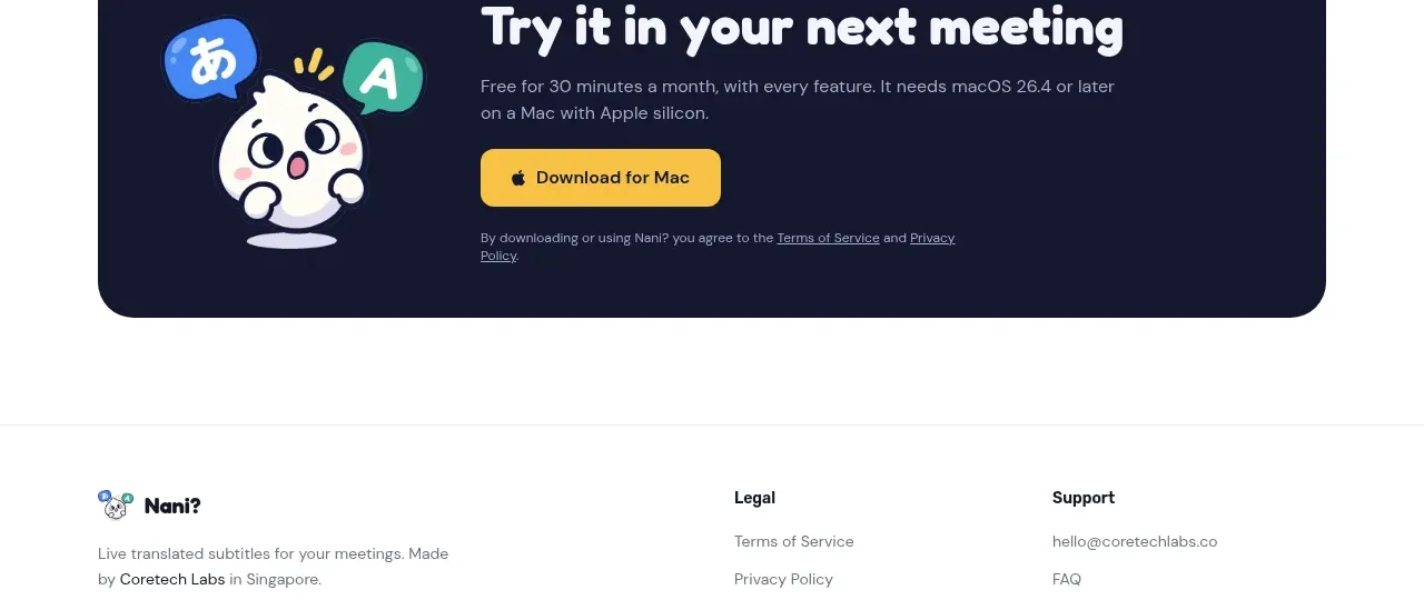
 Download call to action
NANI??? · Call to action
Download call to action
NANI??? · Call to action

 Marble-backed final CTA
Maybloc · Call to action
Marble-backed final CTA
Maybloc · Call to action
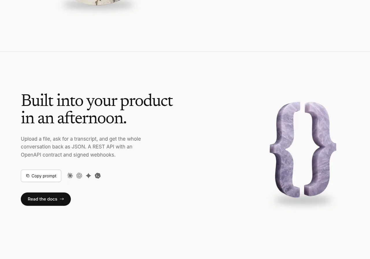 Developer integration CTA
Maybloc · Call to action
Developer integration CTA
Maybloc · Call to action
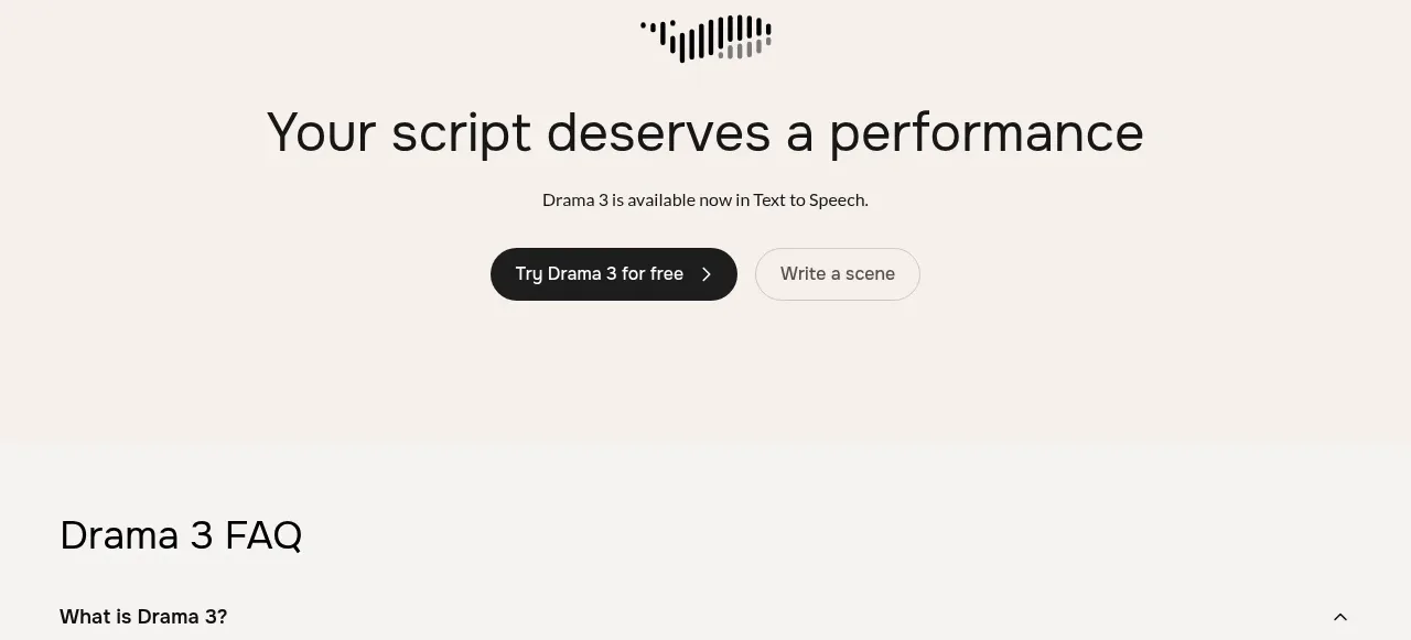
 Centered conversion call to action
Fish Audio Drama 3 · Call to action
Centered conversion call to action
Fish Audio Drama 3 · Call to action