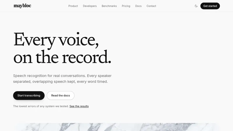
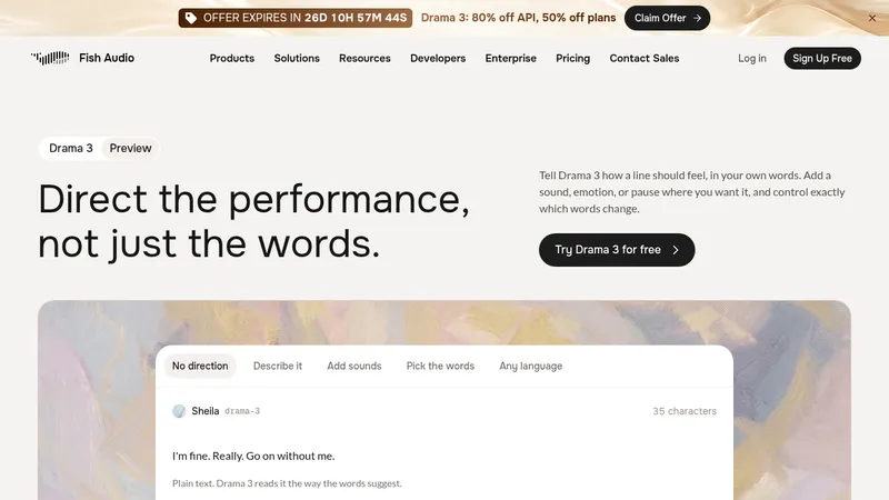
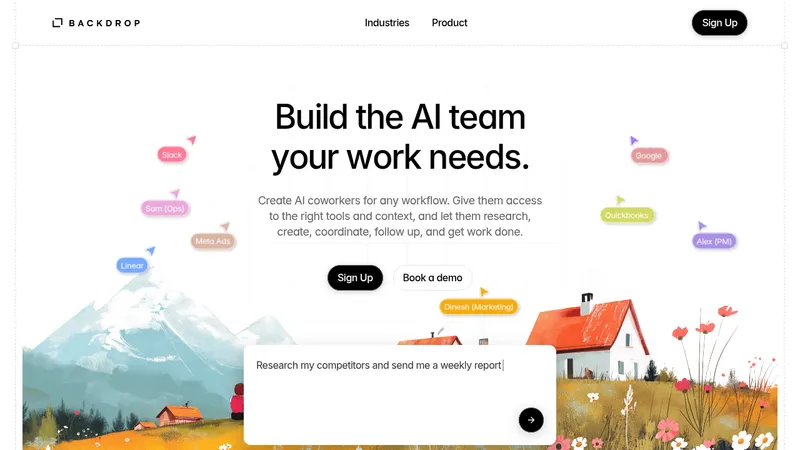
kage
kage
navige.ai

Design analysis
A long-form AI infrastructure landing page uses an off-white canvas, oversized black grotesk headlines, and italic serif emphasis to create a distinctive editorial hierarchy. The page starts with an airy hero and restrained partner whitespace, then becomes denser through metric cards, annotated diagrams, comparison panels, a blue feature section, integration mapping, an estimator form, CTA banner, and a large gradient footer; cobalt and magenta gradients provide the main colour rhythm while thick white layers and offset blue shadows give interface panels a tactile stacked quality.
Prompt preview
## Reference images

Study these alongside the description below: hierarchy, rhythm, spacing, colour. Build for the product you are asked about, using this design language.

- Full page: https://kage-design-assets.t3.tigrisfiles.io/screenshots/navige/e3ee1ee4-7855-4062-a956-cf327122240e-1792130598253-full.webp
- Above the fold: https://kage-design-assets.t3.tigrisfiles.io/screenshots/navige/e3ee1ee4-7855-4062-a956-cf327122240e-1792130593185.webp
- Design on Kage: https://kage.design/designs/navige-landing-page

## Before you start
Ask the user what they are building, who it is for, and which brand assets they already have (name, colours, typefaces, logo or other visual assets). Wait for their answers before designing. Apply the system below to their product, not to the reference product, and use original content throughout.

## Page structure
1. **Floating navigation** — Place a compact white pill-shaped navigation bar near the top center, with a small wordmark area, evenly spaced links, a sign-in link, and a dark primary action.
2. **Hero** — Use a large centered headline on an off-white background, mixing a heavy sans-serif phrase with a short italic serif phrase. Add a small dark credibility badge above it, a two-line explanatory paragraph, and paired dark/light pill buttons below. Behind the hero, use expansive fine-line waves that flow inward from the left in blue and from the right in pink, fading softly toward the center.
3. **Platform recognition spacer** — Follow the hero with a centered heading announcing compatible platforms. Preserve substantial vertical whitespace beneath it so the page briefly feels open before introducing proof.
4. **Metrics section** — Add a left-aligned heading with an italic serif product qualifier, followed by three equal-width rounded statistic cards. Use blue, magenta, and diagonal two-tone gradient treatments, oversized white numerals, compact labels, a thin divider, and small explanatory copy.
5. **Annotated problem illustration** — Center a headline about preventing a problem before it reaches the dashboard. Below it, build a pale atmospheric diagram with a central blue 3D-like object, orbiting arcs, and five floating numbered callout pills; make one callout a saturated blue active state and keep the others white. Add a centered issue title and short caption beneath the visual.
6. **Comparison / directional visual** — Introduce a centered editorial heading contrasting a direct route with detours. Show a large white rounded frame containing an abstract blue funnel or beam diagram and small peripheral objects, then place two side-by-side comparison cards below in blue and magenta, each with a small eyebrow and concise white statement.
7. **Feature block on saturated blue** — Change the rhythm with a full-width cobalt section and white centered heading, again using italic serif emphasis. Use a two-column layout: a vertical stack of four numbered feature cards on the left and a large white-framed abstract pink layered illustration on the right. The first feature card is magenta and active; the remaining cards are translucent blue with subtle borders.
8. **Integration explanation** — Return to the off-white canvas after a very tall blue field, creating a strong colour break. Center a heading explaining the product’s intermediary role, add a short paragraph, and show a wide white rounded diagram card with a thick offset blue lower/right shadow. Label the left and right sides, arrange small stacked framework/model chips in columns, and connect them through a large central magenta gradient module.
9. **Spend estimator introduction** — Place a two-column heading row: a large left headline with italic serif emphasis and a smaller explanatory paragraph on the right.
10. **Estimator form** — Build a large white rounded calculator panel with a pronounced layered blue offset shadow. Split it into a lightly tinted input side and a results side. Include a small uppercase environment badge, a spend input, preset amount chips, a segmented workload choice, checkbox questions, an estimated result with muted placeholder values, simple horizontal scales, opportunity categories, a bordered evidence note, and a magenta full-width action button.
11. **Estimator footnote** — Add a slim text row beneath the panel with a bold opening phrase on the left and a small explanatory/help link aligned right.
12. **Closing CTA banner** — Add a wide rounded cobalt-to-slate gradient banner with fine grain and curved line artwork. Use a white heading, short supporting copy, and a subtle outlined pill action aligned on the left.
13. **Footer navigation** — Finish with four compact link columns labeled by small white pill tabs with blue lower shadows. Place product, pricing, resource, and company links above a very large white typographic brand treatment over a blurred blue/pink/yellow gradient background. Keep legal links and copyright small along the bottom edge.

## Design language
- Build hierarchy with oversized near-black grotesk headlines, short line lengths, and deliberate italic serif words inside otherwise sans-serif headings. Use a display scale around 56–72px for hero text, 36–52px for section headings, 18–24px for card titles, and 12–14px for supporting copy; reduce proportionally on mobile.
- Keep the primary canvas warm off-white, approximately `#f4f3ef` or `#f2f1ed`, rather than pure white. Use near-black `#101014` for type and white `#ffffff` for elevated panels.
- Treat cobalt blue around `#2457d6` / `#315bd4` and magenta around `#bd2c72` / `#c43178` as the visual system. Use them in gradients, active states, diagrams, shadows, and large section transitions rather than as small decorative accents only.
- Make the page rhythm intentionally change: airy hero and recognition spacing, compact proof cards, diagram-led explanatory sections, a dense interactive calculator, then a concise CTA and oversized footer. Use generous vertical gaps between major ideas but tight internal spacing inside controls and cards.
- Use rounded corners generously, typically 16–24px for cards, 28–36px for major panels, and full pills for buttons, badges, and tabs. Avoid hairline gray borders as the primary affordance; use white framing, low-contrast outlines, and strong offset blue shadows instead.
- Give major white panels a tactile stacked construction: a white foreground layer, a cobalt offset base or lower-right shadow, and occasionally a magenta underlayer. Keep shadows crisp and geometric rather than diffuse wherever a panel is meant to feel physical.
- Use gradients with grain or soft texture: blue-to-purple and blue-to-pink fields, diagonal split cards, and hazy atmospheric backgrounds. Keep diagrams abstract and product-oriented—waves, beams, rings, stacked blocks, chips, and connected nodes—rather than relying on photography.
- Use editorial contrast in every major heading: pair a bold geometric sans with one italic, high-contrast serif phrase. Keep body text plain sans-serif, dark gray, and compact.
- Make controls feel calm and practical: pale inputs, rounded segmented choices, square checkboxes, small uppercase mono-like badges, muted placeholder result states, and one high-contrast magenta submit action.
- Where interaction is visible, use pill buttons with short labels and arrow affordances, blue active states in callout lists, and restrained hover motion. Add gentle float/parallax to abstract diagrams and a small lift or shadow shift on cards, but avoid excessive animation.
- On responsive layouts, preserve the editorial type contrast and colour transitions; stack metric cards, comparison cards, estimator columns, and integration columns while keeping the diagrams inside horizontally safe framed containers.

## Never
- Do not copy any logo, wordmark, product name, tagline, exact copy, illustrations, photography, icon set, diagrams, or branded assets from the reference.
- Do not present the result as the reference product or imply affiliation with it.
- Do not reproduce the exact hero wording, statistic values, platform names, estimator labels, or footer text; invent content relevant to the user’s product.
- Do not turn every section into a gradient card: preserve the warm neutral space, white panels, blue transition section, and dense calculator-to-footer progression.
Components from this page
All components
 Floating product navigation
Navige · Navigation
Floating product navigation
Navige · Navigation
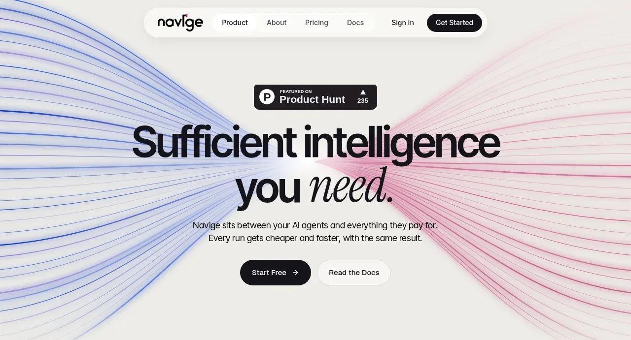 Sufficiency-focused hero
Navige · Hero
Sufficiency-focused hero
Navige · Hero
 Platform compatibility statement
Navige · Logo cloud
Platform compatibility statement
Navige · Logo cloud
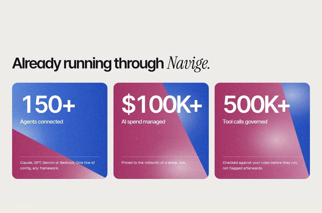 Operational proof metrics
Navige · Stats
Operational proof metrics
Navige · Stats
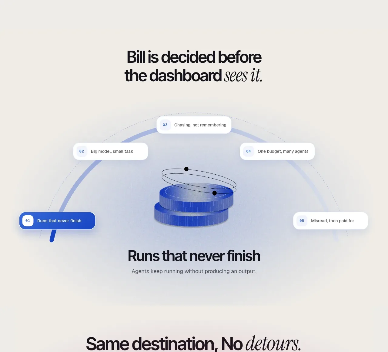 Governed execution workflow
Navige · Feature grid
Governed execution workflow
Navige · Feature grid
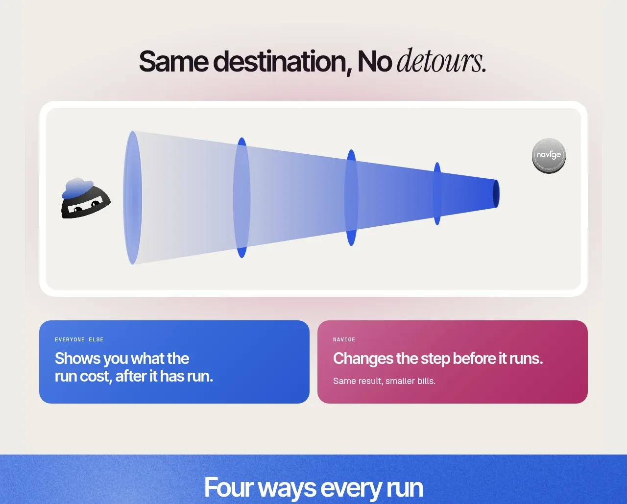 Same-destination comparison
Navige · Feature grid
Same-destination comparison
Navige · Feature grid
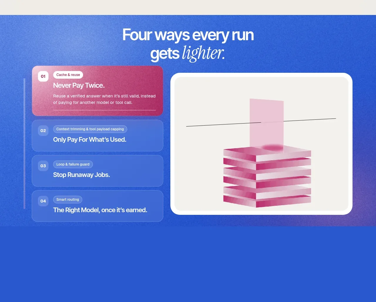 Four ways to reduce run cost
Navige · Feature grid
Four ways to reduce run cost
Navige · Feature grid
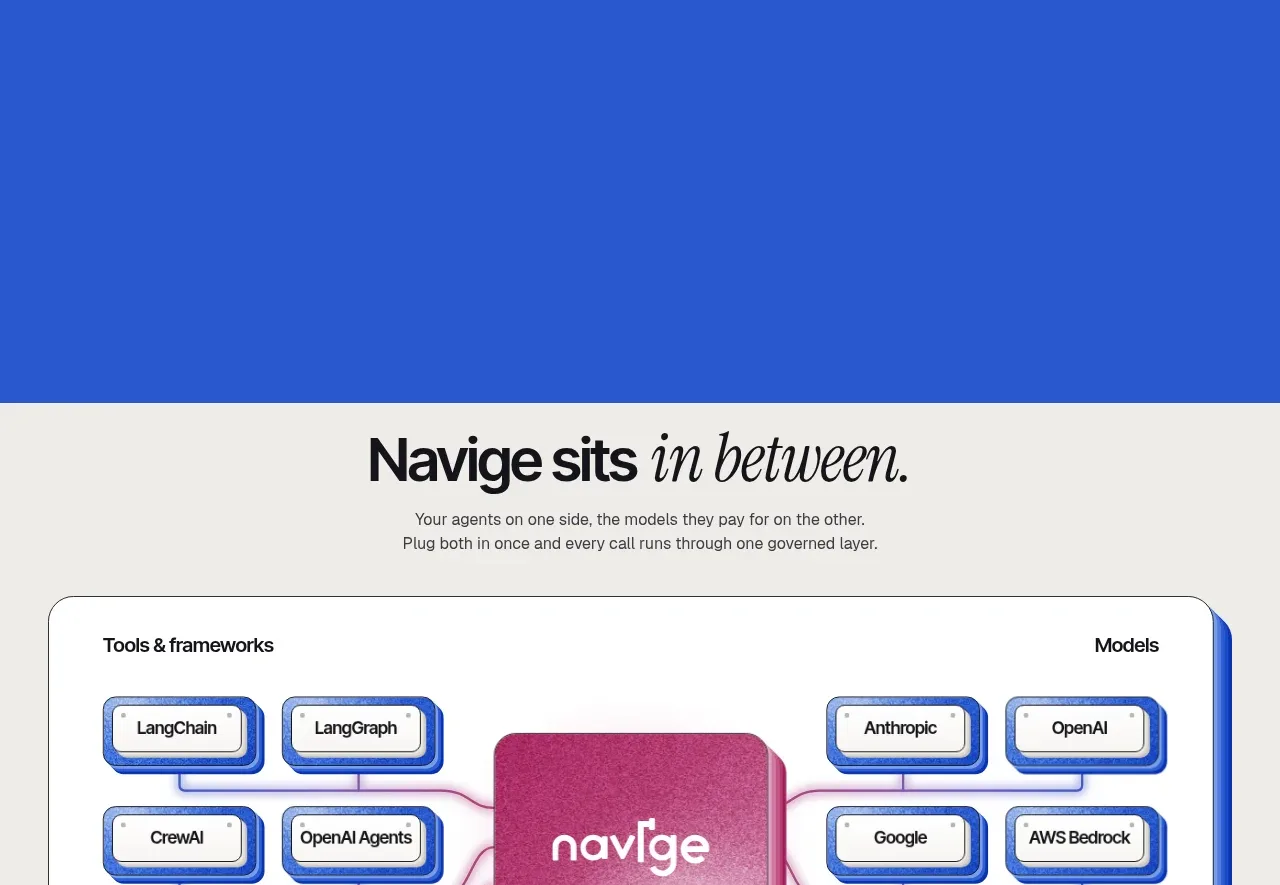 Ecosystem connection map
Navige · Table
Ecosystem connection map
Navige · Table
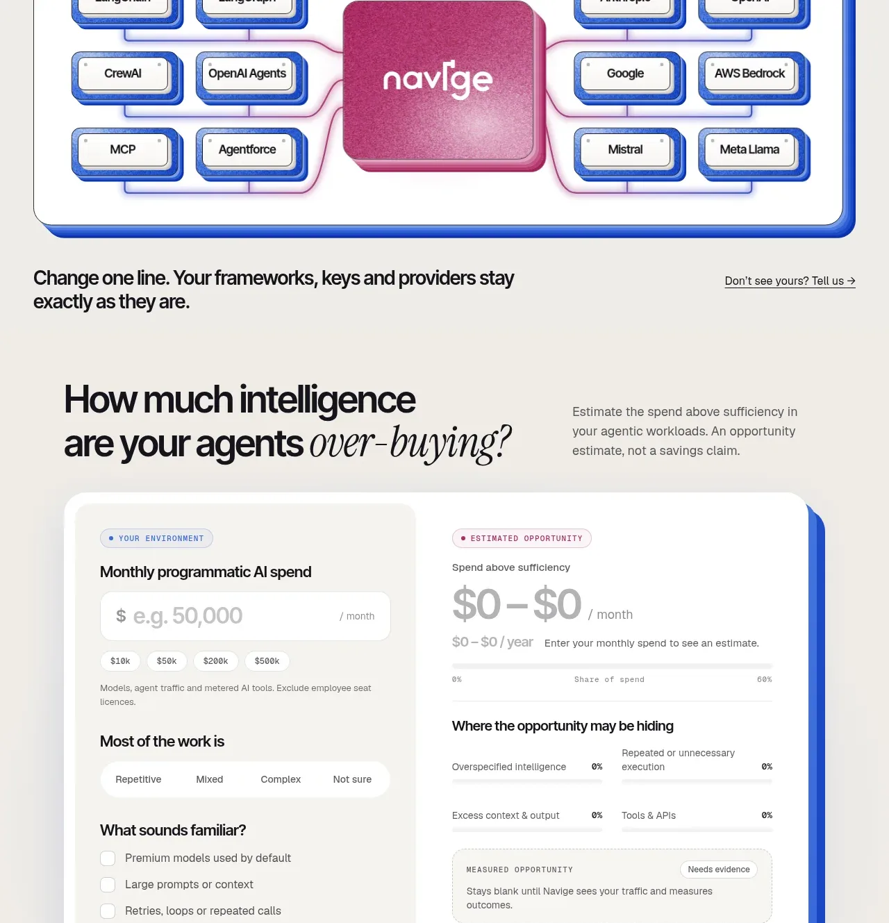 Spend opportunity estimator
Navige · Form
Spend opportunity estimator
Navige · Form
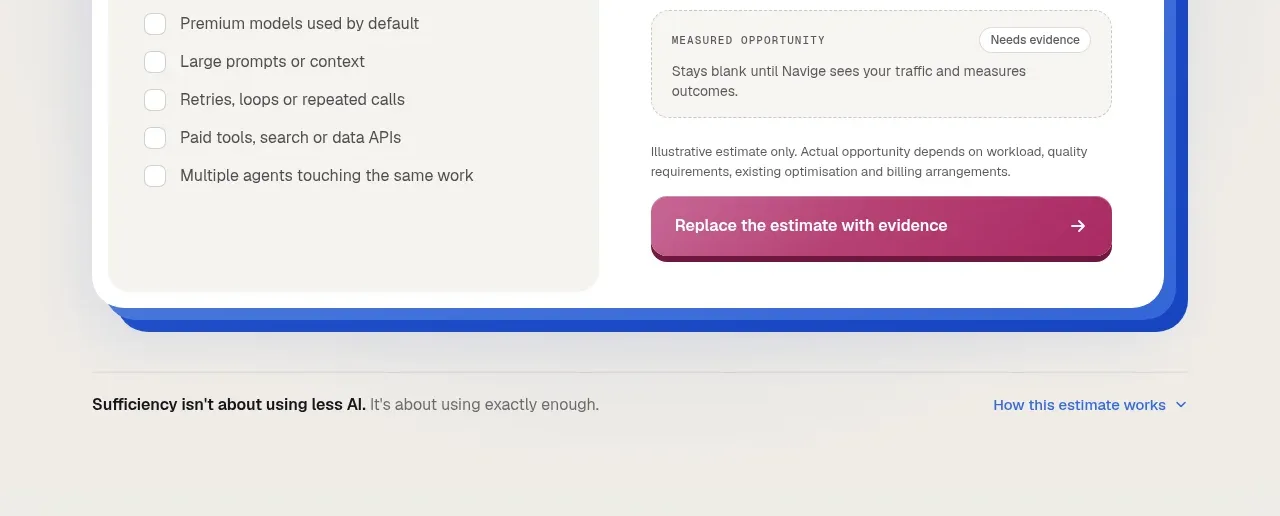 Trust-based closing CTA
Navige · Call to action
Trust-based closing CTA
Navige · Call to action
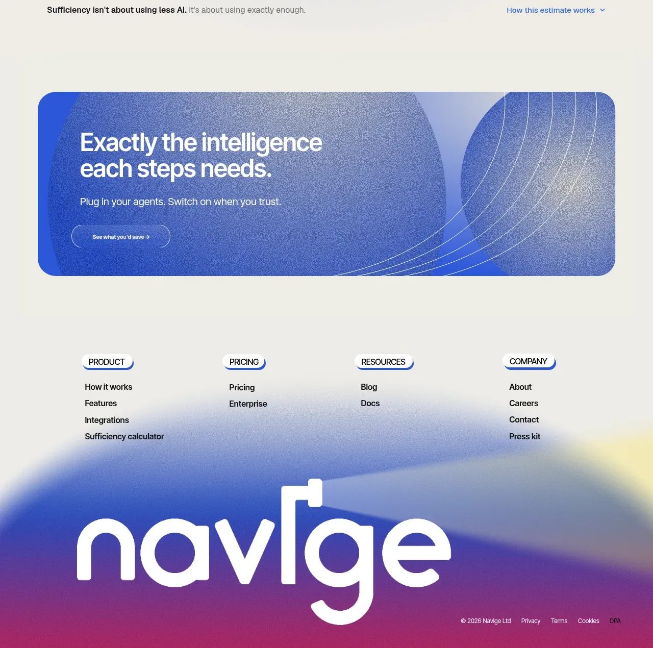 Column navigation footer
Navige · Footer
Column navigation footer
Navige · Footer