kage
kage
navige.ai
Design analysis
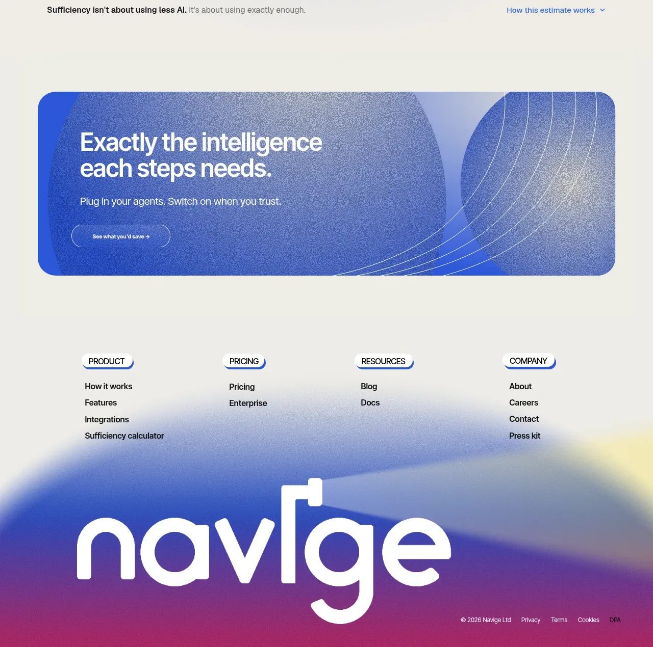
The footer combines four compact link columns with a large typographic brand treatment over a soft blue-to-magenta atmospheric background.
Prompt preview
## Reference images

Study these alongside the description below: hierarchy, rhythm, spacing, colour. Build for the product you are asked about, using this design language.

- Component: https://kage-design-assets.t3.tigrisfiles.io/components/navige/e3ee1ee4-7855-4062-a956-cf327122240e-1792130702-10.webp
- Full page it was cut from: https://kage-design-assets.t3.tigrisfiles.io/screenshots/navige/e3ee1ee4-7855-4062-a956-cf327122240e-1792130598253-full.webp
- Component on Kage: https://kage.design/component/navige-footer

## Before you start
Ask what navigation groups, legal links, contact paths, and brand expression the user's product needs. Apply the principles below to that product rather than reproducing this reference.

Build a spacious footer with a warm off-white upper area and a large atmospheric lower field blending cobalt #2457d6, periwinkle #94a4df, and magenta #b73574. Arrange four link columns across the top with small pill-like category labels, compact 13–14px links, and generous vertical spacing. Below, place an oversized abstract wordmark treatment or brand statement in white, plus a small bottom row for copyright, privacy, terms, and other legal links. Use responsive four-to-two-to-one column behavior, 24–32px section gaps, and strong contrast.

Add clear hover and focus states, keep legal links accessible, and avoid relying on the oversized brand treatment as the only identification.

Never: use logos, product names, copy, illustrations, or imagery from the reference.