 kage
kage
navige.ai
Design analysis
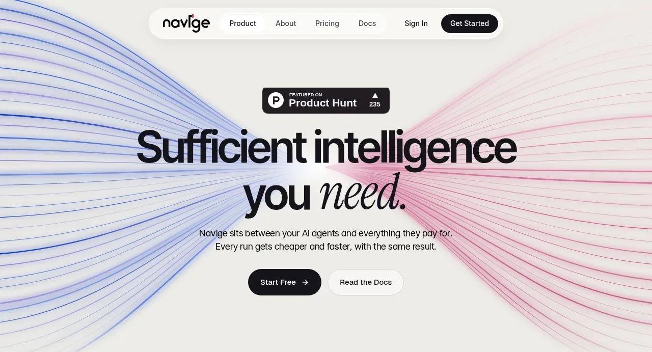
The hero uses an oversized editorial headline over a converging blue-and-pink line field, with a small credibility badge, concise explanation, and two actions.
Prompt preview
## Reference images

Study these alongside the description below: hierarchy, rhythm, spacing, colour. Build for the product you are asked about, using this design language.

- Component: https://kage-design-assets.t3.tigrisfiles.io/components/navige/e3ee1ee4-7855-4062-a956-cf327122240e-1792130699-1.webp
- Full page it was cut from: https://kage-design-assets.t3.tigrisfiles.io/screenshots/navige/e3ee1ee4-7855-4062-a956-cf327122240e-1792130598253-full.webp
- Component on Kage: https://kage.design/component/navige-hero

## Before you start
Ask what the user's product is, who it serves, and what its brand personality and primary conversion goal are. Apply the principles below to that product rather than reproducing this reference.

Create a full-width hero directly beneath the navigation. Center an eyebrow or credibility badge above a large two-line headline, with one restrained italic or serif accent word for contrast. Add a short supporting paragraph and two adjacent CTAs: a dark filled primary button and a pale secondary button. Use a warm off-white background #f3f2ee and an abstract converging line field in cobalt #2457d6 and muted rose #c34b83 fading toward the center; the artwork must remain subordinate to the text. Use a bold sans-serif headline around 56–64px with tight line-height, body text around 14px, and generous vertical whitespace. Buttons should be pill-shaped with 18–22px radius.

Animate the background lines subtly, not the content. Ensure responsive wrapping, strong contrast, and reduced-motion support.

Never: use logos, product names, copy, illustrations, or imagery from the reference.
More components
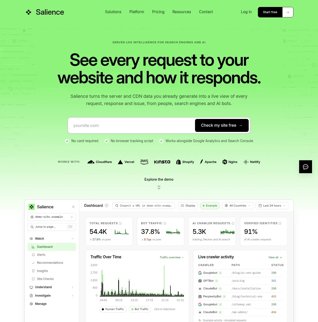
 Product promise and site checker hero
Salience · Hero
Product promise and site checker hero
Salience · Hero
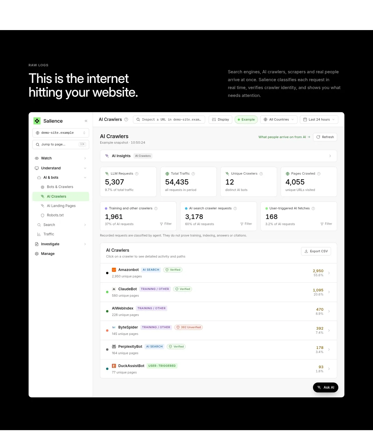 Raw activity dashboard showcase
Salience · Hero
Raw activity dashboard showcase
Salience · Hero
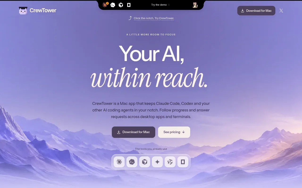
 Focus-oriented hero
CrewTower Mod for Claude Code · Hero
Focus-oriented hero
CrewTower Mod for Claude Code · Hero
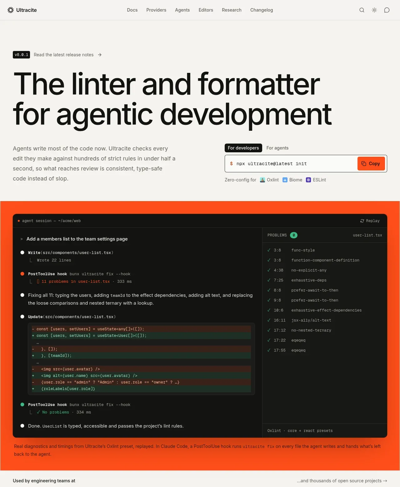
 Agentic development hero with live terminal preview
Ultracite v8 · Hero
Agentic development hero with live terminal preview
Ultracite v8 · Hero
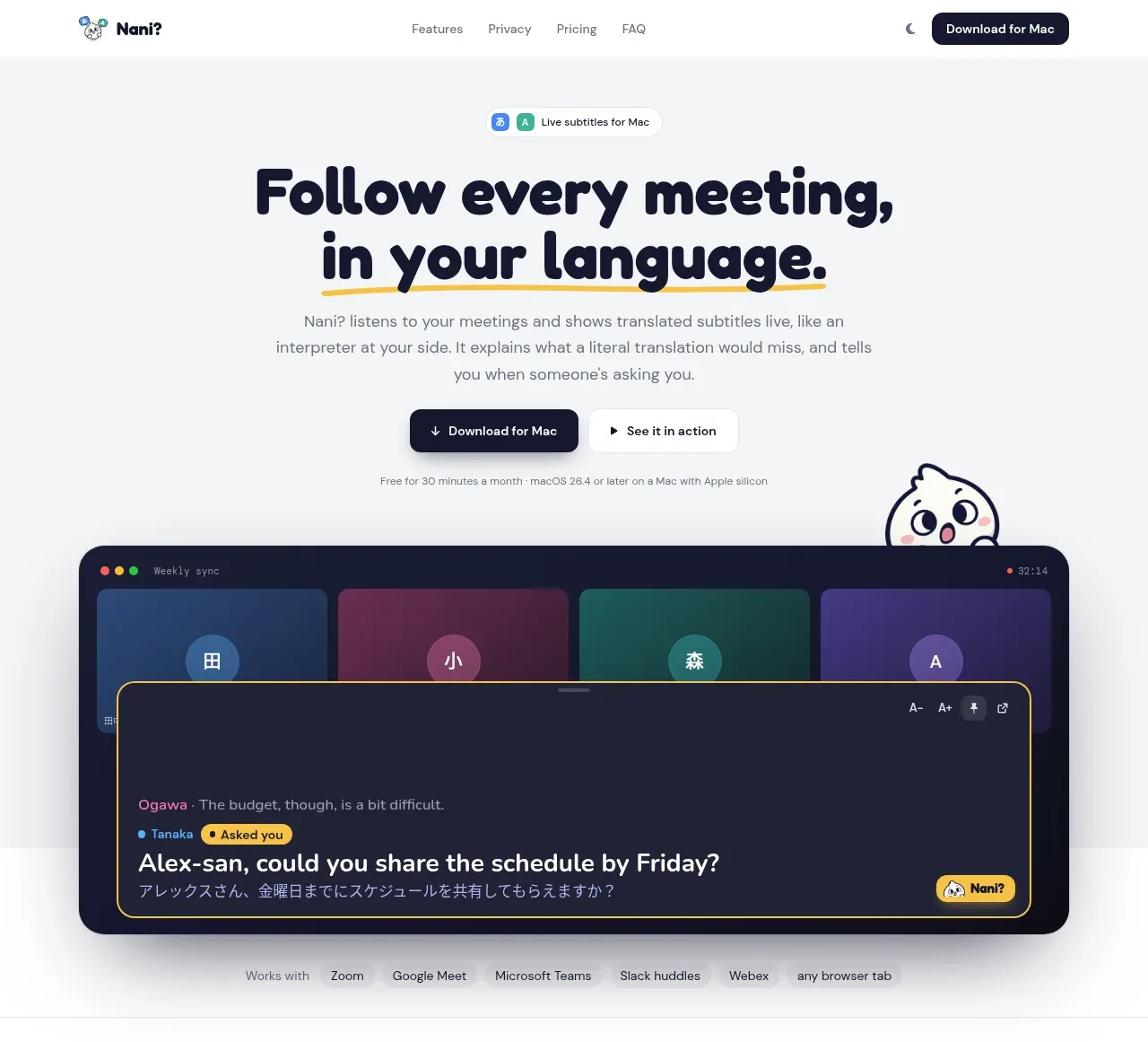
 Translation meeting hero
NANI??? · Hero
Translation meeting hero
NANI??? · Hero
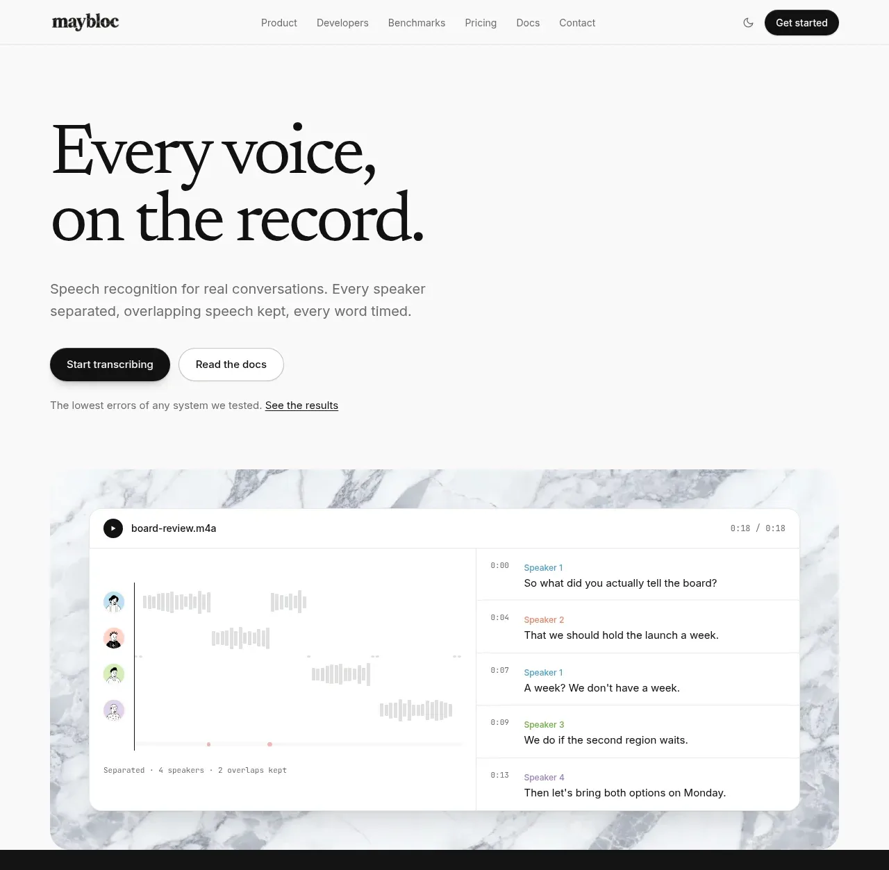
 Editorial speech transcription hero
Maybloc · Hero
Editorial speech transcription hero
Maybloc · Hero