 kage
kage
neopress.ai
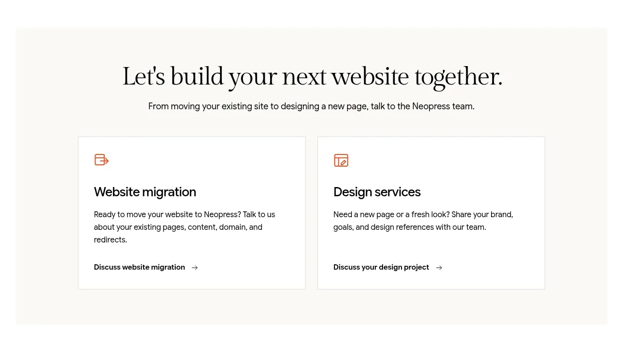
Design analysis
A warm, centered conversion section introduces two clear routes—migration and design help—through parallel bordered cards with direct next steps.
Prompt preview
## Reference images

Study these alongside the description below: hierarchy, rhythm, spacing, colour. Build for the product you are asked about, using this design language.

- Component: https://kage-design-assets.t3.tigrisfiles.io/components/neopress/126c1916-850c-4473-b9b4-49923d5d31e2-1789365754-5.webp
- Full page it was cut from: https://kage-design-assets.t3.tigrisfiles.io/screenshots/neopress/126c1916-850c-4473-b9b4-49923d5d31e2-1789365678746-full.webp
- Component on Kage: https://kage.design/component/neopress-cta

## Before you start
Ask what conversion action the user's product wants here and whether users need one route or several. Then create an original CTA that reflects the user's service model and brand.

### Design language
- Use a centered editorial heading and one-line supporting statement, followed by two equal-width action cards in a simple grid.
- Each card should have a small functional icon, a bold title, two lines of explanatory copy, and a text link with an arrow or equivalent affordance.
- Set the section on a warm cream surface (`#f7f5ef`) with white cards, 1px borders (`#e2dfd7`), near-black text (`#181817`), muted body copy (`#6f6d66`), and a small terracotta accent (`#d87558`).
- Use 20–32px card padding, 2–4px radii, and a clear heading-to-card spacing relationship. Stack cards on narrow screens.
- Make the entire card or its explicit link keyboard accessible, with a subtle border/color hover state and strong focus ring.

### Never
- Never reuse logos, product names, copy, illustrations, or imagery from the reference.
- Never offer ambiguous routes, duplicate CTAs, or decorative icons without accessible labels.
More components

 Website migration CTA
Neopress · Call to action
Website migration CTA
Neopress · Call to action
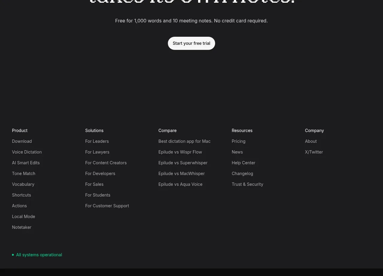
 Final trial call to action
Epilude Notetaker · Call to action
Final trial call to action
Epilude Notetaker · Call to action

 Download conversion prompt
Resurf · Call to action
Download conversion prompt
Resurf · Call to action

 Dark conversion call to action
DockFix 5.0 · Call to action
Dark conversion call to action
DockFix 5.0 · Call to action
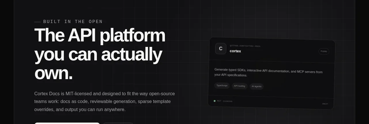
 Final conversion banner
Cortex · Call to action
Final conversion banner
Cortex · Call to action
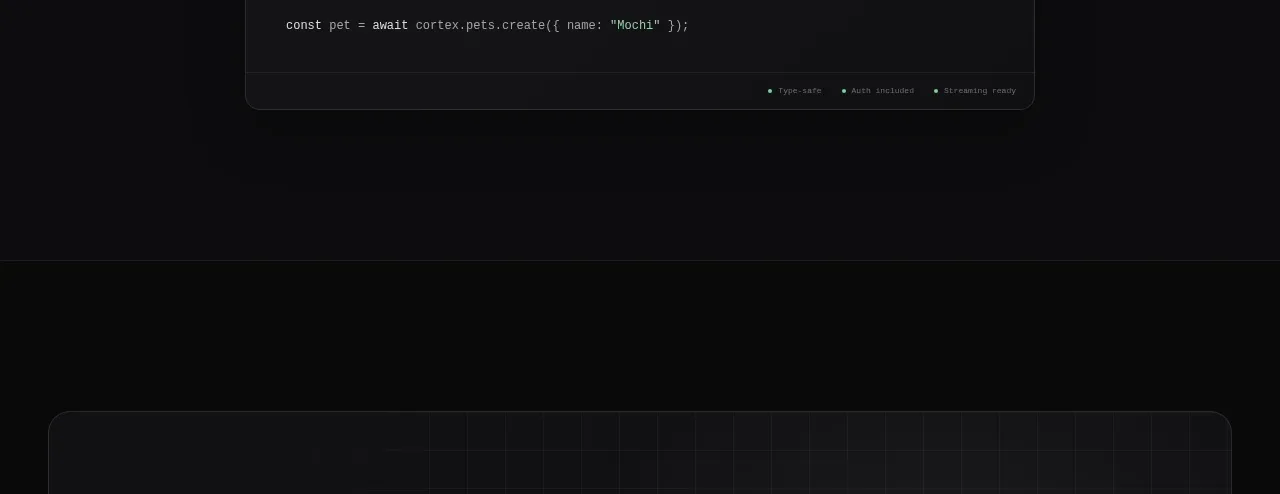 Open-source platform callout
Cortex · Call to action
Open-source platform callout
Cortex · Call to action