 kage
kage
neopress.ai

Design analysis
A spacious standalone CTA addresses visitors who already have a website, states the low-risk promise, and offers one focused migration action.
Prompt preview
## Reference images

Study these alongside the description below: hierarchy, rhythm, spacing, colour. Build for the product you are asked about, using this design language.

- Component: https://kage-design-assets.t3.tigrisfiles.io/components/neopress/126c1916-850c-4473-b9b4-49923d5d31e2-1789365756-8.webp
- Full page it was cut from: https://kage-design-assets.t3.tigrisfiles.io/screenshots/neopress/126c1916-850c-4473-b9b4-49923d5d31e2-1789365678746-full.webp
- Component on Kage: https://kage.design/component/neopress-cta-2

## Before you start
Ask whether the user's audience is migrating, upgrading, or switching from an existing tool, and what reassurance is truthful. Then write an original single-action CTA.

### Design language
- Use a centered, spacious composition with a soft warm background and a two-line editorial heading that moves from a muted premise to a dark, decisive statement.
- Add a short reassurance line beneath the heading and one dark filled button; keep the action singular and obvious.
- Use cream (`#f8f6ef`), near-black (`#171716`), muted gray (`#77746c`), and a restrained coral accent for optional emphasis. Use a 2–4px button radius and generous vertical padding.
- Keep the CTA width narrow enough to feel intentional, and scale the heading fluidly for small screens.
- Include clear hover, focus, and loading states; do not force a modal or multi-step form for a simple migration action.

### Never
- Never reuse logos, product names, copy, illustrations, or imagery from the reference.
- Never use fear-based migration claims, multiple competing buttons, or unsupported guarantees.
More components
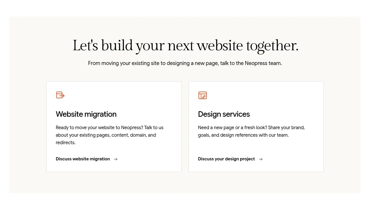
 Build or migrate services CTA
Neopress · Call to action
Build or migrate services CTA
Neopress · Call to action
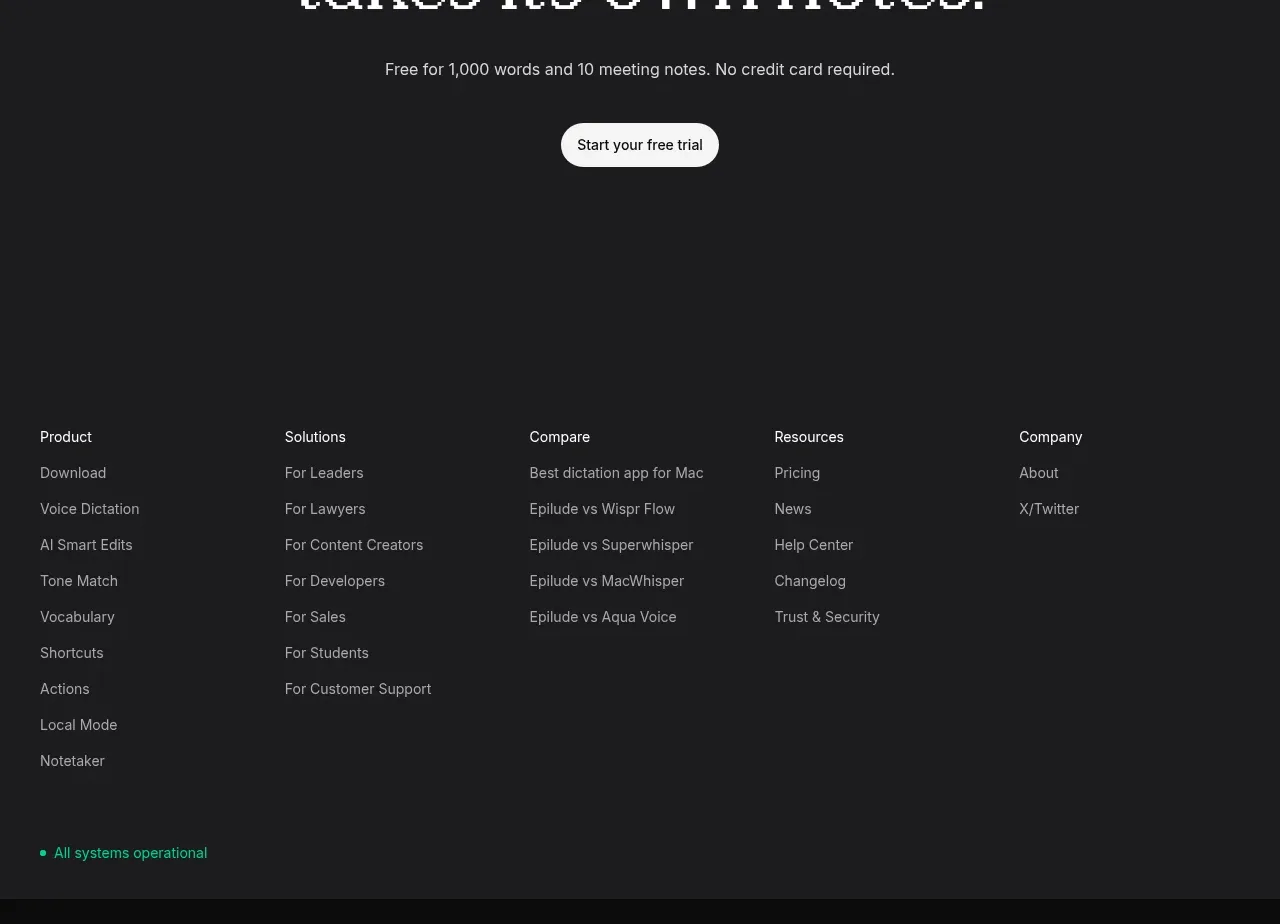
 Final trial call to action
Epilude Notetaker · Call to action
Final trial call to action
Epilude Notetaker · Call to action

 Download conversion prompt
Resurf · Call to action
Download conversion prompt
Resurf · Call to action

 Dark conversion call to action
DockFix 5.0 · Call to action
Dark conversion call to action
DockFix 5.0 · Call to action
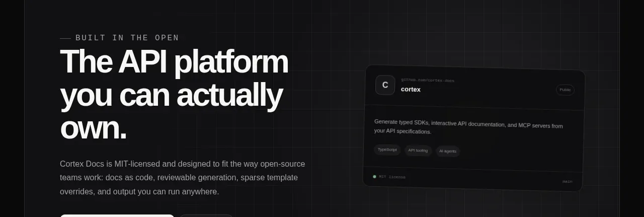
 Final conversion banner
Cortex · Call to action
Final conversion banner
Cortex · Call to action
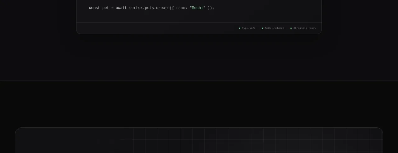 Open-source platform callout
Cortex · Call to action
Open-source platform callout
Cortex · Call to action