kage
kage
noodleseed.com

Design analysis
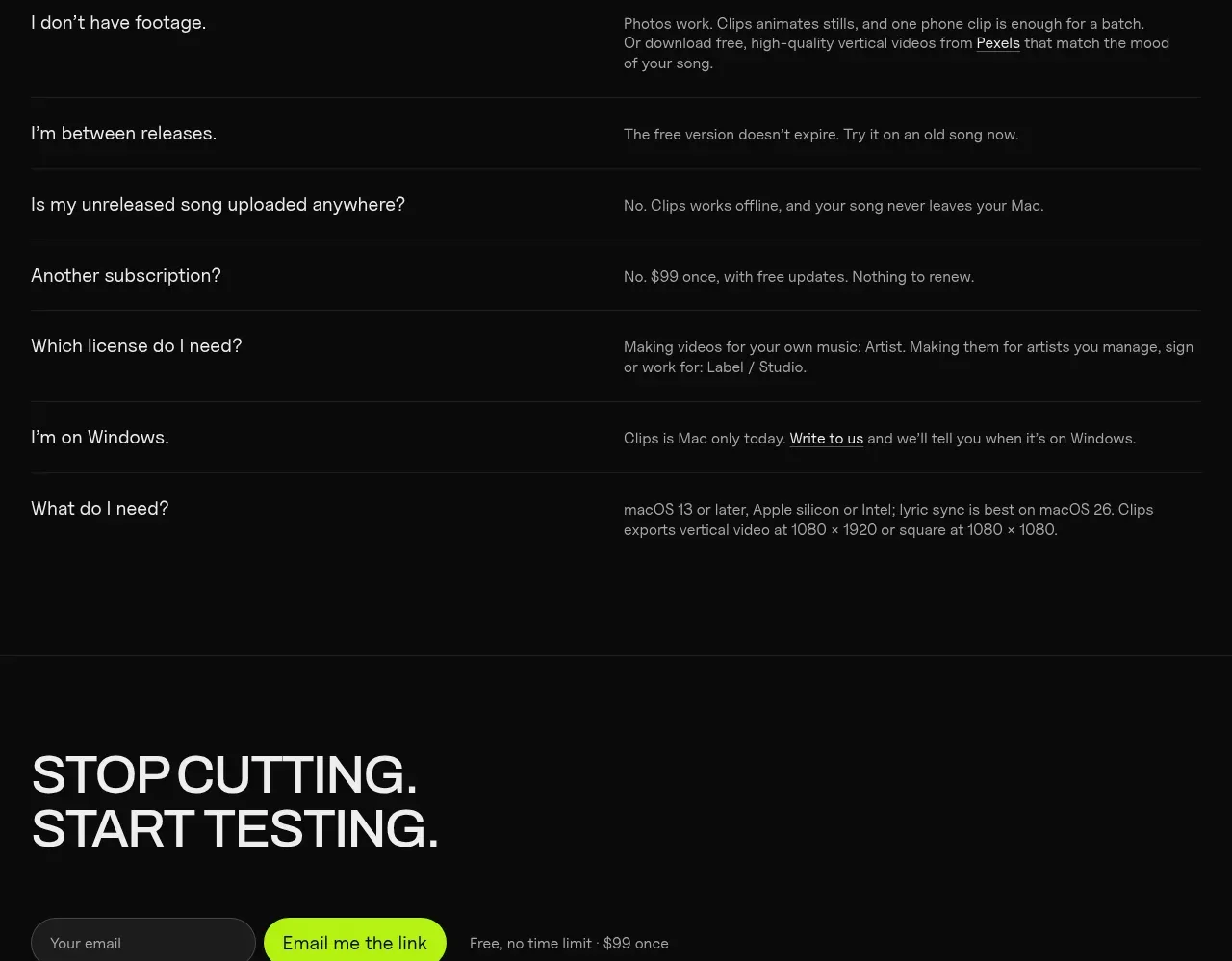
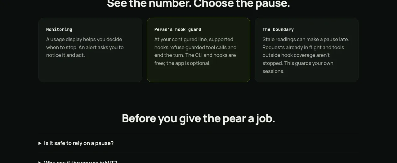
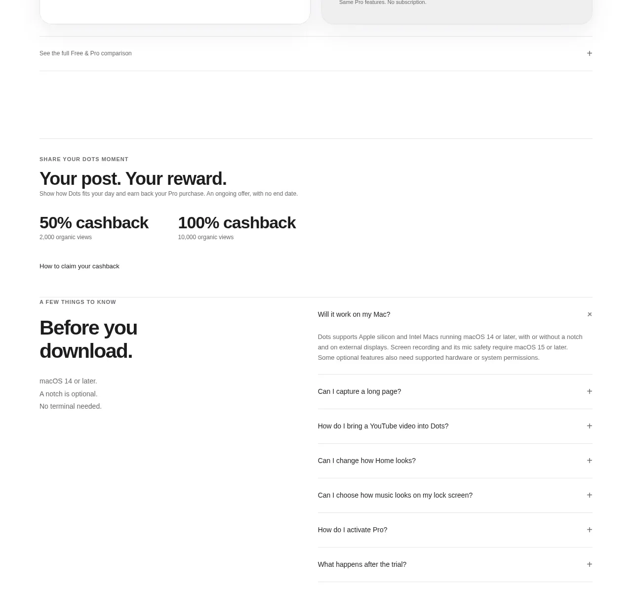
A restrained FAQ section that uses generous vertical spacing, hairline dividers, and right-aligned plus controls to make a long list feel calm and scannable. Its strongest feature is the high-contrast typography paired with an almost-black canvas and a clear transition into the next CTA section.
Prompt preview
## Reference images

Study these alongside the description below: hierarchy, rhythm, spacing, colour. Build for the product you are asked about, using this design language.

- Component: https://kage-design-assets.t3.tigrisfiles.io/components/noodle-seed/892ab390-1bf9-4a7d-a1b3-8cebe5820ba8-1789106719-10.webp
- Full page it was cut from: https://kage-design-assets.t3.tigrisfiles.io/screenshots/noodle-seed/892ab390-1bf9-4a7d-a1b3-8cebe5820ba8-1789106640138-full.webp
- Component on Kage: https://kage.design/component/noodle-seed-faq

## Before you start
Ask the user what their product is, who it serves, and what visual brand or design system it uses. Then apply the principles below to create an FAQ section for that product—not a literal recreation of this reference.

## Design brief
Build a minimal, editorial FAQ accordion for a dark product landing page. The section should feel quiet, premium, and highly scannable, with the questions carrying most of the visual weight.

### Layout and alignment
- Use a full-width section with a centered content rail, approximately 88–92% of the viewport width on desktop and a maximum width around 1120–1200px.
- Place the FAQ list in a single column. Each item should span the full rail, with the question aligned to the left and an interaction control aligned to the far right.
- Use generous vertical space above and below the list. Keep the FAQ visually separate from adjacent sections with a horizontal rule or a substantial change in spacing.
- On smaller screens, preserve the same left/right alignment logic while reducing the outer gutter to roughly 20–24px.
- Allow answers to expand beneath their question without shifting the plus control out of alignment. Use an accessible disclosure pattern with keyboard support and clear focus states.

### Typography hierarchy
- Use a modern neutral sans-serif with clean, open letterforms.
- Render questions at approximately 19–22px on desktop, with medium or regular weight and comfortable line height around 1.35.
- Keep answer text smaller, around 15–17px, with a relaxed line height of 1.6 and a readable maximum width so expanded content does not become too wide.
- Avoid oversized labels or decorative headings unless the user’s brand requires one; the list itself can act as the section’s primary statement.

### Colour
- Use an almost-black background, approximately `#050505` to `#080808`.
- Use soft white for questions, approximately `#F2F2F2` or `#F5F5F5`.
- Use a muted gray for answers and secondary text, approximately `#A5A5A5` to `#B3B3B3`.
- Use a very subtle divider, approximately `#1B1B1B` or `rgba(255,255,255,0.10)`.
- Make the plus icon slightly dimmer than the question text at rest, then brighten it on hover or focus. If the product has an accent colour, reserve it for the active state rather than adding decoration to every row.

### Borders, spacing, and shape
- Use thin 1px horizontal rules between rows and, optionally, one at the top or bottom of the list.
- Avoid cards, shadows, gradients, and visible containers; the rows should sit directly on the page background.
- Give each closed row roughly 64–86px of vertical height, depending on the type scale and viewport.
- Use a small, consistent gap between the question and the right-side control. Keep the plus icon visually simple and geometric, around 14–18px.
- Use no radius for the list itself. If a focus treatment needs a shape, use a subtle 2–4px radius only around the focused control or row.

### Interaction
- Each row should be clickable across its full width, not only on the plus icon.
- The plus icon should rotate into, or morph into, a minus icon when the answer is open; keep the animation subtle, around 150–220ms.
- Animate answer expansion with a restrained height/opacity transition, while respecting `prefers-reduced-motion`.
- Decide whether multiple answers can stay open based on the product context; default to allowing one or more open items without making the interaction surprising.
- Provide visible keyboard focus, an accurate `aria-expanded` state, and an `aria-controls` relationship for every disclosure.
- On hover, slightly brighten the question or divider rather than introducing a large colour change.

### Responsive behaviour
- Keep the list edge-to-edge within the content rail on mobile.
- Let long questions wrap naturally while keeping the control pinned to the top or vertically centered in a stable way.
- Ensure touch targets are at least 44px high and that answer text remains comfortably readable.

## Never
- Never copy logos, product names, brand marks, or proprietary identifiers from the reference.
- Never reuse the reference’s exact FAQ questions, answer copy, CTA copy, or wording.
- Never copy illustrations, imagery, icons beyond generic disclosure controls, or decorative graphics from the reference.
- Never reproduce the reference as a pixel-perfect clone; adapt the layout, content, typography, and accent treatment to the user’s product and brand.
- Never sacrifice semantic HTML, keyboard access, reduced-motion support, or mobile usability for visual similarity.