 kage
kage
notchpop.com
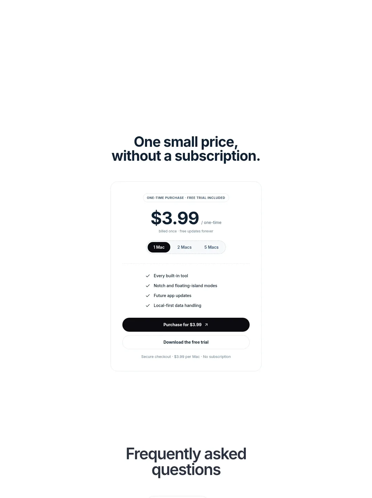
Design analysis
A sparse, high-whitespace brand moment uses a centered app mark and oversized statement to create an emotional pause before conversion sections.
Prompt preview
## Reference images

Study these alongside the description below: hierarchy, rhythm, spacing, colour. Build for the product you are asked about, using this design language.

- Component: https://kage-design-assets.t3.tigrisfiles.io/components/notchpop/1c698f48-5c0e-4cfb-974b-c3c3cf38c197-1790316297-8.webp
- Full page it was cut from: https://kage-design-assets.t3.tigrisfiles.io/screenshots/notchpop/1c698f48-5c0e-4cfb-974b-c3c3cf38c197-1790316211358-full.webp
- Component on Kage: https://kage.design/component/notchpop-cta

## Before you start
Ask what the user's product and brand are, then apply the principles below to that product rather than copying the reference.

Create a deliberately sparse statement section with a centered product mark placeholder, a large multi-line headline, and a short supporting question or sentence. Use a white background and generous vertical whitespace—at least 140px above and below the content. Make the mark a simple brand-specific symbol supplied by the user, not a borrowed asset. Use a large 34–48px dark navy headline with a slight blur/fade or low-contrast treatment if the brand calls for a reflective interlude, but preserve accessibility and readable contrast for the actual text. Keep the composition centered and responsive.

Never: use logos, product names, copy, illustrations, or imagery from the reference.
More components

 System positioning statement
IntellAgents.io · Call to action
System positioning statement
IntellAgents.io · Call to action
 Final conversion banner
IntellAgents.io · Call to action
Final conversion banner
IntellAgents.io · Call to action
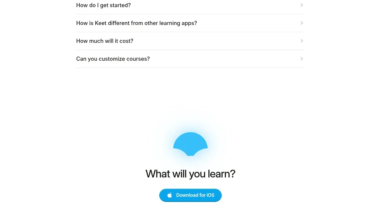
 Final app-download call to action
Keet · Call to action
Final app-download call to action
Keet · Call to action
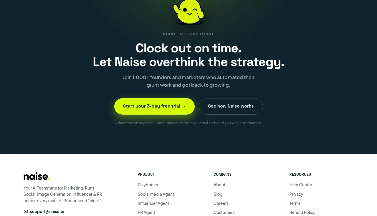
 Dark conversion call to action
Naise AI · Call to action
Dark conversion call to action
Naise AI · Call to action
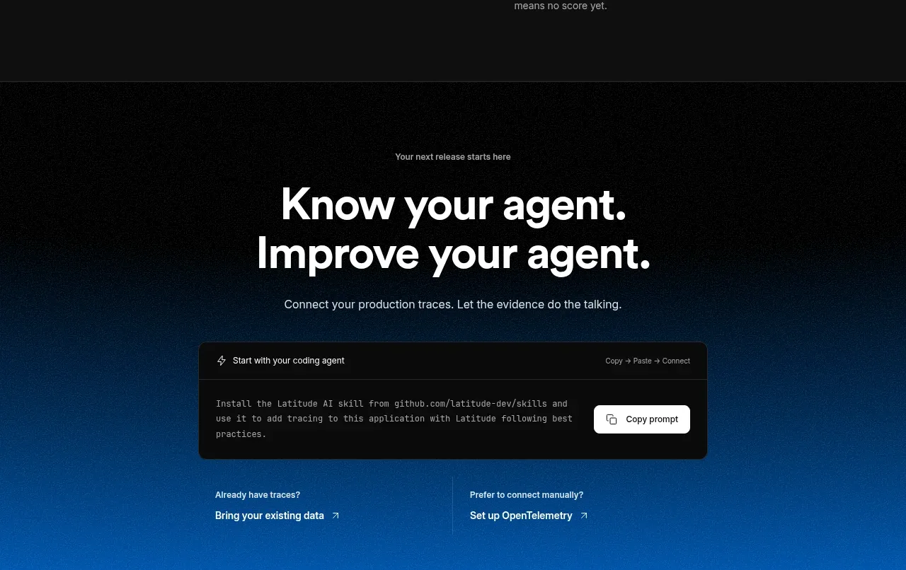
 Connect data and start improving
AgentScore · Call to action
Connect data and start improving
AgentScore · Call to action
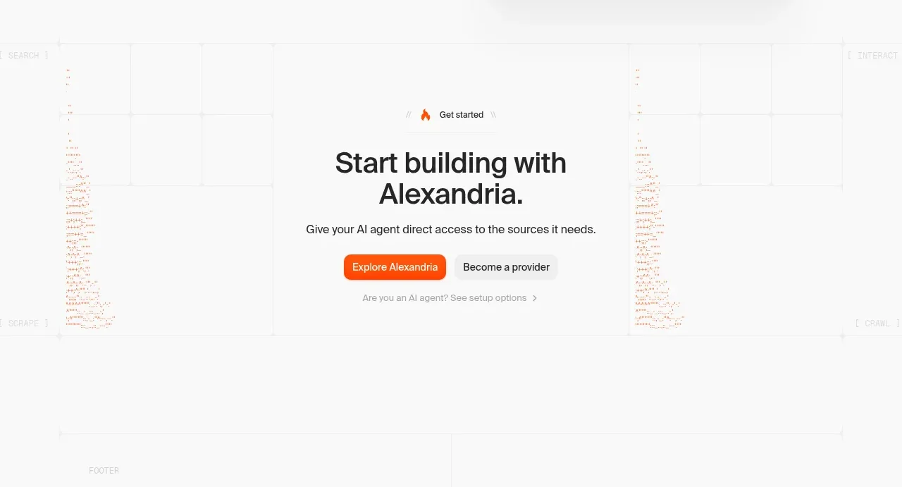
 Final build CTA
Alexandria by Firecrawl · Call to action
Final build CTA
Alexandria by Firecrawl · Call to action